Are Football Clubs Releasing Too Many Kits?
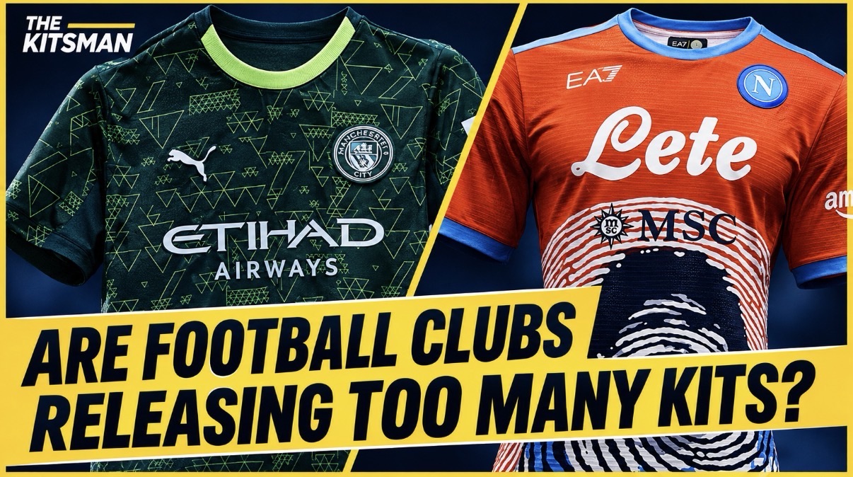
thekitsman2026-11-04T18:26:16+00:00Fourth kits, special editions and endless new releases. Are football clubs selling too many shirts, or simply giving supporters more choice?

Fourth kits, special editions and endless new releases. Are football clubs selling too many shirts, or simply giving supporters more choice?
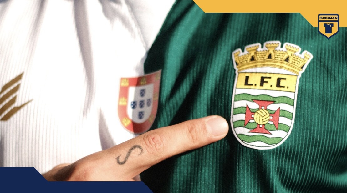
Leça FC put a green and white half-and-half design at the heart of their 2026/27 third kit. From Blackburn to Genoa, which club has worn football’s divided shirt best?
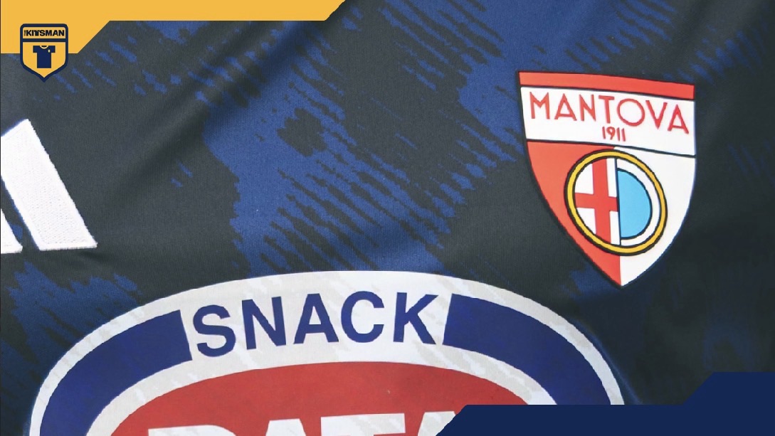
Mantova 1911 celebrate the extraordinary lotus-filled waterways surrounding their city with a rippling blue third kit. Would you banish this shirt to Mantua?
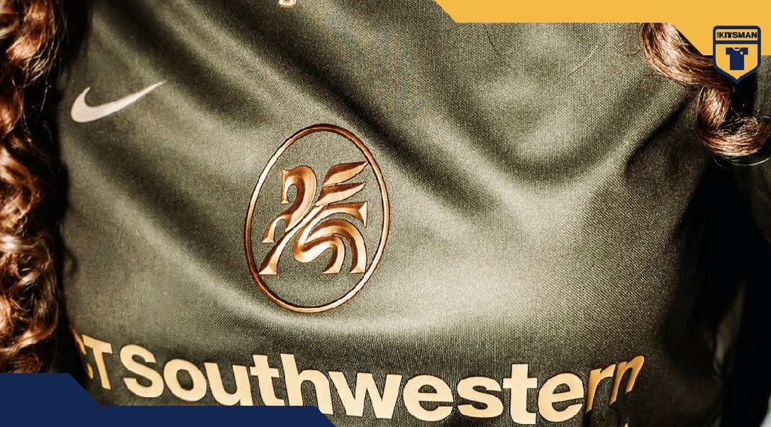
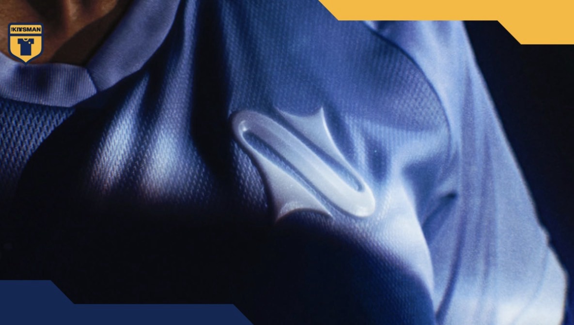
Dallas Trinity and Nike combine shimmering olive green, deep gold and a beautifully bevelled central Pegasus for their State Fair special. But when did central football shirt badges become so popular again?
Cancún FC dive beneath the surface with their ‘Dark Cenote’ kit, celebrating the crystal-clear freshwater sinkholes that make the Yucatán Peninsula one of Mexico’s most unique landscapes.
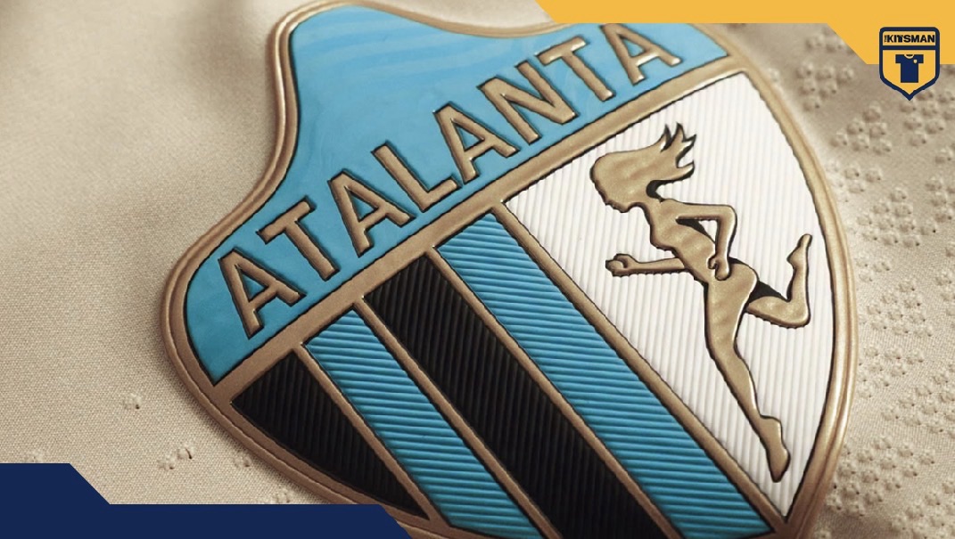
Atalanta and New Balance look back to 1963 with a clean beige throwback shirt featuring the club’s famous goddess in her full-stride form.
La Napoli Women continue their journey from the depths of the sea to the Moon with a lunar-inspired away shirt. It’s another brilliant story, but is the colour different enough from the home kit?
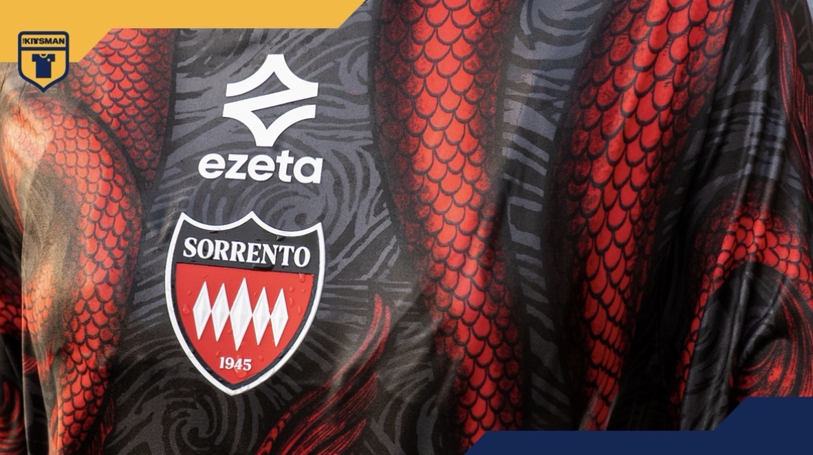
Ezeta turn the Sirens of Greek mythology into a remarkable three-shirt collection for Sorrento Calcio. Is there another football brand whose work is so instantly recognisable?
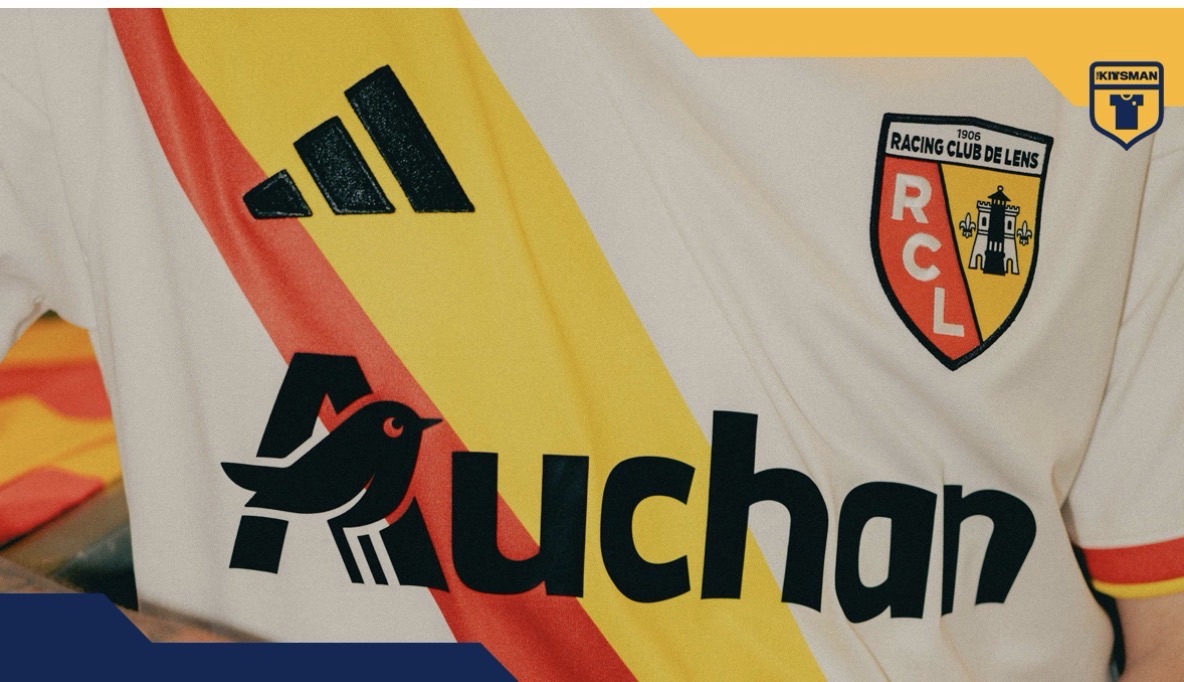
RC Lens celebrate the marriage of their famous red and yellow with a third shirt and a brilliantly unusual wedding-themed campaign. How outlandish have football kit launches become?
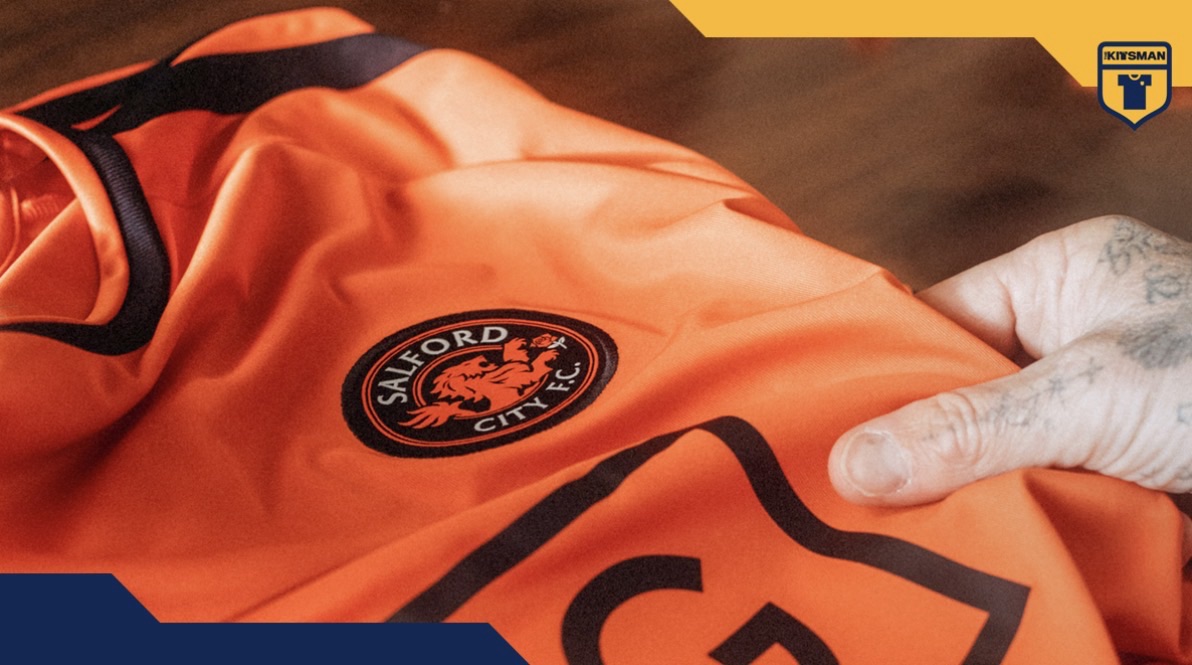
Orange is back at Salford City as the club embraces its historic colours once again. With David Beckham and Gary Neville involved, it also raises an interesting question about former players shaping clubs further down the pyramid.
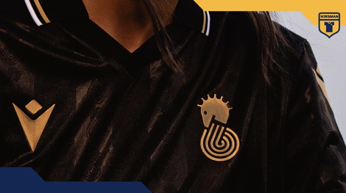
Cesena and Macron combine black with metallic gold for a sleek 2026/27 away shirt featuring the historic Cavalluccio. Is there a better colour combination in football?
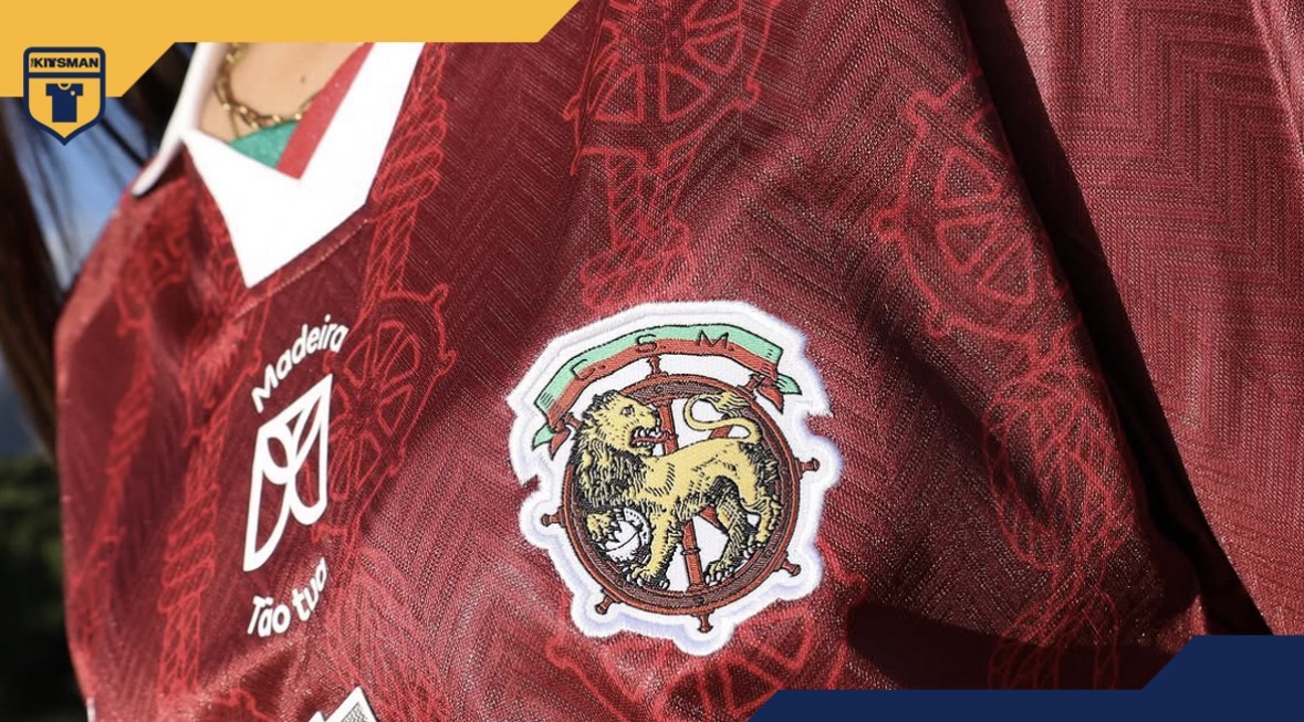
Marítimo and Hummel turn the club’s maritime identity into an intricate third shirt inspired by ships’ wheels and rope. Is Hummel producing better bespoke kits than football’s biggest brands?
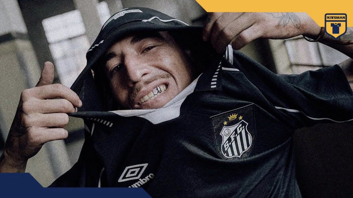
Santos and Umbro revive their 1997 shirt and its message of resilience and determination. But can something from the 1990s really be considered a throwback already?
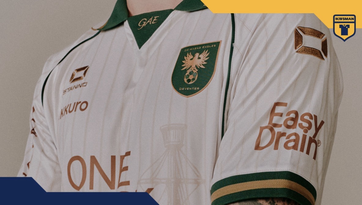
Go Ahead Eagles and Stanno celebrate the IJssel River with a third shirt whose best details only reveal themselves up close. Do football kits need to make an instant impression?
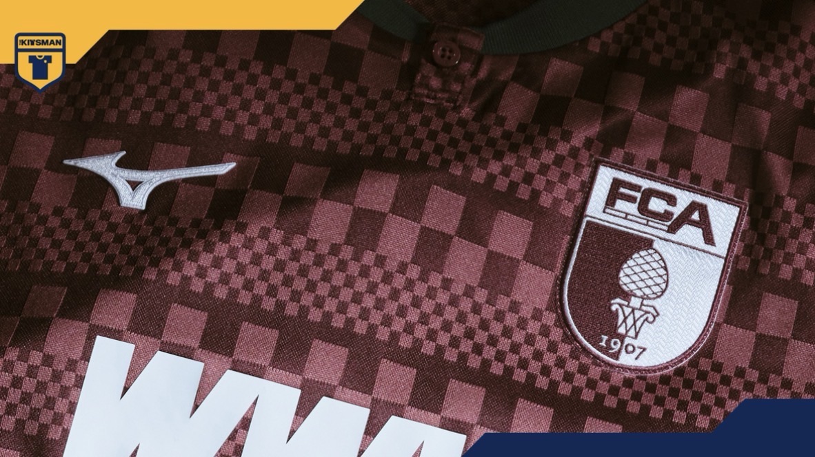
Augsburg and Mizuno turn the historic Weberhaus into another superb third shirt. For us, it strengthens an already convincing argument: nobody in German football is doing kits better.
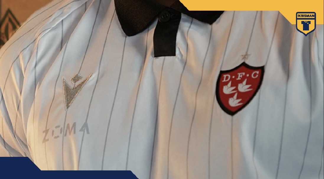
Dundalk celebrate a century of League of Ireland membership with a special edition shirt featuring 26 silver pinstripes. But are pinstripes one of football shirt design’s safest bets?
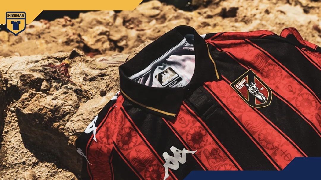
US Endoume turn the architecture, maritime history and symbols of Marseille into one of the most detailed shirts we’ve seen this season. Is this a contender for shirt of the season?
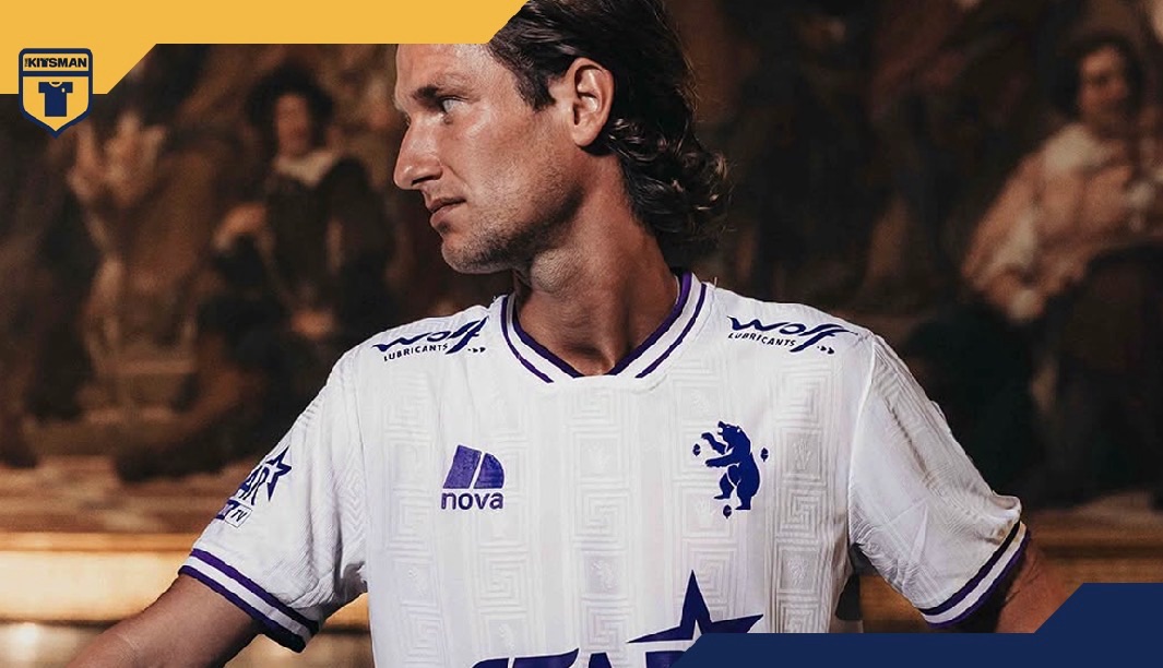
Beerschot’s museum-inspired away kit is packed with cultural references, but there’s another detail worth celebrating: every sponsor adapting to the club’s deep purple colour palette.
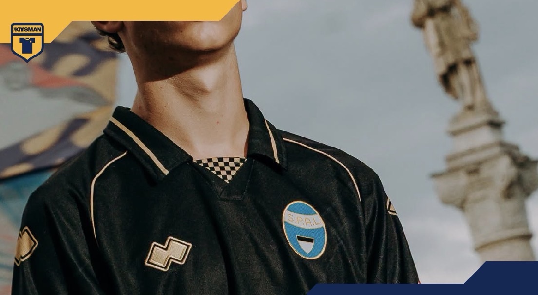
SPAL and Erreà turn to one of the world’s oldest medieval traditions for their 2026/27 away kit, although the finished shirt also raises that familiar question about sponsors and football shirt design.
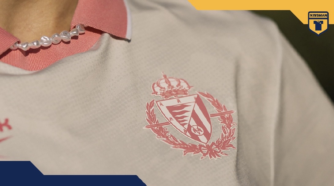
Real Valladolid and Reebok turn to the waters of the Pisuerga and the inspiring Vallkirias for their pink third kit. But in 2026, is pink on a football shirt still considered a risk?