There’s a really good football shirt here.
In fact, strip away the sponsors and there might be an even better one.
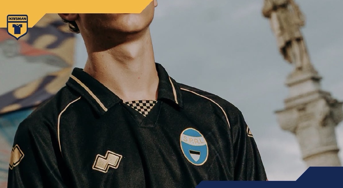
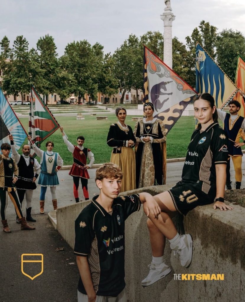
SPAL have turned to one of Ferrara’s great traditions for their latest away kit, taking inspiration from the Palio of Ferrara, one of the oldest medieval festivals of its kind in the world.
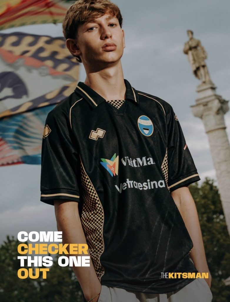
Each year, the city’s districts, or contrade, come alive with their own colours, patterns and identities as they compete for the prestigious decorated fabrics known as the Palio.
It’s an environment filled with the sort of visual language that lends itself perfectly to a football shirt.
Quarters, chevrons, diagonal divides and checks have been associated with heraldry for centuries, and SPAL have opted for the latter.
It’s probably the right choice, too.
Rather than covering the entire shirt in enormous blocks, the check pattern is kept relatively small and concentrated within the gold detailing. Against the otherwise plain base, those sections really stand out, particularly around the collar.
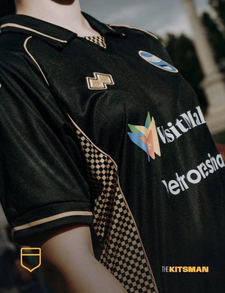
There’s something slightly old-world about that collar treatment itself, which only strengthens the medieval connection without turning the whole thing into a costume.
We’re also glad SPAL have resisted another increasingly common kit-design habit.
They haven’t monochromed the badge.
The traditional light blue remains proudly visible against the shirt. Considering the Palio itself is so heavily rooted in districts displaying their individual identities, keeping SPAL’s own colours intact feels particularly appropriate.
This is who we are.
Then your eyes move across the rest of the shirt and encounter something rather more modern.
The sponsors.
There’s an obvious commercial reality here. Clubs need sponsors, and for teams operating away from the enormous revenues at the very top of European football, those partnerships can be particularly important.
That doesn’t mean they always improve the shirt.
SPAL’s design has enough going on through the collar, checks, gold detailing and full-colour crest to give it an identity without much else being required. With fewer commercial marks across it, you wonder just how good this could look.
It certainly isn’t a problem unique to SPAL.
We’ve all seen a brilliant football shirt where the sponsor’s colour, size, position or sheer number of logos completely changes how we feel about it.
Perhaps that’s one of the strange realities of collecting football shirts. Sometimes the design you love and the shirt that actually reaches the pitch aren’t quite the same thing.
SPAL have produced a clever tribute to Ferrara and a tradition stretching back centuries.
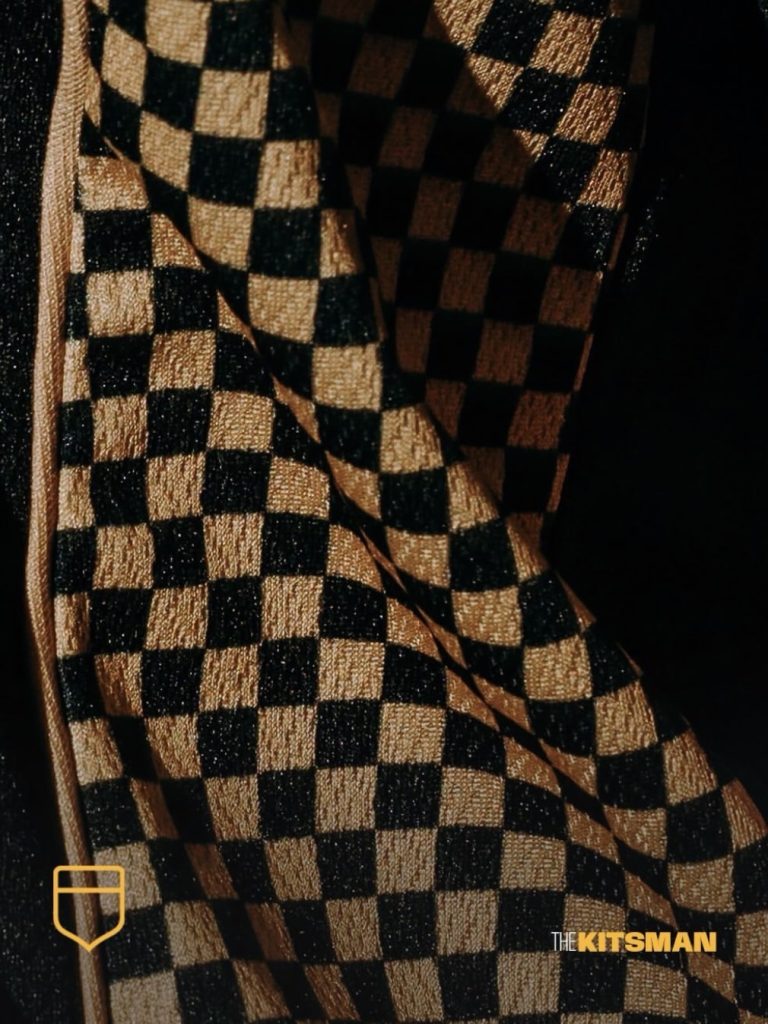
The medieval influence works. The checks work. Keeping the club badge in its traditional colours definitely works.
If only modern football didn’t require quite so much additional decoration.
Credit; @spalferrara @erreasport
#spal #palio #ferrara #festival #footballkits #thekitsman
Join the conversation:
X:
https://x.com/the_kitsman?s=21&t=YKLtf2JIakFxujMRxTUh9Q
Instagram:
https://www.instagram.com/the.kitsman?igsh=ZWtuMDJkb2c4Ynhz&utm_source=qr