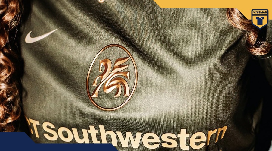
Sometimes a colour combination is enough to demand your attention.
Dallas Trinity have certainly managed it with their new State Fair special, a rich combination of olive green and deep gold inspired by the oak trees of the city.
Strength, resilience and roots provide the story, but visually it’s that colour palette that gets you first.
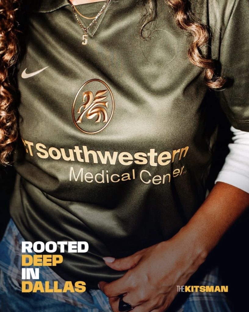
The olive carries a subtle shimmer across the shirt, while the deeper gold creates an earthy, almost autumnal feel. It’s a combination that connects rather neatly with the oak inspiration without needing to cover the shirt in leaves and branches to make the point.
The star of it for us, though, is that Pegasus.
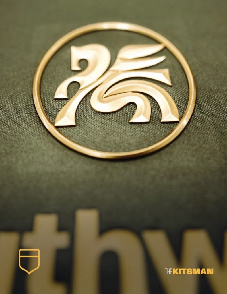
Placed centrally beneath the collar, the Dallas Trinity symbol looks superb in its bevelled gold finish. The raised edges catch the light differently as the shirt moves, giving the crest considerably more depth than a straightforward flat application.
If you’re going gold, that’s how you do it.
It also continues something we’ve been noticing increasingly across modern football shirts: the return of the central badge.
We’ve already seen Panama and Reebok make central placement an important part of their white shirt this year:
More recently, Sorrento and Ezeta positioned the badges centrally across their entire Sirens collection, allowing them to sit amongst the artwork rather than fighting against it:
Central badges aren’t actually new, of course. Football shirts have experimented with crest placement for decades, while club badges themselves weren’t even regular fixtures on many shirts until the latter half of the 20th century. Arsenal, for example, only began wearing their cannon regularly on shirts from 1967.
What feels different now is how normal the central position has become again.

For years, the badge-over-the-heart arrangement was so standard that almost anything else immediately looked unusual. Now central crests, standalone symbols and alternate badges are becoming increasingly familiar parts of modern kit design.
Dallas Trinity show exactly why the position can work.
With the Nike Swoosh and detailing kept away from it, that golden Pegasus gets the space to become the centrepiece of the shirt. It gives the whole thing a pleasing symmetry and makes an already striking badge difficult to ignore.
A one-off that we’d certainly like to see more of.
So, where should a football badge actually sit?
Over the heart, where tradition tells us it belongs?
Or dead centre?
Credit; @dallastrinityfc @nikefootball
#dallas #trinity #oaktree #oaks #nike #footballkits #thekitsman