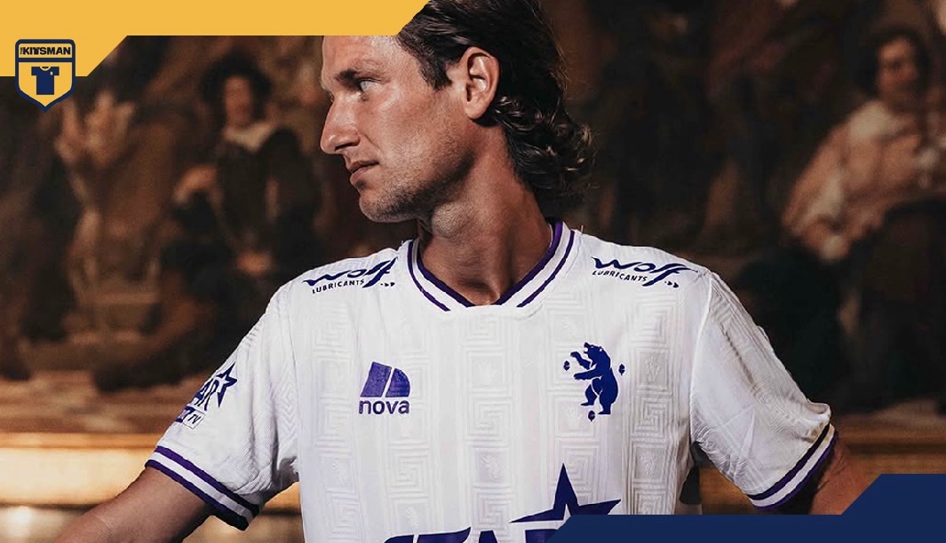
Sponsors are part of football shirts. That’s unlikely to change.
So if they’re going to be there, why can’t they always do this?
Beerschot’s new away kit is a beautiful piece of design in its own right, but there’s something particularly satisfying about looking across the finished shirt and seeing the various commercial partners all working within the same visual identity.
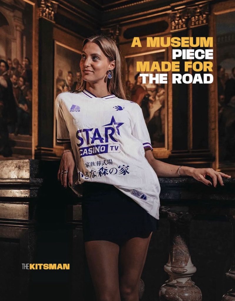
No rogue colours. No logo unnecessarily fighting for attention.
Just that deep Beerschot purple playing against the white.
It’s a small decision that makes a massive difference.
The shirt itself takes us inside the impressive Koninklijk Museum voor Schone Kunsten Antwerpen, or KMSKA, with Beerschot drawing inspiration from the historic tiled floor of the museum for their latest away-day look.
A clean white base provides the canvas, with the distinctive pattern of the floor worked across it.
Look closer and Beerschot have made the artwork their own.
The icons within the original design have been replaced by the Beerschot bear, bringing the museum and football club together rather than simply lifting a pattern and placing it onto a shirt.
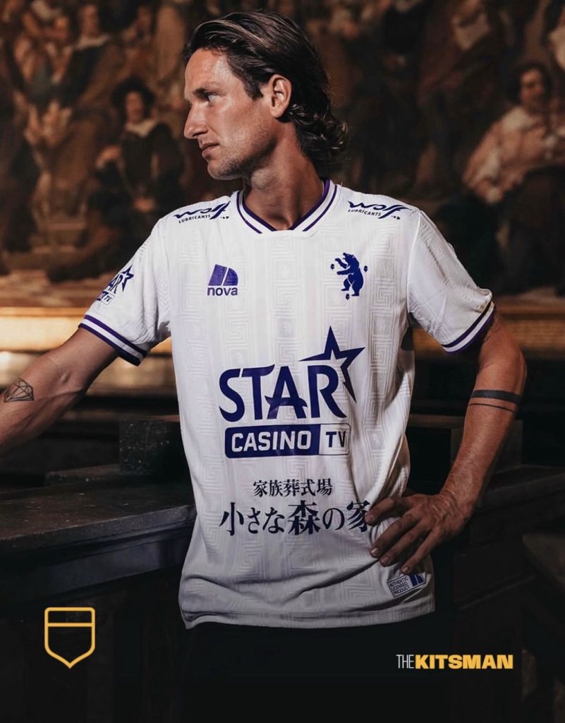
Then comes the purple.
It’s the obvious connection back to Beerschot’s traditional identity, providing a strong contrast across the crest, detailing and, crucially, the sponsors.
Every commercial logo adopting that same deep purple might sound like a minor detail, but compare it with shirts where three or four different corporate colours are competing with the design and the difference is enormous.
It raises a fairly simple question.
Should sponsors always change their colours to suit a football kit?
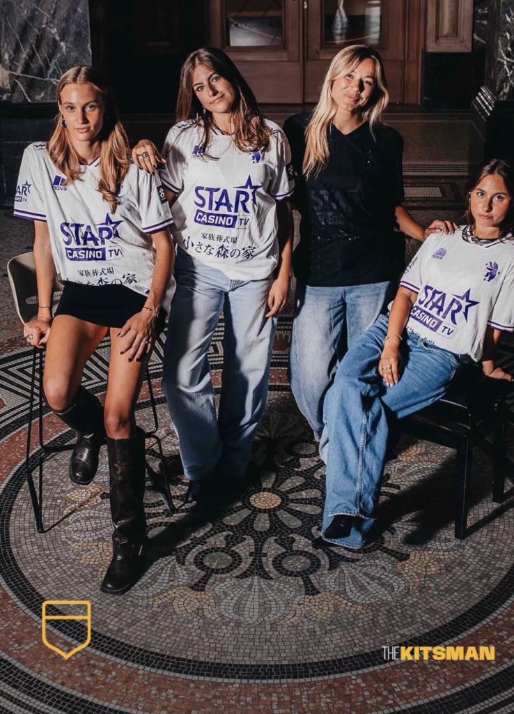
There will obviously be occasions where brand guidelines and commercial agreements make that difficult. Sponsors pay considerable money for visibility, so it’s understandable that some will want their established identity represented accurately.
Yet does changing a logo from red, green or blue to a club colour really make us notice the company any less?
You could argue the opposite.
When the sponsor feels like part of the shirt rather than something pasted over the top of it, the entire design becomes more appealing. Suddenly the commercial branding isn’t something you wish you could remove.
Beerschot demonstrate exactly how effective that can be.
The museum provides the art. The bear makes it theirs. The purple takes a piece of home onto the road.
Even the sponsors have dressed appropriately for the occasion.
A remarkable floor, now ready to go on a journey.
#museum #antwerp #beerschot #mosaic #footballkits #thekitsman
Join the conversation:
X:
https://x.com/the_kitsman?s=21&t=YKLtf2JIakFxujMRxTUh9Q
Instagram:
https://www.instagram.com/the.kitsman?igsh=ZWtuMDJkb2c4Ynhz&utm_source=qr