Birmingham City Away Shirt 2020/21 REVIEW
thekitsman2021-01-04T11:19:27+00:00Image from footyheadlines.com This is a plain red shirt, and, like a child scraping through a school entrance exam, it’s got just enough about it to make it seem smart,

Image from footyheadlines.com This is a plain red shirt, and, like a child scraping through a school entrance exam, it’s got just enough about it to make it seem smart,
Image from footyheadlines.com An interesting mix here from Nike and Birmingham, with bits I love and bits I loathe. The colour is spot-on – just the shade I blue I
Image from footyheadlines.com The type of shirt that’s likely to make people come up to you on holiday and say ‘I’ve never met a Burton Albion fan before.’ That’s the
Image from footyheadlines.com One for the Blockbusters fans out there, or the Beekeepers, as there’s not much going on here other than the hexagons in the background that you might
Image from footyheadlines.com One of two Puma-made efforts in The Championship, with both red home shirts going head-to-head in South Yorkshire. This Barnsley home number has just enough about it
Image from footyheadlines.com For what seems at first glance like a fairly basic shirt, there’s an awful lot to unpick here, most of which is marketing gibberish. It’s a ‘cool,
Image from footyheadlines.com Hands up who was expecting a turquoise AND teal colour scheme in the shirt world this season? There’s a lot going on here – raglan sleeves (fine),
Image from footyheadlines.com One of half a dozen Umbro-made shirts in The Championship, and one of the better. The Cherries’ traditional black and red stripes are faded so that they
Image from www.footyheadlines.com Though I spent some time living in Cologne in my youth, and my mom lived quite a bit of hers in Munich as the daughter of an
Image from www.footyheadlines.com Kitstory episode 4 - Hashtag Time. A shirt fit for the 5-year-old club founded by Spencer Owen – a global YouTube creator who had the idea to
Image from www.kitbag.co.uk Over time there has always been a want and a need among people to have something that not very many others may have, something of association to
Arsenal 2020/21, Home Shirt Review Image from kitbag.com Sticking with their usual red and white, the Gunners have a respectable shirt here that I think will sell very well. Adidas
In the past few years since online shopping and social media have created the ability for everyone to be connected to everything, a new type of market has emerged in
Image from kitbag.com Just the right amount of black used in the shirt. Great use of the Adidas stripes and excellent detailing within the material on the front of the
Image from kitbag.com Love the West Ham colours and love the way they have done it this year. A simple design done really well. There is something nostalgic about the
Image from footyheadlines.com A solid mid-table shirt. It is completely inoffensive but also not very inspiring. It would work quite well with jeans because of the lack of vibrant colours.
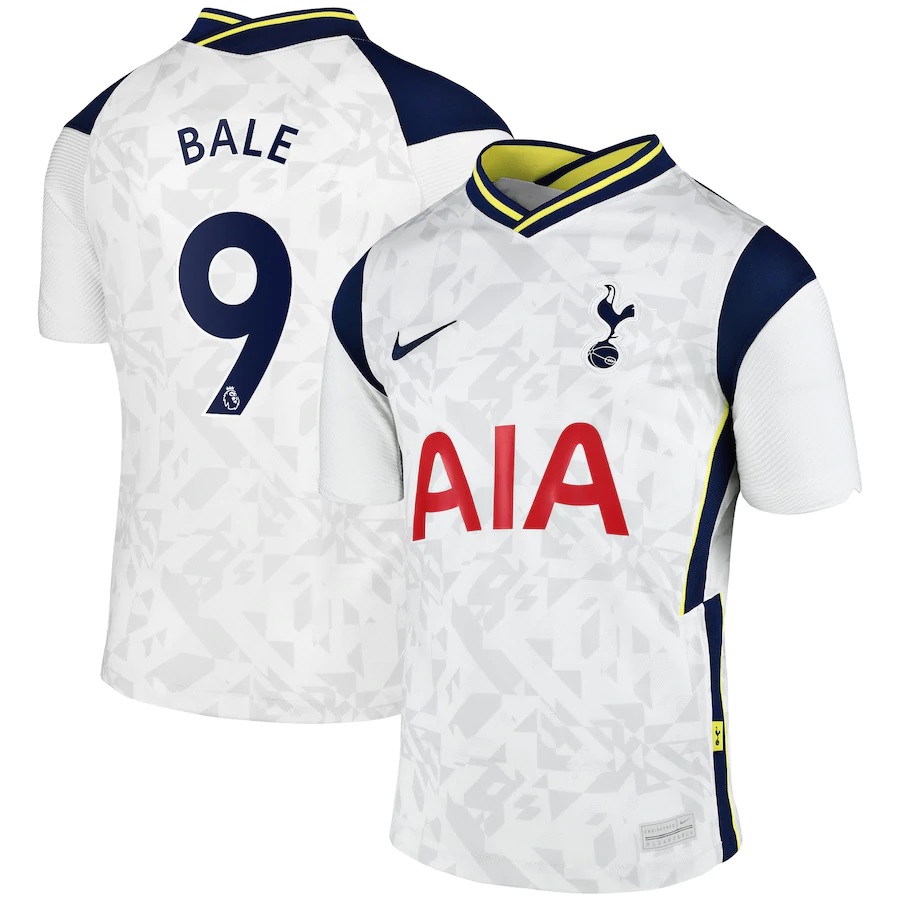
Image from kitbag.com A lovely style to this shirt. Beautiful detailing in the material of the shirt front and back. The hints of yellow are a master stroke in making
Image from kitbag.com Oh the sash! What a shame. I think this is a real downgrade from the red and white stripes. Relegation potential here confirmed with an unattractive sponsor
Image from footyheadlines.com More white than in previous years. This shirt hits the mark. Cool collar and the combination with the Adidas stripes on the shoulders really works. The colour
Image from kitbag.com Black and white stripes look on point and the red lettering is fantastic. Cool Puma logo. The sponsor has destroyed the chances of a great shirt here.