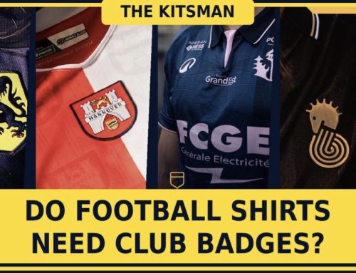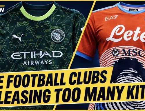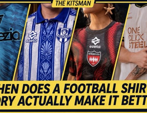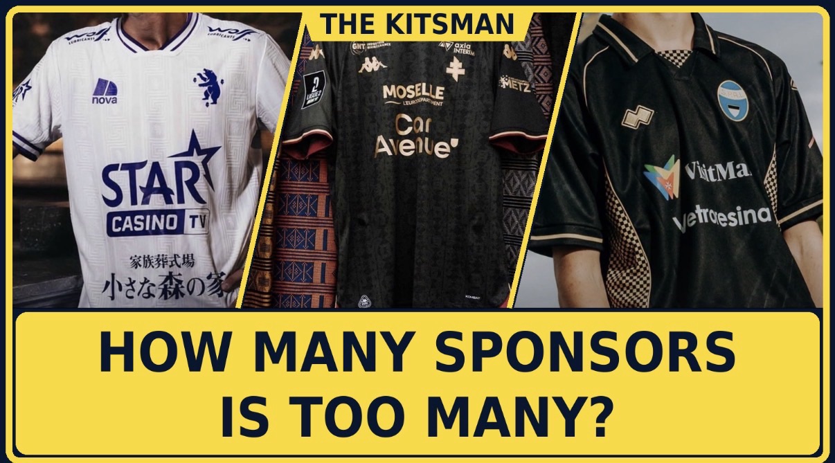
One sponsor? Two? Five? Football shirts are increasingly competing for space between club crests, manufacturer logos and commercial partners. But where should we draw the line between necessary income and turning a football shirt into a walking billboard?
Imagine finding the perfect football shirt. The colours are beautiful, the pattern is distinctive and the club badge sits exactly where it should. Then you notice the sponsors. There’s a company across the chest, another above it, something on the sleeve and perhaps two more competing for attention elsewhere. Suddenly, a design that looked fantastic in isolation feels considerably less appealing.
It’s a familiar frustration for football shirt collectors, particularly when the commercial logos introduce colours, lettering and shapes that have little relationship with the design underneath. Yet there’s another side to the argument. Sponsorship provides valuable revenue for clubs, especially those operating without the enormous commercial resources available to football’s biggest names. Removing that income simply to produce a prettier shirt isn’t necessarily a realistic proposition.
The more interesting question is whether football has reached a point where some shirts are carrying too much advertising, and whether the number of sponsors is actually the biggest problem. We’ve explored some particularly revealing examples at The Kitsman, from heavily branded shirts in France and Italy to Dutch clubs demonstrating how effective a cleaner approach can be.
FC Metz: When the Sponsors Compete With the Shirt
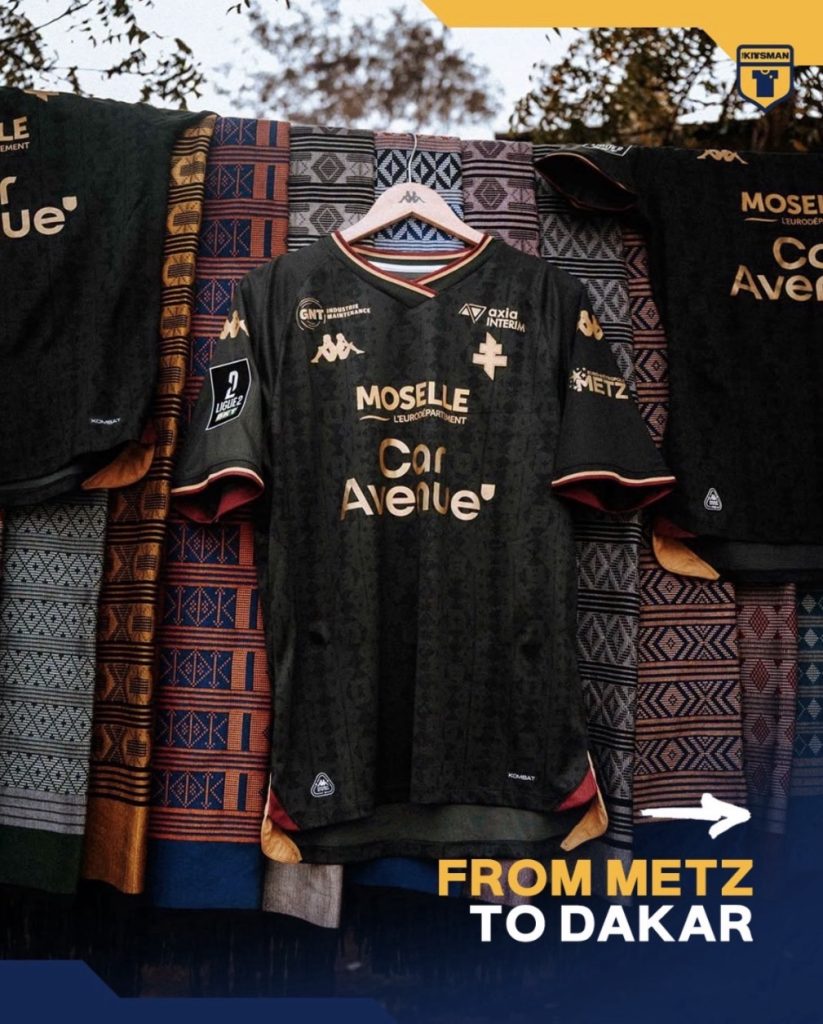
FC Metz’s 2026/27 third shirt is an excellent place to begin because there’s a genuinely beautiful design beneath its commercial branding. Produced by Kappa, the shirt celebrates the club’s longstanding relationship with Senegalese academy Génération Foot, drawing inspiration from traditional textiles and incorporating cultural references into the fabric.
The dark khaki base, intricate patterning and gold detailing create a distinctive appearance, with touches of deep red maintaining a connection to Metz’s traditional identity. It’s the sort of shirt that rewards closer inspection, particularly when you begin noticing how the different visual elements have been incorporated.
Unfortunately, there’s quite a lot competing for that attention. Multiple commercial logos occupy prominent positions across the front, creating a crowded appearance that contrasts with the carefully considered pattern underneath. None of the sponsors necessarily looks disastrous in isolation, but together they make it more difficult to appreciate the shirt as a complete design.
Our original coverage raised precisely this concern when examining the Senegal-inspired release:
Metz demonstrate why the number of sponsors matters, but also why counting logos doesn’t tell the entire story. Three discreet commercial marks might have less visual impact than one enormous sponsor dominating the chest. Equally, several competing logos can make even a relatively understated shirt feel cluttered.
Credit in some part though as the sponsors made their colours to match the design.
SPAL: When Commercial Reality Interrupts a Beautiful Idea
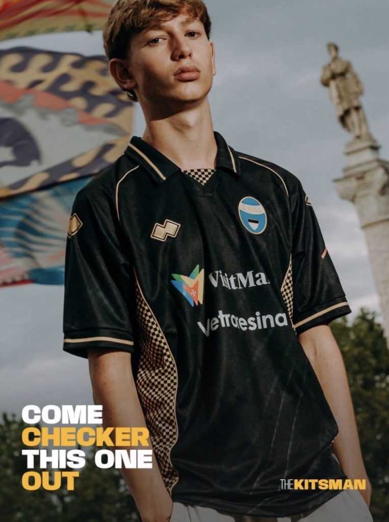
SPAL’s 2026/27 away shirt presents a similar dilemma. Erreà have produced a thoughtful design inspired by the Palio of Ferrara, a historic festival associated with the city’s districts, colours and heraldic traditions. The shirt incorporates delicate checked detailing, gold accents and an attractive collar, while retaining the club crest in its traditional colours.
It’s a particularly effective interpretation of local history because the references are integrated into the design rather than simply printed across the fabric. The shirt has enough personality to stand on its own, with the traditional badge and subtle decorative elements providing a strong connection to Ferrara.
Then the sponsors enter the picture. Their presence introduces another layer of visual information to a design that arguably doesn’t need it. It’s difficult to look at the finished shirt without wondering whether the historical details would stand out more clearly if the commercial branding were reduced.
We discussed that very issue in our original SPAL feature:
There’s a temptation to demand that clubs simply remove the advertising, but SPAL illustrate why that argument can become unfair. Commercial partnerships can make a meaningful difference to clubs outside football’s wealthiest competitions, helping support everything from player wages to operational costs.
Supporters might understandably prefer the shirt without sponsors, but would they feel the same way if removing those logos meant reducing the money available to their club?
That tension sits at the heart of this debate. The most aesthetically pleasing decision isn’t always the most financially sensible one.
Beerschot: Proof That Multiple Sponsors Can Actually Work
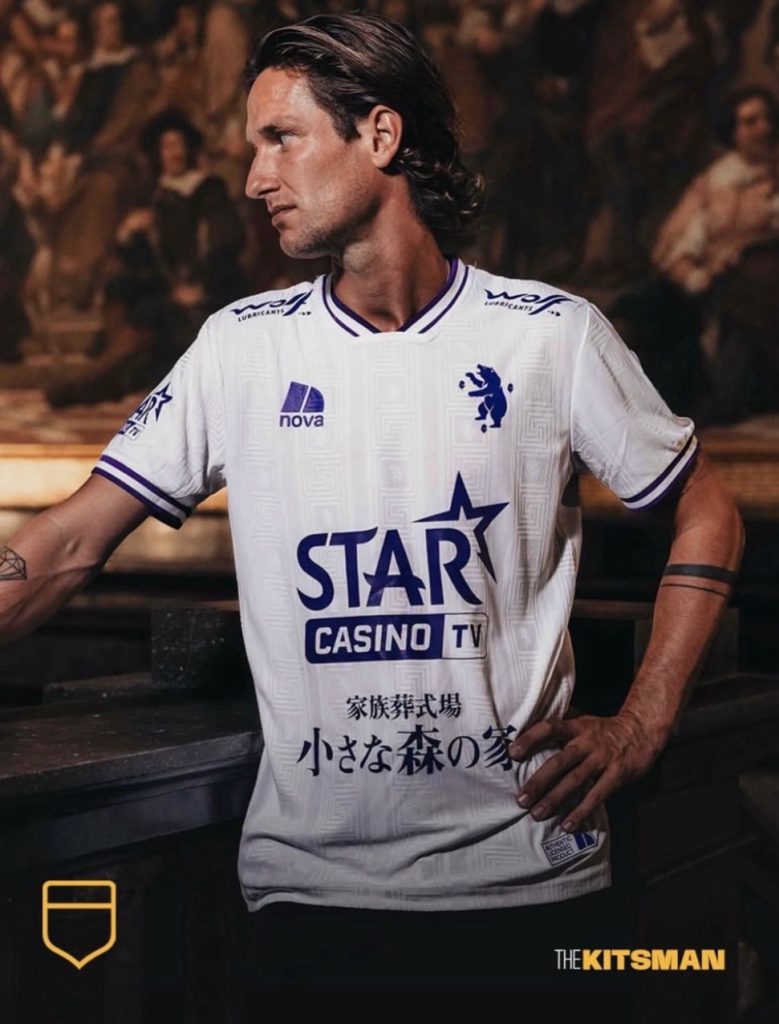
Beerschot’s 2026/27 away shirt offers a compelling counterargument to the idea that football shirts should carry as few sponsors as possible. Produced by Erreà, the design draws inspiration from the historic tiled floor of Antwerp’s Royal Museum of Fine Arts, incorporating the club’s bear emblem into the distinctive pattern.
The white base provides an attractive canvas for the detailing, but one of the smartest decisions concerns the commercial branding. Rather than allowing different companies to display their usual corporate colours, the sponsors have adopted the same deep purple used elsewhere on the shirt.
The result is remarkably cohesive. Multiple commercial partners remain visible, yet their logos don’t compete with one another or overwhelm the underlying design. The club colours establish a consistent visual language, allowing the sponsors to become part of the overall appearance rather than unrelated additions.
We explored why this approach works so effectively in our earlier article:
Beerschot raise an interesting possibility. Perhaps the debate shouldn’t focus exclusively on how many sponsors a shirt carries. Maybe the more important question is whether those sponsors should be required to adapt their branding to suit the kit.
There are understandable commercial objections. Companies invest in sponsorship because they want visibility, and their established logos and colours are important parts of their identities. But Beerschot demonstrate that a coordinated approach doesn’t necessarily make those businesses disappear. Their logos remain recognisable while contributing to a more attractive finished product.
If a shirt can accommodate several sponsors without looking overcrowded, perhaps the problem isn’t always the quantity of advertising. It’s the lack of coordination.
Willem II: What Happens When You Remove the Front Sponsor?
At the opposite end of the spectrum sits Willem II, whose 2026/27 home shirt demonstrates the appeal of giving a traditional football design some breathing room.
The Dutch club reunited with Meyba for its 130th anniversary season, producing a shirt built around the famous red, white and blue vertical stripes. It’s a wonderfully straightforward design, with a traditional collar, restrained manufacturer branding and the club crest allowed to stand prominently against the familiar colours.
One of its defining features is the absence of a conventional commercial sponsor across the chest. Through the club’s Leeuwenmoed sponsorship initiative, the traditional stripes remain uninterrupted, giving the shirt an appearance that many supporters will associate with football’s earlier eras.
The difference is immediately noticeable. There’s no enormous wordmark breaking across the central stripes, no contrasting corporate colour competing with the badge and no additional advertising distracting from the shirt’s traditional identity.
Our original article explored how effective that decision proved:
Willem II demonstrate why sponsor-free designs are so appealing, but the example also shows that commercial partnerships don’t necessarily have to disappear entirely. The club’s approach involves a different sponsorship arrangement rather than simply deciding that commercial revenue is no longer important.
That distinction is crucial. A football club needs to fund its operations, but there may be opportunities to structure partnerships in ways that preserve the appearance of its most important shirt.
Would more supporters prefer their club to explore an arrangement like Willem II’s, even if it meant replacing one prominent shirt sponsor with a different form of commercial partnership?
Can a Sponsor Actually Make a Football Shirt Better?
It’s easy to focus on the negative examples, but some commercial logos have become surprisingly important parts of football shirt history. Think of classic combinations such as Newcastle United and Newcastle Brown Ale, Arsenal and JVC, or Manchester United and Sharp. For many supporters, those names are inseparable from particular players, matches and periods of the club’s history.
The logos weren’t necessarily admired because they represented exceptional graphic design. They became familiar through repeated exposure and the memories associated with the shirts carrying them. Remove the sponsor from certain historic kits and, for some collectors, the result might actually feel less authentic.
San Francisco Glens offer a more recent example. Their Celtic-inspired 2026 collection features Guinness sponsorship on a green-and-white hooped home shirt, creating a combination that feels particularly appropriate given the club’s Irish heritage and the collection’s tribute to Celtic’s Lisbon Lions.
The sponsorship contributes to the overall character rather than appearing completely disconnected from it. It may be a commercial arrangement, but visually it supports the historical theme and gives the shirt an appearance that feels deliberately considered.
We covered the collection and its Celtic connections earlier this year:
This is where the argument becomes more complicated. If supporters can celebrate certain historic sponsor combinations while criticising modern advertising, perhaps we’re not judging sponsorship entirely consistently.
Nostalgia undoubtedly plays a role, but visual compatibility matters too. A well-proportioned sponsor with appropriate colours can become part of a shirt’s identity. An oversized logo in a completely unrelated colour can undermine even the most attractive design.
The distinction is often more important than the simple question of whether advertising should exist at all.
Should Sponsors Have to Match the Shirt?
FC Porto’s 2026/27 away shirt provides another useful example of how commercial branding can be incorporated without dominating a design. New Balance created a rich purple shirt inspired by Port wine, with subtle striping, woven detailing and a traditional collar contributing to an elegant overall appearance.
Crucially, the sponsor, manufacturer branding and crest adopt a coordinated tonal treatment. The commercial logo remains visible, but it doesn’t introduce an entirely different colour palette or disrupt the visual balance.
The result is a shirt that feels more sophisticated because the different elements work together. It would be easy to imagine how dramatically the appearance could change if the central sponsor insisted on using a bright, contrasting corporate colour.
Our original coverage highlighted that restraint as one of the design’s greatest strengths:
Porto and Beerschot demonstrate that clubs don’t necessarily need to choose between commercial partnerships and attractive football shirts. There is room for compromise, particularly when sponsors recognise that a better-looking product may also reflect positively on their brand.
A logo that fits naturally into a shirt might be less visually aggressive, but that doesn’t automatically mean it’s less memorable. Supporters who genuinely like a design are more likely to wear it regularly, potentially giving the companies involved a different kind of visibility.
Perhaps the question clubs should be asking isn’t simply how much advertising space they can sell, but how they can make that advertising work without undermining the product itself.
Where Should Football Draw the Line?
Football has always had a complicated relationship with commercialism. Shirt sponsorship was once controversial in its own right, yet it has become such an established part of the game that sponsor-free designs now attract attention precisely because they’re unusual.
The gradual expansion of commercial branding has also changed what supporters consider normal. Front-of-shirt sponsors are familiar, sleeve sponsorship is widely accepted in many competitions, and additional commercial marks can appear on backs, shoulders and other areas depending on the league.
There are legitimate reasons for those arrangements. A smaller club may rely on several commercial partners to generate revenue that a major European side can secure through one enormous sponsorship agreement. Applying the same expectations to both would ignore the financial realities of football outside the elite.
But there’s also a reasonable argument for protecting the shirt itself. Supporters are being asked to purchase increasingly expensive replica kits, often several times during a season. When the finished product is covered in commercial logos, it’s understandable that some begin questioning whether they’re buying something designed to represent their club or simply paying to wear a collection of advertisements.
A possible compromise would be to limit the number of prominent sponsors on the front of a shirt while allowing additional commercial partnerships elsewhere. Another would be to require coordinated colours, ensuring that companies cannot introduce branding that completely overwhelms the club’s design.
Neither solution is perfect. Restrictions could reduce valuable revenue, while strict colour requirements might make certain partnerships less attractive. Yet the success of shirts such as Beerschot’s suggests that commercial considerations and good design don’t always have to be in conflict.
So, How Many Sponsors Is Too Many?
Looking across these examples, it’s difficult to establish one universal number. Willem II demonstrate the beauty of an uninterrupted shirt, while Beerschot show that several commercial logos can coexist successfully when they’re carefully coordinated. Metz and SPAL illustrate how advertising can compete with an otherwise thoughtful design, while Porto and San Francisco Glens demonstrate the difference a well-matched sponsor can make.
Perhaps one sponsor should be the ideal starting point. A single, appropriately sized chest logo can provide valuable commercial visibility without overwhelming the shirt, particularly when its colours complement the design. Additional sponsors might be acceptable, but only when their placement and presentation respect the club’s visual identity.
There’s also a case for clubs offering supporters the choice of a sponsor-free retail version wherever commercial agreements allow. Some collectors want the exact shirt worn by the players, complete with every logo. Others would happily pay for the same design without advertising across the front.
Ultimately, the answer may depend on whether we consider football shirts primarily sporting uniforms, commercial products or expressions of club identity. They have become all three, and balancing those competing purposes is increasingly difficult.
What seems reasonable, though, is expecting the design itself to remain the priority. A football shirt should still look like it belongs to the club wearing it, rather than whichever companies have purchased space on the fabric.
So, where would you draw the line?
Would you allow one sponsor across the chest, accept a second on the sleeve, or happily wear a shirt featuring five or six different companies if it helped your club financially?
And perhaps the more difficult question: would you rather have a sponsor-free shirt that looks fantastic, or a heavily sponsored one that helps your club compete?
Join the conversation: