Fish skeletons, flowers, luxury fashion houses and local entrepreneurs. Some of football’s most interesting recent shirts have been inspired by things that have very little to do with football itself.
There’s a curious trend emerging in football shirt design.
Clubs are increasingly looking beyond their stadiums, former players and traditional colours for inspiration. They’re finding stories in the streets, businesses, wildlife and history of the places they represent.
Sometimes those stories produce remarkable shirts. Sometimes the explanation is arguably more interesting than the design.
That raises a question worth asking: are we judging football shirts by how good they look, or by how good their stories sound?
Four recent releases offer rather different answers.
Venezia: Would Fish Bones Work Without the Story?
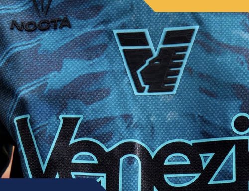
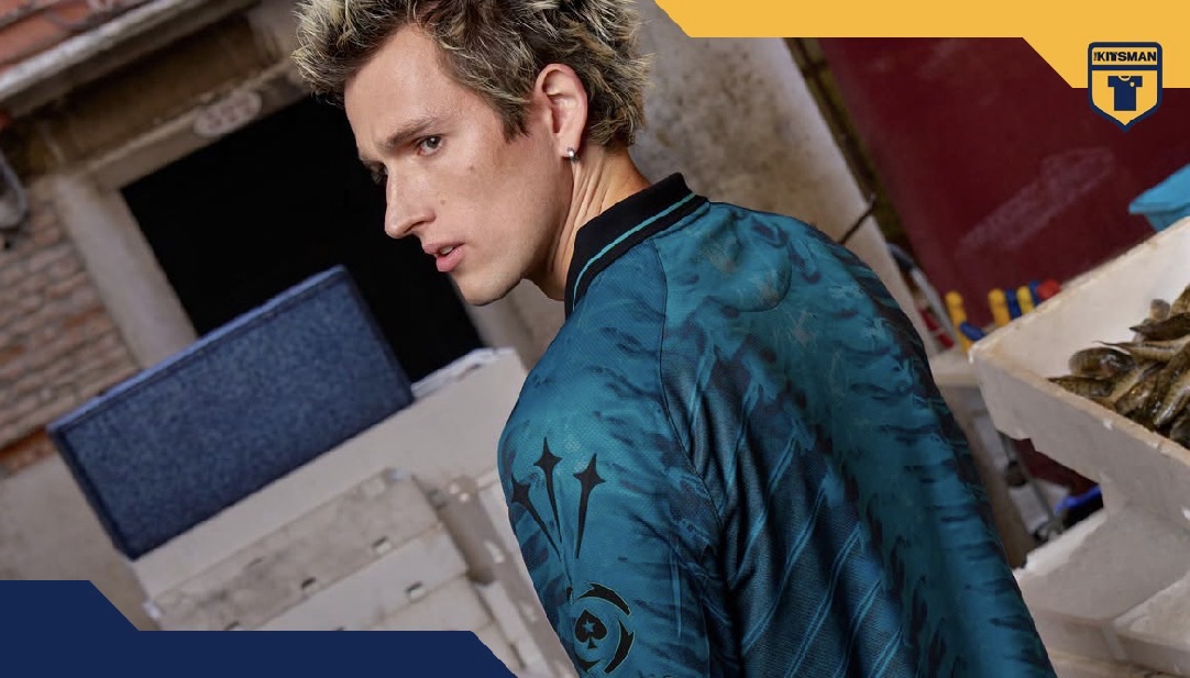
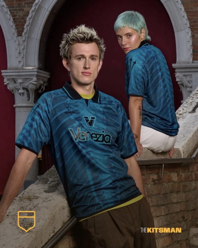
Venezia’s latest NOCTA fourth kit might be the most unusual example.
The shirt features X-ray-style fish skeletons across a turquoise base, inspired by the city’s historic Rialto Fish Market.
It’s certainly not a conventional football design.
Yet once you understand the connection between Venice, its lagoon and the generations of people who have depended on its waters, the idea starts to make sense.
The accompanying campaign, photographed inside the fish market, reinforces that connection.
Without the explanation, though, would you look at a shirt covered in fish skeletons and immediately think it was a great design?
Some undoubtedly would. Others might wonder what on earth they’re looking at.
That’s the fascinating thing about Venezia. Their designs often challenge what we expect from football clothing, while their storytelling gives the more experimental decisions a reason to exist.
London City Lionesses: When the Design Does the Talking
London City Lionesses offer an interesting contrast.
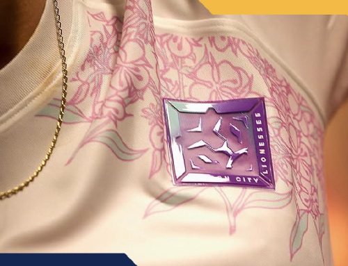
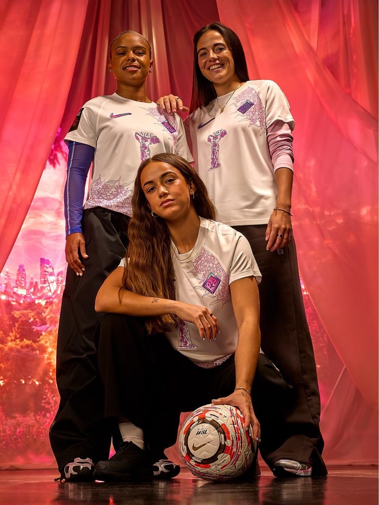
Their new Nike third kit features delicate pink floral illustrations across a white base, with the club crest and Nike branding providing the visual highlights.
It’s an attractive shirt before anyone explains the inspiration.
Then comes the story.
The flowers reference Rosebay Willowherb, a plant that flourished across London’s damaged landscape following the Second World War. It became associated with resilience and regeneration.
For London City Lionesses, an independent women’s football club establishing its own identity in the capital, the symbolism feels particularly appropriate.
The design catches your attention. The story gives you another reason to appreciate it.
Perhaps that’s the ideal combination.
It’s also interesting that the shirt can attract attention without relying on the established identity of a major men’s club.
Bayern Munich x MCM: Does a Famous Collaboration Need a Great Shirt?
Bayern Munich’s collaboration with MCM approaches the subject from another direction.
Here, the story is the relationship between two internationally recognised names with origins in Munich.
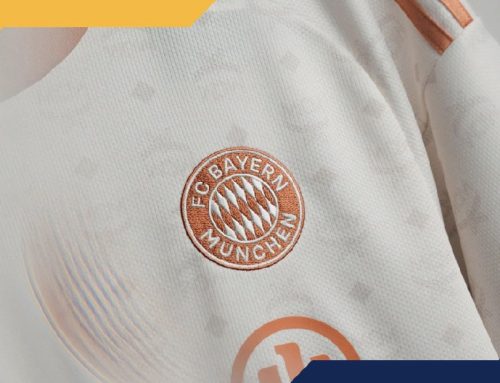
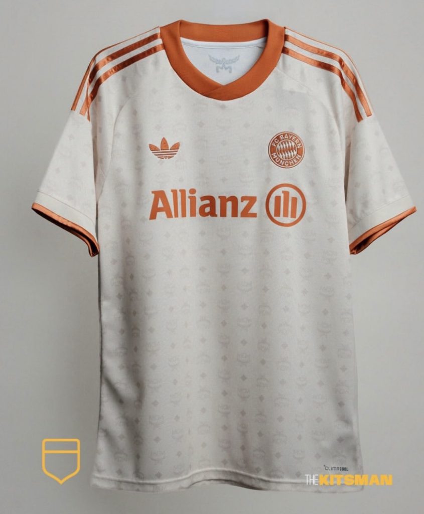
MCM’s distinctive cognac colouring and Visetos monogram appear on the women’s shirt, combining luxury fashion with one of European football’s most established identities.
The design is comparatively restrained.
There are no fish skeletons, elaborate historical illustrations or particularly outrageous graphics.
Instead, the appeal comes from the recognisable characteristics of the two brands.
It’s an example of how a collaboration can carry its own narrative before the shirt is even revealed.
But that raises another question.
Would the design receive the same attention without MCM’s name attached?
And should the reputation of the brands involved influence how we judge the shirt itself?
Como: When the Campaign Is Bigger Than the Kit
Como provide perhaps the clearest example of a story taking centre stage.
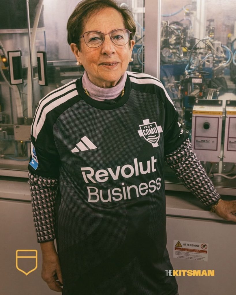
Their recent adidas release features a subtle tonal pattern and the return of the club’s familiar badge.
It’s an attractive, relatively understated design.
The launch, however, focuses on local entrepreneurs and independent business owners, recognising the people whose work helps sustain the city.
For a club whose international profile has grown dramatically, that creates an opportunity to direct attention towards its local community.
There’s something appealing about a football club using its platform in that way.
Yet it also highlights how differently we might respond to a shirt depending on its presentation.
If Como had unveiled exactly the same design against a plain studio background, would people have found it equally interesting?
The campaign gives the shirt a purpose that isn’t immediately apparent from the fabric alone.
Have We Started Judging the Marketing Instead of the Shirt?
Football shirt launches have changed enormously.
A new kit is rarely just a photograph of a player wearing it.
There are elaborate campaigns, carefully selected locations, cinematic videos and detailed explanations of the design process.
At their best, these elements deepen our understanding of a club.
They can introduce supporters to overlooked parts of a city’s history or help smaller clubs establish an identity that reaches beyond their existing fanbase.
There’s also a commercial reality.
A compelling story makes a shirt easier to promote, discuss and share. It gives journalists, content creators and supporters something to talk about beyond whether they like the colour or pattern.
That isn’t necessarily a bad thing.
The problem comes when the narrative becomes so persuasive that we stop questioning whether the shirt itself is any good.
A beautiful explanation cannot automatically make an unattractive design beautiful.
Equally, a brilliant shirt shouldn’t need a lengthy historical essay to justify its existence.
So What Actually Makes a Great Football Shirt?
Consider these four releases without their campaigns.
Venezia’s fish skeletons remain unusual. London City Lionesses’ floral design remains attractive. Bayern’s MCM collaboration retains its luxury detailing. Como’s tonal shirt remains understated.
Their appearances haven’t changed.
What changes is our understanding of them.
That suggests storytelling has become another part of football shirt design, alongside colour, pattern, fit and identity.
The best examples make those elements work together.
A shirt can look fantastic and tell a meaningful story. The two aren’t mutually exclusive.
But perhaps we’re reaching a point where supporters need to separate their appreciation of a design from their admiration for the marketing surrounding it.
After all, if you need several paragraphs explaining why a shirt is brilliant, is it actually brilliant?
Or have you simply been told a very good story?
Join the conversation:
Would you rather have a beautiful football shirt with no particular meaning, or an average-looking shirt with an incredible story behind it?
X:
https://x.com/the_kitsman?s=21&t=YKLtf2JIakFxujMRxTUh9Q
Instagram:
https://www.instagram.com/the.kitsman?igsh=ZWtuMDJkb2c4Ynhz&utm_source=qr