From Lille replacing their crest with a Flemish lion to AS Nancy Lorraine bringing back an enormous historic thistle, football clubs are experimenting with what belongs on the front of their shirts. But does removing the traditional badge actually improve a design, or are we losing something important?
Imagine your club unveiling its next home shirt without its traditional badge. The colours are right, the manufacturer has produced a beautiful design and everything looks exactly as you’d hoped, except for one detail. The crest you’ve associated with your team for as long as you can remember has disappeared. In its place is a historic symbol, a simplified emblem or perhaps something representing the city rather than the football club itself. Would you consider that an improvement?
It’s a question becoming increasingly relevant as manufacturers explore different ways of presenting football identities. Some clubs are reducing elaborate crests to individual symbols, others are revisiting forgotten emblems, while a few are replacing their badges with civic or regional imagery. The results can be spectacular, but they also challenge one of football’s most familiar traditions: the idea that the club crest should sit proudly on the chest.
We’ve been covering plenty of these experiments at The Kitsman, and the variety is striking. From France and Germany to Italy, Australia and the United States, clubs are discovering that a football shirt’s identity doesn’t always depend on displaying its official badge in the conventional way. The more interesting question is whether these alternatives actually make the shirts better.
Lille: When the Club Badge Makes Way for an Entire Region
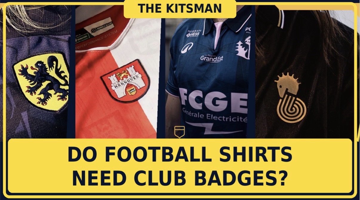
Lille’s 2026/27 Flanders-inspired shirt offers one of the clearest examples of a club deliberately stepping away from its familiar identity. Rather than featuring the traditional LOSC crest, New Balance have placed the black Flemish lion against a bright yellow shield, drawing on the history and culture of the region surrounding the northern French city.
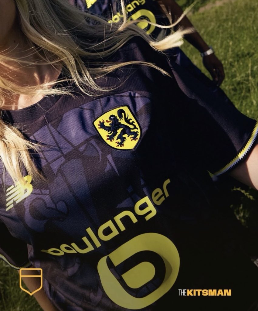
It’s a bold decision because the lion isn’t simply a simplified version of Lille’s existing badge. It represents something different. The shirt celebrates French Flanders and its connections to the wider Flemish world, giving supporters a symbol that extends beyond the football club itself. Visually, the contrast is particularly effective, with the black lion standing out against the yellow background and providing a distinctive focal point.
There’s a strong argument that the alternative emblem makes this particular shirt more interesting than it would have been with Lille’s regular crest. The lion immediately establishes the regional theme and gives the design a character that might otherwise have been difficult to achieve. Yet it also raises an awkward question. If a football club can replace its badge with a regional symbol and produce something supporters find attractive, how essential was the traditional crest to the shirt in the first place?
We explored the Flemish lion and the wider significance of Lille’s design when the shirt was unveiled:
Of course, an occasional special edition is very different from permanently abandoning the club’s identity. Lille’s experiment works partly because supporters know the familiar crest will continue to appear elsewhere. The regional emblem becomes an interesting alternative rather than a replacement they have to accept indefinitely.
AS Nancy Lorraine: Does Bigger Actually Mean Better?
If Lille demonstrate how effective a completely different symbol can be, AS Nancy Lorraine offer an argument for taking something familiar and dramatically changing its presentation.
Their 2026/27 third and fourth shirts feature an enormous version of the club’s famous thistle, stripped of the surrounding crest and placed prominently across the chest. The design draws inspiration from historic Nancy shirts, including the oversized thistle imagery associated with the club during the late 1960s.
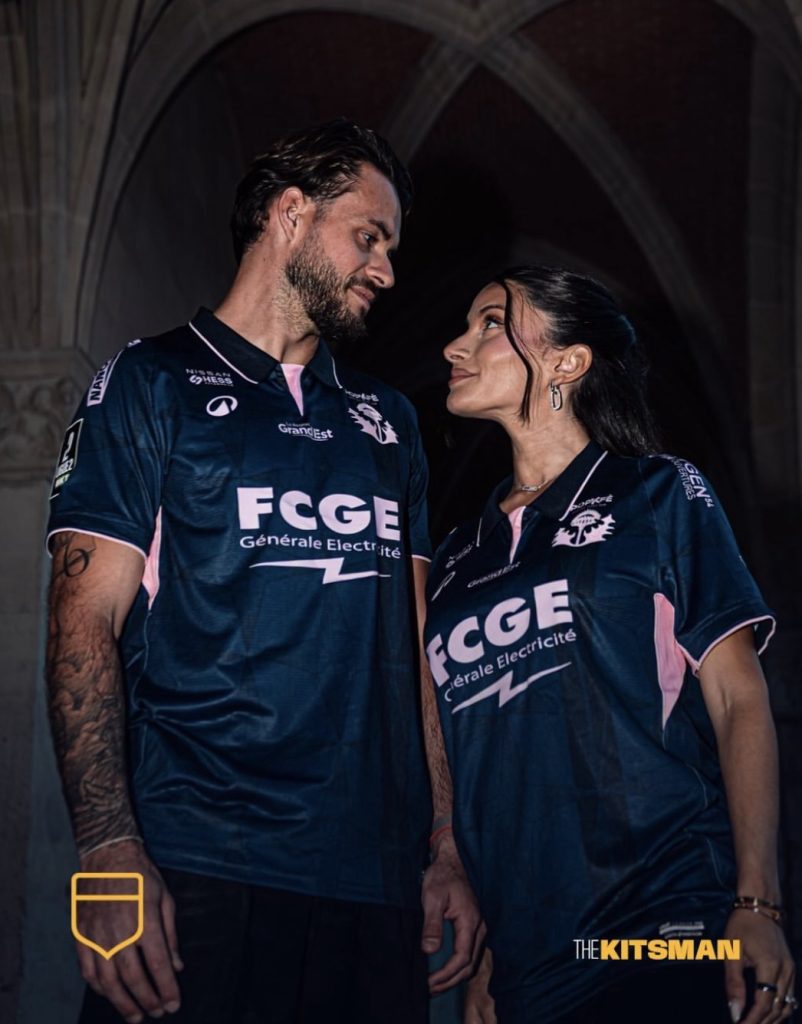
It’s a particularly interesting example because the emblem hasn’t simply been made smaller or more discreet. Quite the opposite. The thistle becomes one of the most dominant features of the entire shirt, challenging the assumption that alternative badges are always about fashionable minimalism.
The effect is striking. Without the surrounding shield, lettering and conventional crest proportions, the thistle feels more like an integral part of the shirt’s design than an identifying badge attached afterwards. There’s a historical connection behind the decision, but the visual result is what makes it successful.
Our original article explored the question of badge size and whether there is an ideal position or scale for a club emblem:
Nancy’s shirts make an important distinction. Removing the traditional badge doesn’t necessarily mean reducing the amount of club identity on display. In this case, the most recognisable element of the crest has become considerably more prominent than it would have been inside the usual shield.
Perhaps that’s a more useful way to think about alternative emblems. The question isn’t always whether the badge should be removed, but whether its individual elements might work better when given greater freedom.
Cesena: Sometimes One Symbol Is Enough
Cesena provide another convincing example with their 2026/27 Macron away shirt, a predominantly black design with metallic gold detailing and the club’s famous seahorse appearing as a standalone emblem.
The Cavalluccio, designed by Piero Gratton in the 1970s, is already a distinctive part of Cesena’s identity. Removing the surrounding badge allows the seahorse to become the main visual attraction, while the restrained black-and-gold colour scheme gives it space to stand out.
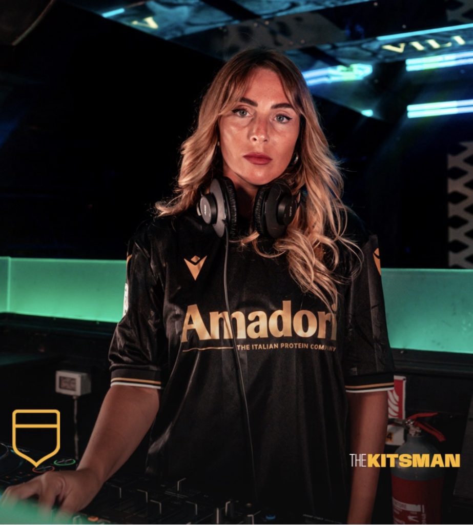
This is arguably the most convincing case for simplifying a football shirt’s crest. There isn’t a need for additional lettering or a conventional shield when the central symbol is already recognisable. The seahorse communicates the club’s identity without competing with the rest of the design, creating a shirt that feels cleaner without becoming anonymous.
Cesena’s approach is especially effective because the standalone emblem is supported by the rest of the shirt. The subtle fabric detailing, traditional collar and metallic accents all contribute to a cohesive appearance, rather than leaving the badge to do all the work.
We previously examined the design and its striking black-and-gold combination:
There is, however, a limitation to this approach. Not every football club possesses an individual symbol as distinctive as Cesena’s seahorse. For teams whose identities depend on a particular combination of letters, colours and heraldic elements, removing the surrounding crest might leave something considerably less recognisable.
A successful simplified emblem needs to communicate the club’s identity. Otherwise, the shirt risks becoming more attractive as a piece of clothing while becoming less meaningful as football merchandise.
Hannover 96: Should a City Come Before Its Football Club?
Hannover 96 have taken the idea of an alternative emblem in a different direction altogether. Their special Macron shirt celebrating the 80th anniversary of Lower Saxony uses the coat of arms of Hannover itself, positioned centrally on a design inspired by the city’s flag.
Unlike Cesena’s seahorse or Nancy’s thistle, this isn’t primarily about extracting one recognisable element from the football club’s traditional badge. Instead, Hannover have allowed the identity of the city to take precedence, creating a shirt that celebrates the place the club represents.
The split-colour design, civic coat of arms and repeating heraldic details give the shirt a distinctive character. It also demonstrates how an alternative badge can influence the entire appearance of a football kit, rather than simply replacing one chest emblem with another.
Our earlier coverage explored that relationship between football clubs and their hometowns:
There is something appealing about a club allowing its city to become the centrepiece of a shirt. Football teams are often among the most visible representatives of their communities, and civic symbols can connect a design to local history in ways that the regular club badge might not.
The counterargument is equally understandable. A city coat of arms represents far more than one football club, and some supporters may feel that their team’s distinctive identity deserves to remain the priority. The traditional badge exists precisely because a football club is its own institution, with a history and culture that cannot always be reduced to the place where it plays.
Hannover’s shirt works as a special celebration, but would the same approach feel appropriate on a regular home kit? That’s a considerably more difficult question.
Sydney FC: What If You Took the Badge Apart?
Sydney FC’s 2026/27 third shirt offers perhaps the most unusual interpretation of the trend. Created by Under Armour to celebrate The Cove supporters’ group, the black design features imagery of fans, scarves and familiar Sydney landmarks. Yet one of its most interesting details is the treatment of the club crest.
Rather than using the complete traditional badge, Sydney have separated familiar elements of their identity, presenting the Opera House symbol and star in a deconstructed sky-blue arrangement. The result is recognisably Sydney FC, but without the conventional shield that normally holds those elements together.
It’s a clever approach because it doesn’t introduce an unrelated symbol or rely exclusively on a historic badge. Instead, the club has rearranged parts of its existing identity to suit the overall design. The emblem becomes another visual component of the shirt rather than something that must always appear in its established form.
Our coverage of The Cove shirt explored how Sydney FC have placed their supporters at the centre of the release:
The deconstructed crest is particularly interesting because it suggests there might be more possibilities between keeping a traditional badge and removing it altogether. Clubs can experiment with proportions, separate recognisable elements and integrate their symbols into the fabric without necessarily losing the identity those emblems represent.
Of course, there’s a danger in taking that idea too far. A crest is recognisable partly because supporters repeatedly see it in a consistent form. Keep rearranging its elements and eventually the connection may become less immediate, particularly for people unfamiliar with the club.
Dallas Trinity: Perhaps the Problem Isn’t the Badge at All
Dallas Trinity’s State Fair shirt provides a useful counterpoint to the argument for removing traditional crests. The Nike design combines olive green and deep gold, but its most memorable feature is arguably the club’s Pegasus emblem, positioned centrally beneath the collar.
The raised, bevelled gold treatment gives the symbol a remarkable presence. Rather than simplifying it into something almost invisible, the designers have made the emblem a focal point, using the shirt’s symmetry and colour palette to draw attention towards it.
It’s an example of how effective a football badge can become when its presentation is carefully considered. The traditional position over the heart isn’t necessarily the only place where a crest belongs, and the conventional flat application isn’t always the most interesting option either.
We looked at the return of central badges and the appeal of Dallas Trinity’s Pegasus in our original feature:
Dallas Trinity raise an alternative possibility: perhaps football shirts don’t need fewer badges, but better use of the ones they already have. A distinctive emblem can become one of the most attractive features of a design when the manufacturer gives it enough attention.
That might be a more appealing direction than the pursuit of simplicity for its own sake. The objective should be to make the shirt look better while retaining the elements that give it meaning.
What Happens When Supporters Want Their Traditional Crest Back?
It’s relatively easy to appreciate these experiments when they’re presented as occasional special editions. A third or fourth shirt gives manufacturers freedom to explore unusual symbols without demanding that supporters permanently accept a different visual identity.
The conversation changes when a club decides its traditional badge is no longer necessary. Supporters don’t necessarily judge their crest by the same standards as a designer. A badge can be complicated, old-fashioned or difficult to reproduce while still representing decades of memories, achievements and personal connections.
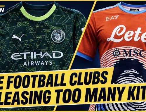
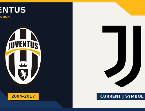
Everton’s unpopular 2013 redesign is a reminder of how strongly supporters can react when familiar elements disappear. Juventus, meanwhile, demonstrated a different approach by deliberately transforming their traditional crest into a simplified global identity. Those were changes to official branding, rather than temporary alternatives on individual shirts, but they illustrate why football badges remain such sensitive territory.
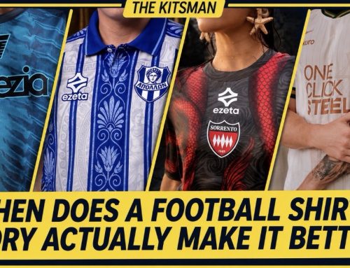
We’ve examined those wider identity changes separately, including the difference between permanent redesigns, minor refinements and alternative shirt emblems:
That distinction matters here. A supporter might love seeing Lille’s Flemish lion or Nancy’s historic thistle on an occasional shirt while still insisting that the traditional crest belongs on the home kit. There is no contradiction in appreciating creative alternatives and wanting the established badge to remain central to the club’s identity.
So, Are Football Shirts Better Without Club Badges?
Looking across these examples, the answer is considerably more interesting than a simple yes or no. Lille have demonstrated the appeal of a regional symbol, Nancy have shown how effective an oversized historic emblem can be, and Cesena have produced a beautifully restrained shirt around one recognisable figure. Hannover have celebrated their city, Sydney FC have rearranged the elements of their crest, and Dallas Trinity have shown that an existing badge can be just as striking when given the right treatment.
What connects these designs isn’t the absence of a traditional club badge. It’s the willingness to consider whether the conventional crest is always the best visual solution for a particular shirt.
Sometimes it clearly isn’t. A standalone symbol can produce a cleaner appearance, a historic emblem can give a shirt additional character, and a civic coat of arms can establish a connection to the community that a regular badge might not communicate quite so directly.
Yet none of those advantages makes the traditional crest redundant. Football shirts aren’t simply exercises in graphic design, and their value to supporters cannot be measured entirely by how attractive they look. The badge remains one of the most powerful expressions of belonging in the sport, even when an alternative might produce a more visually appealing design.
Perhaps the strongest approach is to preserve that identity while allowing occasional freedom to experiment. Keep the familiar crest on the home shirt, but give designers the opportunity to explore historic symbols, regional emblems and unconventional arrangements elsewhere.
After all, a football club can have an extraordinary visual history without needing to replace the badge that supporters recognise as their own.
But here’s the real test: if your club released its best-looking shirt in years, would you still buy it if the traditional badge had been replaced?
Or is the crest the one part of a football shirt that should never be negotiable?
Join the conversation: