There was a time when changing a football club’s badge seemed like an enormous decision. Something to be debated, protested and, in Everton’s case, reversed almost immediately.
These days, it can feel as though somebody is unveiling a new crest every other week.
Juventus replaced their traditional oval with a stylised J. Cardiff City made a dragon the centrepiece of their identity before returning the Bluebird to prominence. Everton’s attempt at simplification lasted a single season. Elsewhere, clubs are digging through their archives, bringing back forgotten emblems and experimenting with standalone symbols on their shirts.
It raises an interesting question.
Are football clubs actually changing their badges more frequently than ever before, or have we simply become more aware of every change?
The answer is more complicated than the steady stream of redesign announcements might suggest.
Football Badges Have Never Been Set in Stone
It’s tempting to imagine an era when every club had one established badge, worn unchanged for generations.
Football history tells a different story.
Many of today’s familiar crests are themselves relatively recent interpretations of much older designs. Some clubs have moved between civic coats of arms, initials, animals, shields and entirely different symbols throughout their existence.
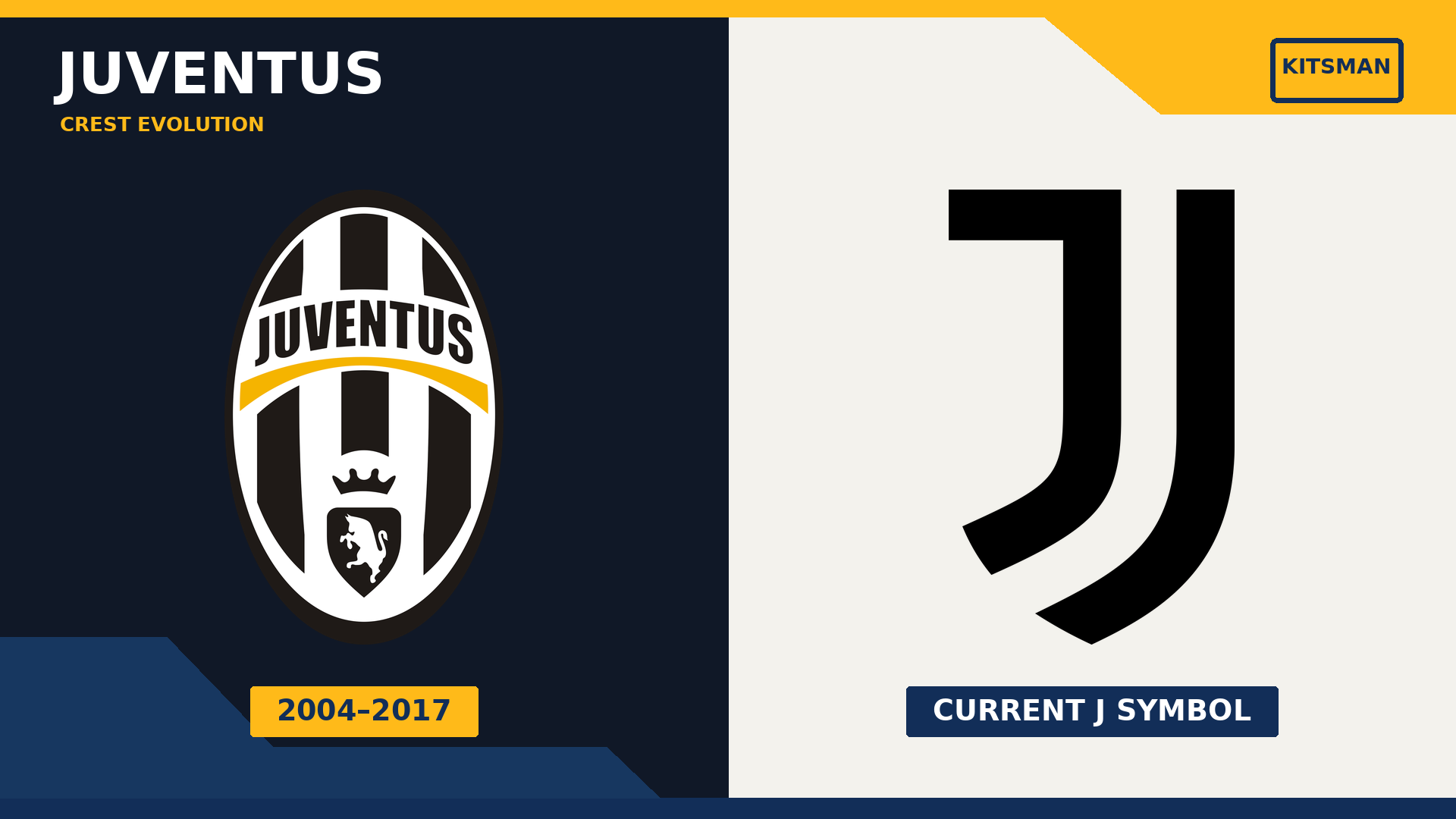
Juventus, for example, had been altering their identity for more than a century before their controversial 2017 redesign. The oval badge they replaced had only been in use in that particular form since 2004.
Crystal Palace’s eagle is another comparatively modern tradition. It arrived in 1973, when Malcolm Allison introduced the Eagles nickname, replacing the club’s previous association with the Glaziers. The eagle remained, but its appearance and the surrounding crest evolved over subsequent decades.
Even the current Palace design, introduced in 2013, received a smaller alteration in 2022 when the date beneath the football changed from 1905 to 1861.
Football badges have always evolved. The more useful question is whether the frequency and purpose of those changes have altered.
Juventus: When a Club Crest Became a Global Brand
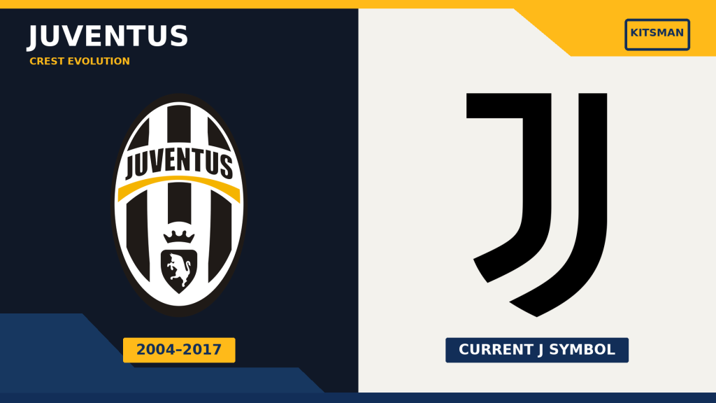
Few modern redesigns have made such a dramatic visual departure as Juventus in 2017.
The previous crest was recognisably a football badge: an oval shield, black-and-white stripes, the club’s name and the familiar bull associated with Turin.
Its replacement was something altogether different.
Two curved black shapes formed a stylised J, incorporating references to the club’s stripes and the traditional Italian shield shape. Gone were the detailed heraldic elements that had connected successive versions of the Juventus badge.
The club wasn’t shy about its ambitions.
In its official announcement of the new identity, Juventus explained that it wanted a visual identity capable of extending beyond football into design, art, music and fashion.
That distinction matters.
The redesign wasn’t simply about making the badge easier to embroider on a shirt. Juventus wanted an identity that could operate across a much broader commercial world.
There was another refinement in 2020, when the Juventus wordmark was removed from above the J, leaving the symbol to stand alone.
In other words, Juventus underwent a major redesign in 2017 and a further simplification in 2020. Those aren’t necessarily equivalent changes, even though both form part of the club’s modern branding story.
Whether supporters prefer the old crest or the new one is a separate argument. What Juventus demonstrated was that a football club could deliberately move away from the traditional appearance of a football badge altogether.
Everton: The Badge That Lasted One Season
If Juventus illustrates the commercial ambition behind modern redesigns, Everton demonstrates how badly the process can go when supporters feel disconnected from it.
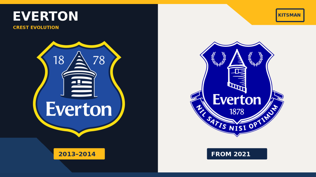
In 2013, Everton unveiled a simplified badge that removed two particularly familiar elements: the laurel wreaths and the club’s Latin motto, Nil Satis Nisi Optimum.
Prince Rupert’s Tower remained, but the overall identity was substantially different.
Everton argued that the existing crest was difficult to reproduce consistently across retail, broadcast and digital applications. The explanation was understandable from a design perspective.
Supporters were considerably less understanding.
The reaction was so negative that Everton agreed to replace the badge after just one season.
This time, supporters were involved in choosing its successor. The design adopted in 2014 restored the motto, wreaths and a more traditional representation of the tower.
There is an important detail in Everton’s subsequent history that often gets lost in simplified badge timelines.
The club’s crest received minor visual refinements around 2021, but these were not comparable to the wholesale redesign of 2013. Everton also developed a broader brand identity using Prince Rupert’s Tower as a standalone graphic, while retaining its established club crest.
That wider identity was explored in a 2022 Creative Review article.
Everton therefore offers several different types of change: a major redesign, a supporter-led replacement, smaller refinements and additional branding elements.
Count them all as equivalent badge redesigns and the statistics immediately become misleading.
Cardiff City: When a Badge Change Became an Identity Crisis
Cardiff City’s 2012 rebrand went further than simply changing the shape of a crest.
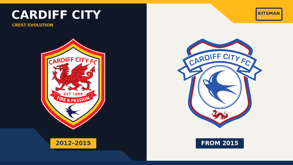
Under owner Vincent Tan, the club switched its traditional blue home shirts to red and introduced a redesigned badge dominated by a Welsh dragon.
The Bluebird, the symbol around which Cardiff supporters had built their identity, was reduced to a much smaller presence.
The intention was partly commercial, with the new colours and branding intended to appeal to international markets.
The response demonstrated how difficult it is to separate a football club’s visual identity from its supporters’ sense of ownership.
Cardiff’s fans protested the changes, and in 2015 the club returned to blue shirts and introduced another crest, restoring the Bluebird as its dominant symbol.
The dragon remained, but its place in the hierarchy had changed.
The club’s official 2015 crest announcement emphasised the importance of historic links and producing an identity supporters could recognise.
Cardiff’s badge had changed several times before 2012, so the story isn’t that a previously untouchable symbol was suddenly altered.
It’s that the 2012 redesign challenged something supporters considered fundamental to the club’s identity.
The subsequent reversal showed that commercial objectives don’t always survive contact with football culture.
The Research: Why a Few Famous Redesigns Don’t Prove a Trend
Juventus, Everton and Cardiff provide compelling examples, but there’s a problem with using them to answer our original question.
They’re famous precisely because their redesigns attracted attention.
Selecting only controversial changes would tell us very little about whether football badges are actually changing more frequently.
A meaningful comparison would need to examine a consistent group of clubs over several decades, including those whose badges have remained largely untouched.
It would also need to distinguish three categories:
- Major redesigns: Substantial changes to the club’s official identity, such as Juventus in 2017 or Cardiff in 2012.
- Minor revisions: Adjustments to typography, colour, dates or individual details while preserving the fundamental crest.
- Alternative applications: Historic badges, standalone symbols and special-edition shirt designs that don’t replace the official crest.
Without those distinctions, a club using three different badge treatments on three shirts could appear to have changed its identity three times in a single season.
That clearly isn’t the same thing as adopting three different official crests.
There is relevant academic research, although it doesn’t establish a definitive rate of redesigns across football.
In Kissing the Badge: Club Crests or Corporate Logos?, published in Soccer & Society, Alison Barnes examines Arsenal, Cardiff City, Everton and Juventus, exploring the tension between clubs as commercial brands and the emotional significance of their crests.
The study helps explain why redesigns happen and why supporters sometimes reject them. It doesn’t demonstrate that permanent redesigns have become more frequent across the sport.
That’s an important distinction.
The evidence supports the idea that commercial and digital considerations have become significant influences on badge design. It doesn’t yet justify declaring that clubs are redesigning their official crests faster than ever.
Atalanta: An Old Badge Can Feel Like a New Release
Then there’s an entirely different development: clubs bringing old badges back without replacing their official identity.
Atalanta recently offered an excellent example.
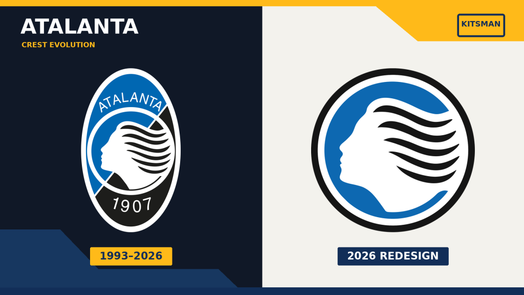
For a throwback release with New Balance, the Italian club revived a crest dating back to 1963, featuring the full figure of the goddess Atalanta rather than the familiar profile used in its modern badge.
We covered the release in Atalanta Throwback Kit Revives the Club’s 1963 Goddess Badge.
The historic emblem gave the shirt a distinctive identity, despite not representing a permanent redesign of Atalanta’s official crest.
That difference is central to this discussion.
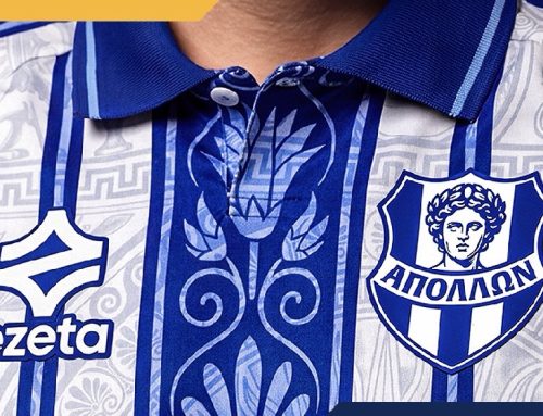
A supporter scrolling through football shirt releases might see Juventus’s J, Atalanta’s historic goddess, an old Palace eagle and several other alternative symbols within a few minutes.
It can create the impression that club badges are constantly changing.
In reality, some of those images represent genuine rebrands. Others are clubs deliberately returning to identities they wore decades ago.
Crystal Palace: One Club, Several Generations of Eagles
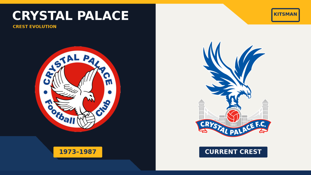
Crystal Palace provides another reminder that football identities develop over time.
The eagle first became associated with the club in the 1970s, but the bird’s design, its relationship with the Crystal Palace building and the surrounding badge have changed considerably since then.
The 2013 redesign modernised the eagle and architectural details while preserving those established symbols.
It also anticipated the modern appetite for flexible branding. At the time, Palace discussed using different versions of its identity across shirts, stadium signage and merchandise.
That wasn’t a rejection of tradition. It was an attempt to make a familiar identity work in different settings.
Historic eagle designs can also return on individual shirts without becoming the club’s permanent crest.
In this respect, Palace and Atalanta help illustrate something that the Juventus example alone cannot.
Modern football isn’t simply replacing old badges with new ones.
It is increasingly capable of presenting different chapters of a club’s visual history side by side.
Have Football Badges Become More Commercial?
There’s a strong argument that the purpose of a football badge has expanded.
Traditionally, the crest identified the club on its shirt, stationery, signage and merchandise. Those uses still matter, but a modern football identity also has to work as a tiny social media profile image, a mobile app icon, an embroidered emblem, a fashion graphic and a symbol recognised by international audiences.
The pressure to simplify is understandable.
Intricate details that look excellent on a large woven crest may disappear when reduced to the size of a phone notification.
A standalone cannon for Arsenal, a Liver bird for Liverpool or the devil from Manchester United’s crest can be instantly recognisable without the full surrounding badge.
These examples don’t all represent recent permanent redesigns. They demonstrate how established symbols can be separated from their traditional presentation.
Yet simplicity is not automatically an improvement.
A football badge can carry information that isn’t obvious to somebody encountering it for the first time: local landmarks, civic history, founding dates, mottos and references to generations of supporters.
Remove too much and a design may become more adaptable while losing some of what made it distinctive.
Recent academic discussion has even examined the movement in the opposite direction. Research into Ajax and Roma considers the significance of returning to heritage-rich crests, contrasting those decisions with Juventus’s minimalist approach.
The assumption that every club will eventually move towards a simpler corporate symbol may therefore be premature.
So, Are Football Badges Changing Faster Than Ever?
We can’t confidently say that they are. Not yet.
Football clubs have been redesigning their crests for well over a century, and the most controversial modern examples don’t constitute evidence of an accelerating trend on their own.
To establish that, we’d need a consistent historical comparison across a sufficiently broad selection of clubs, measuring major redesigns separately from minor adjustments and temporary shirt variations.
What we can say is that the role of the football badge has changed.
Clubs now expect their identities to function across more platforms, more products and more international markets. Some have responded with radical redesigns. Others have developed flexible systems around established crests. Increasingly, clubs are also discovering the commercial and emotional appeal of their own archives.
Those developments can make badge changes feel more frequent, even when the official crest hasn’t changed at all.
Perhaps the most revealing contrast is between Juventus and Atalanta.
One looked towards a future in which its identity could operate far beyond football. The other found fresh appeal in a symbol from 1963.
Both approaches can generate attention. Both can sell shirts. Only one required the club to abandon its existing crest.
That may be the real story behind the apparent explosion in football badge changes.
The football badge is no longer just one image. It’s an entire visual history that clubs can redesign, refine, revive or reinterpret.
Whether that represents creative freedom or the gradual commercialisation of something supporters hold sacred is a debate unlikely to disappear.
Would you rather your club keep one badge for generations, or embrace the opportunity to revisit its history?
Further reading
- Kissing the Badge: Club Crests or Corporate Logos?, Alison Barnes, Soccer & Society.
- Beyond the Badge: Visual Reembedding and the Politics of Football Crest Design, research examining heritage crest revivals.
- The Evolution of the Football Jersey: An Institutional Perspective, Journal of Institutional Economics.
Join the conversation: