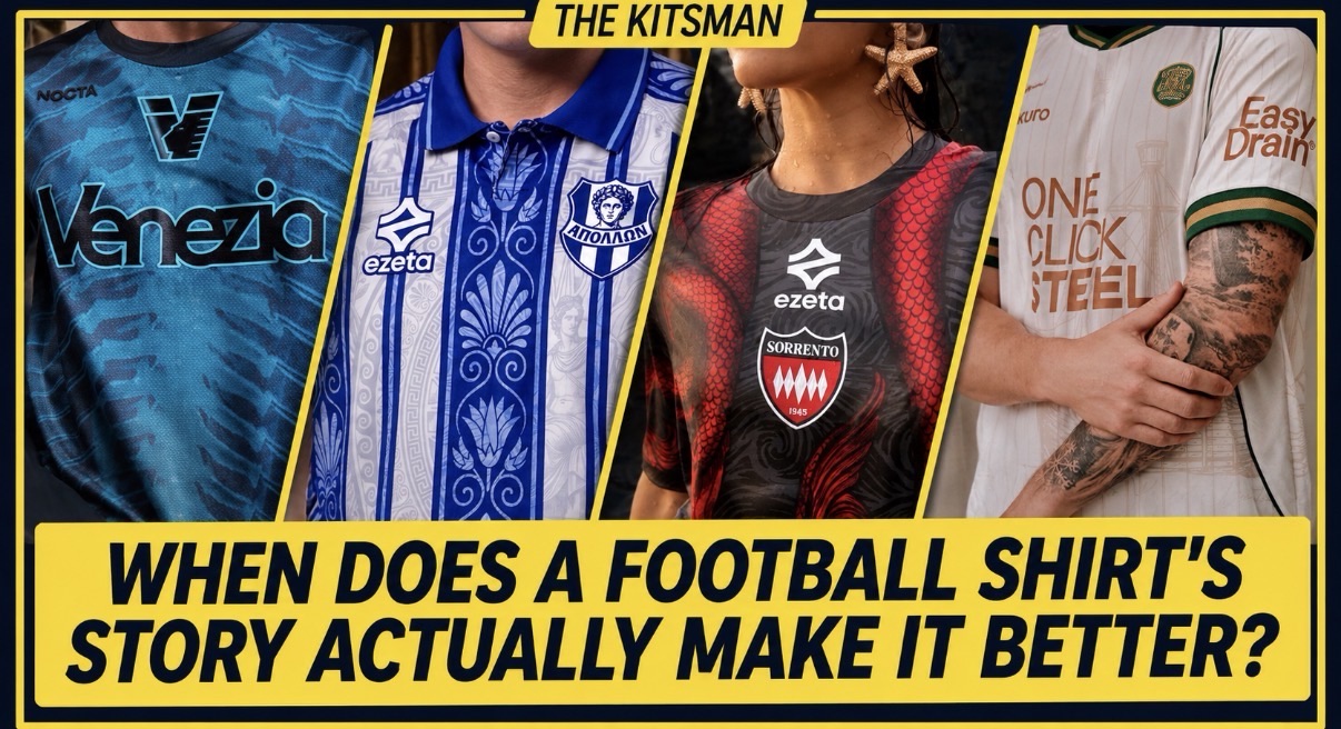
Italian nougat, ancient mythology and a forgotten emblem from 1904. Football shirts are drawing inspiration from increasingly unexpected places. But which stories genuinely improve the designs, and which simply make them easier to sell?
A football shirt inspired by nougat.
Another featuring the tails of mythical sea creatures.
A third resurrecting a symbol that had spent more than a century buried in a club’s archives.
Football shirt design has certainly found some interesting places to explore.
We’ve become accustomed to manufacturers explaining the meaning behind every colour, pattern and detail. A new shirt can arrive with an accompanying history lesson, a carefully produced film and an entire campaign devoted to its cultural significance.
Sometimes the results are extraordinary.
Other times, the explanation is considerably more impressive than the shirt itself.
But perhaps the most interesting question isn’t whether football shirts need stories at all.
It’s whether those stories actually make the designs better.
Cremonese: Can Nougat Really Inspire a Great Football Shirt?
Let’s begin with one of the more unusual inspirations we’ve encountered this season.
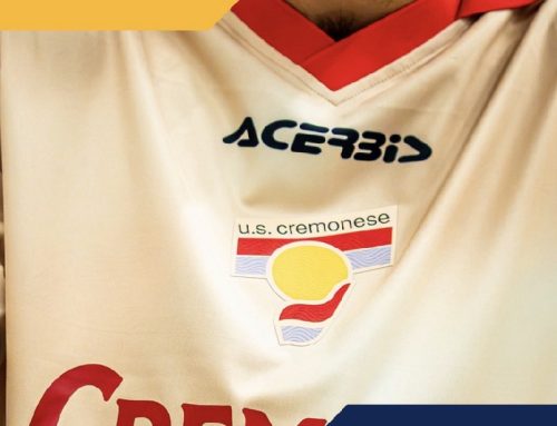
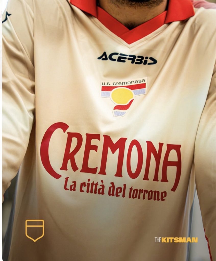
Cremonese’s new Acerbis fourth kit celebrates Torrone di Cremona, the almond-and-honey confectionery that has become synonymous with the Italian city.
It’s a deliciously strange starting point.
The shirt features a creamy base with subtle speckled detailing, complemented by traditional red and grey accents, a vintage-style collar and a historic-looking club crest.
Across the chest, the usual commercial sponsor makes way for the words Cremona – La città del torrone, celebrating the city’s association with the sweet.
It’s remarkably cohesive.
The colours work beautifully together, the retro styling feels appropriate and the confectionery references are subtle enough to avoid turning the shirt into a novelty.
Most importantly, the design doesn’t require an explanation to be attractive.
You could know absolutely nothing about Cremona’s confectionery traditions and still appreciate the shirt.
Learning about the inspiration simply makes it more interesting.
That’s an important distinction.
The story hasn’t rescued an otherwise unremarkable design. It’s given an already appealing shirt an identity that belongs specifically to Cremonese.
The club have even connected the release to the city’s annual Festa del Torrone, taking the concept beyond a marketing campaign and into a genuine local celebration.
It’s difficult to imagine another club producing quite the same shirt with quite the same meaning.
Perhaps that’s what the best kit storytelling achieves: it makes a design feel like it couldn’t belong anywhere else.
Sorrento: When the Story Is Impossible to Separate From the Shirt
Italian manufacturer Ezeta have developed a reputation for producing football shirts that look more like illustrated artworks than conventional teamwear.
Their 2026/27 collection for Sorrento Calcio is a particularly striking example.
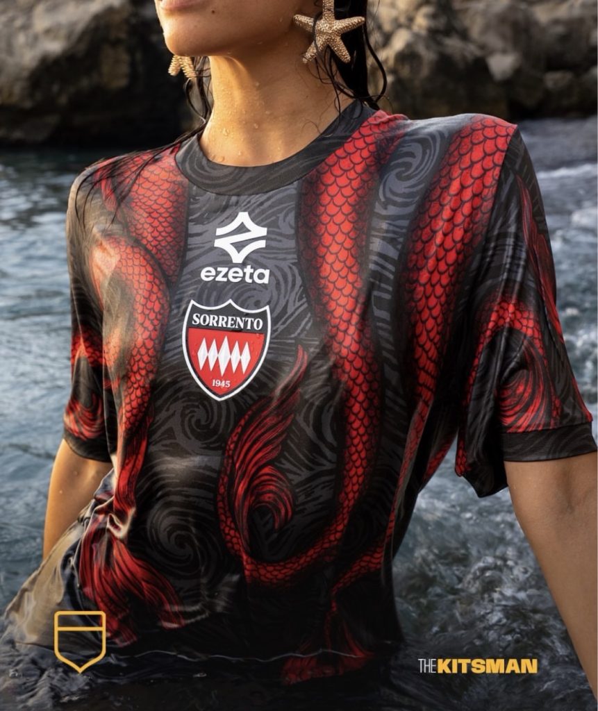
Inspired by the legendary Sirens associated with the Sorrentine Peninsula, the three shirts feature artwork incorporating the creatures’ scales and the surrounding sea.
At first glance, the designs appear to feature elaborate, shifting stripes.
Look closer and the mythology begins to emerge.
The illustration carries across the collection, with different colours giving each shirt its own character.
There’s a clever connection between the visual effect and the legend itself. The patterns draw you in before revealing something unexpected.
It’s an approach that feels entirely appropriate for a collection inspired by creatures famous for luring sailors towards them.
We’ve explored the designs in greater detail in our feature on Sorrento Calcio’s 2026/27 Ezeta collection.
What makes these shirts particularly interesting is how difficult it would be to remove the inspiration without fundamentally changing the designs.
The mythology isn’t merely an explanation attached to the finished product.
It’s the foundation of the artwork.
You might love the intricate illustration or prefer something considerably simpler, but there’s little doubt that the concept has shaped what you’re looking at.
And that brings us to another question.
Does a shirt become better because its story is clever, or does it still have to succeed as a piece of design?
The two aren’t necessarily the same thing.
Apollon Smyrnis: A Forgotten Symbol That Deserved Another Life
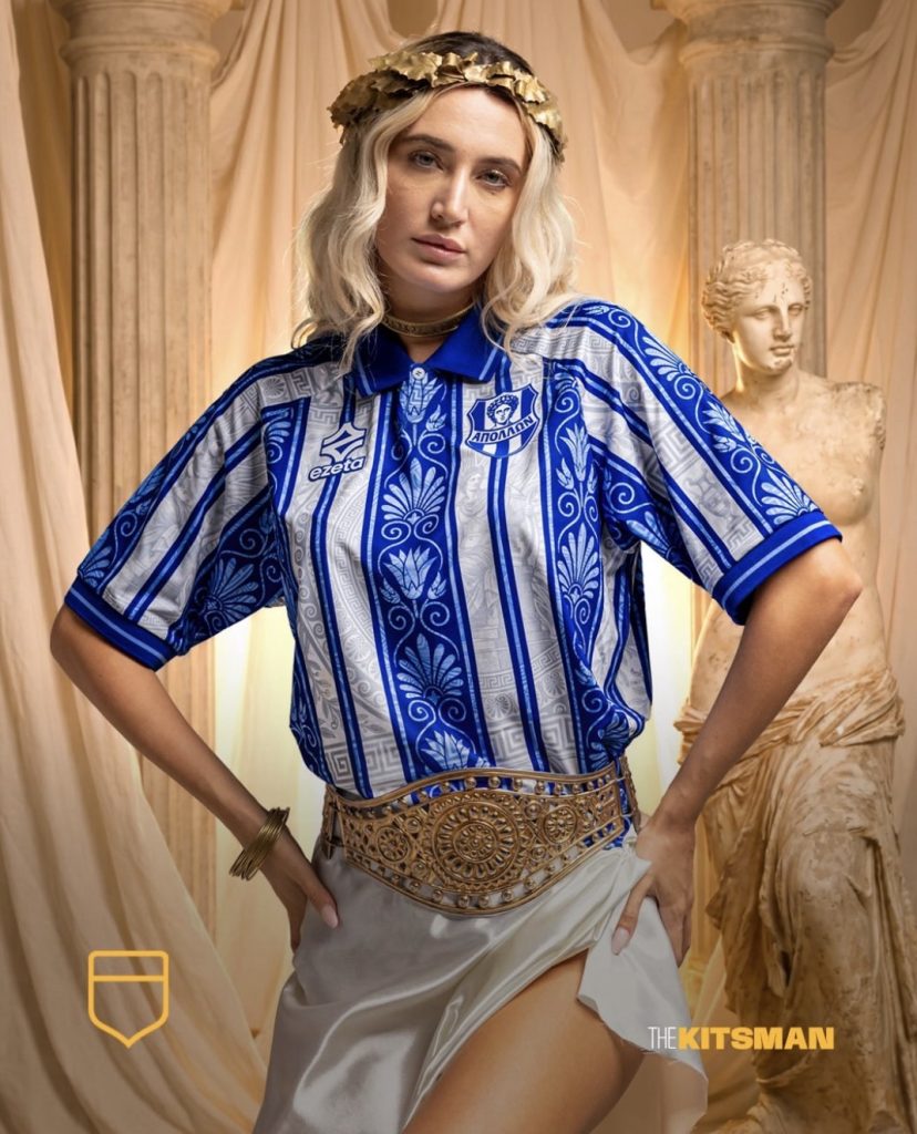
If Cremonese demonstrate how local culture can influence a shirt, Apollon Smyrnis show how historical research can give one a genuine purpose.
The Greek club’s 2026/27 collection, also created by Ezeta, celebrates 135 years of history.
Founded in Smyrna in 1891, the club eventually relocated to Athens following the upheaval and displacement of the Greek population in 1922.
Its identity has survived an extraordinary journey.
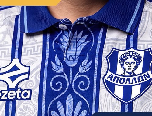
Ezeta have explored that history through three different shirts, incorporating classical Greek decorative elements, references to Apollo and details drawn from the club’s origins.
The traditional blue-and-white home shirt remains recognisably Apollon, but its stripes feature ornamental artwork inspired by Greek culture.
The pink away shirt takes a more experimental approach.
Perhaps the most compelling design, however, is the black-and-gold third shirt.
During their research, Ezeta discovered an old club monogram in a programme dating back to 1904.
More than 120 years later, the symbol has returned, appearing prominently across the new shirt.
That’s a remarkable detail.
Rather than inventing another retro-inspired badge, the designers recovered something that genuinely belonged to the club.
For an institution whose history includes displacement and relocation, the revival of an early emblem carries particular significance.
The connection between the modern club in Athens and its origins in Smyrna becomes visible again.
Our full feature on the Apollon Smyrnis collection explores the history behind all three shirts.
There’s also an opportunity to appreciate the collection beyond the photographs.
The 2026/27 Apollon Smyrnis home shirt is available through Classic Football Shirts, with its traditional blue-and-white stripes and intricate Greek-inspired detailing.
It’s a particularly interesting example of how a manufacturer can preserve a club’s recognisable identity while introducing something genuinely new.
Apollon’s collection offers perhaps the strongest argument in favour of historical storytelling.
Without the research, that forgotten monogram might have remained unseen for another century.
Instead, it has become part of the club’s present.
Go Ahead Eagles: How Much Meaning Can a Simple Pattern Carry?
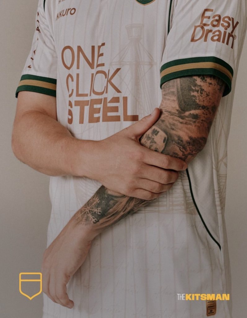
Not every shirt needs a dramatic historical discovery or an elaborate illustration.
Sometimes a much quieter connection can be equally effective.
Go Ahead Eagles’ 2026/27 third kit takes inspiration from the River IJssel, which runs alongside the club’s home city of Deventer.
The navy-and-gold design incorporates fine pinstripes and a sailing ship, drawing on the area’s relationship with the water.
It’s an understated approach compared with the intricate artwork of Ezeta.
Yet there’s something appealing about that restraint.
The references don’t dominate the shirt, and the design remains relatively simple.
Our closer look at the Go Ahead Eagles third kit examines how those details come together.
Of course, rivers and waterways have become familiar sources of inspiration across modern kit design.
Wisła Kraków have looked towards the Vistula, Mantova have celebrated the lotus-filled waters surrounding their city, and Troyes have referenced the great lakes of Champagne.
Each location has its own history and character.
But there is a risk that certain ideas become so familiar that their significance starts to diminish.
A wavy pattern doesn’t automatically become more interesting because it represents a river.
A blue shirt doesn’t necessarily need an explanation about water.
Sometimes a design works because its colours and patterns are simply pleasing to look at.
And that should be enough.
Venezia: When the Story Is Almost as Strange as the Shirt
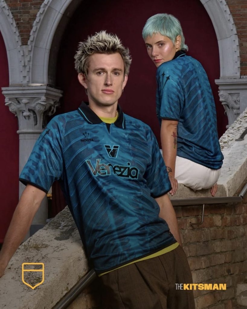
Venezia have spent several seasons blurring the distinction between football shirts and fashion.
Their latest NOCTA fourth kit takes that approach in an especially unusual direction.
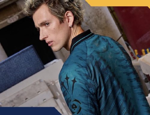
Inspired by Venice’s historic Rialto Fish Market, the turquoise shirt features X-ray-style illustrations of fish skeletons.
It’s certainly memorable.
The club’s relationship with its surrounding waters provides a logical connection, while the fish-market inspiration gives the unusual artwork a clear purpose.
We’ve previously examined Venezia’s Fish Bones fourth kit and the way its design celebrates an often-overlooked part of the city’s identity.
But here’s where things become interesting.
Imagine seeing that shirt without knowing anything about the Rialto Fish Market.
Would you immediately consider it a great football shirt?
Some people undoubtedly would.
Others might struggle to understand why a football club had covered its shirt in fish skeletons.
The story changes how we interpret the design.
It doesn’t necessarily change whether we find it attractive.
That’s an important distinction, particularly for a club whose shirt launches have become as much about fashion and presentation as football.
An effective campaign can make almost anything look desirable.
Whether that desirability survives outside the photographs is another matter entirely.
When Does Storytelling Become a Sales Technique?
There’s an obvious commercial advantage to giving a football shirt a compelling backstory.
A shirt inspired by a forgotten emblem, a local delicacy or an unusual cultural tradition offers something to discuss beyond its appearance.
It creates opportunities for photography, social media, video campaigns and editorial coverage.
It can also attract buyers who have no particular allegiance to the club.
Someone who has never watched Cremonese might still be interested in a shirt celebrating Italian nougat.
A collector unfamiliar with Apollon Smyrnis might discover the club through its extraordinary history.
That’s not necessarily a criticism.
Football shirts have become a way of exploring different places and cultures, and smaller clubs can use thoughtful design to reach audiences far beyond their traditional supporters.
The problem arises when the explanation becomes more important than the result.
If every pattern represents something profound, every colour symbolises a cherished tradition and every minor detail carries enormous significance, the language begins to lose its impact.
There’s a difference between uncovering a genuine piece of club history and inventing a narrative to make an ordinary design sound extraordinary.
The challenge is recognising which is which.
Perhaps the Best Shirts Don’t Need Explaining
Here’s a useful experiment.
Take away the launch films, promotional photography and lengthy explanations.
Look at the shirts on their own.
Does Cremonese’s cream-coloured fourth kit still look good?
Does Sorrento’s intricate illustration remain impressive?
Does Apollon Smyrnis’ traditional striped home shirt still have an identity?
Does Venezia’s fishbone design still appeal?
The stories haven’t changed the physical shirts.
What they’ve changed is our understanding of them.
And perhaps that’s the most important thing.
A genuinely successful concept doesn’t ask us to overlook a weak design because the inspiration is interesting.
It gives us something extra to appreciate in a shirt that already works.
Cremonese have produced a beautiful retro-inspired design with a charming local connection.
Sorrento have turned mythology into an intricate visual language.
Apollon Smyrnis have recovered a forgotten part of their identity.
Go Ahead Eagles have translated their surroundings into something understated and wearable.
Venezia have embraced a more experimental approach that won’t appeal to everyone, regardless of how compelling the story might be.
Each represents a different way of approaching the same challenge.
A great story can make a football shirt more interesting. It can’t automatically make it a great football shirt.
Perhaps that’s the distinction we should remember whenever another elaborate kit launch arrives.
The story should enhance what we’re seeing, not persuade us to ignore it.
So which matters more to you: a brilliant-looking football shirt, or a shirt with a brilliant story behind it?
Join the conversation: