Some football shirts look like they’re designed purely for 90 minutes on the pitch. Others look just as good away from football altogether.
Port FC’s latest Mizuno shirt falls firmly into the second category.
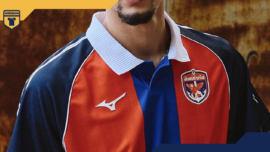
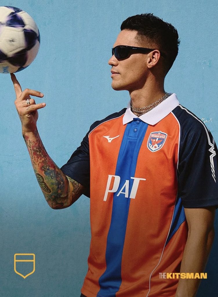
The Thai club have embraced a distinctly 1990s aesthetic, bringing together their familiar orange and blue colours with a design that feels like something you’d find tucked away in a vintage football shop.
It’s not an overly complicated shirt, either. Much of its appeal comes from getting the basics right.
A Proper 90s Throwback
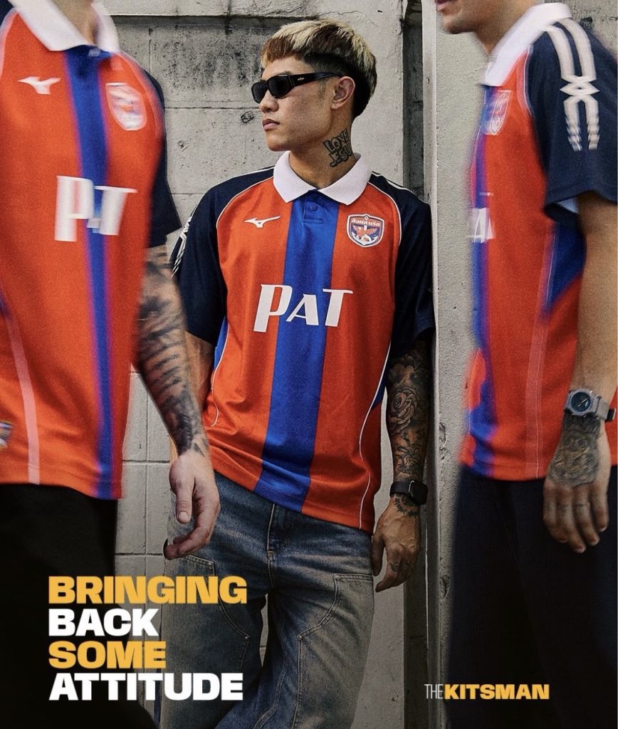
The bold blue stripe running down the centre immediately catches the eye, contrasting with the orange body and darker navy sleeves.
A ribbed white polo collar adds another layer of retro character, giving the shirt a more traditional football look without making it feel dated.
It’s a similar appeal to what we saw with Santos bringing back their 1997 Umbro design. Sometimes a familiar collar, a few contrasting panels and the right colours are all a shirt needs to transport you back a few decades.
Thin white piping runs down the sides, additional blue panels sit beneath the sleeves, and subtle graphics across the shoulders introduce a slightly rougher edge.
None of those features dominates the shirt. Together, though, they make it far more interesting than another straightforward retro-inspired release.
The Details Give It Its Identity
Perhaps the most distinctive touches are the lettering and numbering.
The chunky, old-school number styling feels lifted from a different era, while the Thai script gives the shirt a character that goes beyond the usual European-inspired retro formula.
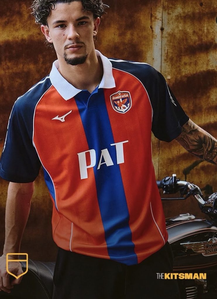
The PAT lettering across the front is another important detail.
Standing for Port Authority of Thailand, it references the club’s former official name and reinforces the connection between Port FC and their history.
It’s the sort of detail that works because it actually belongs to the club, rather than being added simply to make a shirt appear nostalgic.
We’ve seen that approach work elsewhere, particularly with Atalanta’s revival of their historic 1963 goddess badge. A well-chosen piece of club history can give a modern shirt far more personality than an elaborate graphic ever could.
Football Shirt or Streetwear?
There’s something particularly appealing about football shirts that don’t need to rely on elaborate storytelling to justify their existence.
Port FC’s design has enough character in its colours, collar and typography to stand on its own.
The slightly gritty styling also feels appropriate for a club based in Bangkok, where a shirt like this wouldn’t look remotely out of place among the city’s busy streets.
Football and fashion have been overlapping for years, but the best examples still tend to be the ones that feel natural rather than forced.
Port FC and Mizuno have delivered a shirt with plenty of retro appeal, but crucially, one that still feels like Port FC.
It looks ready for matchday. It might look even better away from the stadium.
You can explore the club’s current range through the official Port FC store.
Follow The Kitsman
For more football shirt releases, retro discoveries and kit culture, follow us on X and Instagram.
Image credits: Port FC and Mizuno Thailand.