A football shirt inspired by nougat might sound like an unusual idea. Cremonese have managed to make it look remarkably convincing.
The Italian club have unveiled their fourth kit for the 2026/27 season, taking inspiration from Torrone di Cremona, the traditional confectionery that has been produced in the city for generations.
Created by Acerbis in collaboration with creative agency Socialidea, the shirt draws on the colours and textures of the famous almond-and-honey sweet, combining them with a distinctly vintage appearance.
It’s an unusual source of inspiration, but one with a genuine connection to the city. Cremona is so closely associated with the confectionery that it is widely known as La città del torrone, the City of Nougat.
Now, that identity has found its way onto a football shirt.
A Football Shirt That Looks Good Enough to Eat
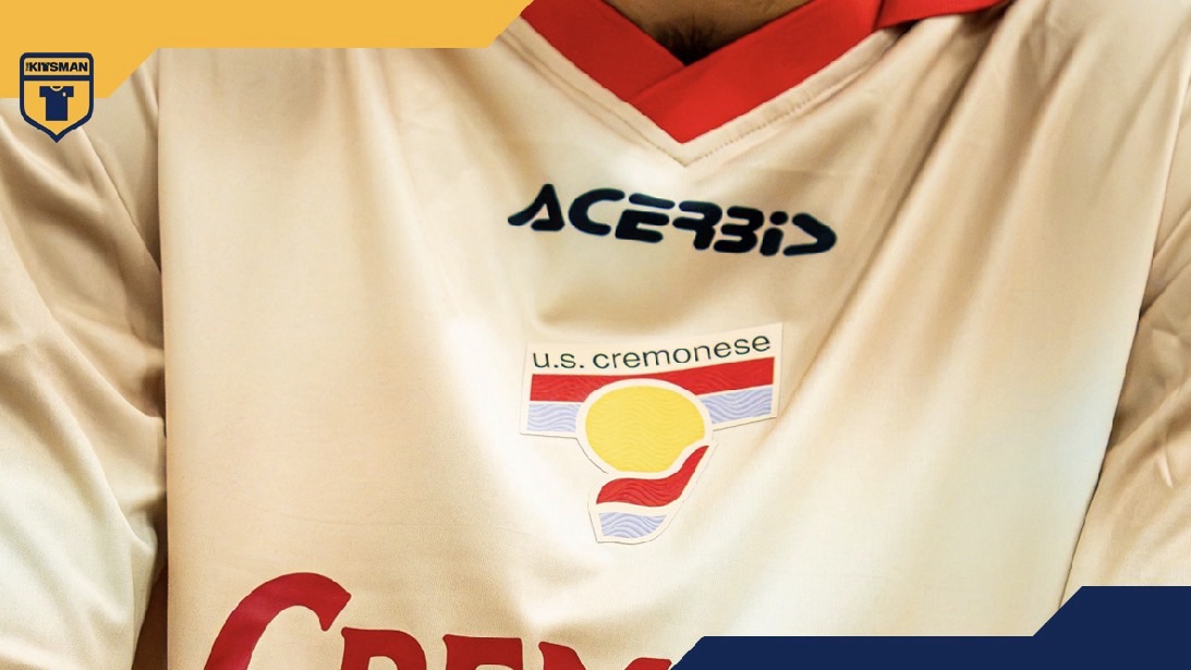
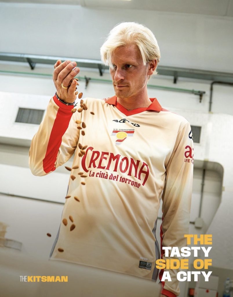
The most immediately noticeable feature is the creamy, almond-coloured base.
Rather than printing illustrations of nougat across the fabric, Acerbis have opted for something considerably more subtle. Gentle gradients and speckled textures reference the almonds found within the confectionery, creating a finish that resembles the sweet without reproducing it literally.
It’s a clever decision.
The shirt’s inspiration becomes obvious once you understand the story, but the design is perfectly capable of standing on its own.
Cremonese’s traditional red and grey colours appear along the collar and side panels, providing enough contrast to retain the club’s identity without overwhelming the softer base.
The long sleeves are another welcome detail. Combined with the old-fashioned collar, they give the shirt the appearance of something that might have been worn decades ago.
There’s a deliberate contrast between the contemporary fabric treatment and the vintage silhouette, and the combination works particularly well.
The City of Nougat Takes the Sponsor’s Place
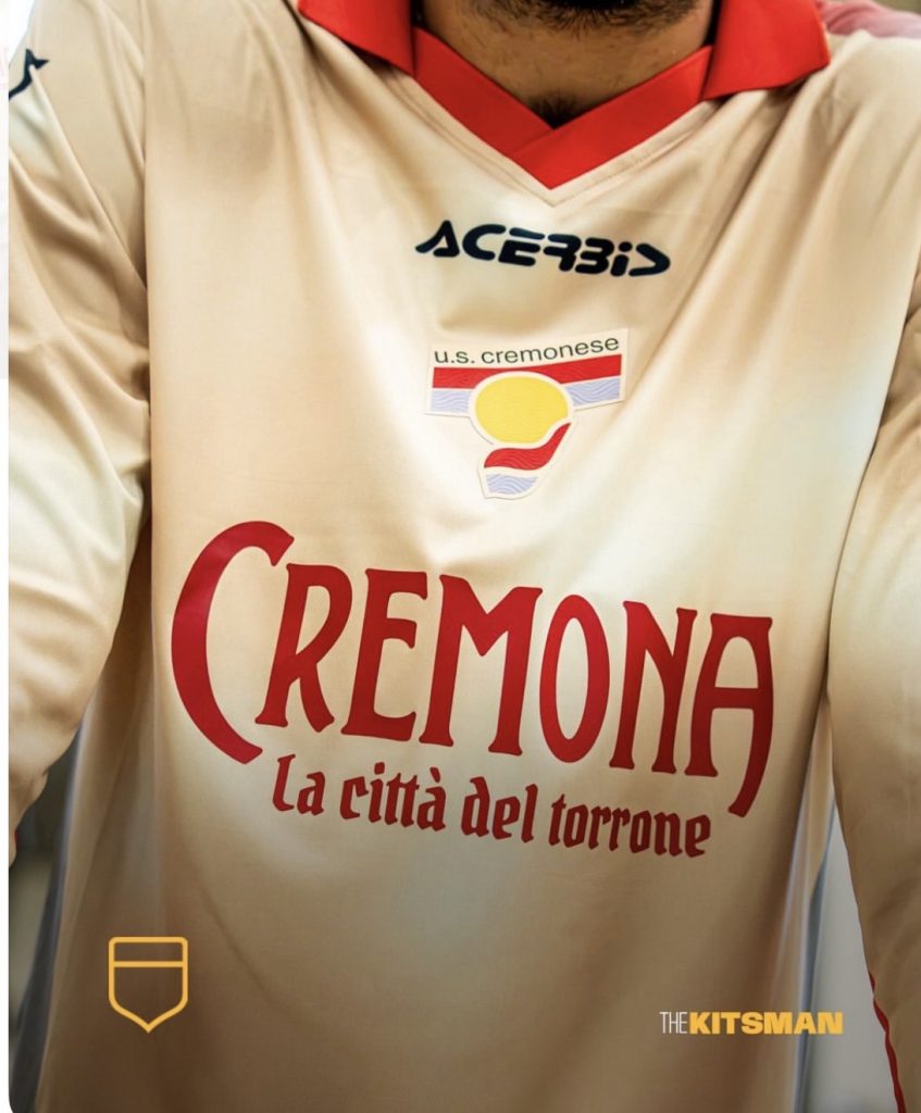
Perhaps the best decision is what appears across the chest.
Instead of allowing the usual commercial sponsor to dominate the design, Cremonese have placed the words Cremona – La città del torrone front and centre.
The lettering complements the shirt’s retro appearance, making the city’s famous confectionery tradition part of the overall identity rather than a reference hidden in the detailing.
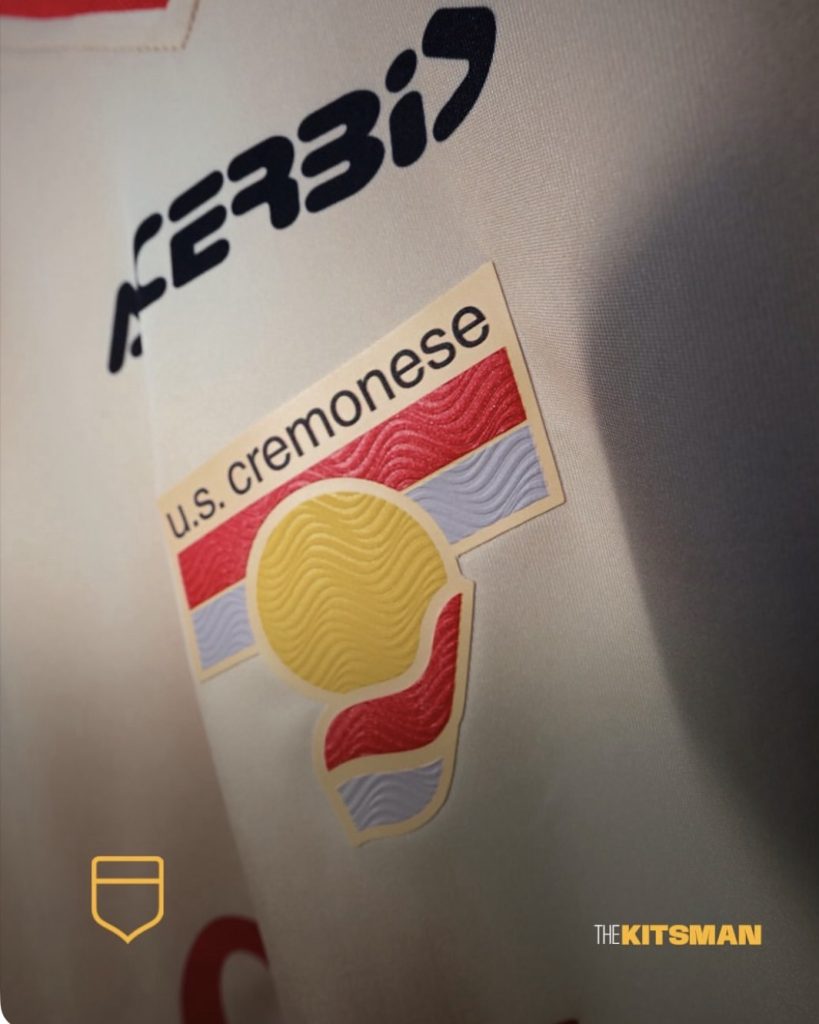
The club crest follows a similar approach.
A historic-looking emblem inspired by Cremonese’s badges of the 1980s and 1990s replaces the usual modern treatment, strengthening the impression that this could be a rediscovered shirt from another era.
It’s another example of a club using an alternative crest to tell a particular story.
Atalanta recently explored their own archives with a throwback release featuring a historic goddess emblem, demonstrating how older club identities can give modern kits an entirely different character.
Atalanta Throwback Kit Revives the Club’s 1963 Goddess Badge
A Celebration That Extends Beyond the Shirt
Cremonese have taken the theme further than the design itself.
The club’s official announcement, titled Il Sapore della Tradizione (The Taste of Tradition), explains how the kit was developed to celebrate one of Cremona’s most recognisable cultural traditions.
The shirt was introduced for the club’s league fixture against Benevento on 31 October, but the wider launch also connects with the city’s annual Festa del Torrone.
From 7 to 22 November, Cremonese will operate a dedicated stand in Largo Boccaccino as part of the festival, where supporters and visitors will be able to purchase the shirt.
Each kit will be sold in a specially designed commemorative presentation box.
Match-worn and match-prepared shirts from the Benevento fixture will also be offered through the festival stand, with a smaller selection made available online.
It’s a thoughtful extension of the concept. The club isn’t simply borrowing a local tradition for its latest release; it’s making the shirt part of the celebration itself.
Further details can be found in Cremonese’s official fourth-kit announcement.
When Local Identity Makes the Best Football Shirts
There is a growing appetite for football kits that represent something specific about the places clubs call home.
Some draw inspiration from architecture, others from landscapes, local industries or regional traditions.
Cremonese’s approach is particularly interesting because food rarely takes centre stage in football shirt design, despite being such an important part of local culture.
We’ve previously seen clubs explore their regional identity through very different design choices.
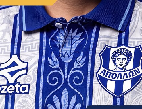
Marítimo’s Madeira-inspired third kit, for example, celebrated the island’s character through a distinctive visual approach, while Sorrento’s Ezeta collaboration drew on the mythology and history associated with its coastal home.
Marítimo Third Kit 2026/27: Hummel Celebrates Madeira
Sorrento Calcio 2026/27 Kits: Ezeta Draws on the Sirens
The common thread is that each design becomes more interesting when its inspiration is something genuinely associated with the club’s home.
Cremonese could easily have produced another cream-coloured retro shirt without any deeper explanation.
Instead, the club have connected almost every element of the design to a tradition that belongs specifically to Cremona.
The colours evoke nougat, the textures reference almonds, the chest lettering celebrates the city, and the vintage badge brings the club’s own history into the story.
Even the packaging and release schedule are connected to the annual festival.
A Sweet Addition to the 2026/27 Season
The fourth kit is available from 7 November through Cremonese’s official online store and the club’s Festa del Torrone stand.
It’s a release that could easily have become a novelty, but Acerbis have shown considerable restraint in the execution.
The almond-coloured fabric, red and grey accents, long sleeves and retro badge combine to create a shirt that feels cohesive rather than gimmicky.
There will undoubtedly be supporters who prefer Cremonese in their traditional colours, but this is precisely the sort of opportunity a fourth kit provides: the freedom to explore something different without abandoning the club’s established identity.
A football shirt inspired by nougat shouldn’t necessarily work this well. Cremonese have made a rather convincing case for it.
Would you wear a shirt inspired by your city’s most famous food?
Images: U.S. Cremonese / Acerbis.
Join the conversation: