Some colour combinations just feel made for football shirts.
Black and gold might be the best of the lot.
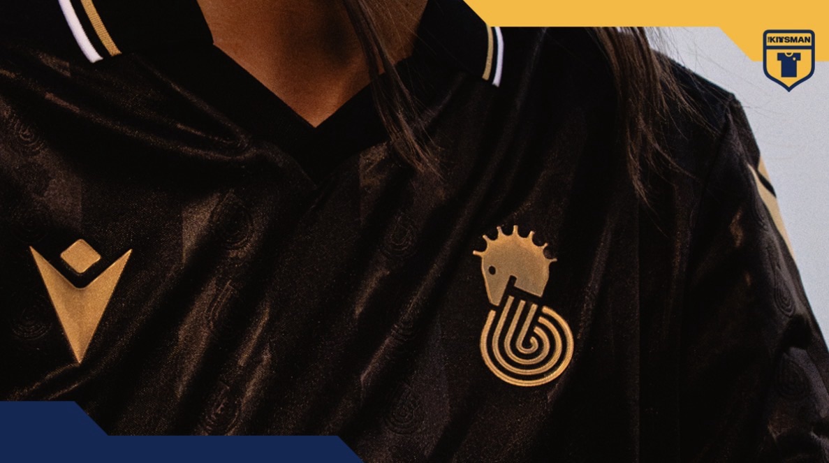
Cesena certainly aren’t doing anything to change our minds with their new away kit, as Macron take the club’s identity and give it a sleek, predominantly black treatment.
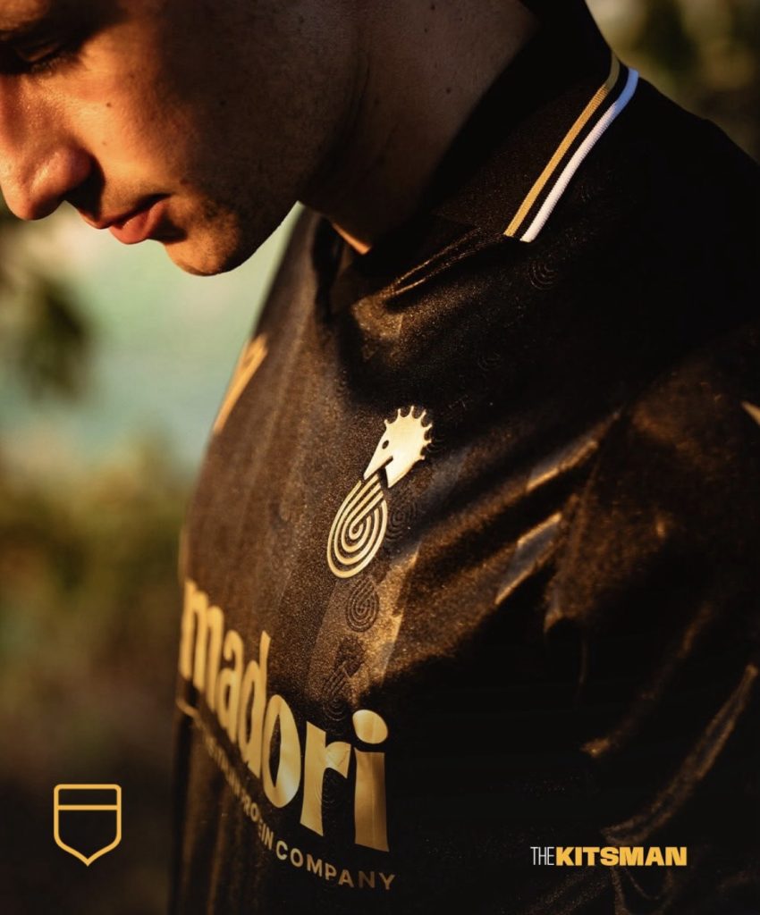
The star of it all is surely that Cavalluccio.
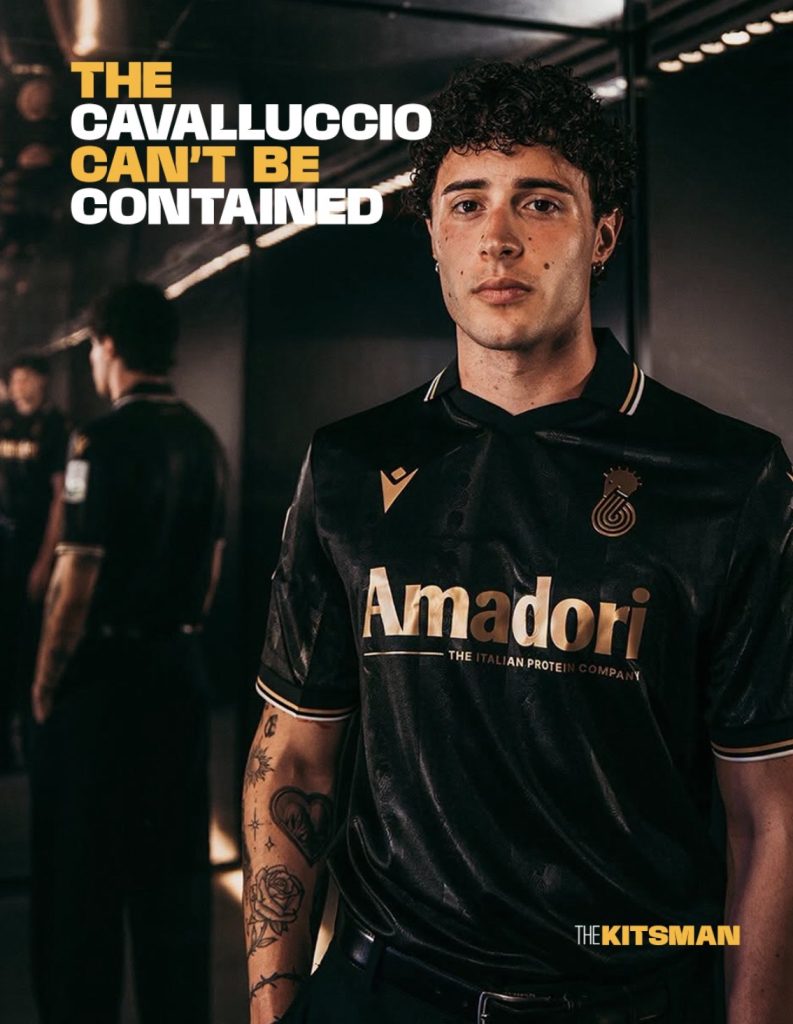
Designed by Piero Gratton in the 1970s, the famous seahorse is given the freedom to fly solo as an alternate crest. Picked out against the black, it becomes an immediate focal point and shows exactly why some club symbols don’t need the rest of the badge surrounding them.
That same identity continues through the fabric.
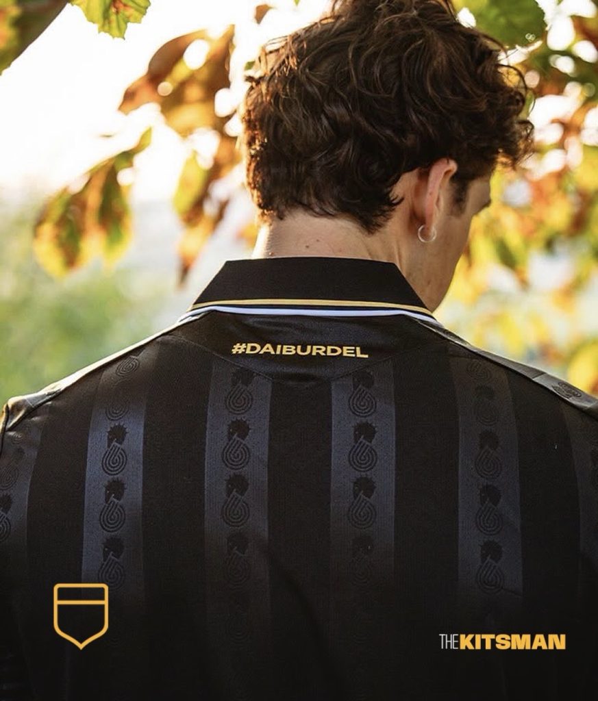
Subtle stripes bring a little sheen and throwback character to the black base, while metallic gold detailing provides the hit of colour. White is used sparingly alongside it, keeping everything sharp without interfering with the main combination.
The detailed polo collar adds another classic element and suits the slightly smarter direction Cesena have taken.
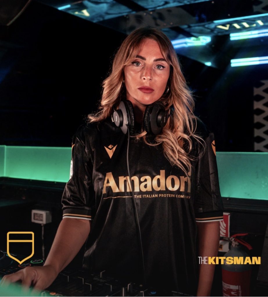
Then there’s the launch.
From the gardens of Villa Silvia Carducci to the nightlife of Romagna, Cesena have deliberately taken the shirt away from the football pitch. It’s another example of clubs presenting shirts as something to be worn anywhere rather than simply as sportswear.
With a shirt this clean, it works.
Black provides the versatility. Gold gives it the character.
Which brings us to the important bit.
Is there actually a better colour combination for a football shirt than black and gold?
If there is, we want to hear it.
Images; @cesenafc @macron @macronfootball
#cesena #macron #blackandgold #footballkits #thekitsman
Join the conversation:
X:
https://x.com/the_kitsman?s=21&t=YKLtf2JIakFxujMRxTUh9Q
Instagram:
https://www.instagram.com/the.kitsman?igsh=ZWtuMDJkb2c4Ynhz&utm_source=qr