There’s something wonderfully ridiculous about taking the sort of wallpaper you’d find in your grandparents’ living room and turning it into a football shirt.
It’s even better when the club involved is St. Pauli.
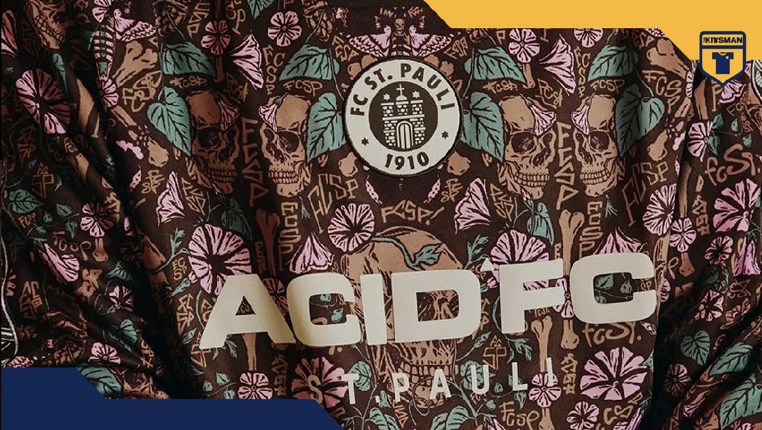
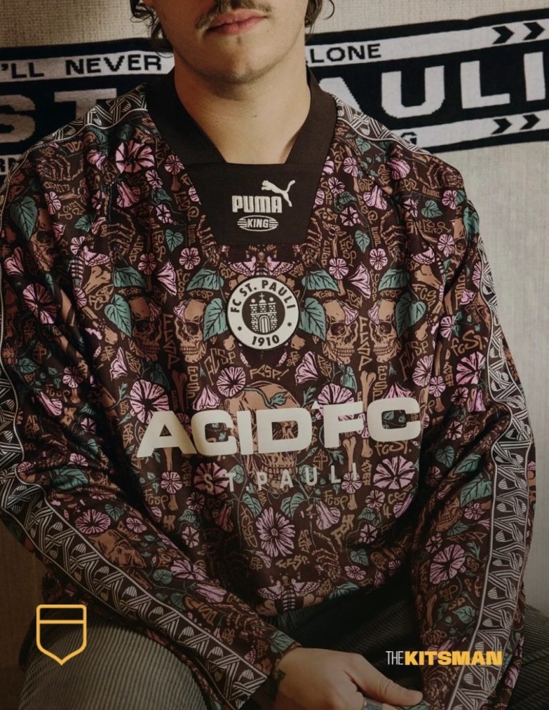
The Hamburg side, hardly known for doing things conventionally, have teamed up with PUMA KING and British design studio ACID FC for a lifestyle shirt that looks like it’s been pulled straight from a Victorian sitting room. At least until you notice what’s hiding among the flowers.
Because this isn’t quite the innocent floral pattern it first appears to be.
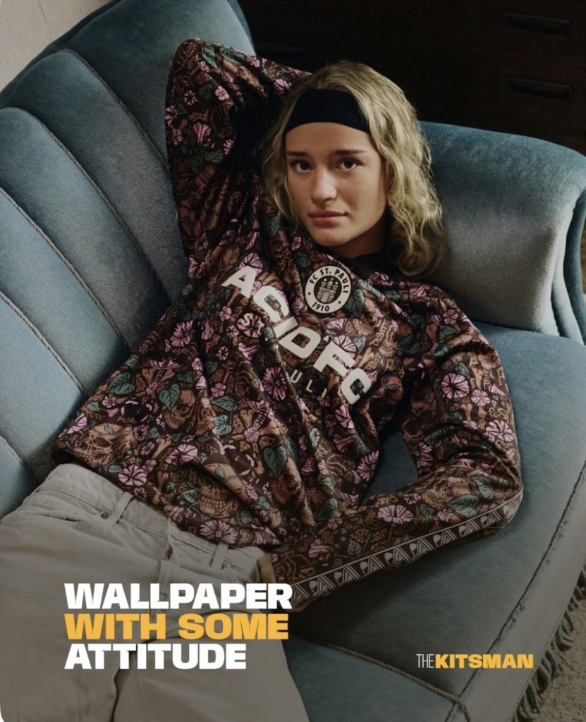
Skulls, moths, bones and graffiti tags are woven through the design, turning something rather traditional into something unmistakably St. Pauli. It’s the sort of shirt that makes you look twice, then a third time just to work out what on earth is going on.
And we rather like it.
From William Morris to the Millerntor
The inspiration comes from the work of William Morris, the influential British designer associated with the Arts and Crafts movement of the 19th century.
His elaborate wallpaper patterns, filled with flowers, leaves and twisting stems, became a defining feature of traditional English interiors. You can probably picture the sort of thing. Heavy curtains, patterned walls, a slightly intimidating armchair and a biscuit tin that’s been there since 1987.
ACID FC have taken that familiar aesthetic and given it a distinctly Hamburg makeover.
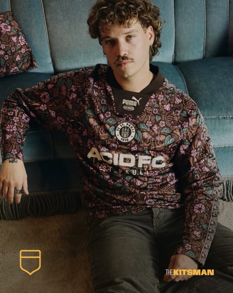
The brown base is a natural fit for St. Pauli, while pink and green details weave through the elaborate floral artwork. The long sleeves and V-neck collar give the shirt an old-fashioned quality, with the club crest and ACID FC branding sitting among the pattern.
It’s busy, certainly. But that’s rather the point.
This isn’t an attempt to produce a clean, understated football shirt. It’s a deliberate collision of two very different worlds, and the more you examine it, the more sense it makes.
There’s Something Rather Clever Hidden in the Pattern
One of the most interesting details isn’t immediately obvious.
ACID FC founder Ed Cowburn photographed graffiti tags around Hamburg’s St. Pauli district while developing the artwork.
Rather than simply reproduce those tags, the designers created their own FCSP lettering inspired by what they’d seen. The club explains that this was a conscious decision to respect the work of the original graffiti artists.
It’s a small detail, but an important one.
The shirt isn’t simply borrowing the visual language of street culture because it looks fashionable. There’s a genuine connection to the neighbourhood and an effort to represent it without copying somebody else’s work.
That makes the whole thing feel a little more considered than your average limited-edition lifestyle release.
The result is a strange mixture of decorative English tradition and the rebellious imagery associated with St. Pauli.
A floral wallpaper pattern shouldn’t really have much in common with the streets of Hamburg.
Somehow, ACID FC have made the combination work.
A Football Shirt That Doesn’t Take Itself Too Seriously
This isn’t a conventional matchday kit. It’s part of a wider PUMA KING lifestyle collection, which also includes a black T-shirt and zip-up hoodie featuring skull artwork.
That distinction matters because it gives the designers room to do something genuinely unusual.
We’ve seen plenty of football shirts that try to appear fashionable by stripping away the club’s identity or borrowing whatever happens to be popular in streetwear.
This takes a different approach.
It leans heavily into St. Pauli’s personality while exploring an aesthetic that you’d never normally associate with football.
There’s a wider conversation here about how much freedom designers should have when creating football shirts. As we explored in our look at whether sponsors are overwhelming football shirt design, commercial demands can sometimes dictate what ends up on the finished product.
This collaboration feels like the opposite. The design itself is the attraction, and ACID FC have clearly enjoyed making it.
Will everyone like it? Absolutely not.
Some will think it’s brilliant. Others will wonder why their grandmother’s spare bedroom has suddenly become a football shirt.
Both reactions are entirely understandable.
But there’s something refreshing about a release that doesn’t appear remotely interested in pleasing everybody.
St. Pauli have built an identity around being different, and this collaboration embraces that rather than simply printing another skull and crossbones onto a black shirt.
It’s eccentric, slightly macabre and probably not something you’d want covering all four walls of your living room.
As a football shirt, though?
We’d happily make an exception.
More from The Kitsman
How Many Sponsors Is Too Many on a Football Shirt? — A look at the growing influence of commercial branding on football shirt design.
Beerschot’s 2026/27 Away Kit Shows Why Sponsors Should Adapt to the Shirt — Another example of a football shirt where the design takes priority.
Further reading
- FC St. Pauli: Official ACID FC x PUMA KING shirt and design story
- SUPERSUB: St. Pauli, PUMA and ACID FC unveil lifestyle collection
Design and imagery credits: FC St. Pauli, PUMA Football and ACID FC.
For more football shirt stories, releases and opinion, follow The Kitsman on X and Instagram.