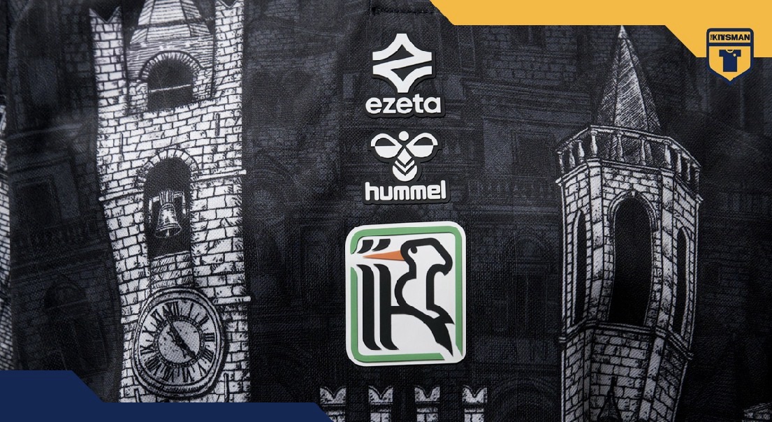
I’ve seen plenty of football shirts inspired by a club’s hometown, but Ascoli Calcio’s latest effort might be one of the most elaborate yet. Ezeta have effectively taken the architecture of an entire Italian city and put it on a football shirt. I rather like it, although I’m not entirely convinced I’d wear it down the pub.
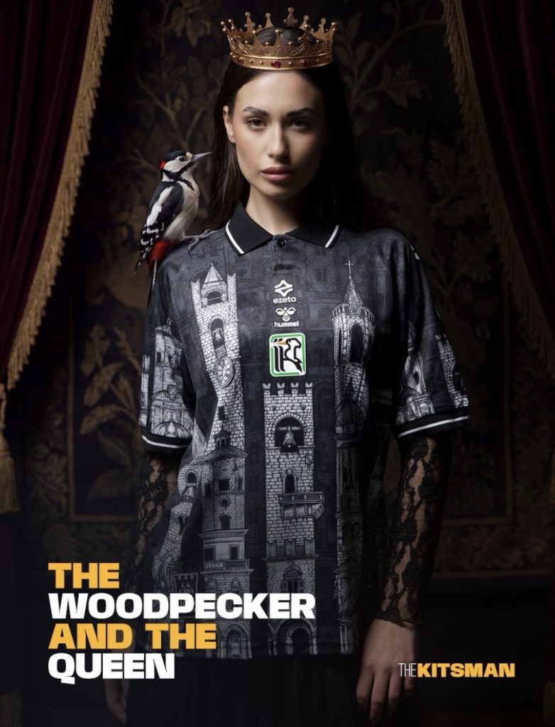
The special 2026/27 release, titled The Queen Wears Her City, marks the first collaboration between Ezeta and Hummel. It’s predominantly black and white, as you’d expect from Ascoli, but that’s about where the conventional design ends.
The shirt features detailed illustrations of the medieval towers, bell towers and buildings that once dominated Ascoli Piceno’s skyline. The city reportedly had around 200 towers during the Middle Ages, built by wealthy families keen to demonstrate their standing. Apparently, having a bigger house wasn’t enough.
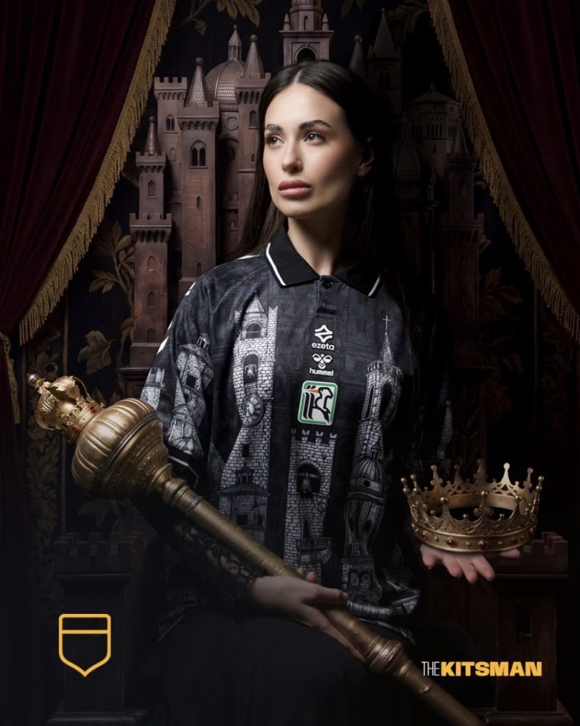
Even the pale colouring takes inspiration from the travertine stone used throughout the city’s historic centre, particularly around Piazza del Popolo.
It’s an impressive piece of design. There’s an enormous amount of detail, but it doesn’t immediately look like someone has thrown every local landmark onto a shirt and hoped for the best.
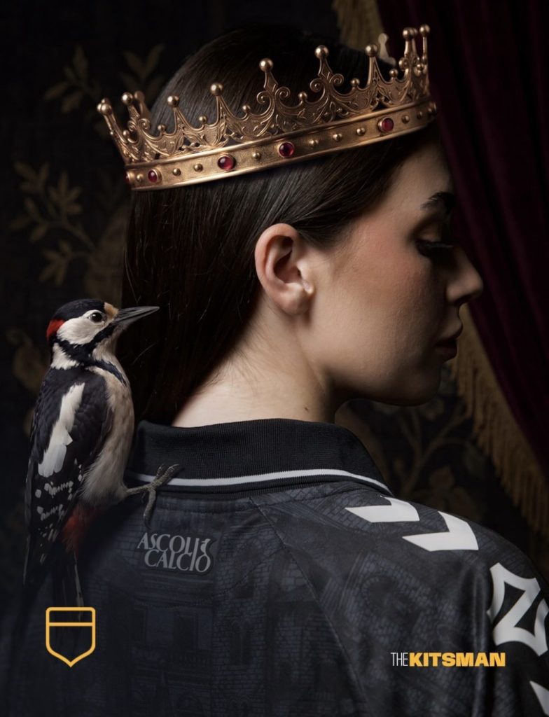
Brilliant Design, But Is It a Football Shirt?
That’s the interesting thing about this release. I can admire the artwork without necessarily wanting to wear it myself.
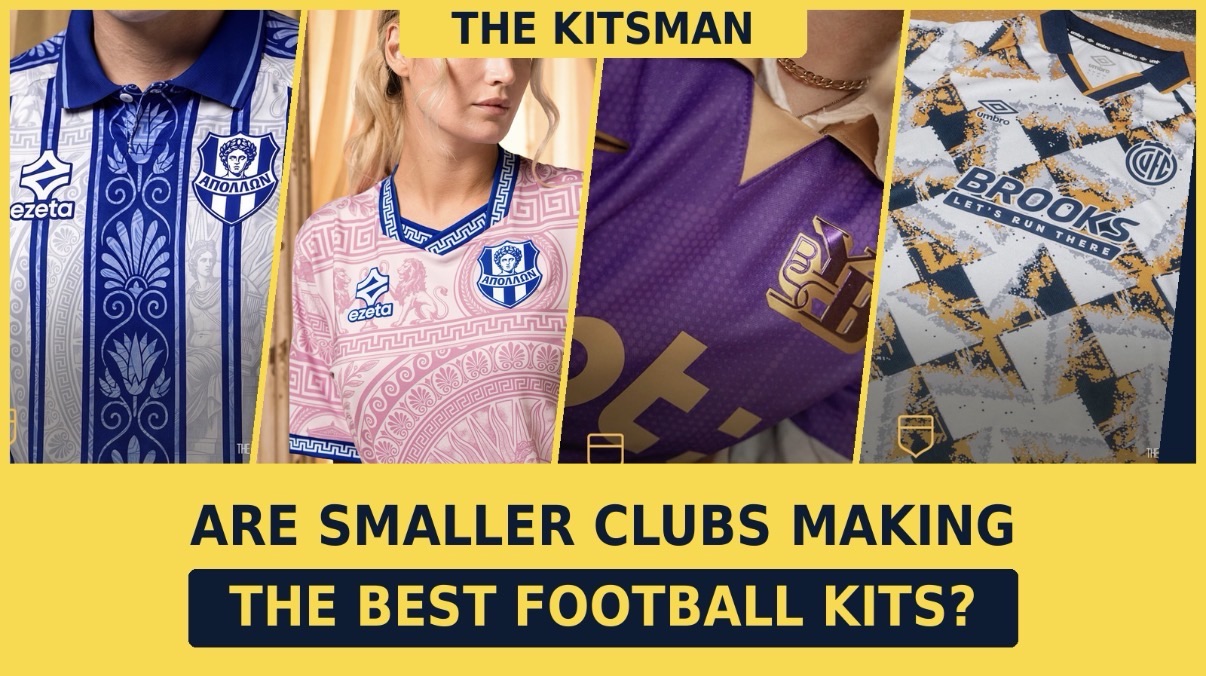
Football shirts have become increasingly elaborate, particularly among smaller manufacturers looking to do something different. Ezeta are a perfect example, with their recent Apollon Smyrnis collection incorporating Greek history, classical imagery and ornamental patterns.
There’s clearly an audience for this approach. Plenty of collectors now buy shirts from clubs they’ve never watched simply because the designs are extraordinary. Ascoli’s latest will undoubtedly appeal to that crowd.
I do wonder, though, whether there’s a point where a football shirt becomes more of an art print than something you’d actually want to play football in.
Personally, I think Ascoli have just about got away with it. The black-and-white colour scheme keeps the design connected to the club, while the illustrations are detailed enough to reward a closer look. I’m not entirely sold on the amount of patterning, particularly around the shoulders, but it’s certainly more interesting than another generic template.
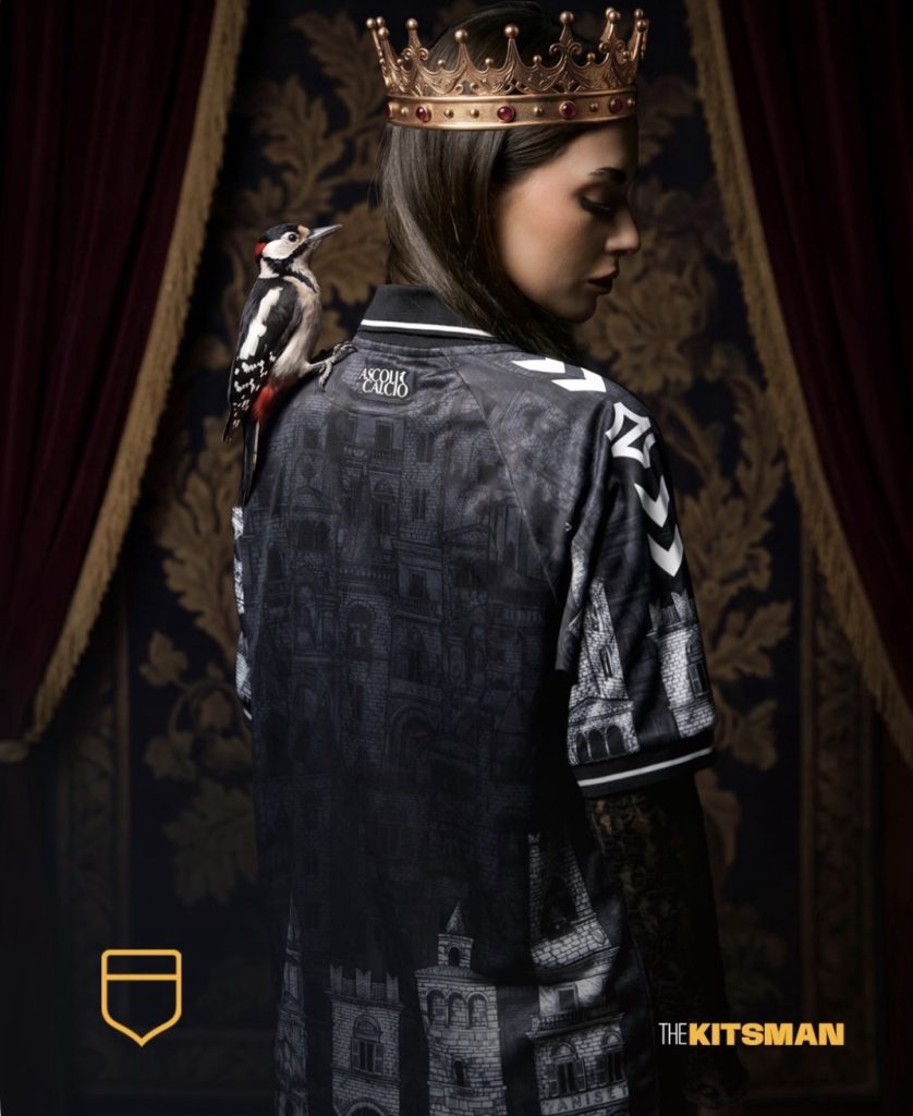
A Shirt Worth Talking About
We’ve seen a similar commitment to local identity elsewhere in Italian football. SPAL’s Palio-inspired away shirt, for instance, took inspiration from Ferrara’s historic celebrations, with Erreà producing a design that felt specific to the club rather than something pulled from a catalogue.
Ascoli have taken that idea considerably further.
There’s a nice piece of local folklore behind the release too. According to legend, a woodpecker sacred to Mars guided the Sabines to the land where Ascoli would eventually be founded. The bird subsequently became a symbol of the city and gave the football club its nickname, Picchio.
The shirt’s title references another nickname, Queen of the Marche, earned during Ascoli’s years in Serie A.
It’s a lot of history to squeeze into one release, although I suspect most people will decide whether they like the shirt long before reading any of it.
That’s probably how it should be.
For me, the artwork is excellent, the concept is clever and the finished shirt is certainly memorable. Whether I’d actually wear one is another matter.
Would you wear Ascoli’s new shirt, or has football kit design started getting a little too artistic for its own good?
The special 2026/27 shirt is available through Ezeta’s official website and Ascoli’s club boutique.
Images courtesy of Ezeta, Hummel and Ascoli Calcio 1898.
Follow The Kitsman for more football shirt news, features and opinions: