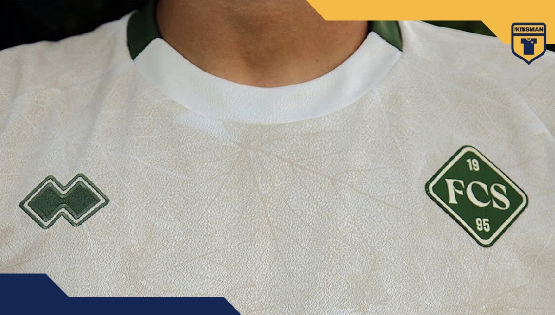
Simple white football shirts have nowhere to hide.
When most of the colour disappears, it’s the smaller details that suddenly have to do the work. FC Südtirol have absolutely nailed that part.
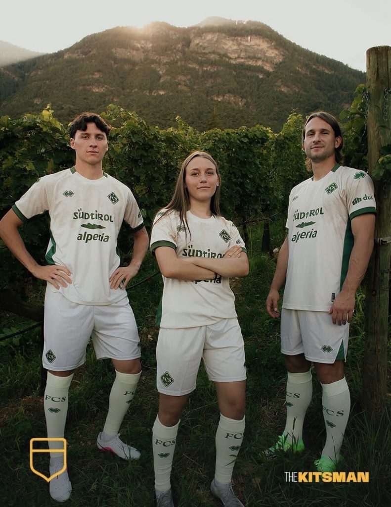
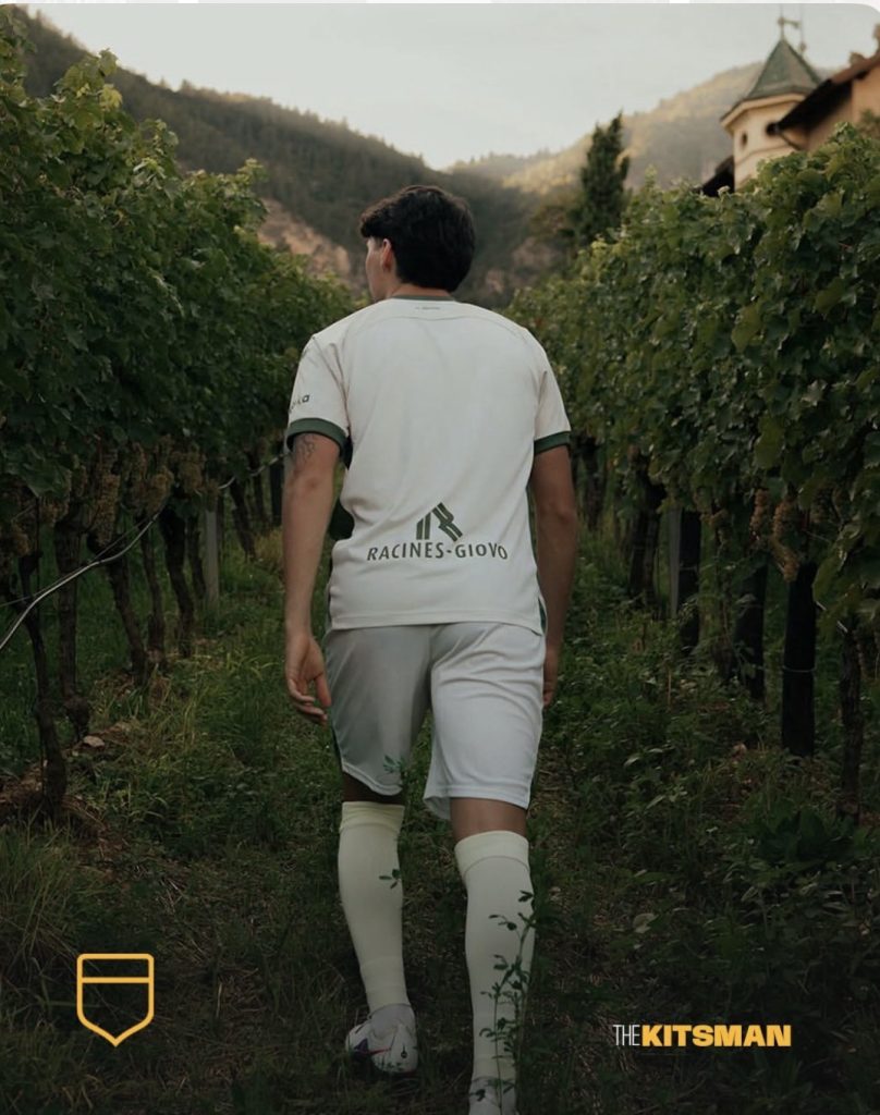
Their latest Erreà creation celebrates one of the defining sights of South Tyrol, a region where rugged Alpine landscapes meet an almost Mediterranean climate and vineyards blanket the valleys and hillsides.
Rather than taking the obvious route of wine reds and burgundies, Südtirol have focused on something vital to the whole process: the vine leaf.
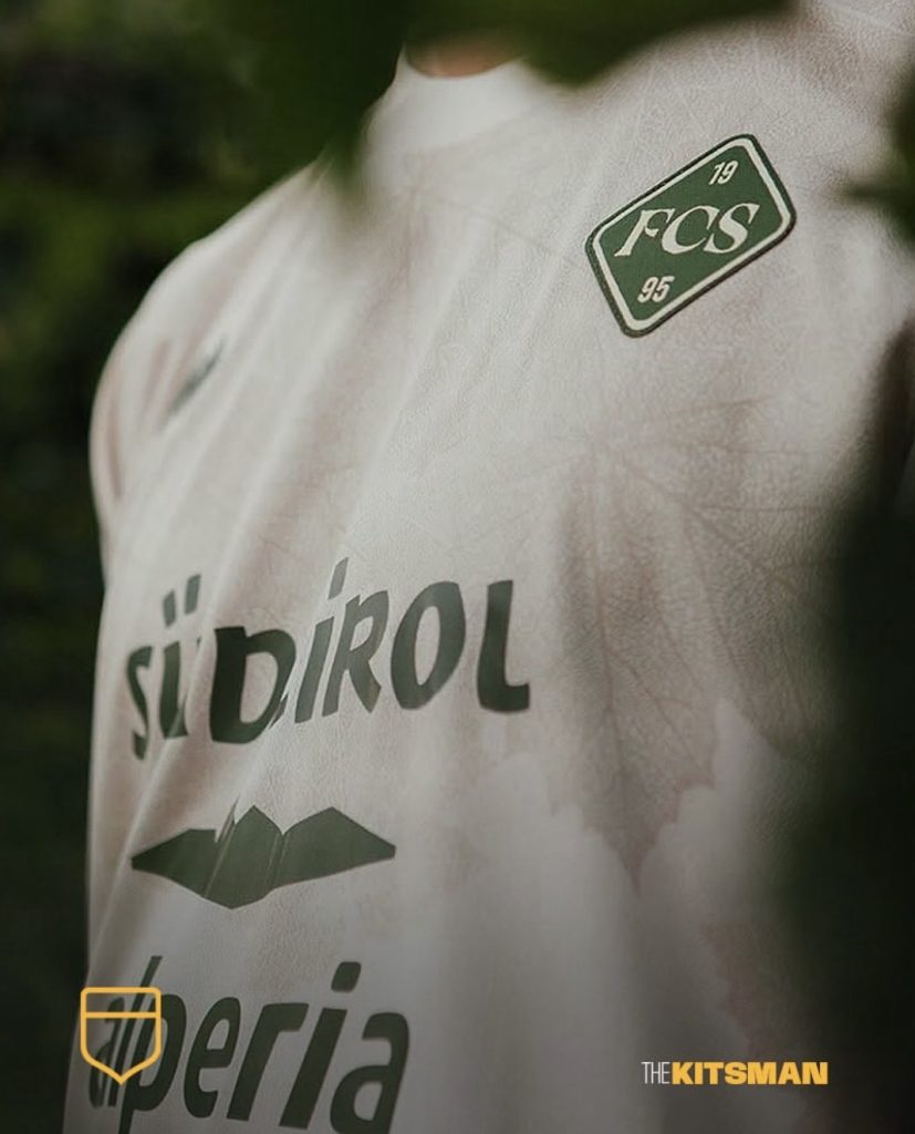
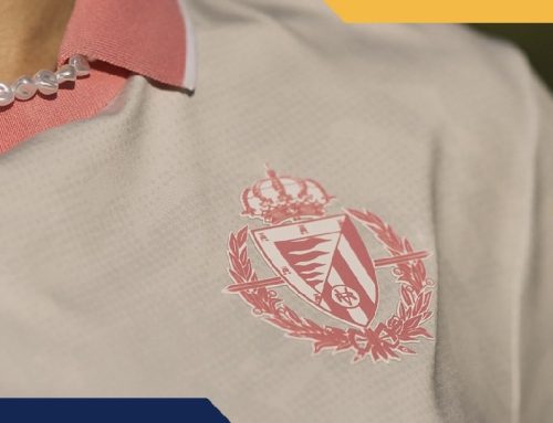
A fresh creamy beige provides an almost-white canvas, and from a distance everything looks remarkably clean. Get closer and the shirt completely changes.
Fine illustrated vine leaves run through the fabric, with intricate line work bringing the vineyards of the region onto the shirt without overwhelming it. It’s exactly the sort of detail that makes a predominantly white kit work.
Green provides the natural accompaniment, while we’re particularly taken by the alternate crest. The simple FCS and founding date have an almost stamped appearance that feels completely different from the club’s usual badge.
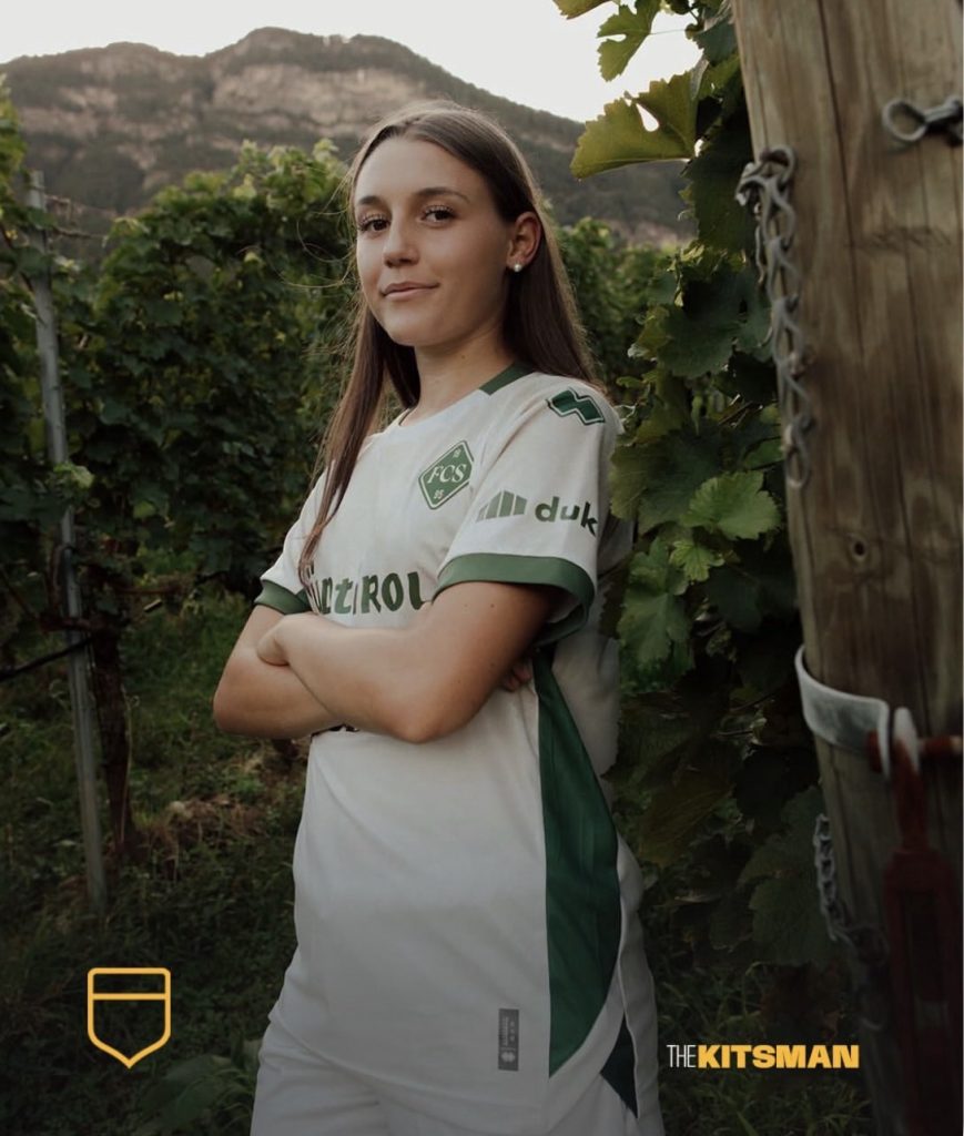
It’s a shirt that understands when to keep things quiet.
White and off-white kits have produced some absolute classics over the years, from international shirts to some of football’s most recognisable club identities.
But who does predominantly white football shirts better than anyone else?
Real Madrid? England? Germany? Spurs? Someone completely different?
Südtirol have certainly produced a beauty here.
The leaf of life, woven into the shirt.
Images; @fcsuedtirol @erreasport
#southtyrol #südtirol #wine #vineyard #footballkits #thekitsman
Join the conversation:
X:
https://x.com/the_kitsman?s=21&t=YKLtf2JIakFxujMRxTUh9Q
Instagram:
https://www.instagram.com/the.kitsman?igsh=ZWtuMDJkb2c4Ynhz&utm_source=qr