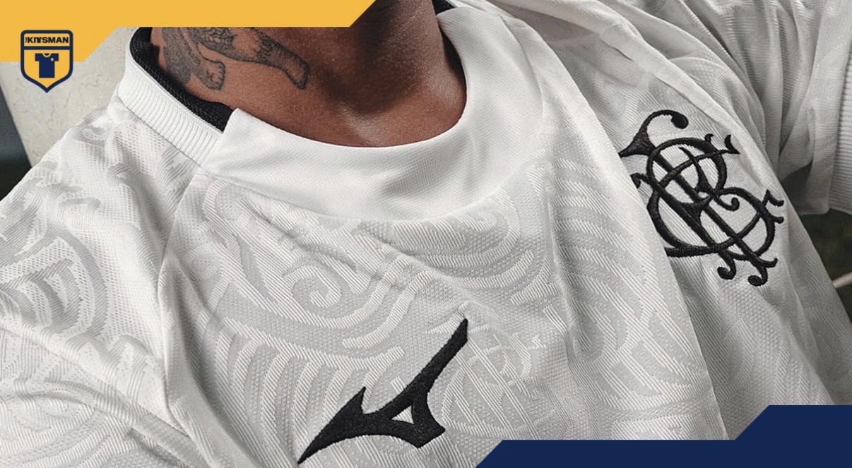
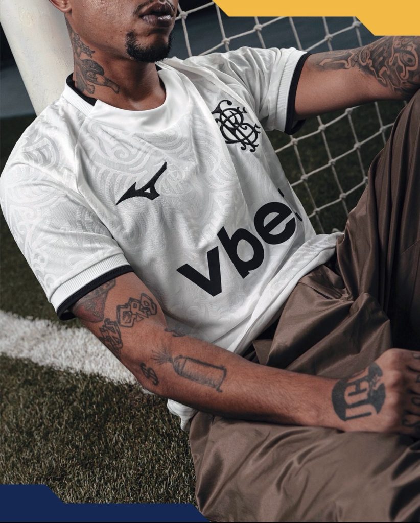
Let’s get straight to it. That wonderfully ornate and monogrammed BFC crest is an absolute thing of beauty.
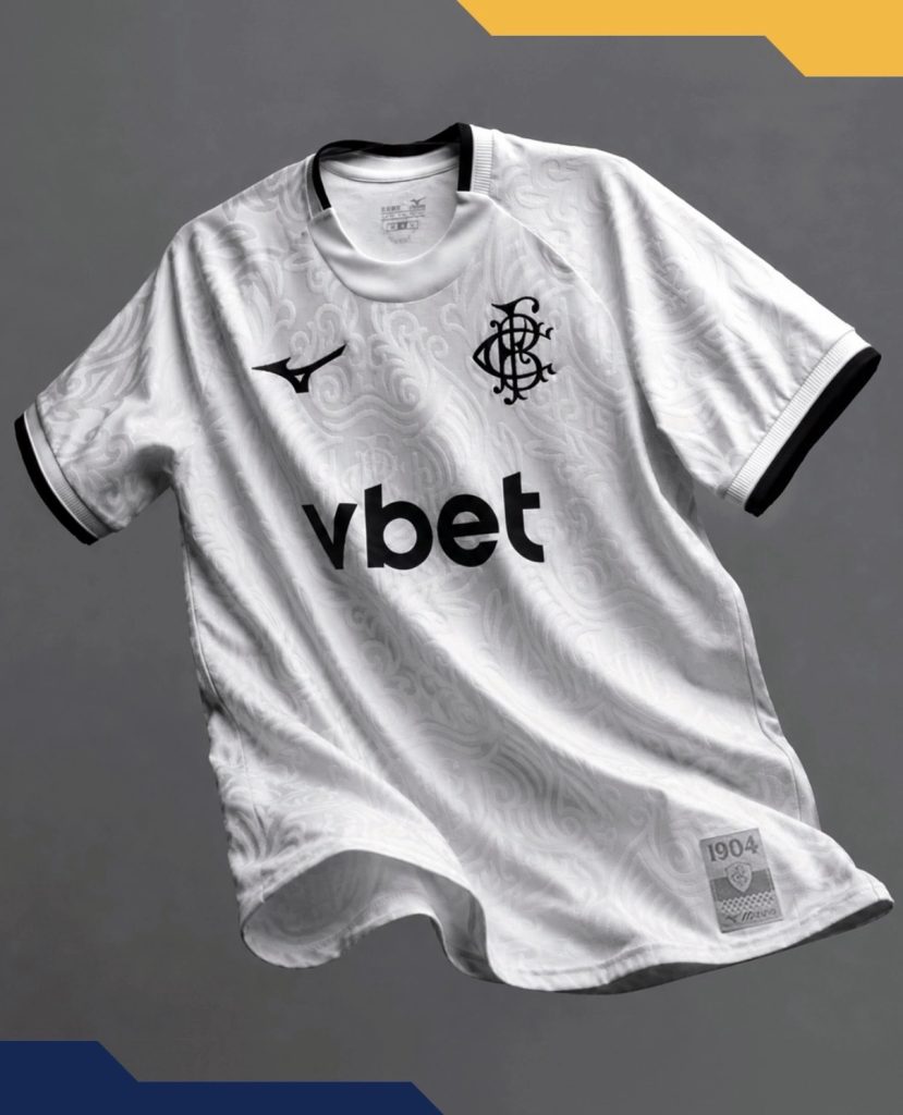
Originally crafted in 1904 when the club was founded, before the football and rowing clubs merged into the Botafogo recognised today, the return of the historic badge immediately gives this third kit its identity. In an era where more and more clubs are flattening, simplifying and squeezing crests into circles and shields, seeing something this intricate take centre stage again feels genuinely refreshing.

Against the clean white base, it absolutely sings.
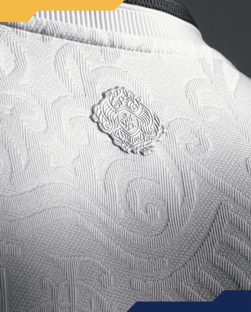
The shirt itself backs it up too. What initially looks simple quickly reveals a swirling embossed pattern running throughout the fabric, giving the jersey texture and movement without overwhelming the overall look. The slightly raised finish helps the details catch light differently across the shirt and stops the white from ever feeling flat or empty.

Importantly, everything surrounding those details stays restrained. The trim is minimal, the colour palette stays controlled and nothing distracts from the elements that deserve the attention most. That balance is what makes the whole release feel premium rather than overworked.

It is a third kit that manages to feel elegant, historic and modern all at once.
More clubs should be brave enough to revisit their roots like this.
Join the conversation:
https://x.com/the_kitsman?s=21&t=YKLtf2JIakFxujMRxTUh9Q
https://www.instagram.com/the.kitsman?igsh=ZWtuMDJkb2c4Ynhz&utm_source=qr