Look across football’s biggest leagues and the same few manufacturers increasingly dominate.
Adidas in particular has amassed a huge portfolio of major clubs, while Nike and Puma continue to occupy plenty of football’s most valuable shirt space.
Yet when a new Kappa kit appears, why does it so often seem to get football shirt people talking?
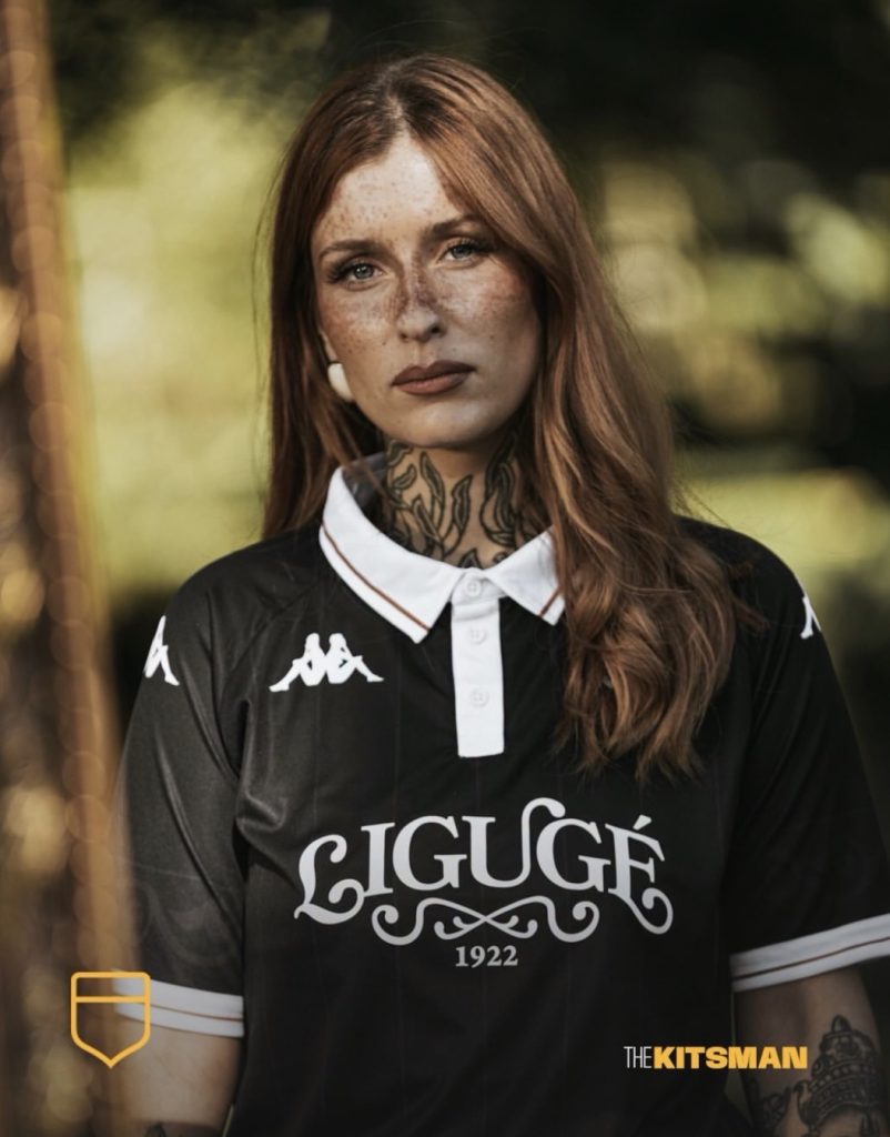
French amateur side La Ligugéenne have just provided the latest example.
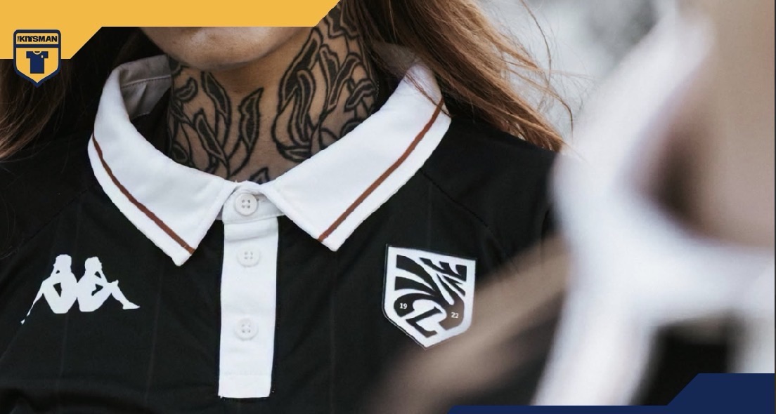
The club have undergone something of a reinvention, introducing a new crest and fresh visual identity with Kappa and creatives +3 Studio helping to build the new look.
The home shirt is an impressive place to start.
Black provides the base, with subtle pinstripes running through a design that immediately feels more considered than its relatively simple ingredients might suggest. The contrasting polo collar and cuffs do much of the heavy lifting, giving it a refined, almost fashion-led appearance.
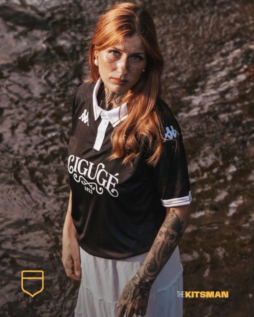
There’s even a slight silky quality to the overall look. Take away the context and you could imagine elements of this belonging within a much more expensive fashion collection.
Yet this is an amateur football club using its shirt to announce a new era.
The crest helps enormously. It’s sharp, distinctive and another example of a club being prepared to move slightly away from convention when refreshing its identity.
Then there’s the front of the shirt.
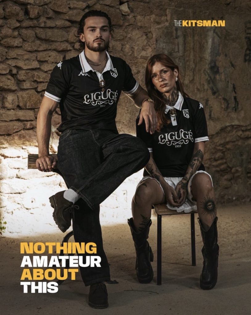
No sponsor.
Instead, La Ligugéenne have created their own wordmark, placing the club’s name and founding date proudly across the chest. At a time when some football shirts are becoming increasingly crowded with commercial logos, there’s something particularly effective about a club using that valuable space to advertise itself.
It all feeds into a much bigger discussion around Kappa.
They might not have the sheer number of heavyweight clubs that some of their competitors possess, but does that even matter when we’re talking purely about football shirt design?
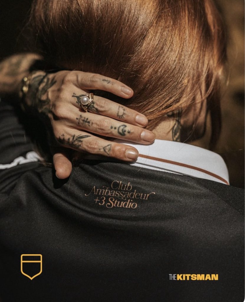
Kappa have the Omini. They understand collars. They understand trim. Their branding can become part of a shirt rather than simply sitting on it. There’s also often a willingness to give individual clubs an identity rather than making everything feel part of the same seasonal template.
Perhaps having fewer of football’s global giants even gives them more freedom to do that.
So, despite the increasing dominance of the biggest manufacturers, are Kappa still the kings of football shirt design?
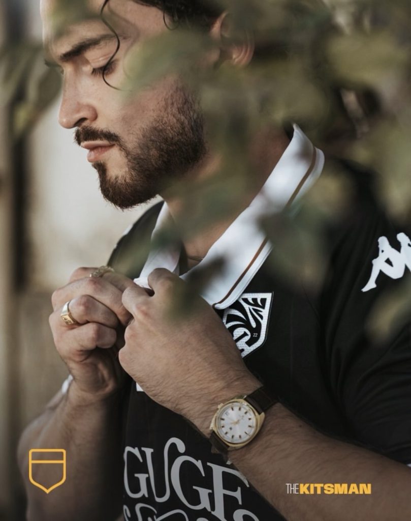
La Ligugéenne are hardly one of the biggest names on Kappa’s books.
Maybe that’s what makes this such a good example.
If an amateur club can be given this much personality, perhaps the size of the badge on the contract isn’t the most important thing after all.
Images; @laligugeenne @kappa @plus3.studio
#amateur #kappa #frenchfootball #footballkits #thekitsman
Join the conversation:
X:
https://x.com/the_kitsman?s=21&t=YKLtf2JIakFxujMRxTUh9Q
Instagram:
https://www.instagram.com/the.kitsman?igsh=ZWtuMDJkb2c4Ynhz&utm_source=qr