Some football shirts need a complicated pattern or an outrageous colour combination to get noticed. Others manage it with considerably less fuss.
FC Groningen’s new 2026/27 third shirt falls firmly into the second category.
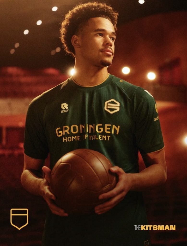
Deep green, gold detailing and a wonderfully traditional appearance make this one of those designs that looks impressive before you’ve even discovered the story behind it. But there’s rather more going on here than a particularly attractive colour scheme.
Working with Dutch manufacturer Robey, Groningen have taken inspiration from Grönnens Laid, the anthem of the province, and turned one of its most recognisable lines into a football shirt.
The result is something the club calls Ain Pronkjewail in golden raand.
A jewel with a golden edge.
And once you understand the meaning, the design becomes even better.
A Shirt Inspired by an Anthem
For people across Groningen, Grönnens Laid is more than simply a regional song.
It celebrates the province, its landscape and the connection between the city of Groningen and the surrounding countryside. It’s also familiar to supporters at Euroborg, where the anthem has become part of the matchday experience.
One of its best-known lines describes Groningen as a precious jewel surrounded by a golden edge.
It’s a lovely piece of imagery, and Robey have interpreted it rather literally.
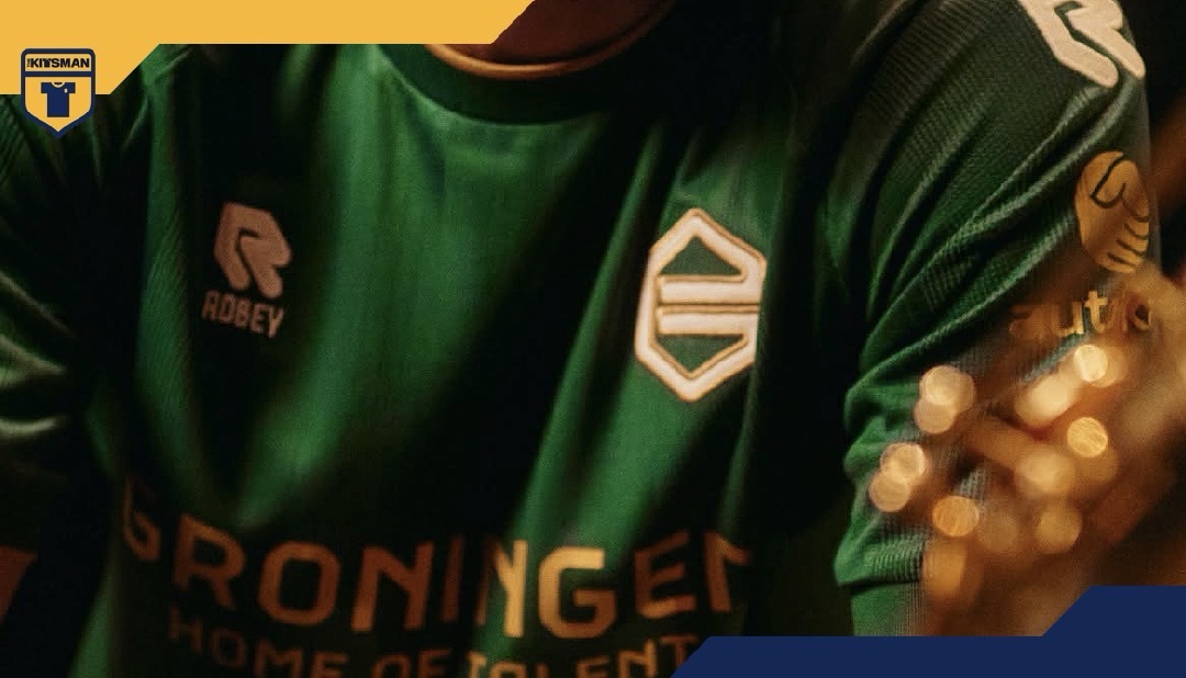
The shirt uses a rich, dark green base, with gold providing the finishing touches. The collar, cuffs, manufacturer branding and sponsor details all follow the same understated approach.
There’s no elaborate graphic fighting for attention, no enormous illustration across the chest. The design relies on its colours, subtle fabric texture and the meaning behind them.
And sometimes that’s more than enough.
The Jewel Is Right There on the Chest
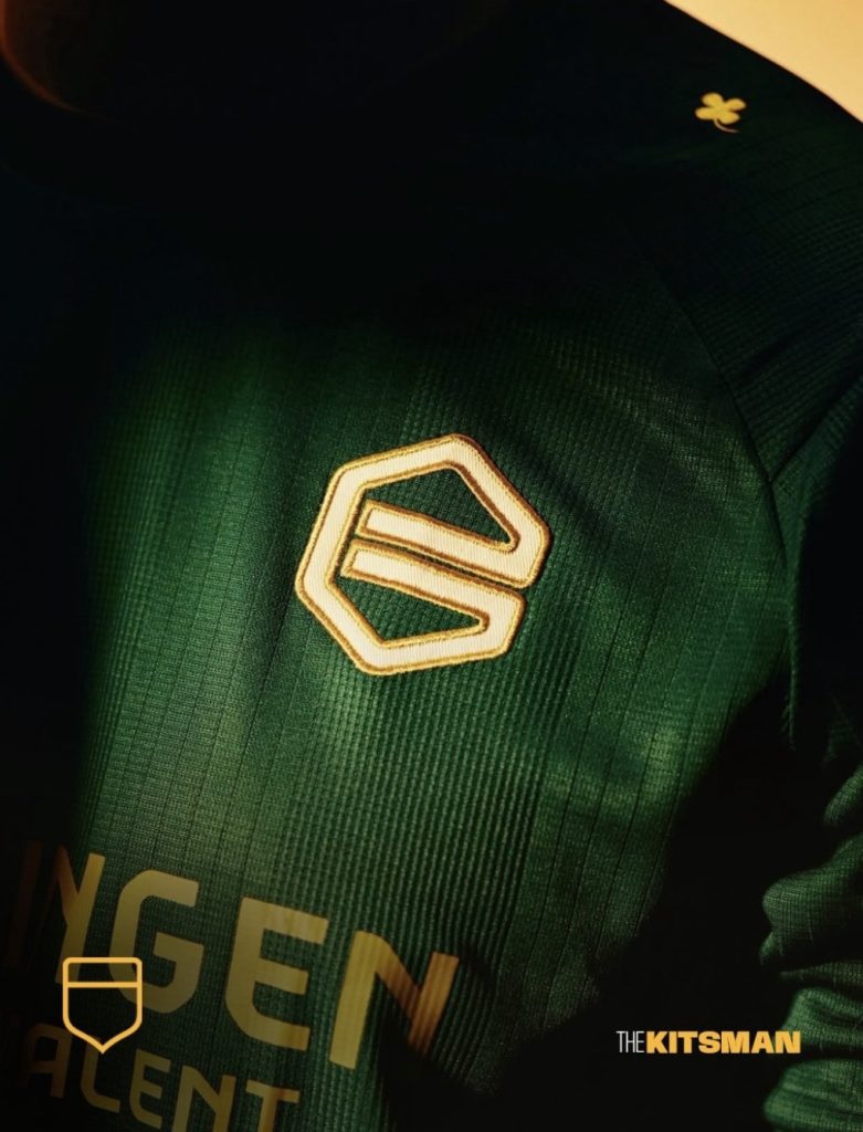
The cleverest detail is the club crest.
Rather than simply reproducing the usual badge, Groningen have given the familiar G a golden outline, representing the jewel described in the anthem.
It’s a particularly appropriate choice considering that the G has been central to the club’s identity for 55 years.
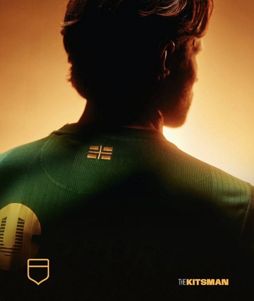
The gold continues elsewhere, including an embroidered version of the provincial flag on the back of the shirt.
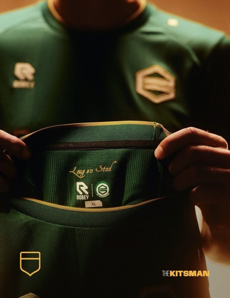
Inside the neckline are the words Loug and Stad, taken from the second verse of the anthem. They refer to the villages and the city, reinforcing the idea that FC Groningen represents more than the place where its stadium happens to stand.
These are the sorts of details that make a shirt feel genuinely connected to its club.
Anyone can produce a green shirt with gold trim. Giving those colours a specific meaning, rooted in something supporters recognise, is what makes this one interesting.
We’ve previously explored how the appearance of a shirt can be affected by its commercial branding in How Many Sponsors Is Too Many on a Football Shirt?. Groningen’s decision to keep the visible branding gold is a good example of how a consistent approach can help the whole design feel considered.
It’s elegant without trying too hard.
An Old-Fashioned Look With a Modern Surprise
There’s one detail you certainly wouldn’t expect to find on a shirt inspired by a traditional provincial anthem.
An NFC chip.
Groningen have incorporated the technology into the garment, allowing supporters to hold their smartphone against it and access a dedicated webpage explaining the shirt and its inspiration.
It’s a neat addition, particularly because the story is such an important part of the release.
Football clubs increasingly want supporters to understand the thinking behind their kits, but that information can quickly disappear beneath the next announcement on social media.
Building a direct connection into the shirt itself is an interesting way of keeping that story accessible.
Whether supporters will regularly scan their shirts is another question entirely. Still, it’s a thoughtful feature rather than technology included purely for the sake of it.
The traditional design and modern functionality make an unlikely but rather effective pairing.
A Proper Jewel for Groningen
The shirt was unveiled on 13 November and is scheduled to make its first appearance on the pitch against Willem II at Euroborg on Friday 27 November.
It’s available through the club’s official shop, with adult shirts priced at €69.95.
There’s something particularly appealing about a third kit that doesn’t feel the need to abandon everything associated with the club.
Groningen and Robey have produced something distinctive without relying on novelty. The deep green and gold work beautifully together, but the design also has enough local meaning to feel like more than another alternative shirt.
The embroidered flag, the words inside the collar and that golden outline around the G all contribute to the same story.
And that’s what makes it work.
The best football shirts don’t always need to shout for attention. Sometimes a beautiful colour combination and a connection to the people who’ll wear it are enough.
Groningen have called theirs a jewel with a golden edge.
Looking at the finished result, it’s difficult to argue.
More from The Kitsman
How Many Sponsors Is Too Many on a Football Shirt?
A look at how commercial branding influences football shirt design, and whether clubs are beginning to lose sight of what makes their kits special.
Beerschot’s 2026/27 Away Kit Shows Why Sponsors Should Adapt to the Shirt
Another example of how a consistent approach to colours and branding can make a football shirt considerably more attractive.
Further reading
- FC Groningen’s official third-shirt announcement
- Groningen Internet Courant: Third kit inspired by Grönnens Laid
- OOG Groningen: Details behind the new third kit
Shirt and design credits: FC Groningen and Robey Sportswear.
For more football shirt releases, stories and opinion, follow The Kitsman on X and The Kitsman on Instagram.