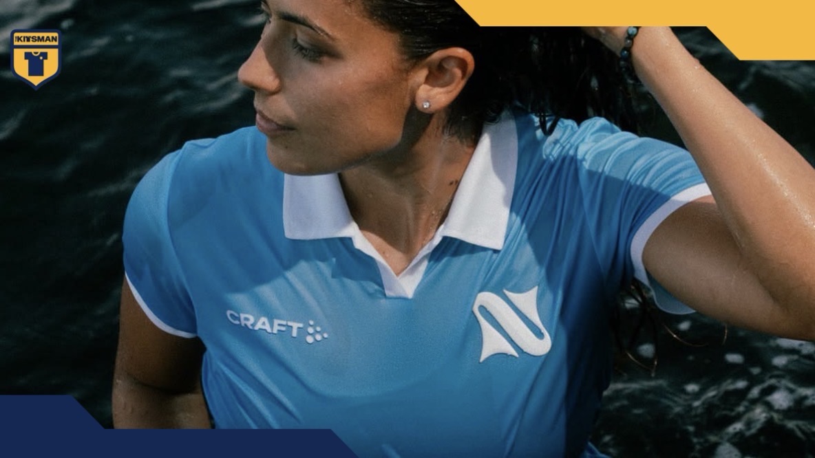
A new name. A new crest. A new identity.
The newly rebranded Napoli Women are forging their own path, stepping out from underneath the identity of the men’s club and embracing something distinctly their own.
And what an identity they’ve chosen.
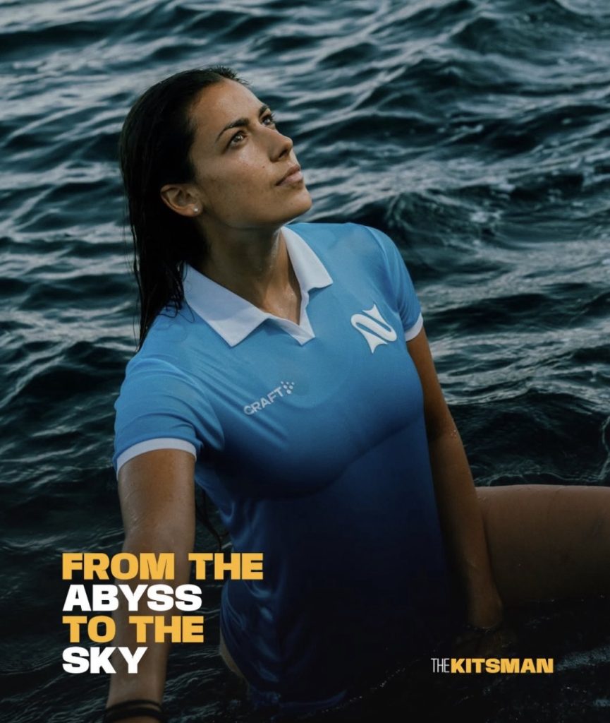
Naples and the sea have been intertwined for centuries, with the legendary Siren Parthenope deeply rooted within the mythology surrounding the city.
That story now sits at the heart of Napoli Women.
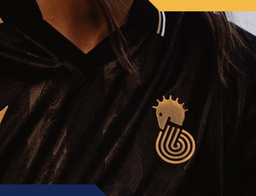
Their glorious new crest centres around an ‘N’ formed from two interlocked Siren tails, creating something that works as a strong football identity in its own right while retaining a clear connection to the history and mythology of Naples.
On the new home shirt, it’s given plenty of room to sing.
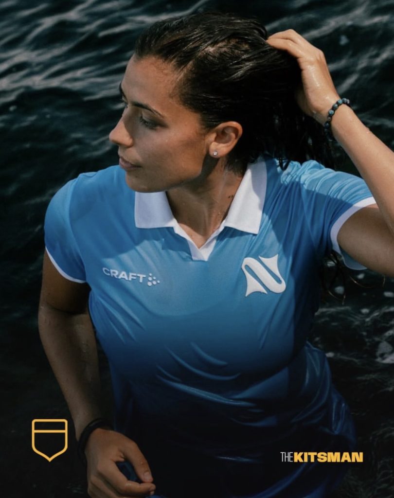
Rather than filling the shirt with additional graphics, Craft have placed the focus on a gradient that appears to embody the club’s new mantra: ‘from the abyss to the sky’.
Deep, dark blue rises through the shirt before shifting towards the lighter shade of blue so synonymous with Naples.
It’s a relatively simple concept visually, but there’s an awful lot wrapped up within it.
The sea. Parthenope. Naples. A new beginning. A women’s team establishing an identity of its own.
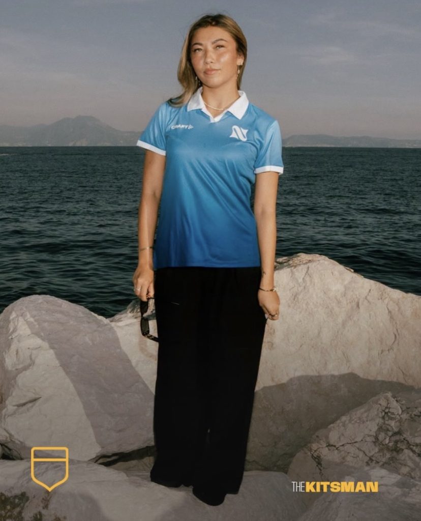
The launch from Modí only strengthens it, taking those ideas and giving them the kind of visual treatment increasingly being afforded to women’s football shirts.
That brings us to a wider question.
We’ve seen the ambition surrounding women’s kit launches grow enormously, with clubs increasingly producing campaigns, bespoke designs and identities that stand completely on their own.
Which women’s team is doing football kit launches better than anyone else right now?
Images; @napoliwomenofficial @craftsportswear @quellidimodi
#naples #napoli #napoliwomen #siren #womensfootball #footballkits #thekitsman
Join the conversation:
X:
https://x.com/the_kitsman?s=21&t=YKLtf2JIakFxujMRxTUh9Q
Instagram:
https://www.instagram.com/the.kitsman?igsh=ZWtuMDJkb2c4Ynhz&utm_source=qr