One of the best trends in modern kit design has been the return of local history.
Rather than simply refreshing colours each season, more clubs are finding ways to weave their city’s story into the fabric—and Osasuna are the latest to do just that.
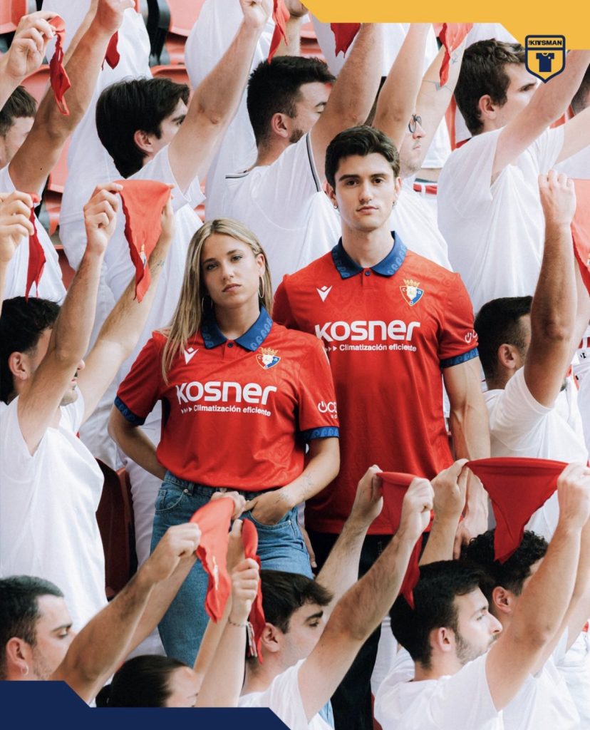
At first glance, it’s the bold red you’d expect from the club.
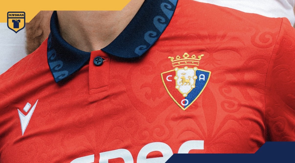
Look a little closer, though, and an embossed pattern begins to emerge across the shirt, inspired by the paving mosaics that once decorated Pamplona’s Plaza del Castillo. Although the originals disappeared in 2001, they’ve found a new home here.
The blue collar and cuffs provide a strong contrast against the red and continue that connection, taking cues from the colours found within those historic mosaics.

It’s a shirt that doesn’t need to overcomplicate things.
The story sits quietly beneath the surface, rewarding anyone who takes the time to look a little closer rather than dominating the entire design.
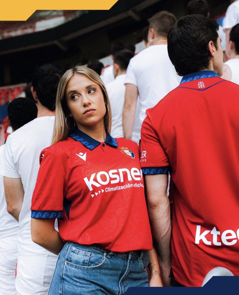
The launch photography deserves a mention too. Against the clean white surroundings, the vivid red immediately catches the eye and keeps the focus firmly on the shirt itself.
It does pose an interesting question.
Are the best home kits the ones that evolve subtly while preserving a club’s identity, or should they take bigger creative risks from season to season?

Osasuna have chosen the more understated route here, blending tradition with a meaningful piece of local history.
Sometimes, that’s more than enough.
Join the conversation:
https://x.com/the_kitsman?s=21&t=YKLtf2JIakFxujMRxTUh9Q
https://www.instagram.com/the.kitsman?igsh=ZWtuMDJkb2c4Ynhz&utm_source=qr