Sometimes a club doesn’t need to reinvent itself.
Sometimes a single colour tells you everything you need to know.

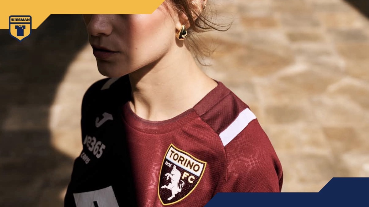
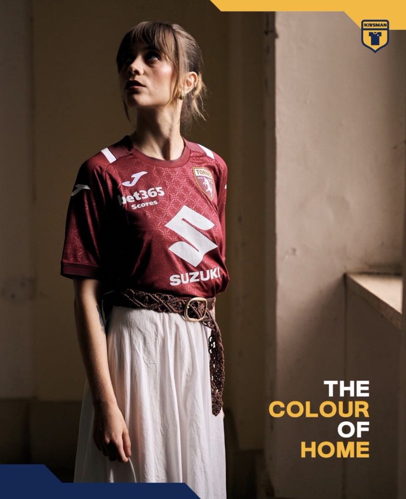
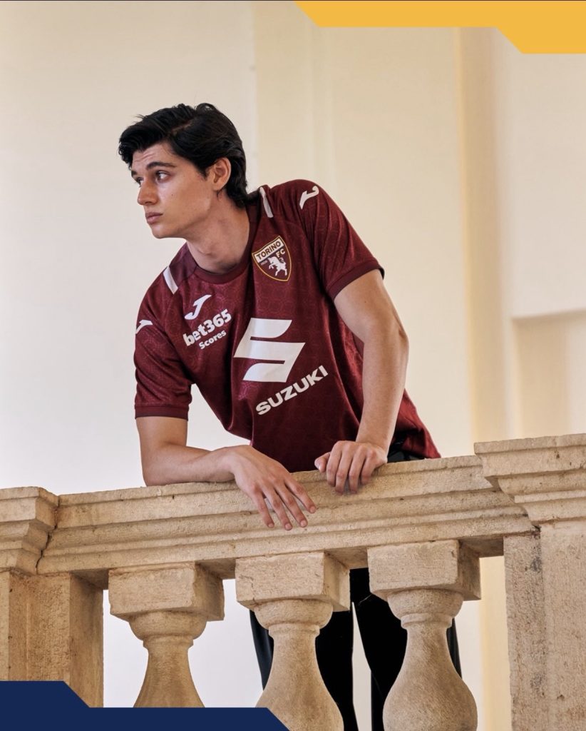
Torino’s famous Granata remains the unmistakable centrepiece of their 120th anniversary home kit, but this season it arrives with an extra layer of storytelling.
The inspiration comes from the Basilica di Superga, one of the city’s most recognisable landmarks and a place forever intertwined with Torino’s history. Rather than recreating the building itself, the club has drawn from its elegant tiled floors, creating a subtle all-over pattern that gives the shirt texture without distracting from its timeless appearance.
It’s a restrained approach, and one that suits Torino.
A particularly nice touch is that the pattern doesn’t stop at the front. It continues across the back of the shirt too, only breaking for the shoulder and side panels, giving the design a more complete feel than many textured kits.
The anniversary branding also avoids overpowering the shirt, allowing the club’s identity and that unmistakable maroon to remain the focal point.

It raises an interesting question.
For milestone seasons, is refinement often more effective than producing something completely different?

Torino haven’t chased a dramatic anniversary design here. Instead, they’ve taken an iconic colour, layered in a meaningful piece of the city’s history and let the details do the work.
Sometimes, that’s all a club needs.
Join the conversation:
https://www.instagram.com/the.kitsman?igsh=ZWtuMDJkb2c4Ynhz&utm_source=qr
https://x.com/the_kitsman?s=21&t=YKLtf2JIakFxujMRxTUh9Q