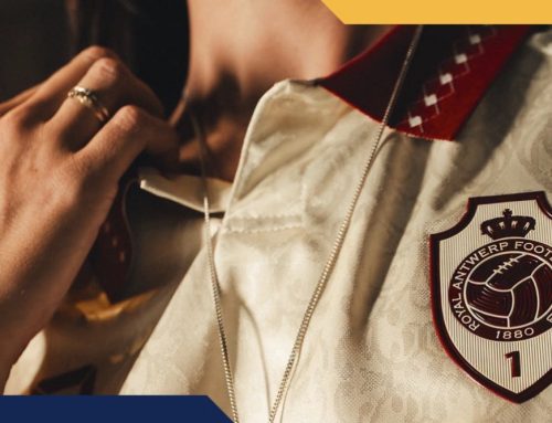
Instant Vintage 🔴⚪🔵
Launching a new kit supplier is one thing.
Doing it in your 130th anniversary season while celebrating promotion back to the Eredivisie is quite another.
Fortunately for Willem II, Meyba seem to have understood exactly what was required.
Sometimes the smartest decision is knowing what not to change.
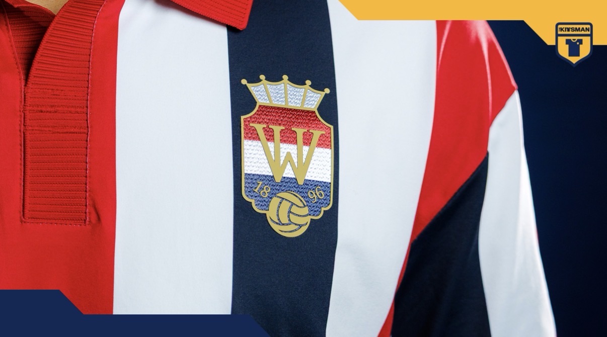
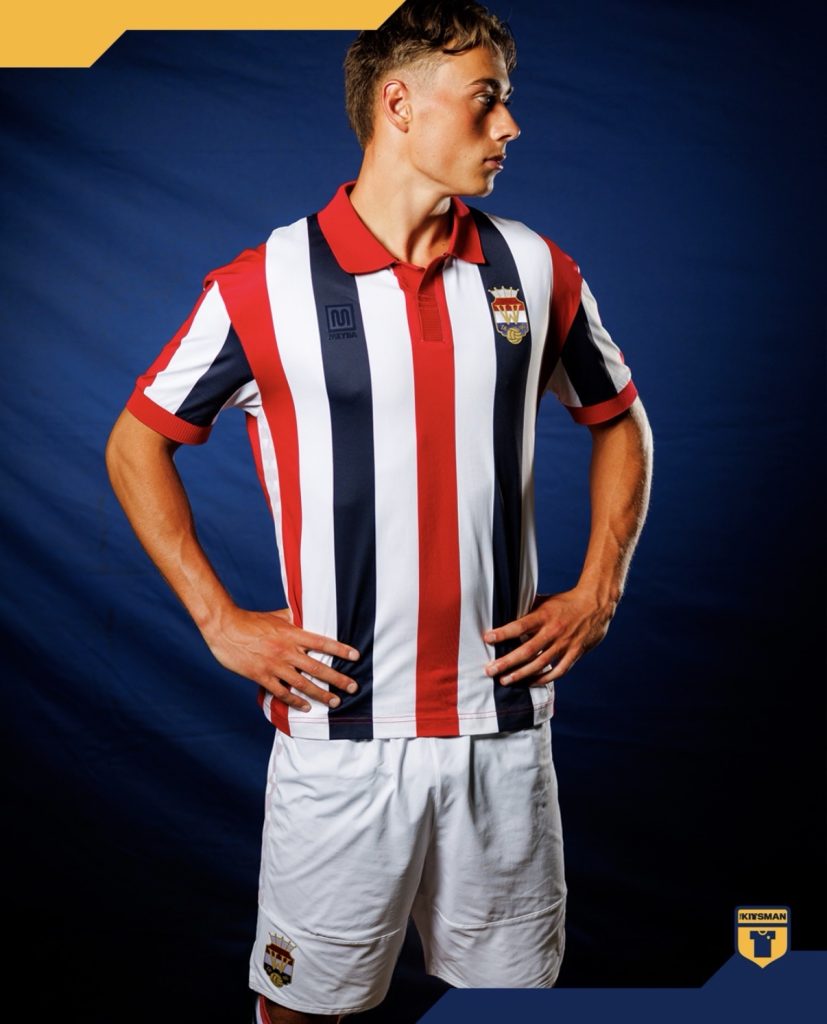
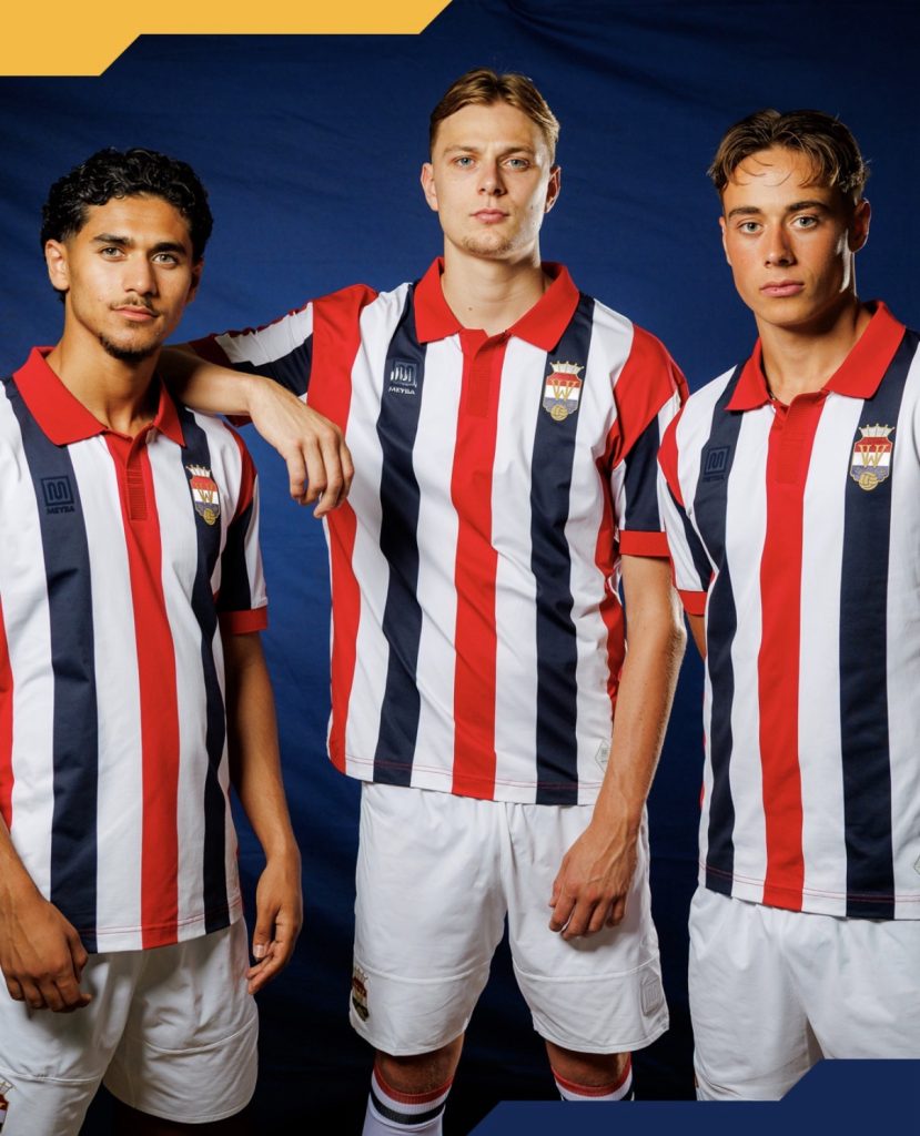
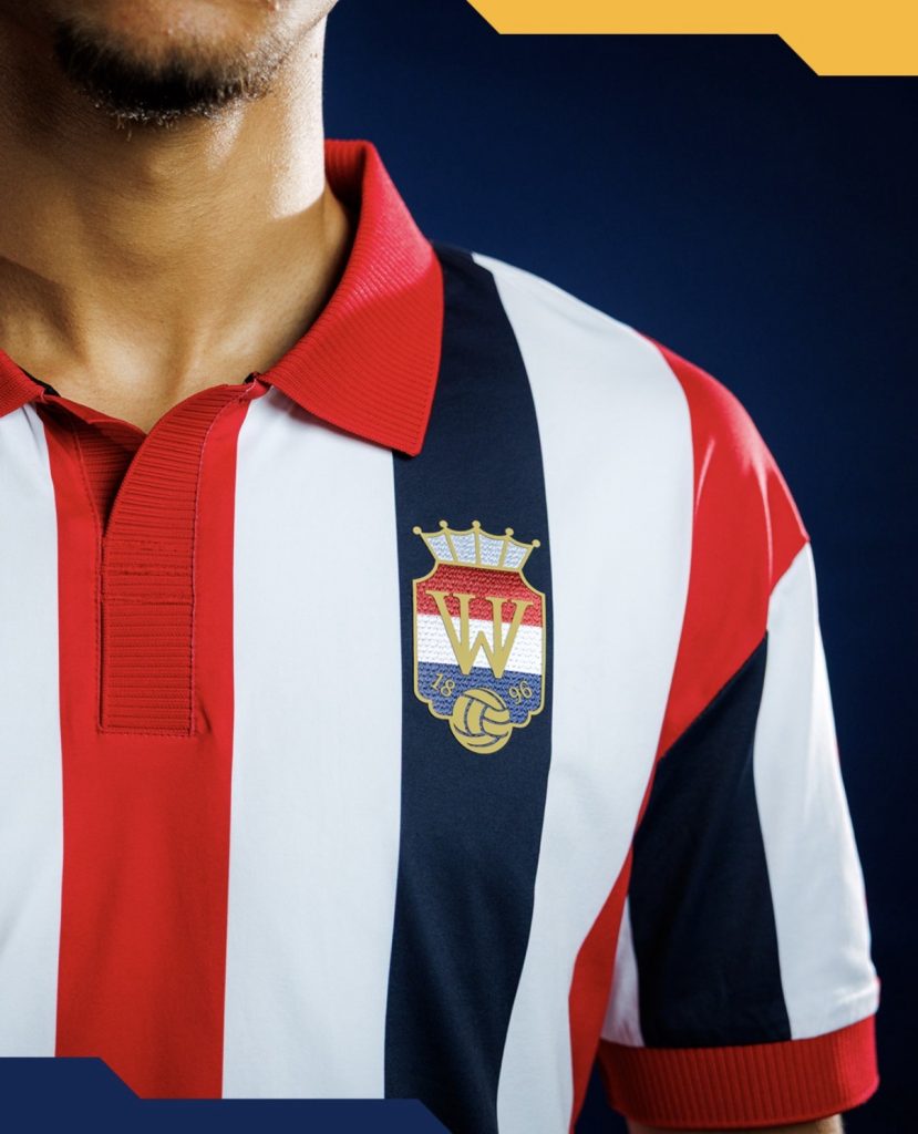
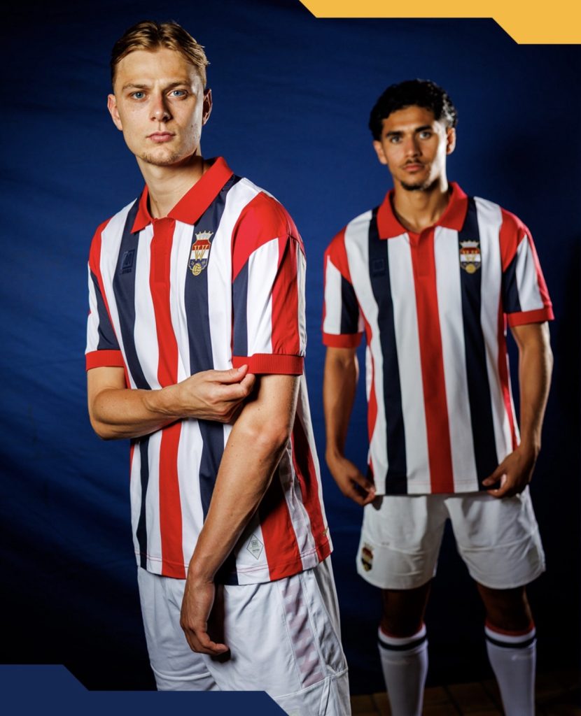
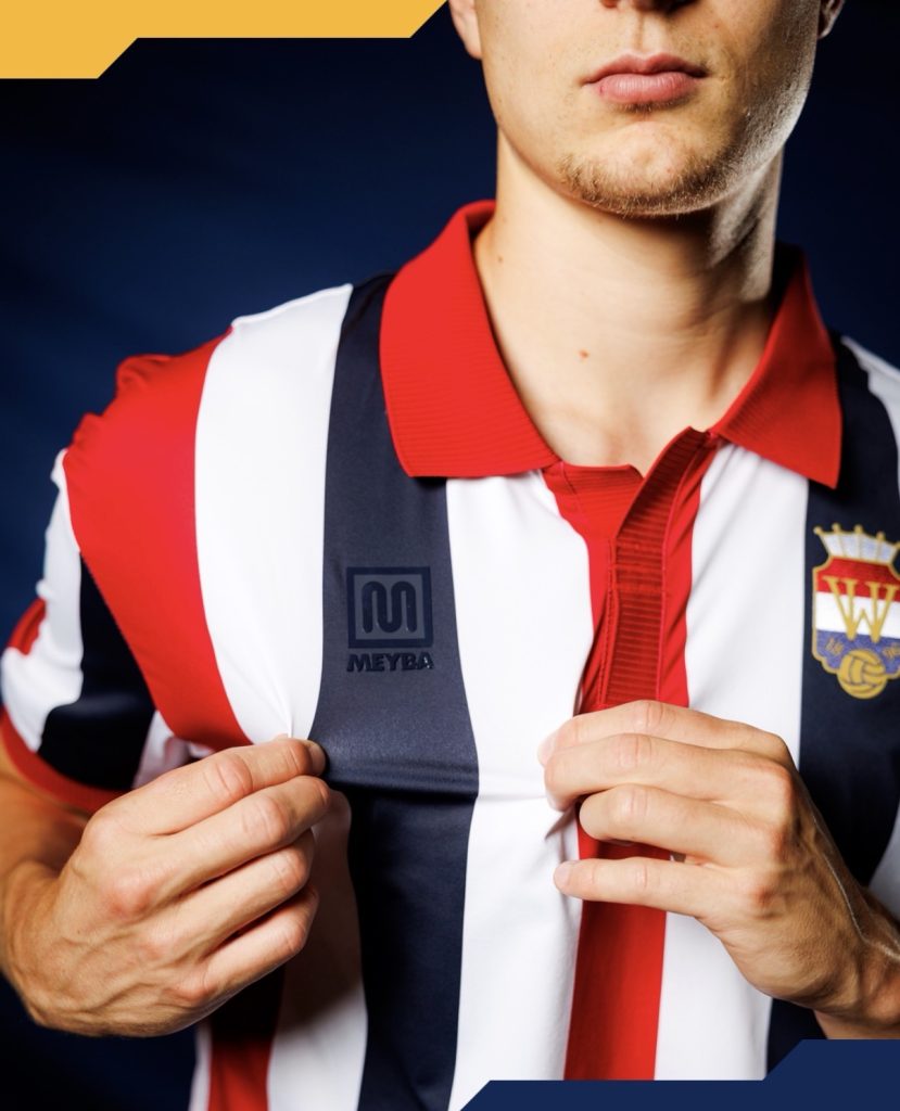
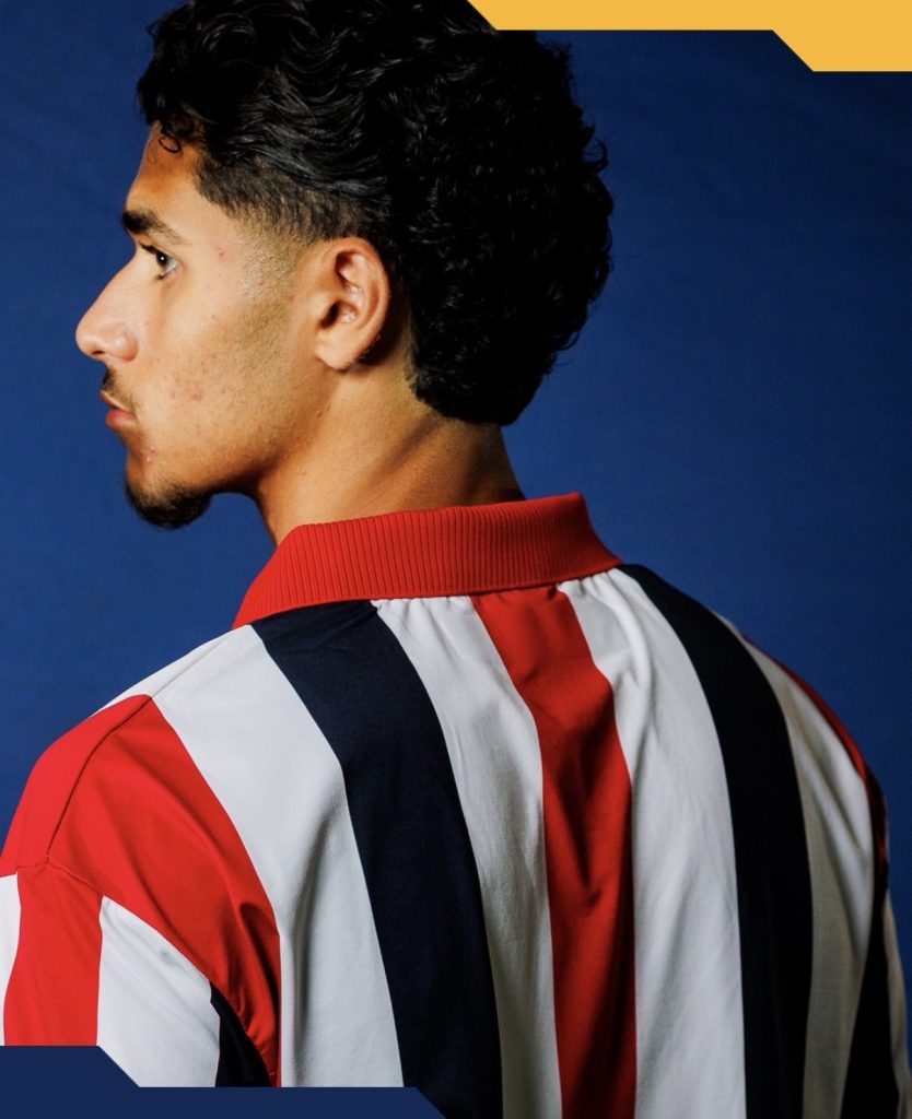
The club’s famous tricolour stripes remain the undisputed centrepiece. They’re one of Dutch football’s most recognisable identities and, thanks to Willem II’s Leeuwenmoed sponsorship initiative, they’ll remain uninterrupted across the front of the shirt throughout the season.
It’s a reminder that sometimes, less really is more.
One of the nicest touches actually comes from Meyba themselves. Rather than demanding attention, the manufacturer’s logo has been toned down to blend into the navy fabric, allowing both the stripes and Willem II’s excellent crest to dominate the shirt.
It’s a subtle decision, but one that many supporters will probably appreciate.
Then there’s the collar.
If you’re aiming for a shirt that bridges past and present, it’s difficult to ignore a proper ribbed collar. Here it feels like the right balance of retro inspiration and modern execution without tipping too far into replica territory.
The overall result raises an interesting question.
Do iconic clubs actually need to reinvent their identity every season, or is simply refining a classic the better approach?
Willem II haven’t tried to chase trends here.
Instead, they’ve produced a shirt that already feels as though it’s been part of the club’s history for years.
For a 130th anniversary celebration, that’s probably the biggest compliment you can give it.
Join the conversation:
https://www.instagram.com/the.kitsman?igsh=ZWtuMDJkb2c4Ynhz&utm_source=qr
https://x.com/the_kitsman?s=21&t=YKLtf2JIakFxujMRxTUh9Q