A good home-and-away pairing doesn’t necessarily mean two shirts that look alike.
Sometimes it means two shirts that approach the same identity from completely different directions.
That’s exactly what St. Pauli have done here.
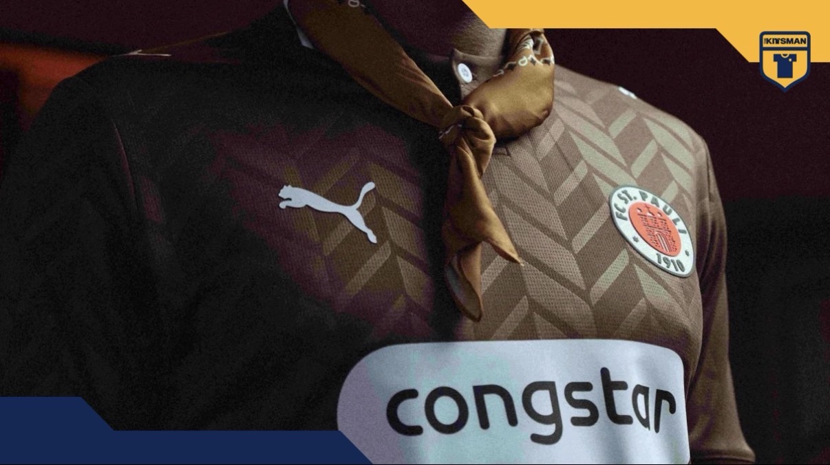
The home shirt is the more restrained of the pair. At first glance it appears fairly straightforward, but the all-over pattern reveals itself when the light catches it, giving the shirt more depth than a simple brown jersey might otherwise have. The single-button collar helps reinforce that slightly smarter feel too.
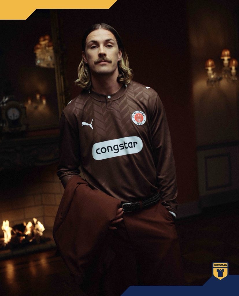
It’s a shirt that relies on details rather than statements.
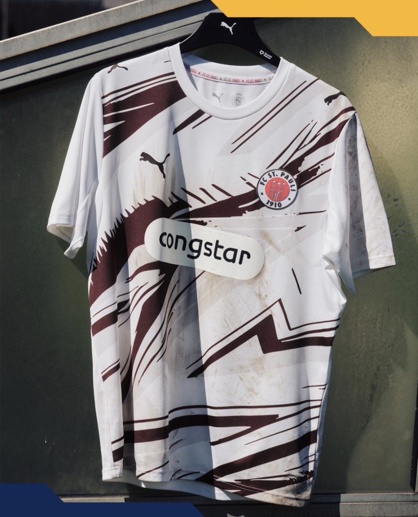
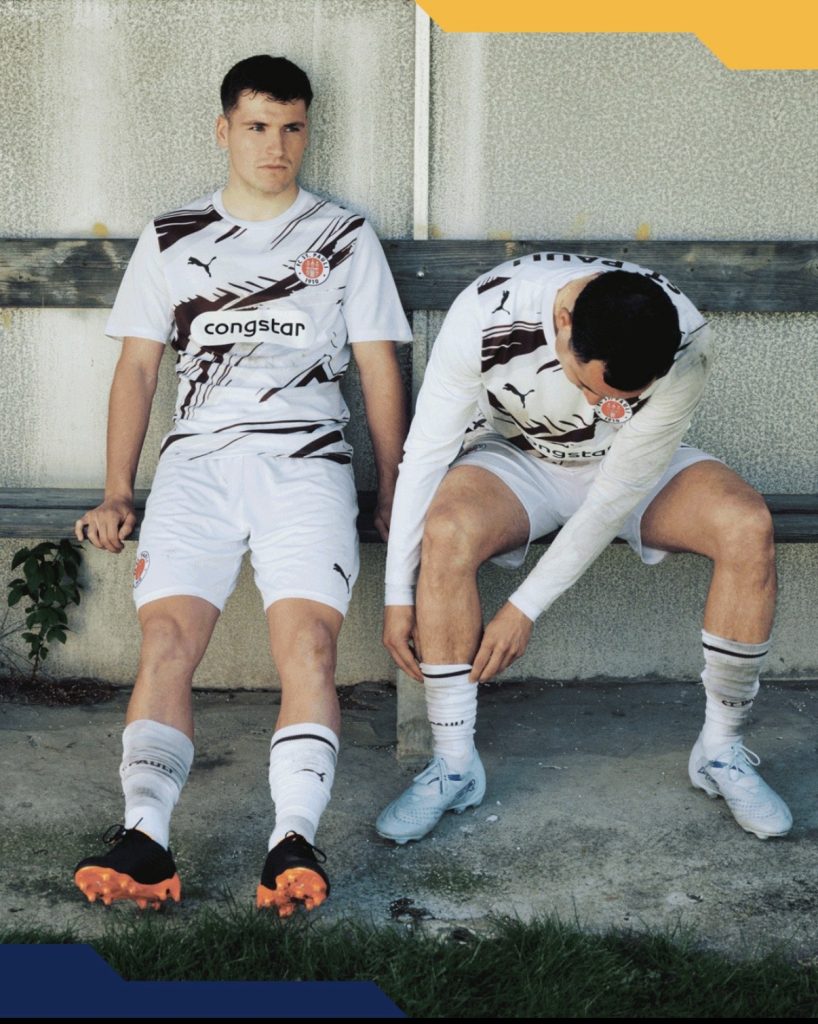
The away shirt takes the opposite approach.
The structure and order of the home design gives way to something more energetic, with a busier aesthetic that feels far less concerned with keeping things neat and tidy. Yet despite the change in tone, it never loses sight of the club’s identity. Importantly, it stays within St. Pauli’s established colour palette rather than chasing a completely unrelated concept.
That’s often easier said than done.
Many clubs use away kits as an opportunity to become something entirely different. St. Pauli have instead chosen to explore another side of themselves.
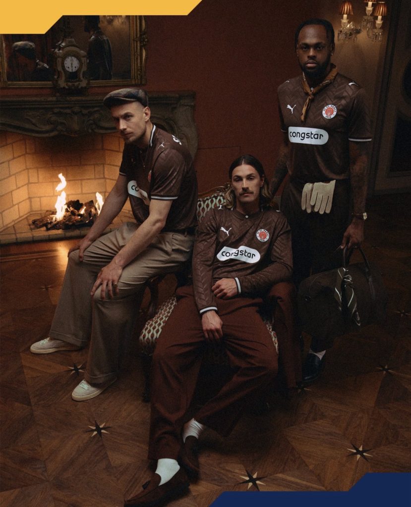
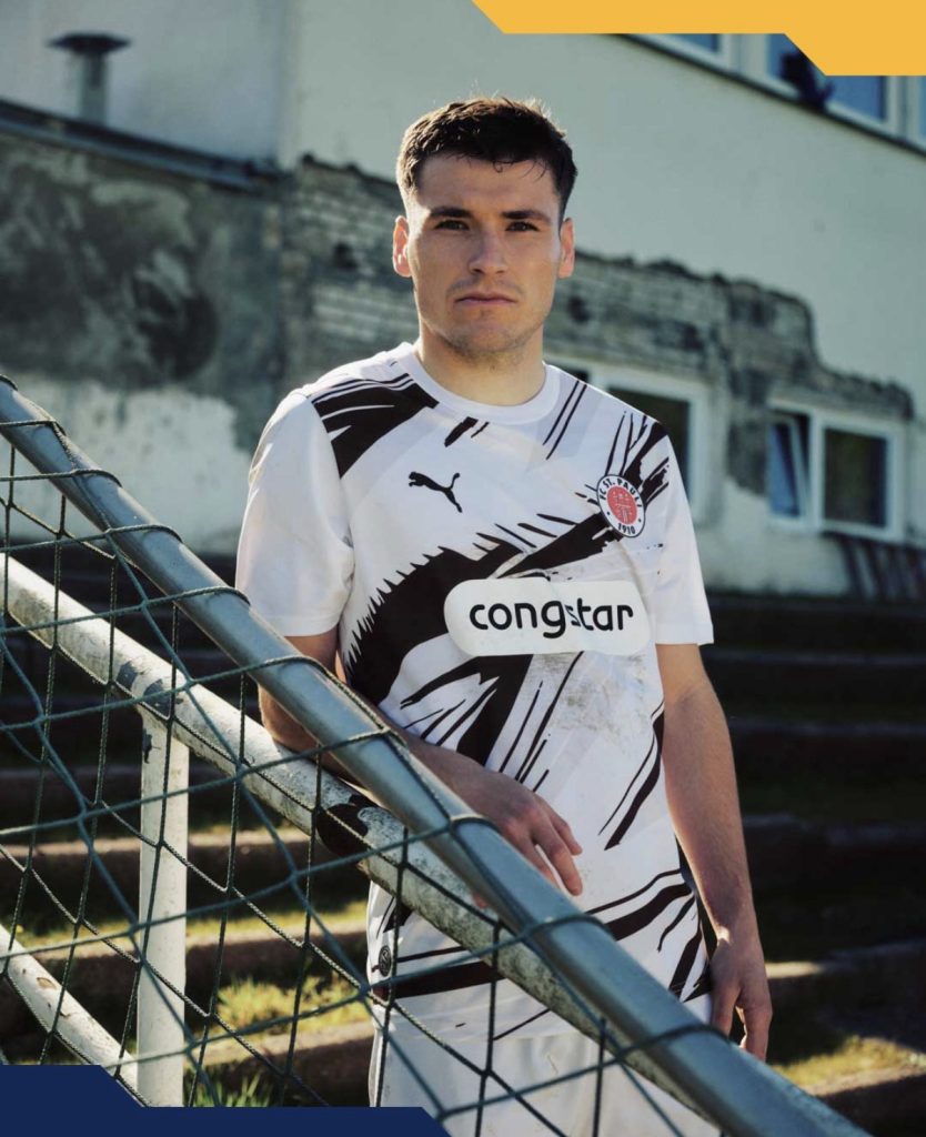
The launch photography leans into that contrast too. The home shirt is presented with a cleaner, more polished feel, while the away embraces something rougher around the edges.

The interesting question is which approach better suits St. Pauli.
Is the club best represented by the more refined home shirt, or does the bolder, more energetic away capture the spirit supporters associate with them?

Either way, the collection succeeds in feeling cohesive without being repetitive.
And that’s often harder to achieve than simply making two good shirts.
Join the conversation:
https://www.instagram.com/the.kitsman?igsh=ZWtuMDJkb2c4Ynhz&utm_source=qr
https://x.com/the_kitsman?s=21&t=YKLtf2JIakFxujMRxTUh9Q