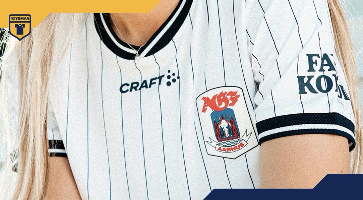
Pinstripes can be a difficult balance.
Too subtle and they disappear entirely. Too bold and they risk overwhelming everything else.
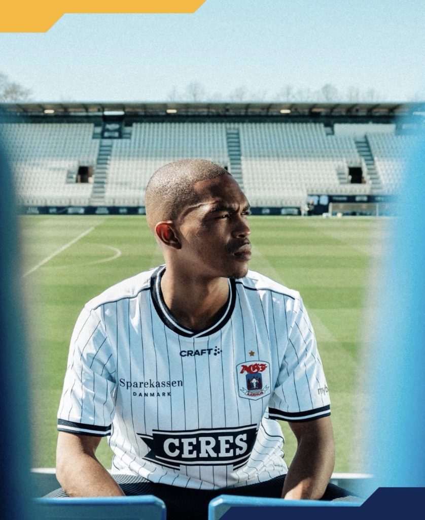
AGF Aarhus seem to have landed somewhere comfortably in the middle with their latest home shirt.
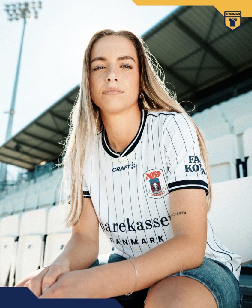
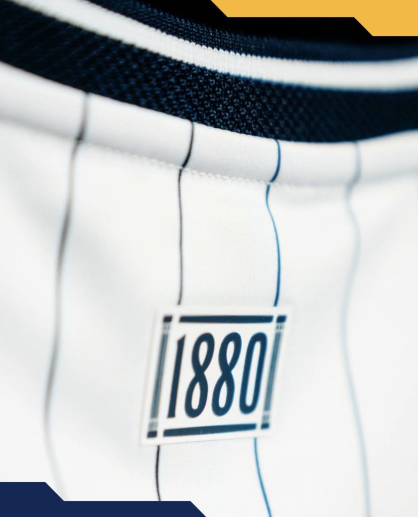
The stripes are fine enough to keep the jersey looking clean from a distance, yet prominent enough to give the shirt texture and identity once you get a little closer. It’s a simple idea, but one that doesn’t always get executed this neatly.
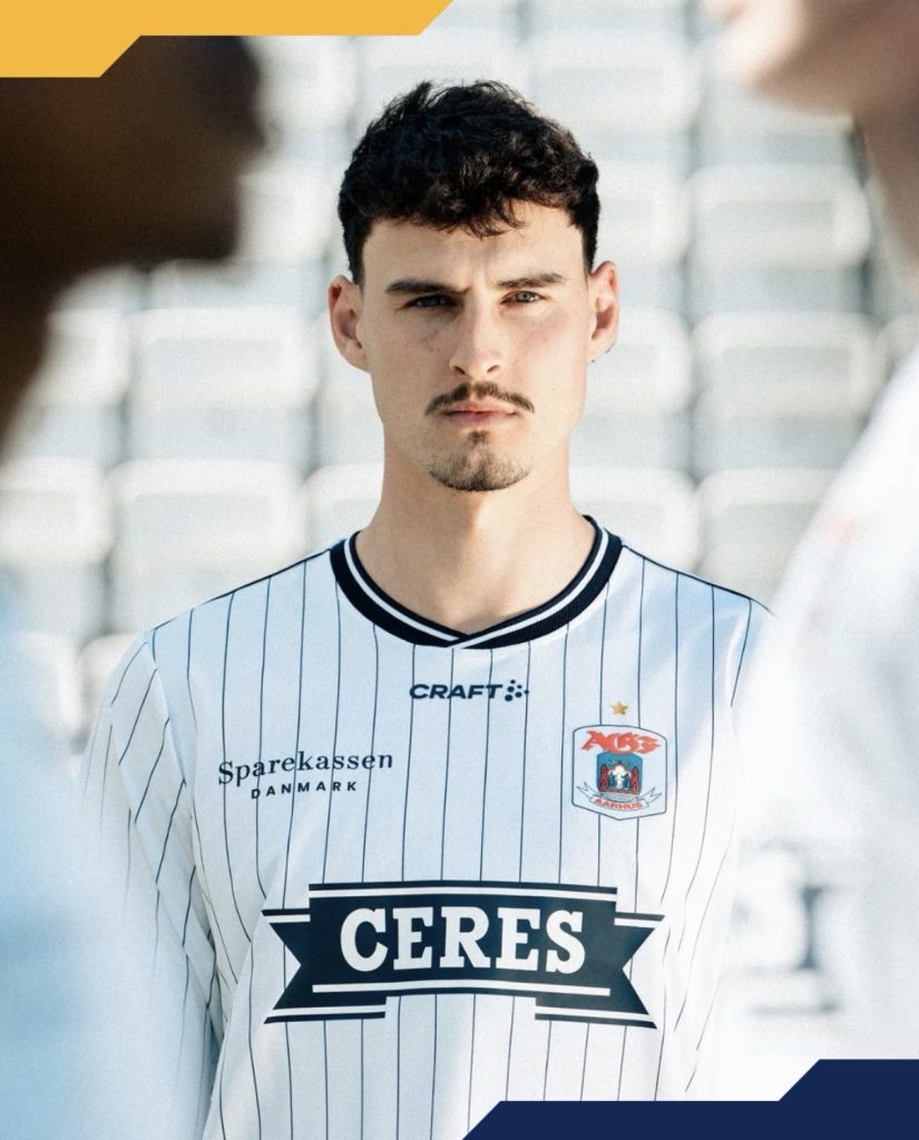
The collar and cuffs help frame everything nicely too. There’s no excessive detailing fighting for attention and that restraint allows the pinstripes to remain the focal point throughout.
One detail that might divide opinion is the placement of the Craft logo. Sitting centrally beneath the collar, it’s not the most common arrangement in modern football, but it arguably suits the symmetry of the design better than a traditional chest position would.
The overall result feels quite traditional, which raises an interesting question.
Should reigning champions be wearing something bolder?
Some supporters will appreciate the confidence of keeping things understated. Others may have hoped for a little more flair to mark their status.
Either way, AGF haven’t complicated things unnecessarily.
Sometimes a clean shirt, a good set of pinstripes and a strong identity is enough.
Join the conversation:
https://www.instagram.com/the.kitsman?igsh=ZWtuMDJkb2c4Ynhz&utm_source=qr
https://x.com/the_kitsman?s=21&t=YKLtf2JIakFxujMRxTUh9Q