Football’s love affair with the 1990s doesn’t seem to be ending anytime soon.
For their 80th anniversary, Ebbsfleet United have decided to embrace it fully, serving up a pair of kits that wear their influences proudly on their sleeves. Quite literally in some cases.
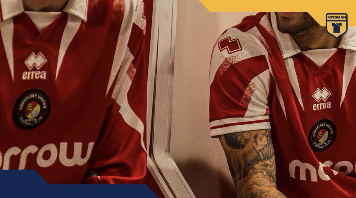
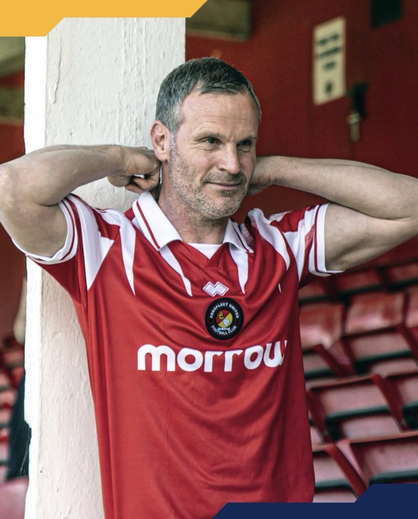
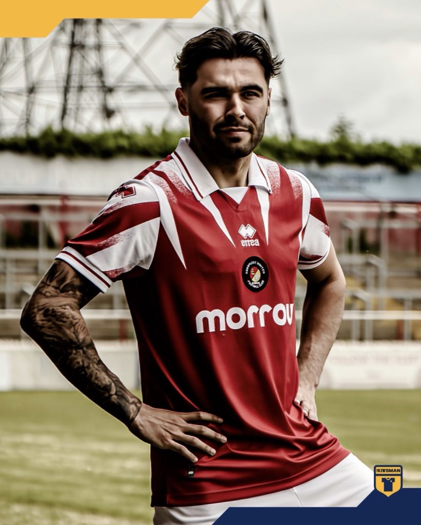
The home shirt takes its cues from a 1998 design and doesn’t exactly try to hide the inspiration. The speckled shoulder fade, oversized cuffs and prominent collar details all feel lifted from an era when football shirts weren’t afraid to be a little bolder. The centrally positioned crest helps complete the look and raises an interesting question: are we now far enough removed from the 90s for these designs to feel fresh again rather than simply nostalgic?
For many supporters, the answer is probably yes.
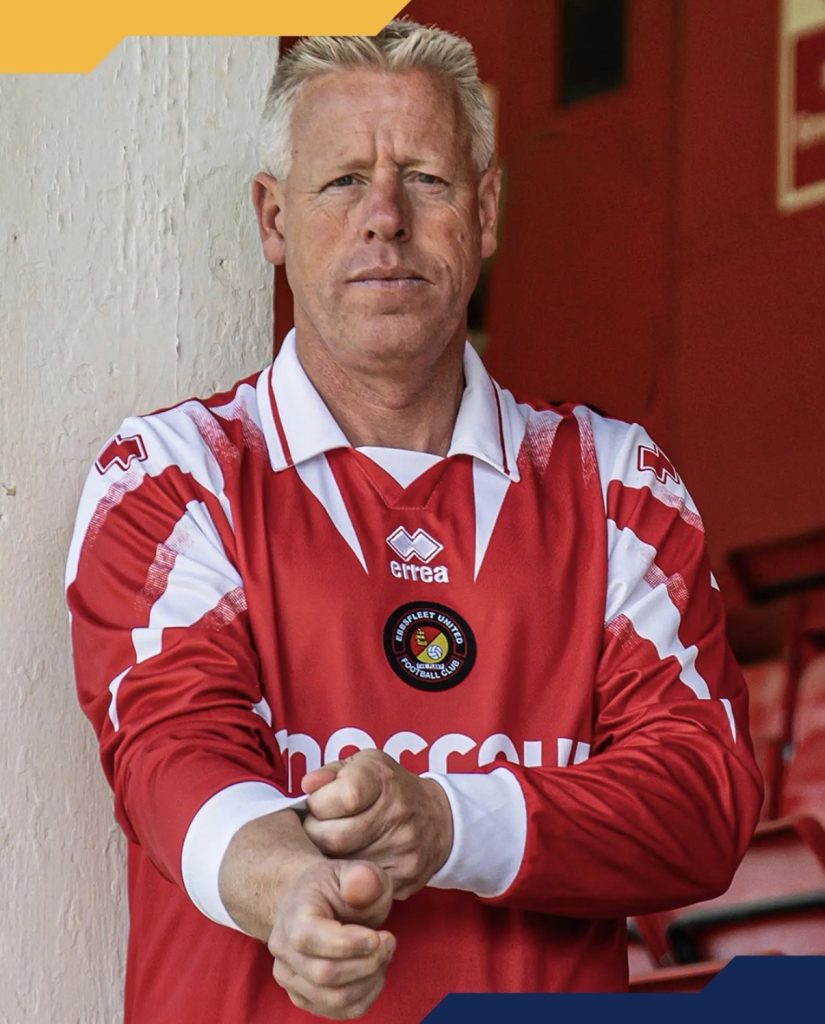
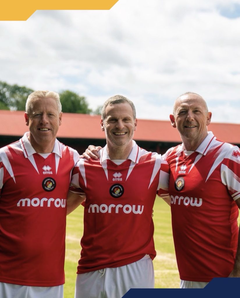
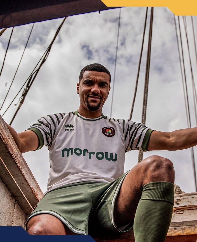
The away shirt takes a different route but still arrives at a similar destination. The sleeves do most of the heavy lifting here and arguably become the standout feature of the entire set. If you’ve only seen the short-sleeve version, the long-sleeve deserves a look too.
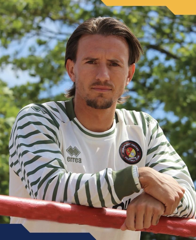
The colour choice carries some significance as well. The military green pays tribute to Gravesend United, one half of the merger that eventually formed the modern Ebbsfleet United. It’s a thoughtful nod to the club’s roots rather than simply picking an alternative colour for the sake of it.
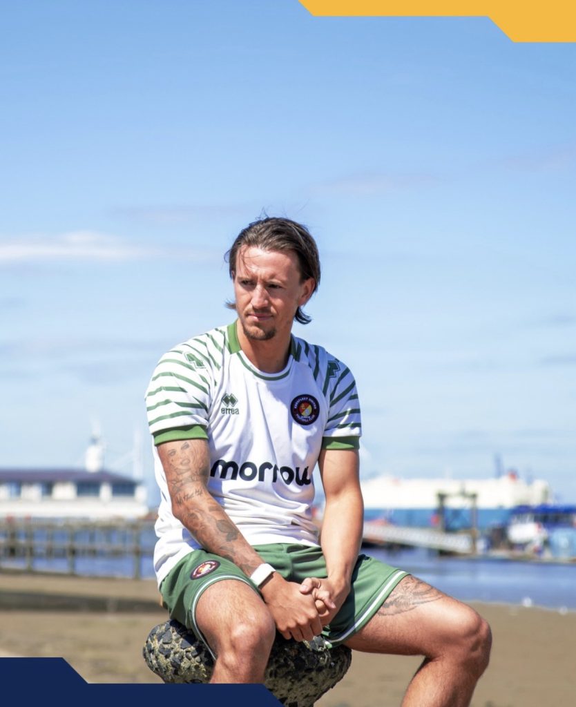
The cream base helps soften the overall look and gives the green room to stand out without overwhelming the design.
Perhaps the most interesting thing about these kits is that neither feels trapped by nostalgia. They’re clearly inspired by the past, but they don’t feel like museum pieces.
The real question is which one does the better job of celebrating 80 years?
Are you taking the full 90s throwback of the home, or the heritage-driven away?
Join the conversation:
https://x.com/the_kitsman?s=21&t=YKLtf2JIakFxujMRxTUh9Q
https://www.instagram.com/the.kitsman?igsh=ZWtuMDJkb2c4Ynhz&utm_source=qr