Anniversary kits often face the same challenge.
Do you go all-in on nostalgia, or do you create something modern with a nod to the past?
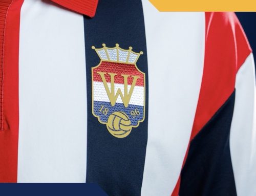
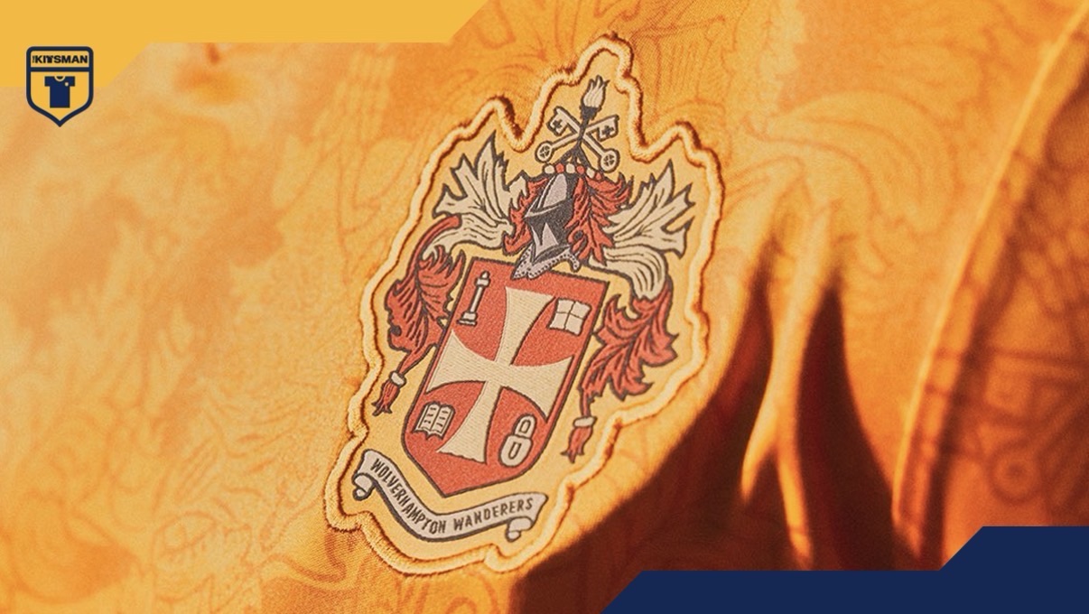
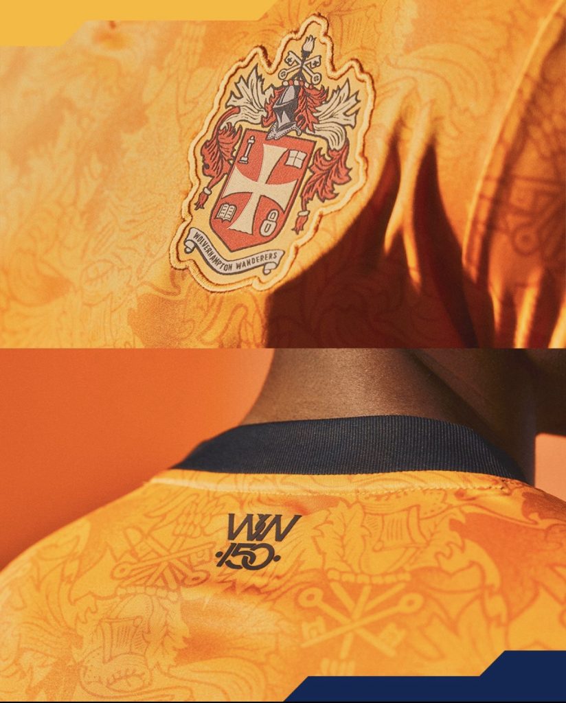
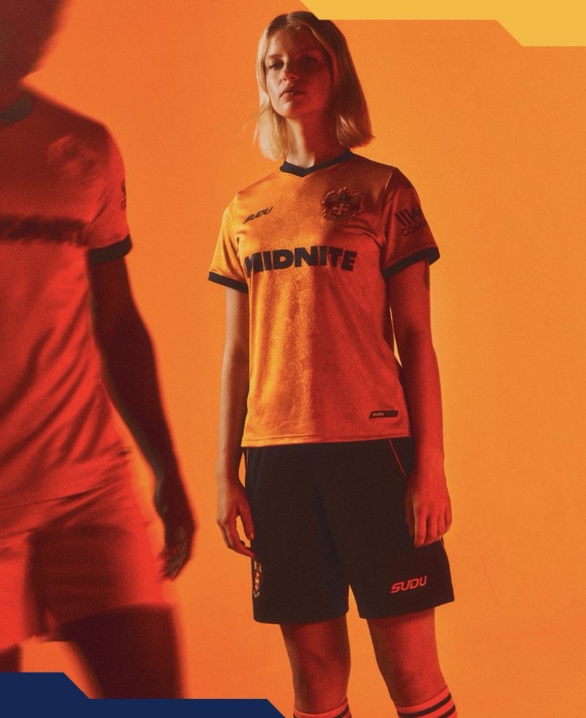
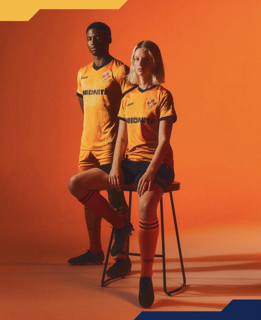
Wolves have opted for the latter and, unsurprisingly, the first thing everybody will be talking about is the crest.
The return of the historic badge is the headline act here. Ornate, detailed and packed with character, it couldn’t be further removed from the simplified marks that dominate modern football. The question is whether it’s enough to carry the entire shirt or whether the rest of the design deserves more attention than it’ll probably receive.
Because there’s quite a bit going on elsewhere.
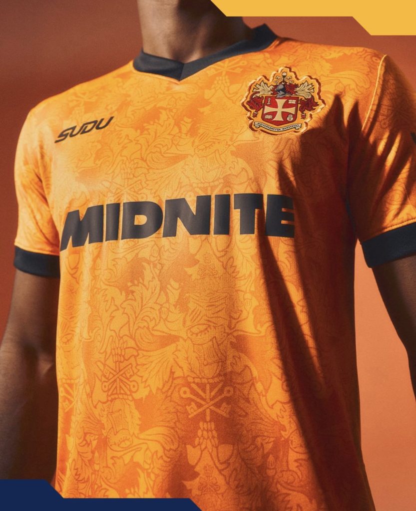
The all-over pattern pulls from elements of the city’s coat of arms and gives the shirt a texture that becomes more noticeable the longer you look at it. It’s heritage-driven without becoming a direct replica, which feels in keeping with the club’s apparent aim of celebrating 150 years while still looking forward.
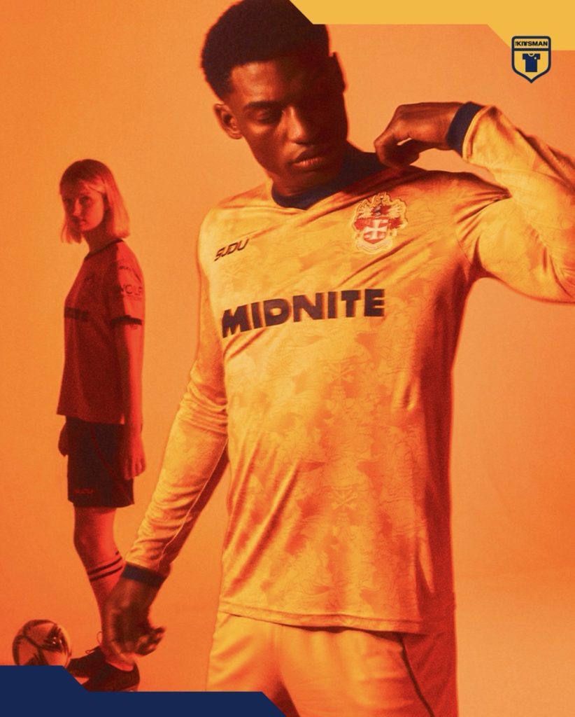
The sponsor is another interesting talking point. Most anniversary shirts would probably be improved by removing it entirely, but football rarely works that way. As sponsors go, this one at least stays relatively restrained and doesn’t completely dominate the design.
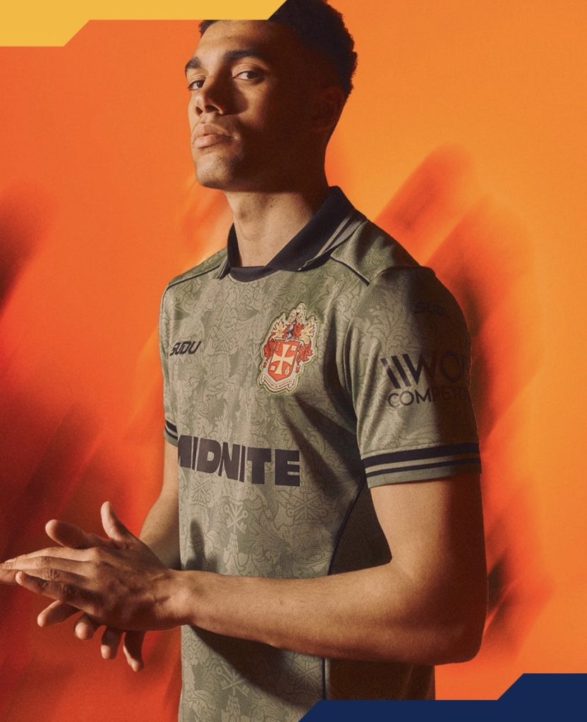
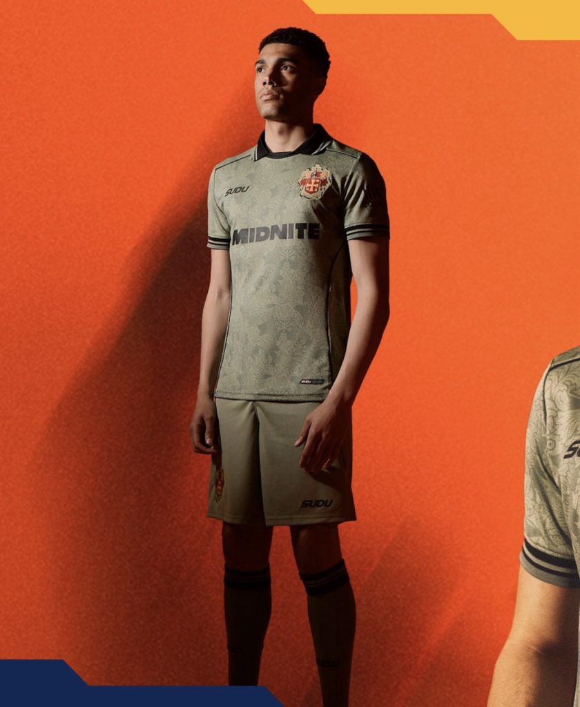
Perhaps the biggest surprise is that some supporters may end up preferring the goalkeeper version. The muted grey-khaki colourway gives the detailing a very different character and raises another question: should the collar have made its way onto the outfield shirt too?
That’s probably where opinions will split.
Some will wish Wolves had leaned even harder into the retro theme. Others will appreciate the balance between heritage and modern kit design.
Either way, anniversary shirts are supposed to spark conversation and this one should manage exactly that.
Join the conversation:
https://www.instagram.com/the.kitsman?igsh=ZWtuMDJkb2c4Ynhz&utm_source=qr
https://x.com/the_kitsman?s=21&t=YKLtf2JIakFxujMRxTUh9Q