Some inspirations are subtle. This isn’t one of them.
FC Tulsa’s latest kit celebrates the centennial of Route 66, the iconic highway that has become intertwined with the city’s identity. Often referred to as the “Capital of Route 66”, Tulsa sits at the heart of one of America’s most famous journeys, with a 28-mile stretch packed with historic landmarks, neon signs and roadside attractions.
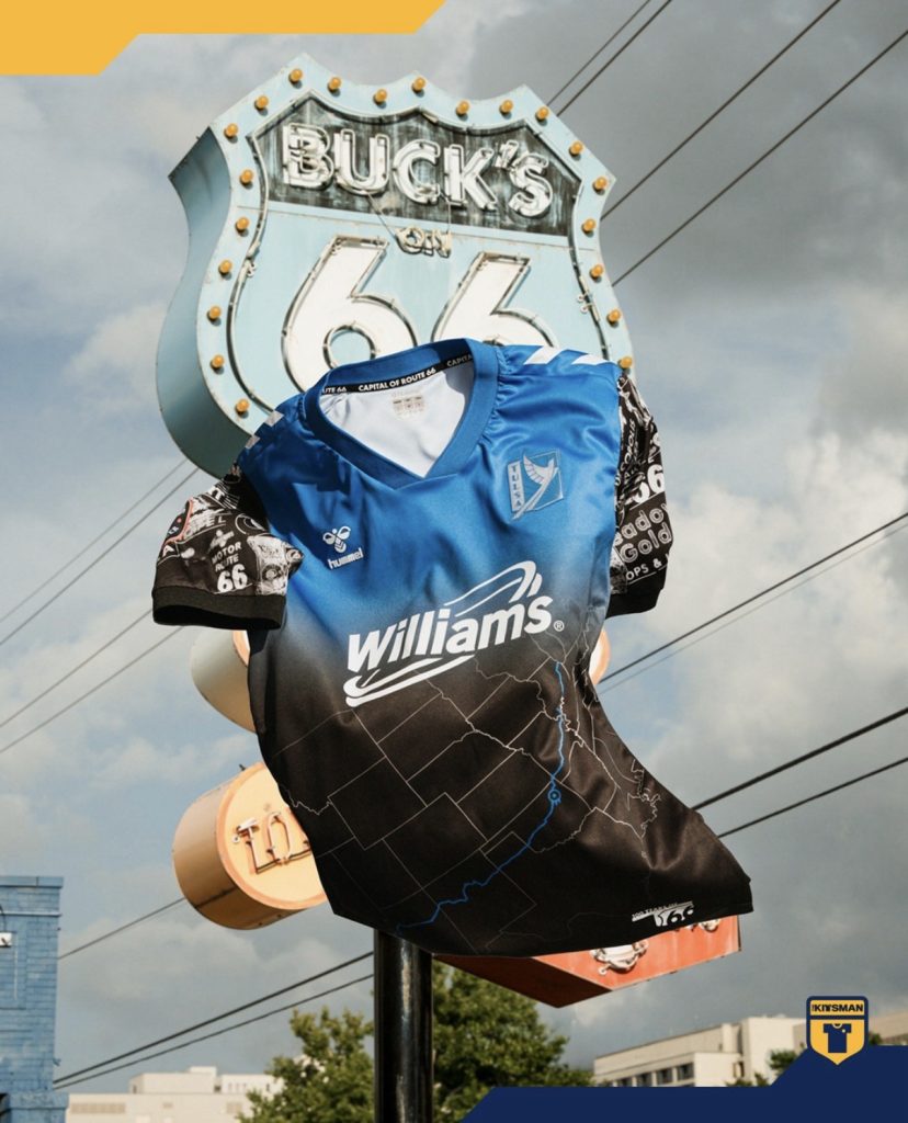
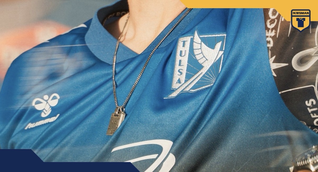
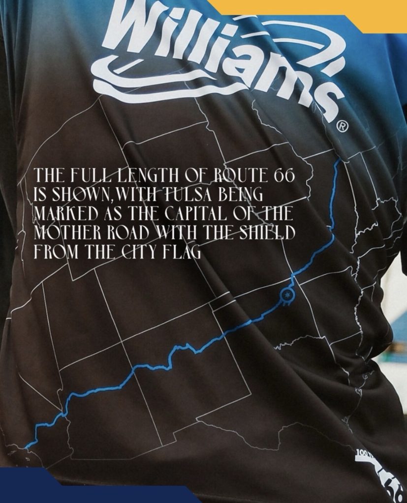
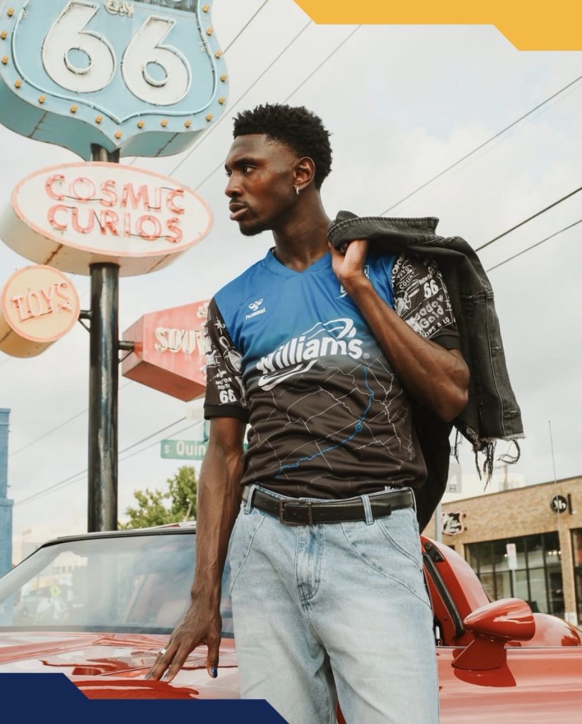
The tribute leaves little room for ambiguity. Running across the front is a map of Oklahoma, with Route 66 cutting directly through it in a vivid blue. A marker pinpoints Tulsa itself using the shield from the city flag, ensuring the inspiration remains front and centre.
The sleeves take things in a different direction. Rather than continuing the map design, they’re filled with a collage of signs, symbols and visual cues associated with the route. It’s certainly eye-catching and creates a clear contrast with the cleaner body of the shirt.
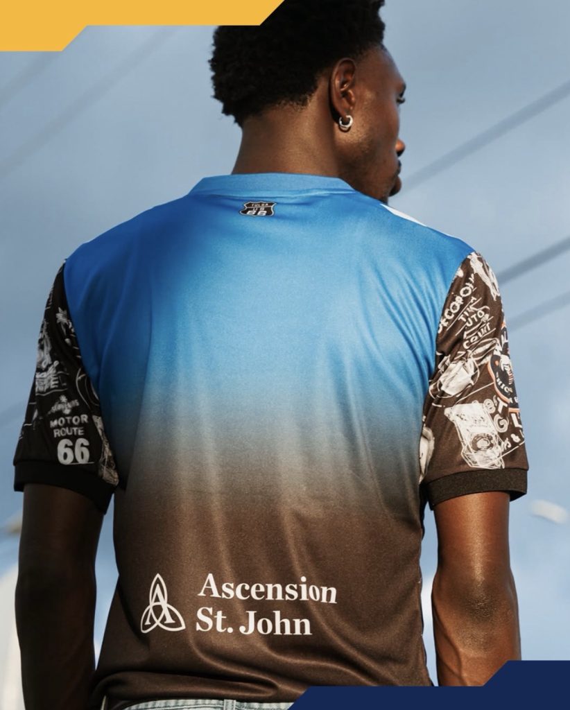
Whether that contrast works perfectly will probably come down to personal taste. Some will enjoy the busier approach and the amount of storytelling packed into the design. Others may feel the sleeves compete a little with the map graphic rather than supporting it.

The monochrome crest and sponsor treatment is a smart choice though. Had either introduced additional colours, the shirt could have become considerably more chaotic. Instead, they allow the Route 66 elements to remain the focal point.
What isn’t up for debate is the commitment to the concept. From the route itself to the roadside iconography, FC Tulsa have leaned fully into the centennial celebration.
The question is whether you’d have taken the same journey, or preferred a slightly less crowded route.
Join the conversation:
https://www.instagram.com/the.kitsman?igsh=ZWtuMDJkb2c4Ynhz&utm_source=qr
https://x.com/the_kitsman?s=21&t=YKLtf2JIakFxujMRxTUh9Q