A Toast to Port 🍇
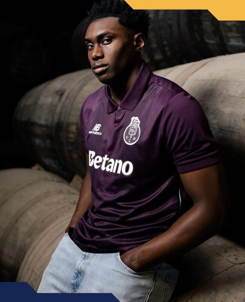
Few colours in football carry quite the same sense of richness as a deep, velvety purple.
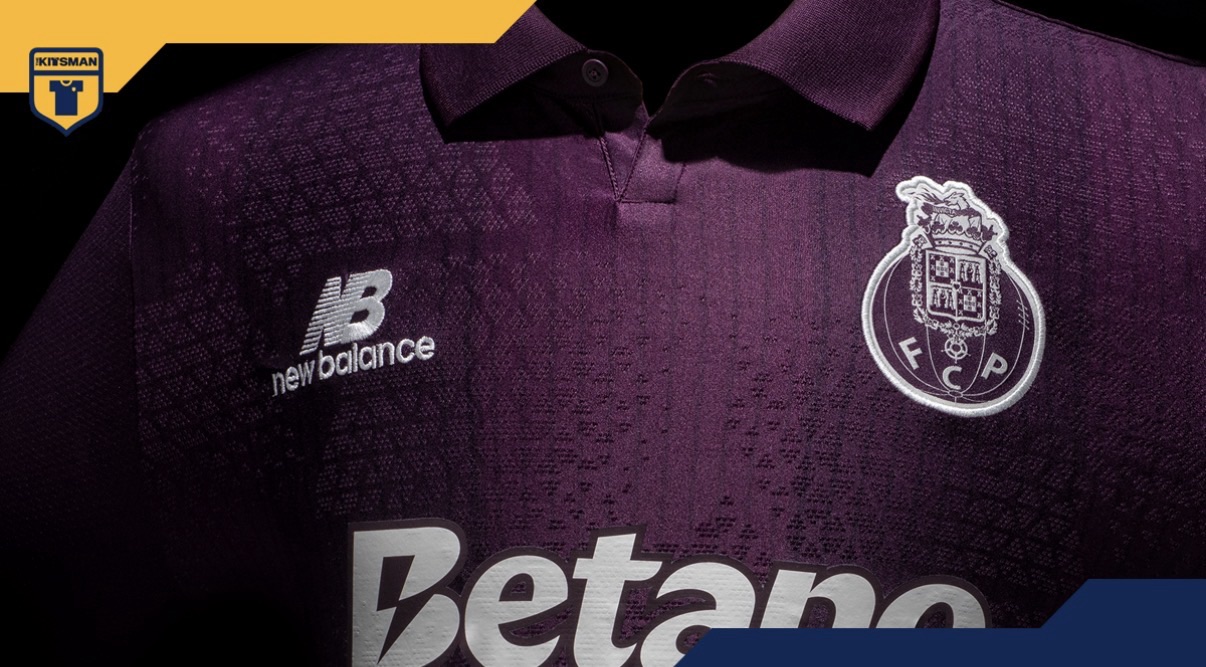
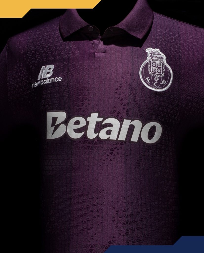
For FC Porto, it is not simply an aesthetic choice either. The club’s new away kit takes inspiration from one of the region’s most famous exports: Port wine. Produced in the Douro Valley before making its way through the city of Porto and out to the world, it has become synonymous with the area’s identity and heritage.
It is easy to see why the club chose to celebrate it.
The colour itself does much of the heavy lifting. Rich without being loud, luxurious without feeling overdone, the purple base immediately gives the shirt a distinctive character. Looking closer reveals subtle broad stripes alternating in shade across the jersey, creating depth without disrupting the clean overall appearance.
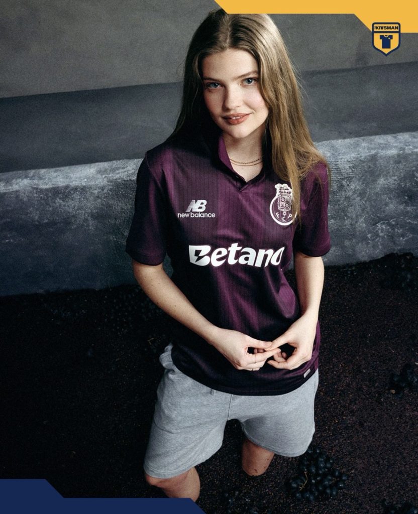
Supporting that is a finer woven pattern that moves gently throughout the fabric. It adds another layer of texture while remaining understated enough to let the colour remain the focal point.
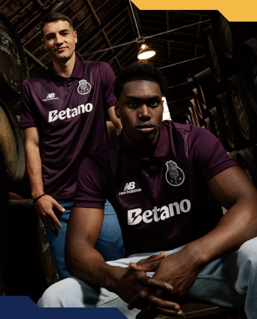
The monochrome treatment of the crest, sponsor and branding is another smart decision. A more colourful approach could easily have diluted the elegance of the concept, whereas the tonal execution helps maintain the premium feel from top to bottom.

The collar completes things nicely too. Structured, traditional and perfectly suited to a shirt that leans heavily into sophistication rather than spectacle.
Not every tribute needs dramatic graphics or elaborate storytelling. Sometimes a colour alone can carry the message.

In this case, Porto have uncorked a very good one.
Join the conversation:
https://x.com/the_kitsman?s=21&t=YKLtf2JIakFxujMRxTUh9Q
https://www.instagram.com/the.kitsman?igsh=ZWtuMDJkb2c4Ynhz&utm_source=qr