

Real Betis are a club that have become rather synonymous with nailing the retro and classic aesthetic but this time around, they’ve given it a sharper twist.

The instantly recognisable green and white stripes remain front and centre, while the Hummel collar and shoulder chevrons keep that slightly old-school feel alive. The big talking point though is the diagonal interruption running through the stripes.
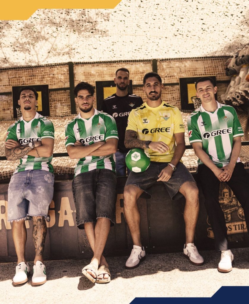
Thankfully, they’ve balanced it well. The segmented effect stops it feeling too heavy-handed or overpowering and instead gives the shirt a bit more movement without losing the identity entirely. Rather than fighting the stripes, the diagonals almost work like a transition between the green and white as they cut across the jersey.

It gives the whole thing a slightly more aggressive feel without abandoning what makes Betis look like Betis in the first place. That’s the important part. Clubs can very easily overcook a classic template trying to modernise it but this still feels rooted in identity.

There’s definitely a bit of Geylang International about it too with the fading diagonal effect and colour balance, although their sponsor integration felt cleaner in our opinion and allowed the pattern to breathe a little more naturally.
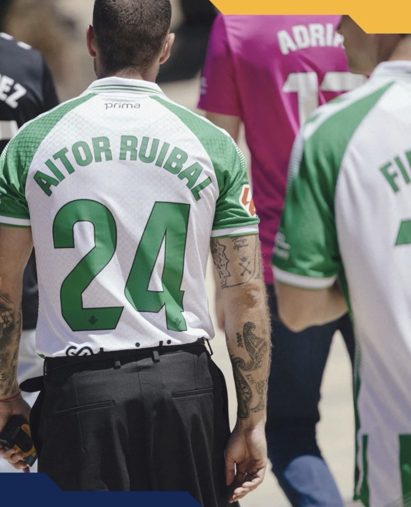
The photoshoot helps sell it too. Bright sunlight, sharp shadows and that vivid green all combine to make the shirt feel lively without needing gimmicks or excessive detailing elsewhere.

It’s familiar, slightly experimental and probably exactly the sort of modern update Betis fans will appreciate.
Join the conversation:
https://x.com/the_kitsman?s=21&t=YKLtf2JIakFxujMRxTUh9Q
https://www.instagram.com/the.kitsman?igsh=ZWtuMDJkb2c4Ynhz&utm_source=qr

[…] Real Betis 2026/27 Home Kit Brings a Bold Twist to the Classic Green and White Stripes […]