Some colour combinations do the work for you.
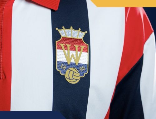
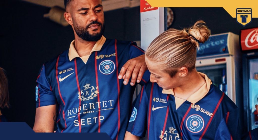
RC Pays de Grasse tap into one of them here, building their third kit around navy, red and gold. It is familiar, but when it is handled well, it rarely misses.
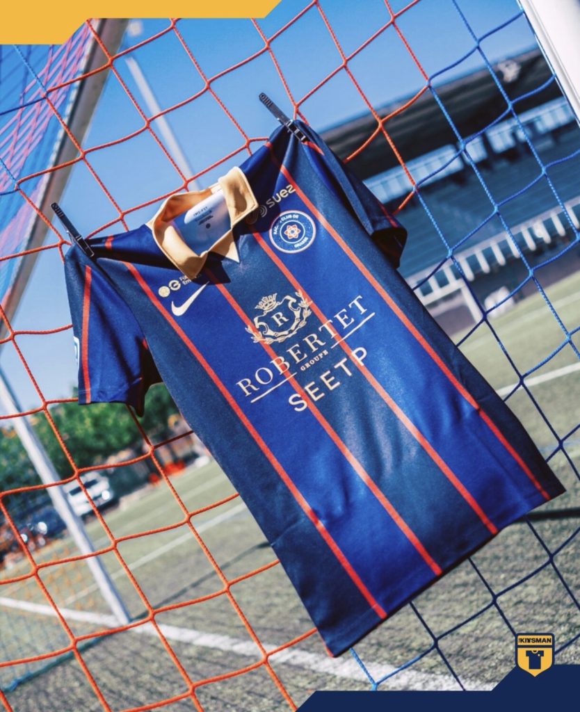
The base is not as straightforward as it first looks. Alternating stripes shift between tones of navy, with one leaning slightly brighter and giving the shirt a more refined edge. It is subtle, but it keeps the design from feeling flat. Pinstripes layered over the top add another level, bringing that traditional feel without making it heavy.
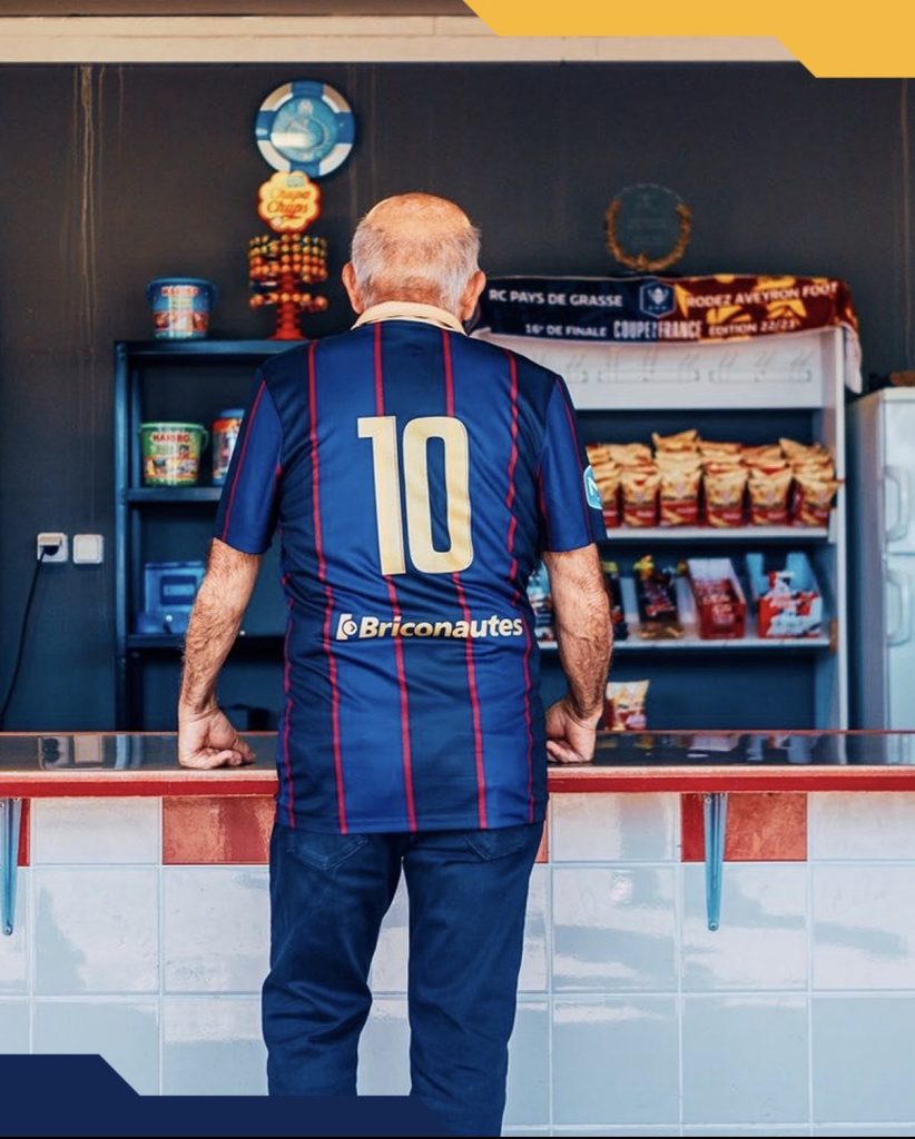
The gold elements carry the real presence.
The collar stands out immediately. Structured and bold, it sits prominently and frames the shirt in a way that feels deliberate. It is not overdesigned, just confident in its placement.
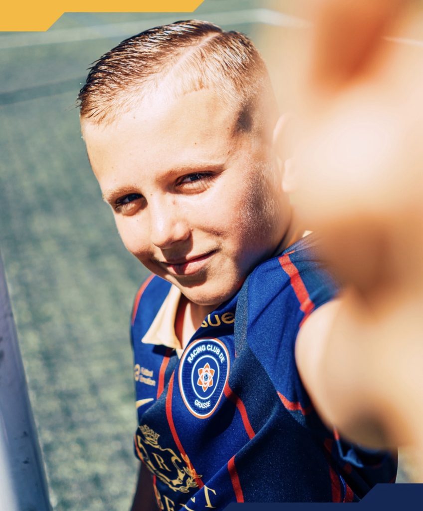
That same gold runs through the sponsor, where the detailing, including the heraldic “H”, ties neatly into the overall look. Nothing feels out of place.
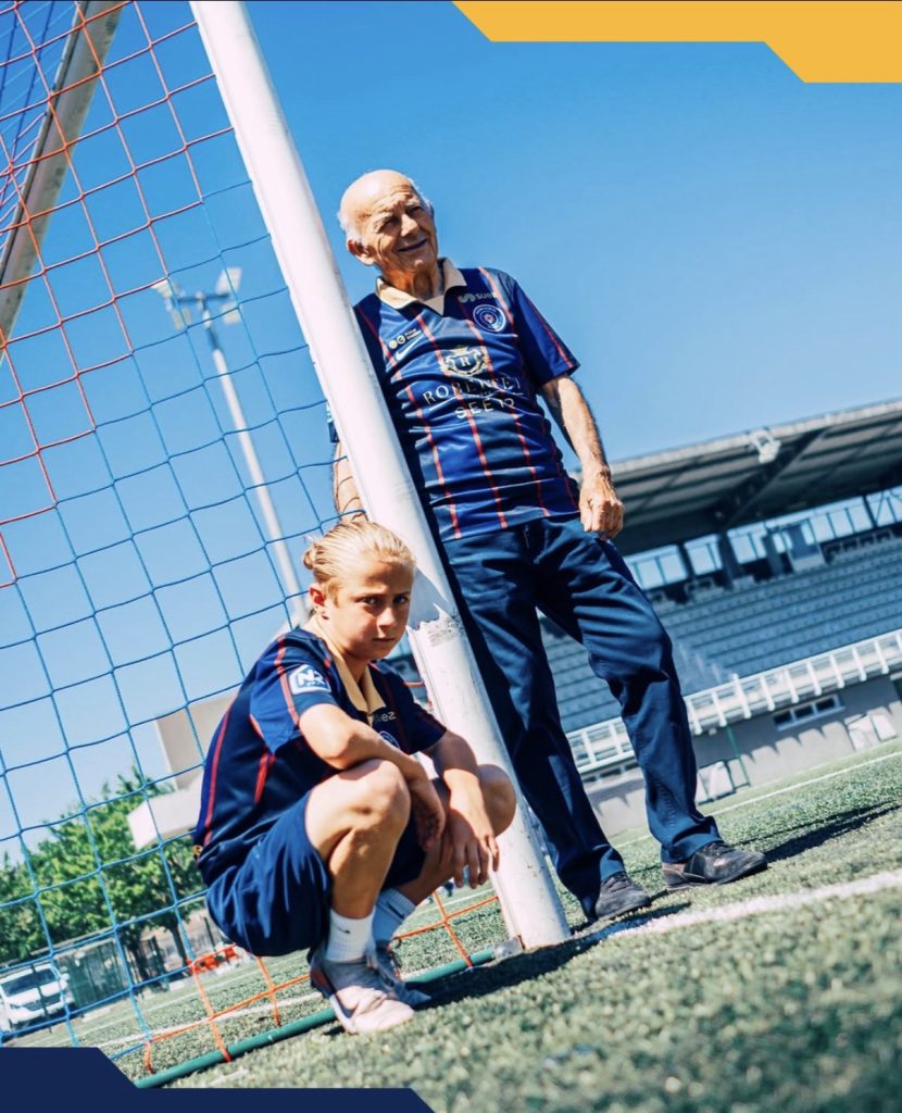
Everything here is built around balance.
The colours, the striping, and the detailing all work within the same idea rather than competing for attention. The result is straightforward, but effective.
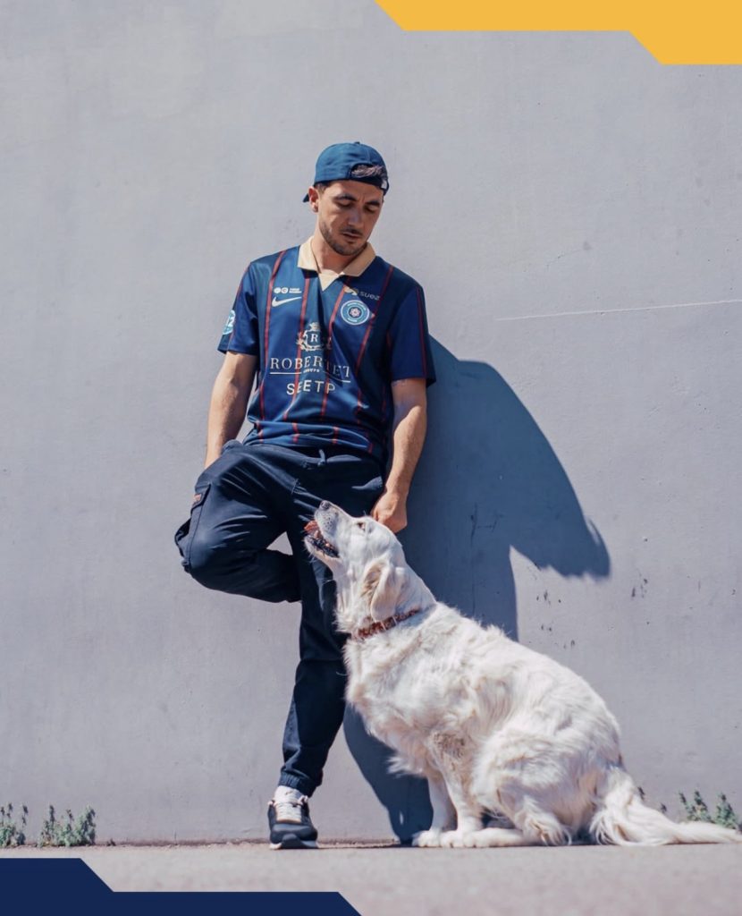
A combination that continues to deliver.
Join the conversation:
https://www.instagram.com/the.kitsman?igsh=ZWtuMDJkb2c4Ynhz&utm_source=qr
https://x.com/the_kitsman?s=21&t=YKLtf2JIakFxujMRxTUh9Q