There is something about that Reebok badge. It instantly pulls you back.
Panama have leaned fully into that feeling for 2026, delivering a set of kits that feel straight out of another era without looking dated. This is not just nostalgia for the sake of it. It is controlled, considered, and executed with purpose.
Three shirts. Three different identities. One clear direction.
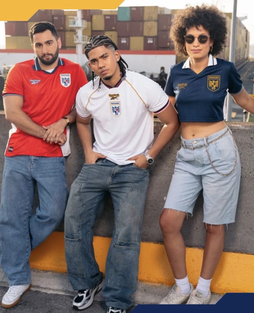
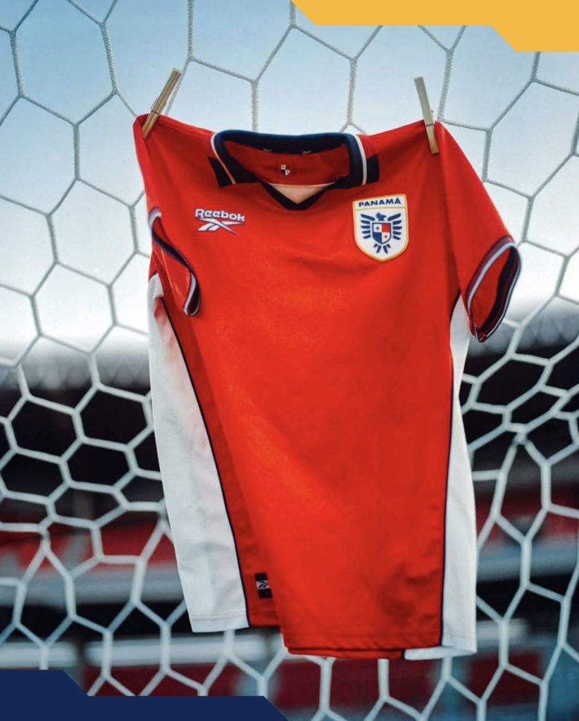
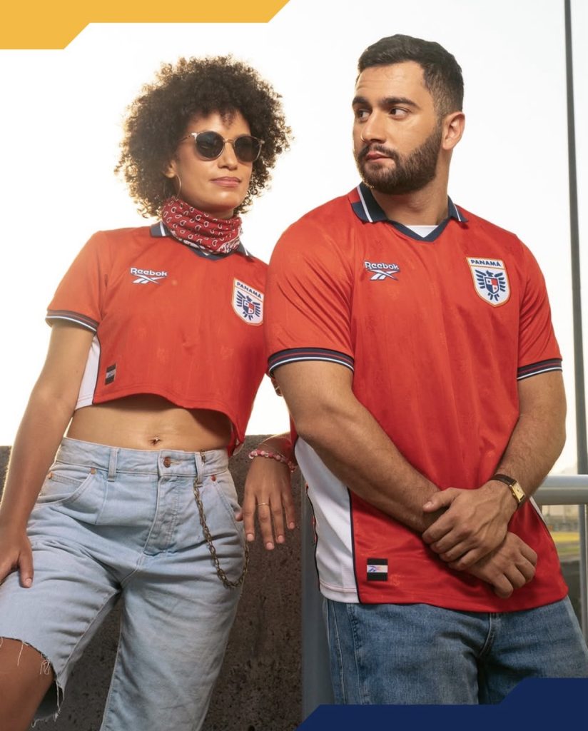
The red is the most direct of the three. Bold, confident, and stripped back. Nothing unnecessary gets in the way. An embossed Harpy Eagle pattern sits beneath the surface, adding texture without distracting from the overall look. White side panels and subtle cuff detailing bring that classic Reebok balance that makes everything feel complete.
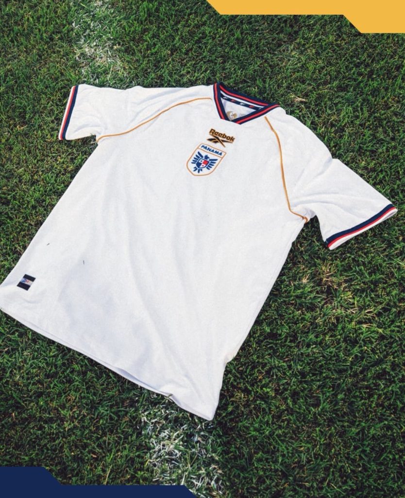
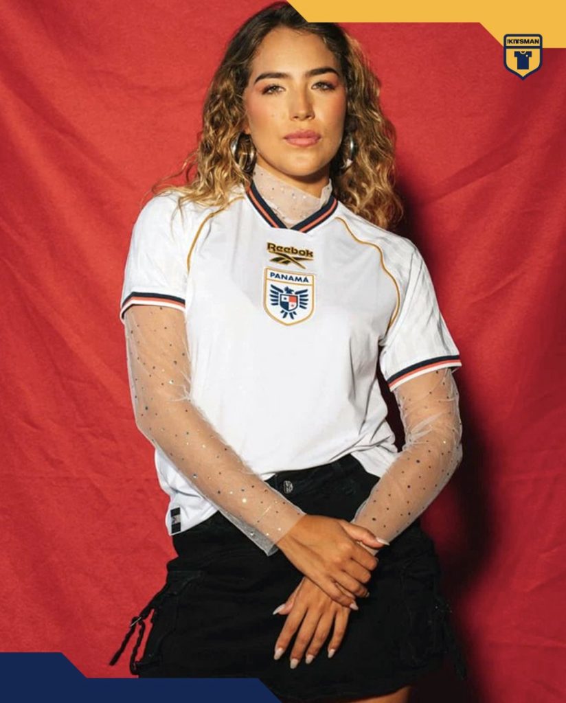
The white takes a different approach and arguably carries the most personality. The centralised badge placement draws immediate attention, sitting neatly beneath the collar and guiding the eye down the shirt. Gold detailing lifts it further, adding a refined edge that gives it real presence. This is the one that asks you to look twice.
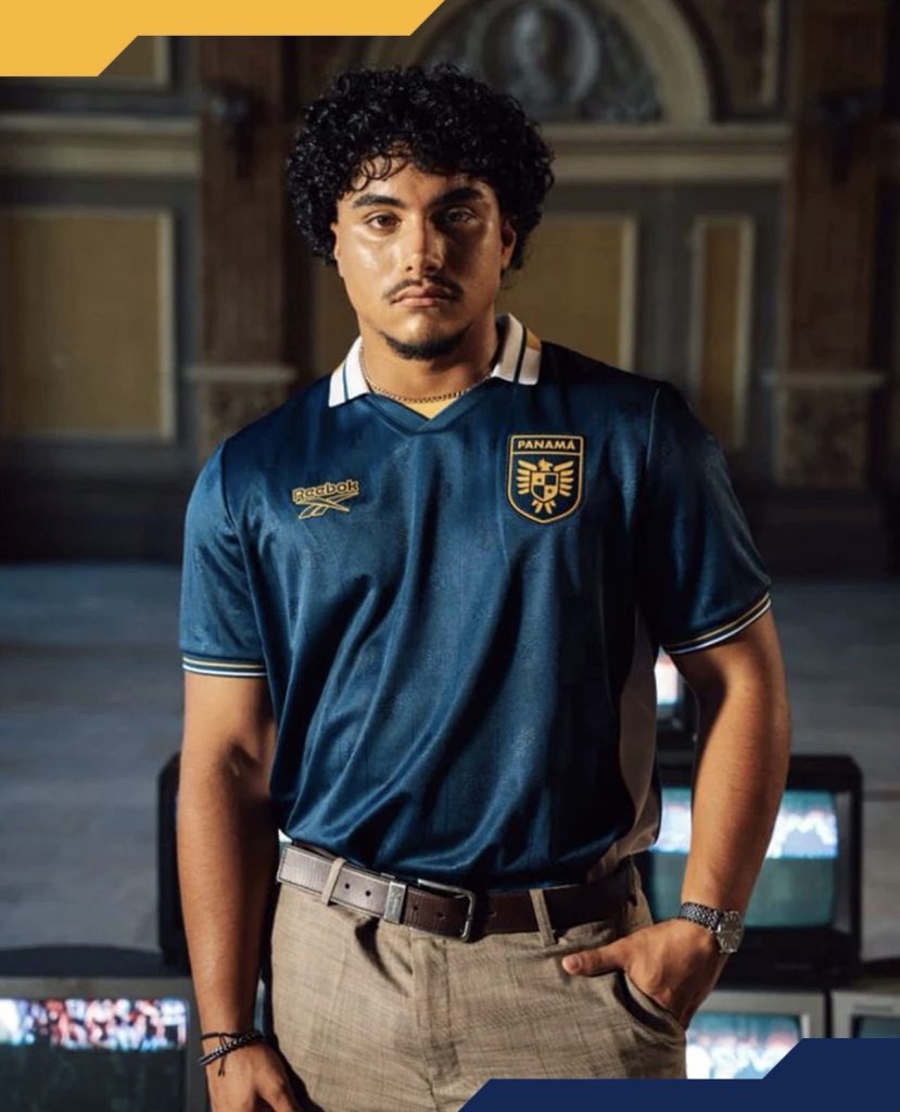
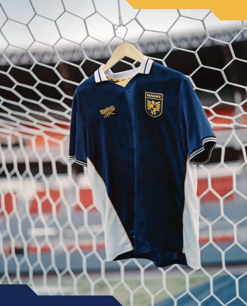
Then there is the blue. Deeper, richer, and more understated. It leans into a more premium feel with heavier gold accents and subtle white touches. The repeated embossed crest pattern runs throughout, giving it texture and depth without overcomplicating things. It feels composed and deliberate.
Here is where it comes together.
This is not just three kits thrown into a set. Each one explores a slightly different tone while staying tied to the same identity. The collars vary, the finishes shift, but the overall feel remains consistent. That is where the strength lies.
The question is not whether they work. It is which one stands above the rest? For me, it’s the blue but the answer might not be as obvious as it first seems.
Join the conversation:
https://www.instagram.com/the.kitsman?igsh=ZWtuMDJkb2c4Ynhz&utm_source=qr
https://x.com/the_kitsman?s=21&t=YKLtf2JIakFxujMRxTUh9Q