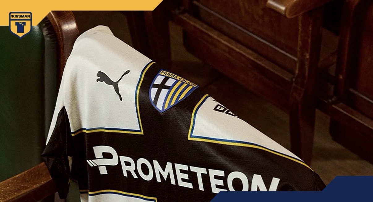
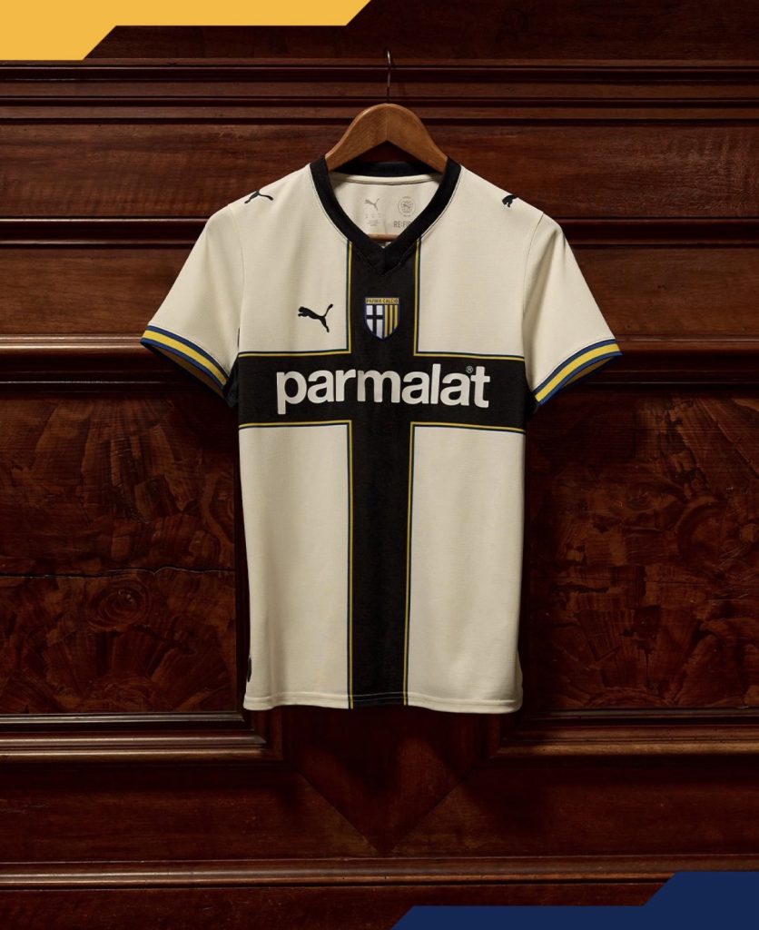
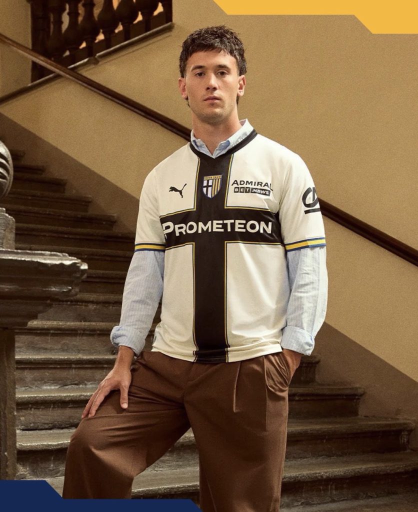
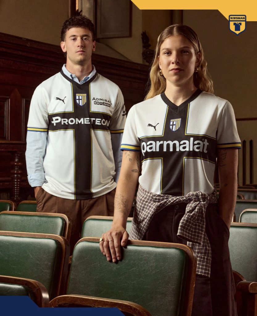
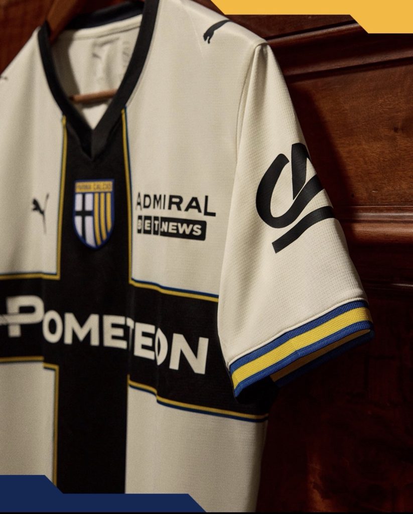
The black cross on a white shirt remains one of football’s most recognisable looks and one that very few clubs can claim as their own. You don’t need a badge to know what you’re looking at from a distance.
Which raises an interesting question every summer: how much should Parma actually change?
This season’s answer is “not much” — and that’s probably the right call.
The most noticeable adjustment comes through the yellow and blue trim that now frames the famous cross. It’s a relatively small addition, but enough to freshen the design without interfering with the feature everybody is here for in the first place.
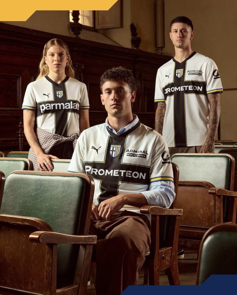
The crest moving centrally is another talking point. Some will appreciate the cleaner symmetry it creates, while others may prefer the more traditional positioning. Either way, it shifts the balance of the shirt more than you’d initially think.
Then there’s the sponsor situation.
Are we really seeing hints of a Parmalat-style return? The resemblance is difficult to ignore and it adds another layer of nostalgia to a shirt already built on one of football’s most enduring identities.
Perhaps that’s the challenge with reviewing Parma kits.
Are you judging the shirt itself, or are you responding to decades of history attached to it?
Either way, the formula remains largely unchanged.
Would supporters actually want it any other way?
Join the conversation:
https://x.com/the_kitsman?s=21&t=YKLtf2JIakFxujMRxTUh9Q
https://www.instagram.com/the.kitsman?igsh=ZWtuMDJkb2c4Ynhz&utm_source=qr