Freshest of Resets
Vermont Green’s rise has been steady, ambitious and increasingly difficult to ignore. USL League Two champions on the men’s side, a women’s team now entering the picture and a club identity that continues to grow well beyond the pitch.
Their kits have often leaned into creativity along the way too, but this latest release takes a different route. Instead of pushing louder concepts, Vermont Green have stripped things back and focused on something cleaner, calmer and far more understated.
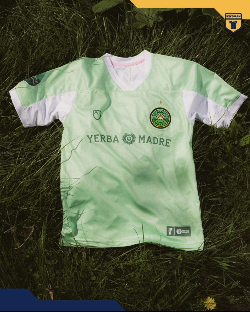
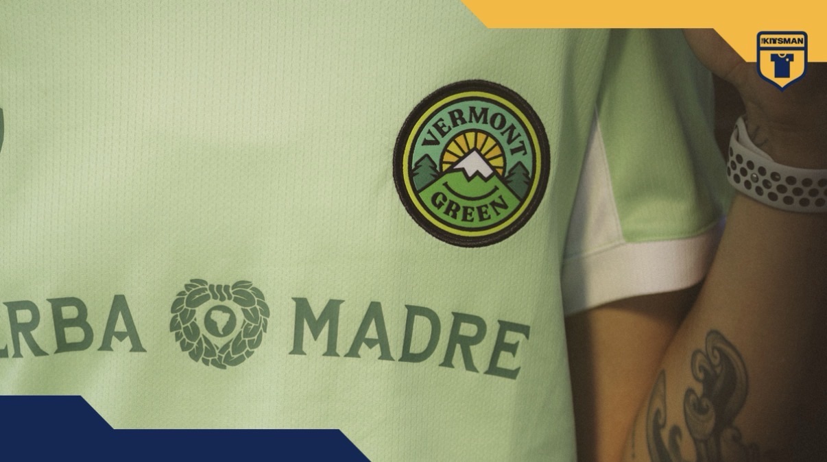
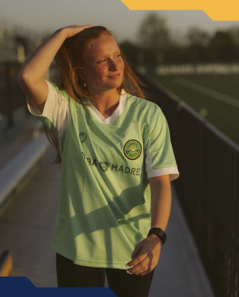
The mint green base immediately gives the shirt its character. Soft without feeling weak, it pairs naturally with the darker green detailing running through the trim and supporting elements. White side panels break things up at exactly the right moments too, stopping the palette from becoming too flat while keeping the overall feel light and balanced.
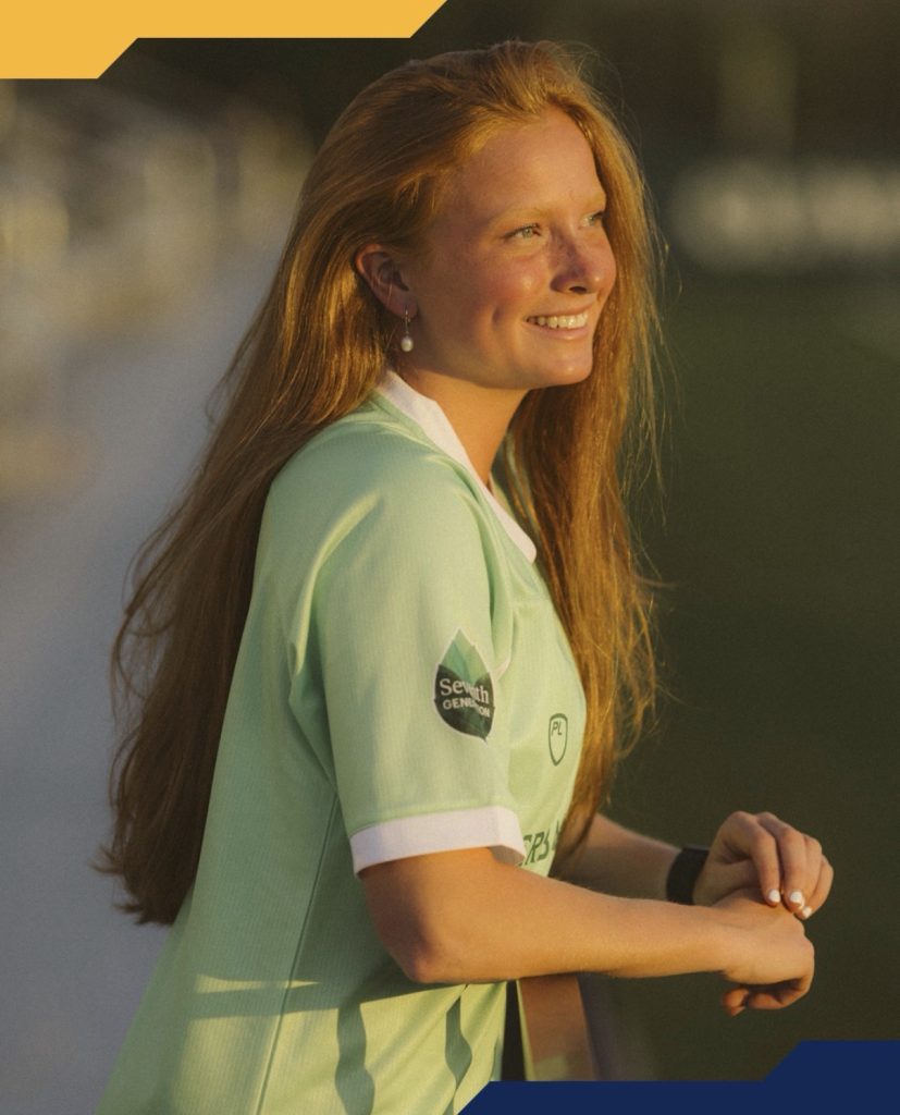
There is a smoothness to the whole presentation that suits the direction the club seems to be heading in. Even the launch photography leans into that same atmosphere, airy and natural rather than overproduced.

The championship star sitting above the crest on the men’s version quietly ties recent success into the design as well. It does not dominate the shirt, but it catches the eye at the right moment.
This feels less like a statement piece and more like a club settling confidently into its identity. Cleaner, calmer and still instantly recognisable as Vermont Green.
Join the conversation:
https://x.com/the_kitsman?s=21&t=YKLtf2JIakFxujMRxTUh9Q
https://www.instagram.com/the.kitsman?igsh=ZWtuMDJkb2c4Ynhz&utm_source=qr