Cup Final Ready 🏆
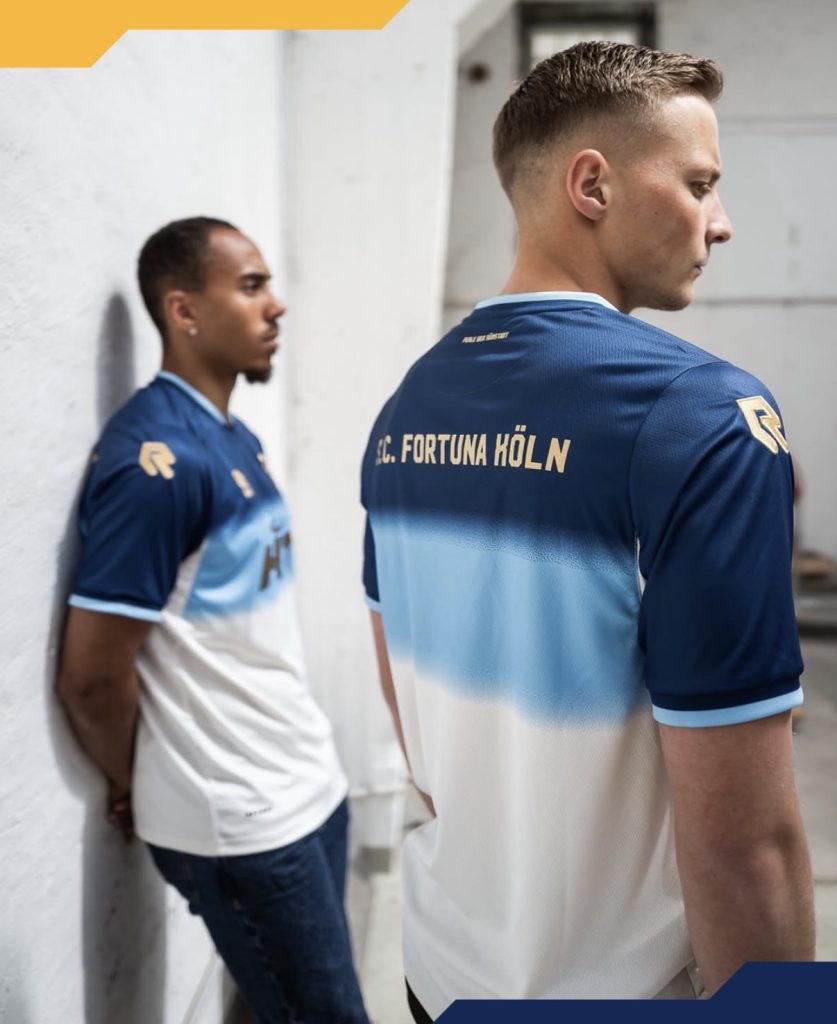
Fortuna Köln have stepped away from their usual red for the Mittelrheinpokal final, opting instead for a blue and gold combination that immediately gives the occasion a different feel.
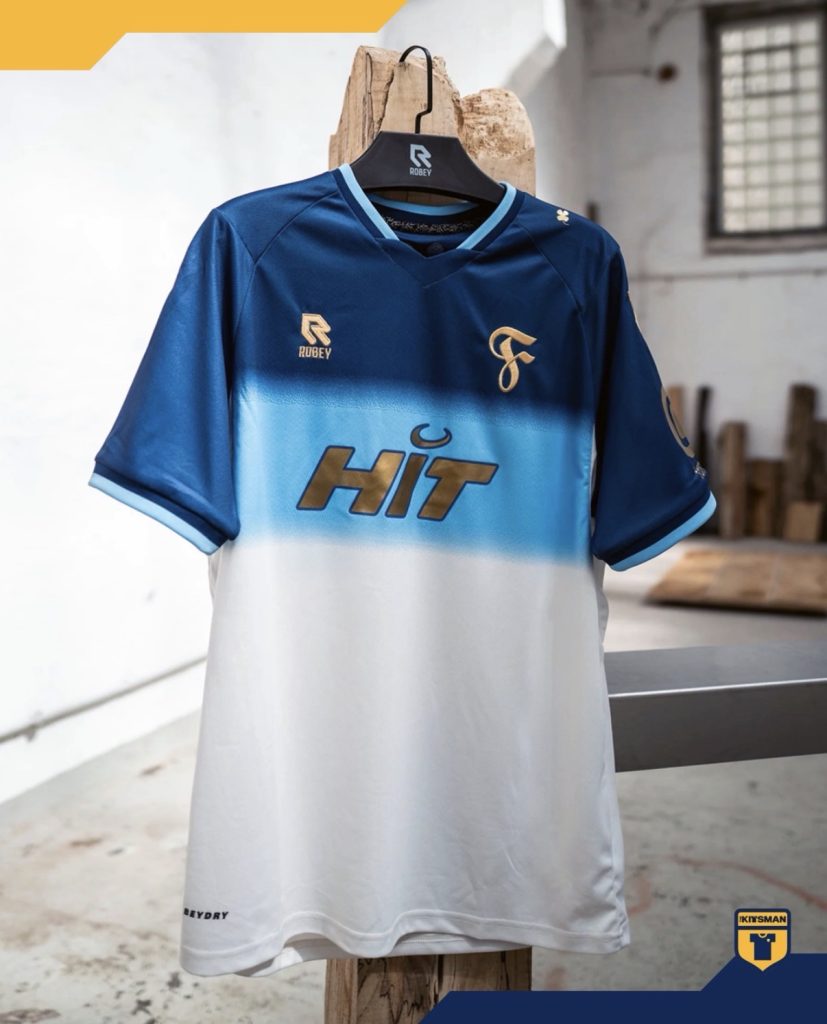
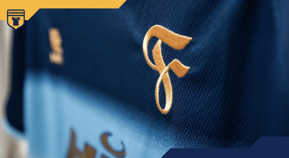
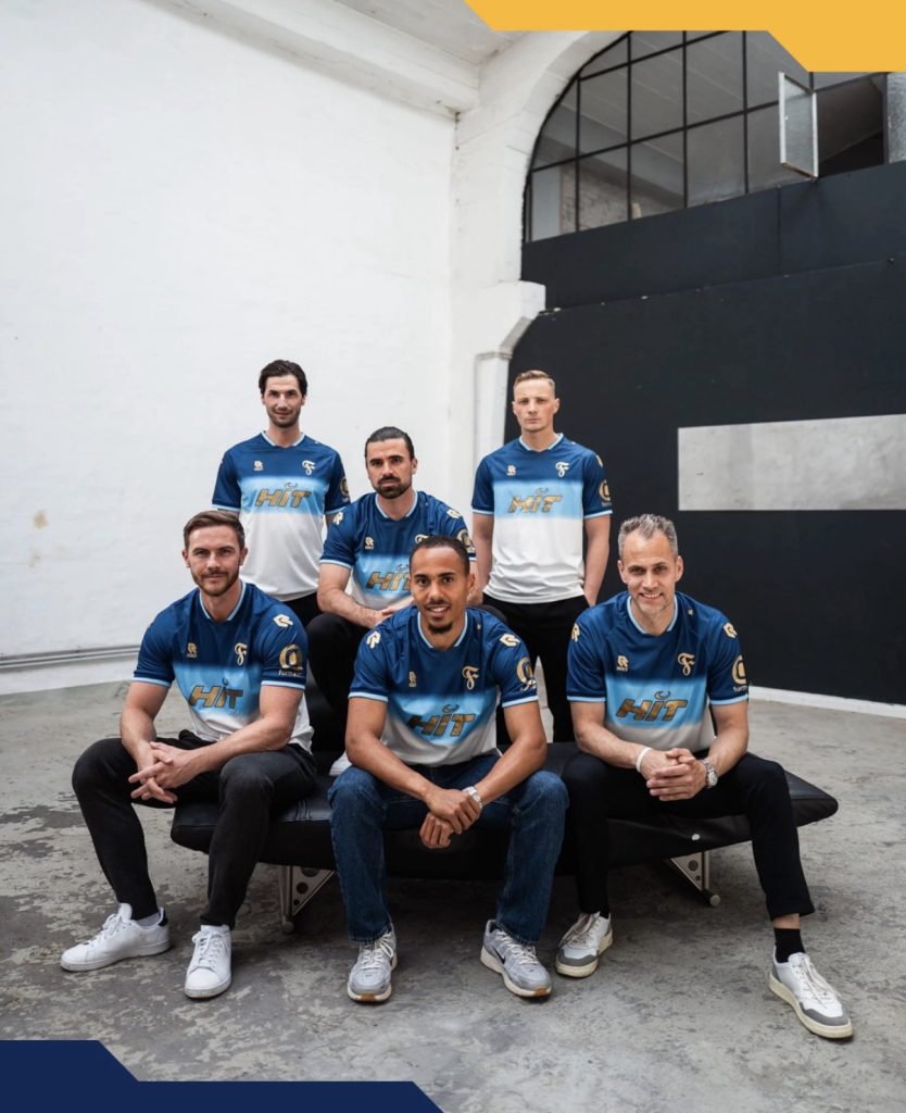
The centrepiece is impossible to miss. A large golden “F” dominates the front of the shirt, standing out sharply against the darker base and giving the release a clear focal point from distance. It is bold without feeling excessive, helped by the rest of the design staying relatively controlled around it.
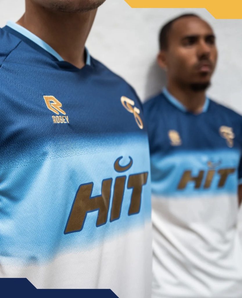
The blue base itself carries more detail the closer you look. Thin bar structures run throughout the fabric, while speckled fading between the tones gives the shirt texture and movement without overwhelming the overall look. The gold detailing layered across it all keeps the palette tight and consistent from top to bottom.
The sponsor deserves credit too. Matching the gold treatment instead of introducing another colour makes a huge difference here and allows the entire kit to feel properly unified rather than interrupted halfway through.
This is clearly designed around the occasion itself. Different colours, a stronger sense of event and enough visual weight to feel worthy of a cup final appearance after a long wait.
Join the conversation:
https://www.instagram.com/the.kitsman?igsh=ZWtuMDJkb2c4Ynhz&utm_source=qr
https://x.com/the_kitsman?s=21&t=YKLtf2JIakFxujMRxTUh9Q