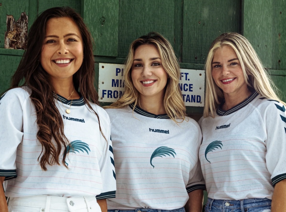
Seacoast Sensations 🌴
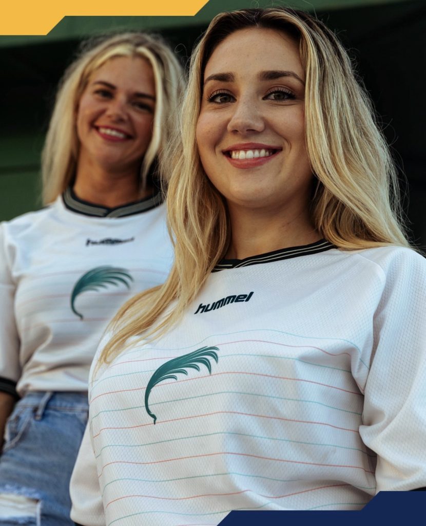
Presenting the Seacoast Athletic, the Sarasota Paradise 2026 secondary jersey—a design inspired by the bright, warm sands of the Gulf Coast. Debuting in a fresh “Coastal Cream” base, the kit features alternating throwback-style pinstripe hoops in Sabal and Sunset, echoing the club’s primary look. At the centre sits a wind-swept palmetto frond crest, while Grove dusk-green chevrons on the shoulders and pinstriped collar and cuffs round off a refined, classic aesthetic. Finished with updated Sarasota Paradise script detailing, it’s a modern take on traditional athletic style.
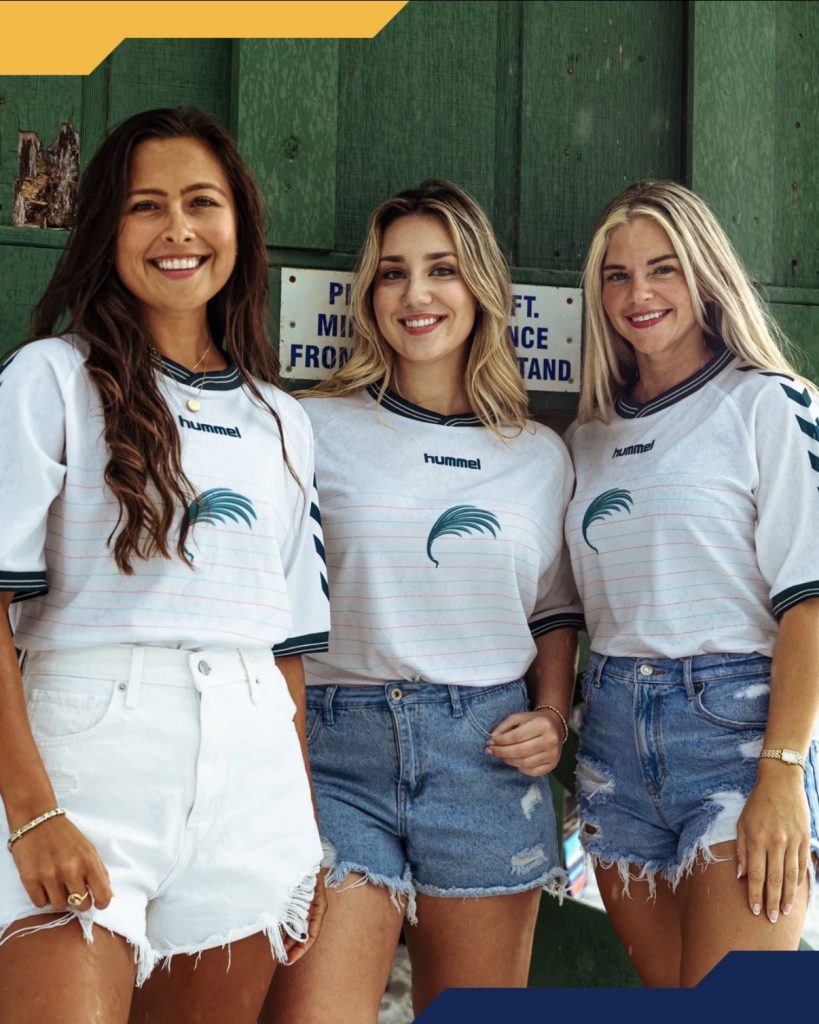
There’s something instantly calming about this one. You can almost feel the warm sand underfoot, the soft coastal breeze rolling in, and that easy rhythm of life along the Gulf Coast—where Sarasota Paradise take inspiration for a secondary kit that feels equal parts vintage throwback and modern refresh. A proper homage to home… to Paradise itself.
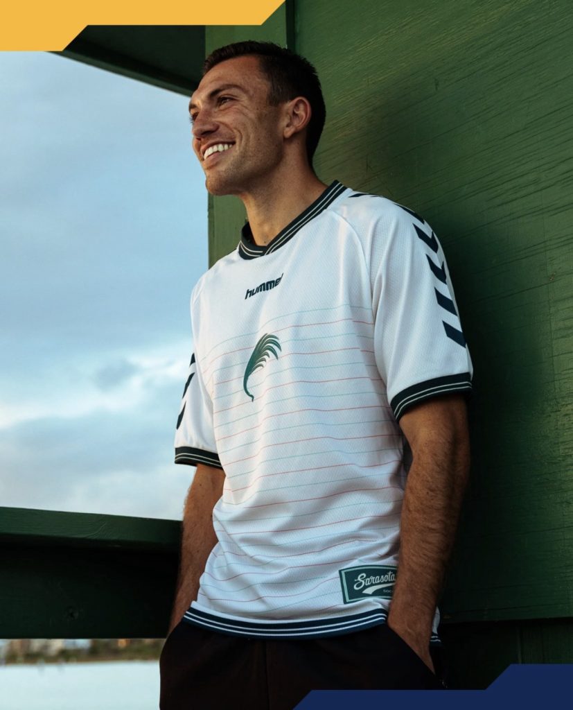
Front and centre, the identity is stripped right back in the best way possible. The club’s palm emblem takes pride of place on this Seacoast Athletic design, standing alone like a statement of intent. It’s a frond from the Sabal Palmetto—an iconic symbol of Florida’s coastline and the state tree itself—and it couldn’t be more fitting here. Bold, simple, and instantly recognisable, it draws the eye straight away against the clean sandy-white base. Sarasota aren’t afraid to break their identity down into its core elements, and in doing so, they let each piece tell its own story better than most.
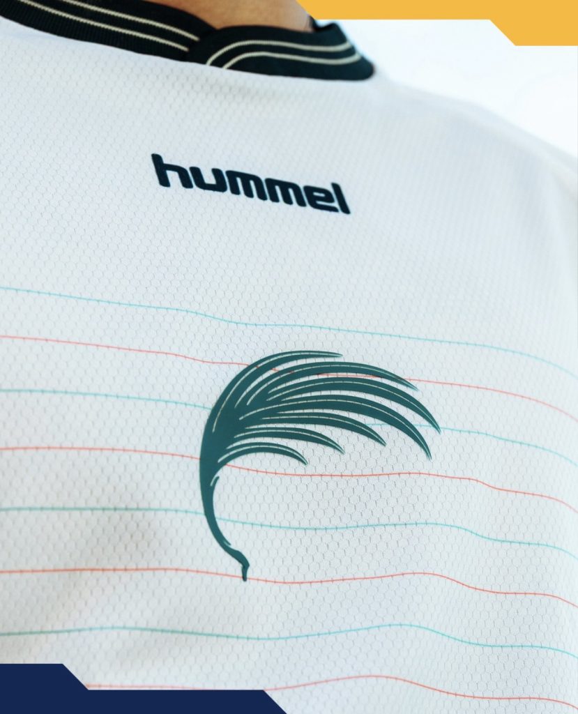
Underneath, there’s a subtle layer of fine pinstripes, alternating in the club’s colours. It’s a clever touch that brings balance to the design—adding just enough texture to keep things interesting without losing that airy, summer-ready feel. It leans into that “Paradise” aesthetic while also pulling in a gentle vintage influence, something both the club and Hummel have been leaning into more and more.
That nostalgic edge continues through the wordmark too, styled in a classic, throwback direction that ties everything together nicely.

We’re really into the simplicity here—the relaxed feel, the soft detailing, and the way those coloured bands quietly lift the whole look. But above all else, it’s that palm emblem that defines it. That’s the heart of it.