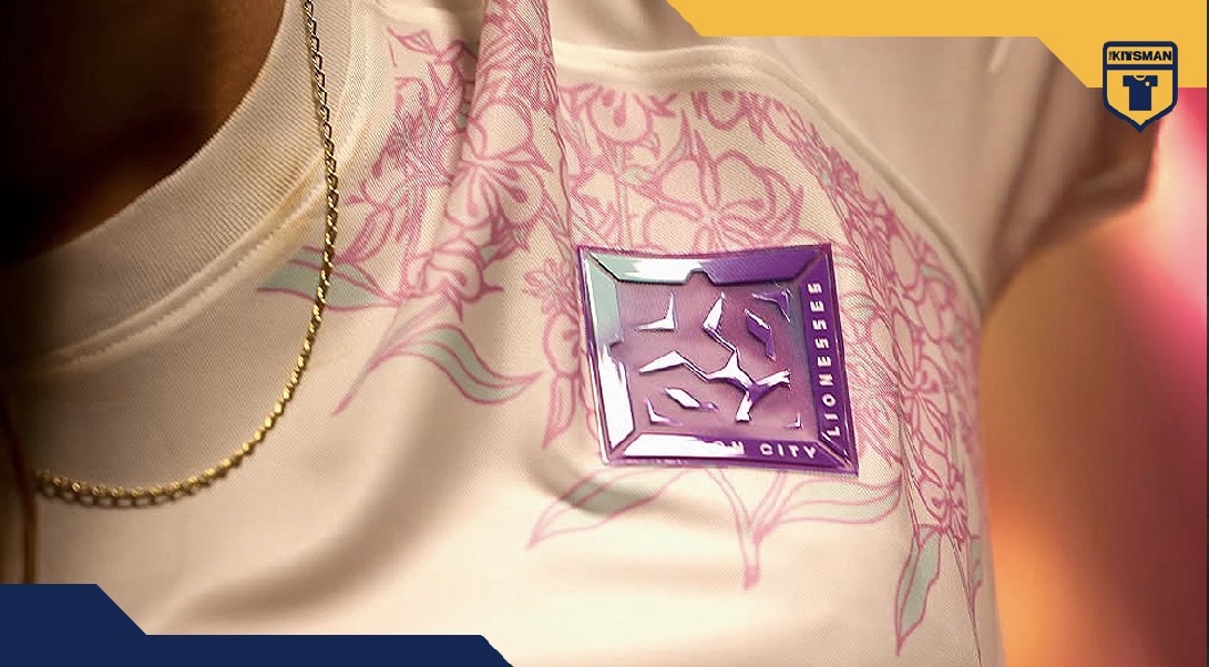
No men’s team attached. No established football giant behind the badge. Yet London City Lionesses have produced another shirt capable of attracting attention well beyond their own supporters.
Their new 2026/27 Nike third kit, launched under the name Rooted in the City, is a floral creation that immediately catches the eye.
There is plenty to admire about the design itself, but perhaps the most interesting part of this release is the club wearing it.
London City Lionesses are building an identity entirely their own. Could their growing appeal in football shirt culture be another sign of how much the women’s game is changing?
Come for the Flowers, Stay for the Badge
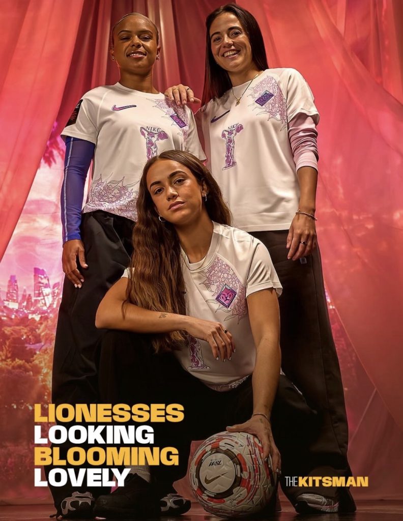
At first glance, the shirt is wonderfully simple.
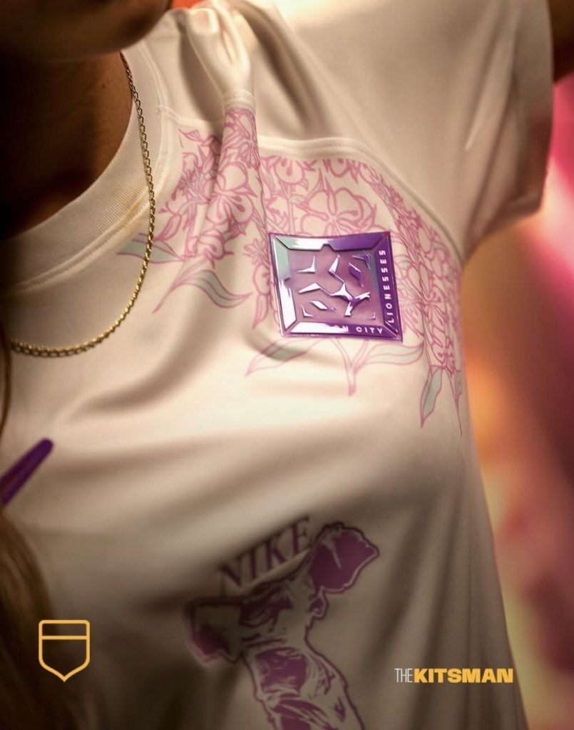
A crisp white base provides the canvas, with delicate pink, lilac and mint floral illustrations blooming around the chest and lower sections.
The flowers are carefully positioned, adding colour and character without overwhelming the shirt.
Then there is the crest.
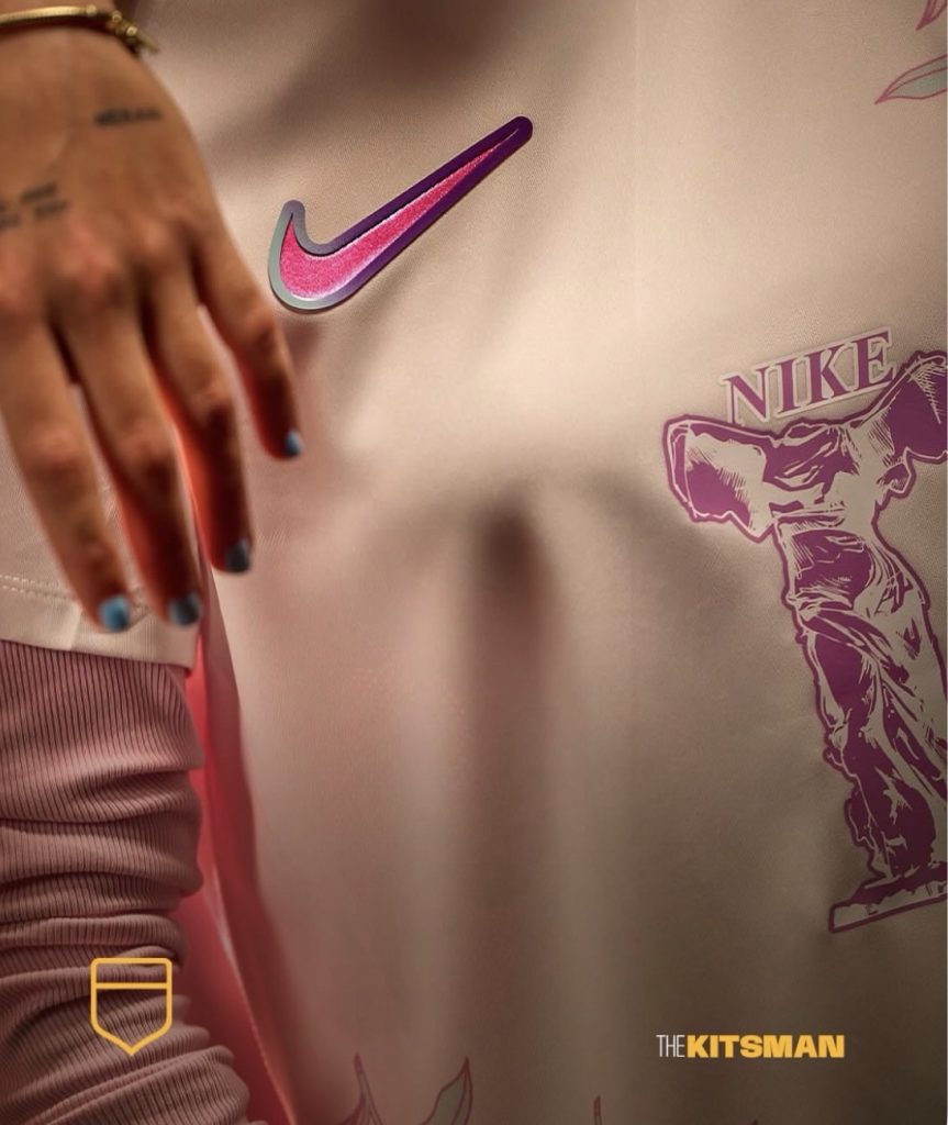
Finished in an iridescent combination of purple and turquoise, the London City Lionesses badge is one of the most striking features of the entire design. Nike’s matching Swoosh receives the same shimmering treatment.
The combination gives an otherwise gentle design a surprisingly bold focal point.
There is another unusual detail, too. Across the centre sits a graphic depicting the Winged Victory of Samothrace, the ancient Greek sculpture associated with Nike, the goddess of victory.
Rather than a conventional commercial sponsor, the club’s partnership with Nike places this distinctive artwork front and centre.
It is a shirt that rewards a second look.
A Floral Design With a London Story
The flowers are not simply decorative.
The design draws inspiration from Rosebay Willowherb, London’s county flower, which became particularly associated with the capital following the destruction of the Second World War.
The plant flourished across bomb sites and damaged areas, becoming a symbol of recovery and resilience.
That history gives the club’s Rooted in the City campaign a particularly meaningful connection.
London City Lionesses are still establishing themselves within the capital’s football landscape. The idea of finding space, taking root and growing into something recognisable feels especially appropriate.
It is a thoughtful piece of storytelling that gives the shirt considerably more depth than its attractive appearance initially suggests.
A Women’s Club Building Its Own Identity
This is where London City Lionesses’ story becomes particularly interesting.
Unlike the majority of clubs in the Women’s Super League, London City Lionesses do not operate as the women’s department of an established men’s football club.
They became independent following their separation from Millwall in 2019 and have since developed their own name, badge, supporters and commercial identity.
That independence makes their recent kit releases particularly noteworthy.
For many women’s teams, recognition can arrive through an existing football institution. Familiar club colours, badges and enormous supporter bases provide a ready-made audience.
London City Lionesses are taking a different route.
Their shirts need to communicate an identity that the club is still building, and their partnership with Nike has given them a distinctive visual platform.
The attention this latest design is attracting across football shirt coverage suggests that the approach is resonating beyond the club’s traditional audience.
There is no need to claim that London City are the first women’s club to achieve this kind of interest. What makes their position fascinating is that they are doing it without borrowing the identity of a famous men’s team.
Could Football Shirts Help Build the Next Generation of Clubs?
Football shirts have increasingly become objects of interest beyond the supporters of the clubs that wear them.
Collectors discover teams through unusual designs. Fashion enthusiasts take an interest in shirts without necessarily following the football. A compelling visual identity can introduce a club to people who might otherwise never encounter it.
London City Lionesses appear well placed to benefit from that culture.
Their new third shirt combines an attractive design, a distinctive badge, a meaningful local story and an unusual Nike partnership.
The wider football shirt world has already shown how effectively clothing can communicate local identity. Our coverage of the Go Ahead Eagles third kit, inspired by the River IJssel, explores another example:
London City have added another dimension to that idea. Their shirts are not simply reflecting an established club identity. They are helping to create one.
More Than Just Another Beautiful Shirt
There is no question that this is an attractive release.
The floral detailing is delicate without disappearing, the white base keeps everything fresh, and the iridescent badge and Swoosh provide exactly the right contrast.
The connection to London’s Rosebay Willowherb makes it even better.
Yet the most significant aspect might be what the shirt represents.
An independent women’s football club is developing a recognisable aesthetic, attracting interest from kit enthusiasts and creating products that can stand alongside releases from much bigger football institutions.
Whether that translates into lasting commercial success remains to be seen.
For now, London City Lionesses have another excellent shirt to their name, and a compelling argument that a football club doesn’t need a famous men’s team behind it to create something people want to wear.
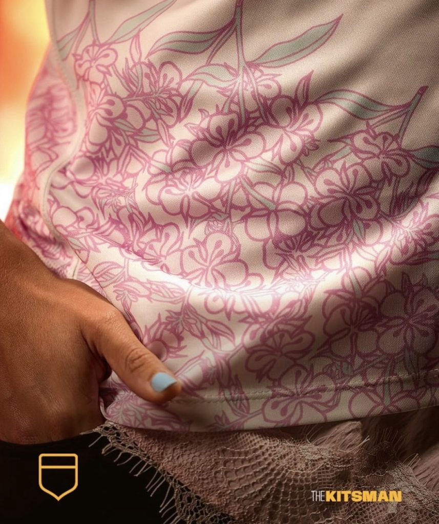
Image credit: London City Lionesses.
Join the conversation:
Could an independent women’s football club become a major name in football shirt culture through its designs alone?
X:
https://x.com/the_kitsman?s=21&t=YKLtf2JIakFxujMRxTUh9Q
Instagram:
https://www.instagram.com/the.kitsman?igsh=ZWtuMDJkb2c4Ynhz&utm_source=qr