Royal Attire 👑
Some kits make their statement immediately.
Others reward a closer look.
Royal Antwerp’s new away shirt firmly falls into the latter category.
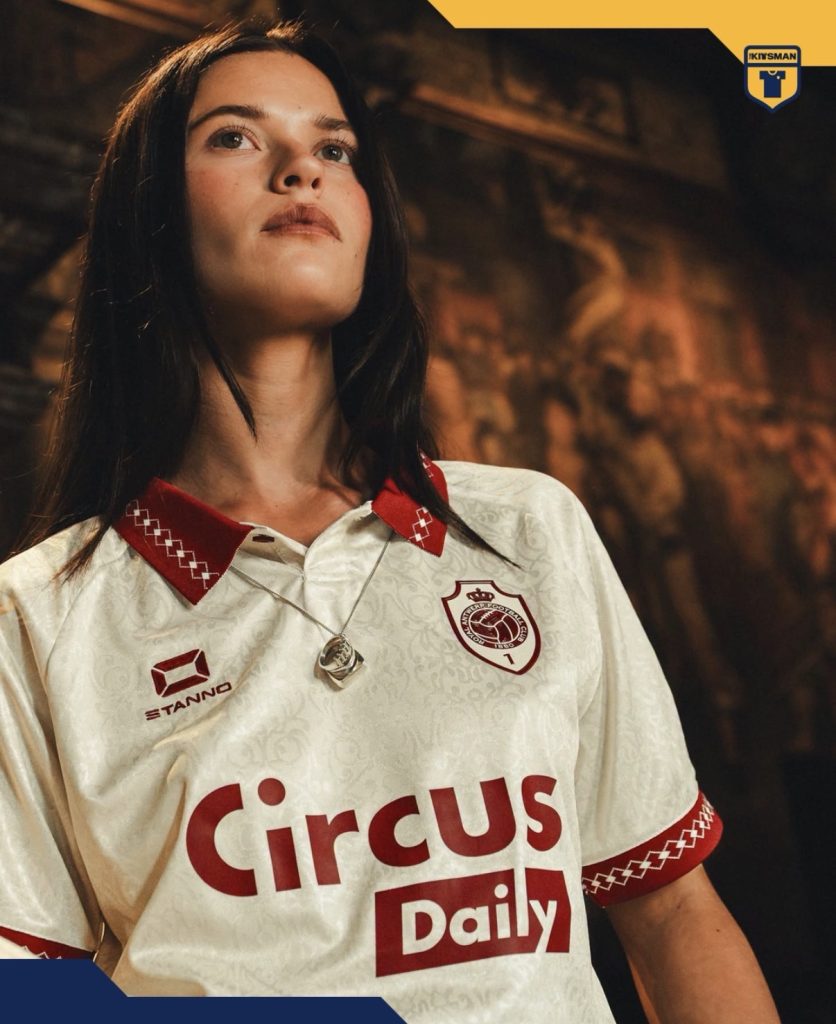
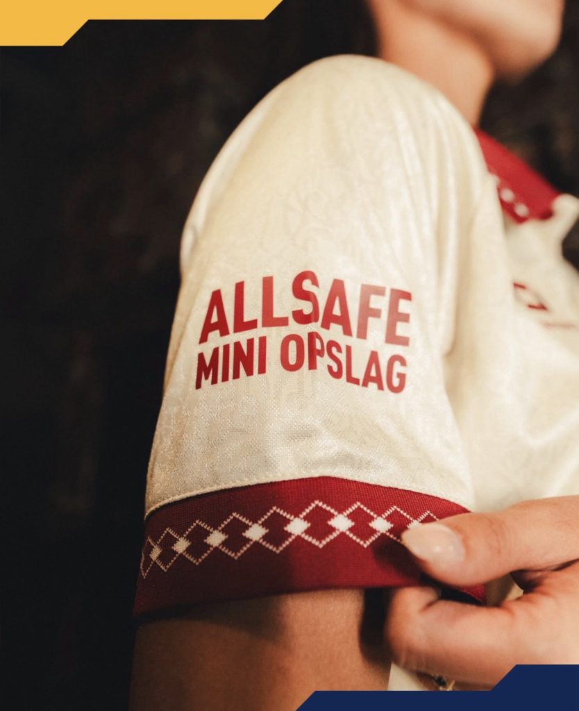
Unveiled inside the grandeur of the Salle de Leys at Antwerp City Hall, the launch setting makes perfect sense once you understand the inspiration behind the design. At first glance, your eyes are likely drawn towards the collar and cuffs, where the patterned trim provides an elegant contrast against the clean base.
But there’s more going on.

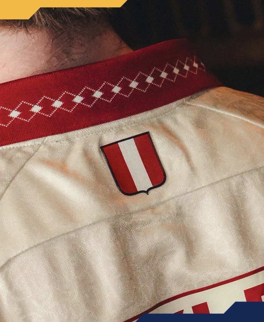
Look a little closer and an intricate all-over pattern begins to reveal itself. It’s subtle enough not to dominate the shirt, yet detailed enough to give the jersey its own personality. The ornate design appears to pull from the décor and embellishments found within the historic room itself, creating a direct link between the kit and the city it represents.
It’s an approach that raises an interesting question.
Should more clubs look to local architecture and interiors for inspiration?
Football kits often turn to crests, landmarks and skylines, but taking cues from decorative details inside a city’s most prestigious buildings feels a little different.
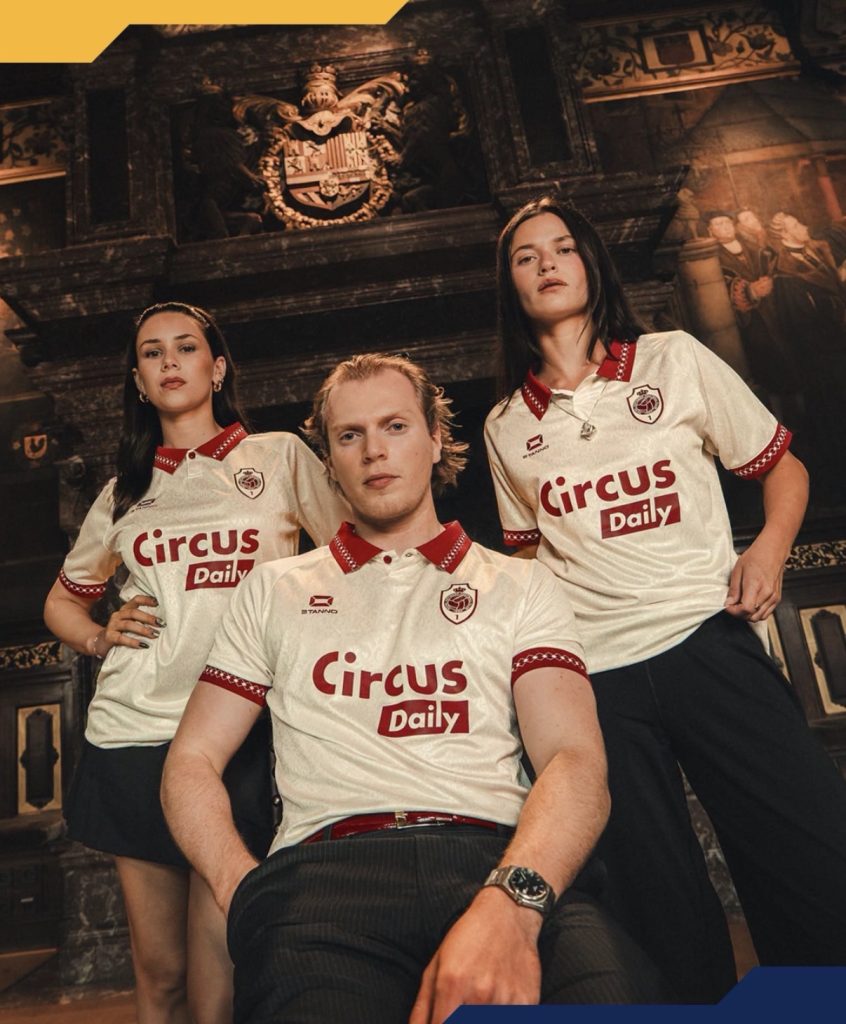
The result here is a shirt that carries a sense of occasion without becoming overdesigned. There’s plenty of detail, but none of it feels forced or excessive.
Perhaps that’s why it works.

It’s classy without trying too hard to convince you that it’s classy.
And for an away kit that will spend plenty of time travelling, that’s not a bad look to take on the road.
Join the conversation:
https://x.com/the_kitsman?s=21&t=YKLtf2JIakFxujMRxTUh9Q
https://www.instagram.com/the.kitsman?igsh=ZWtuMDJkb2c4Ynhz&utm_source=qr