Football clubs love a throwback. The challenge is making it feel like more than nostalgia for nostalgia’s sake.
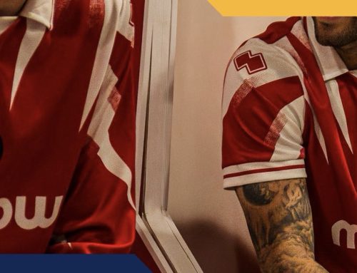
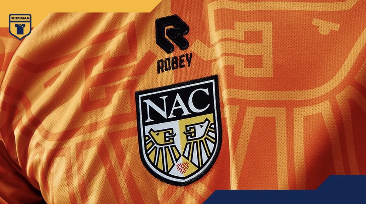
NAC Breda’s latest third kit certainly won’t struggle to get noticed. The bright orange base immediately grabs your attention, but the real story sits at the centre of the shirt.
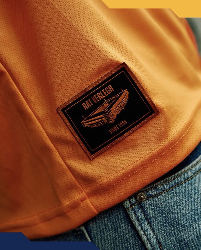
Thirty years on from the opening of the Rat Verlegh Stadium, the club have revived the commemorative badge created for the occasion back in the 1990s. Derived from the coat of arms of Breda itself, the crest returns not merely as a small detail but as the focal point of the entire design.
That decision shapes everything else.
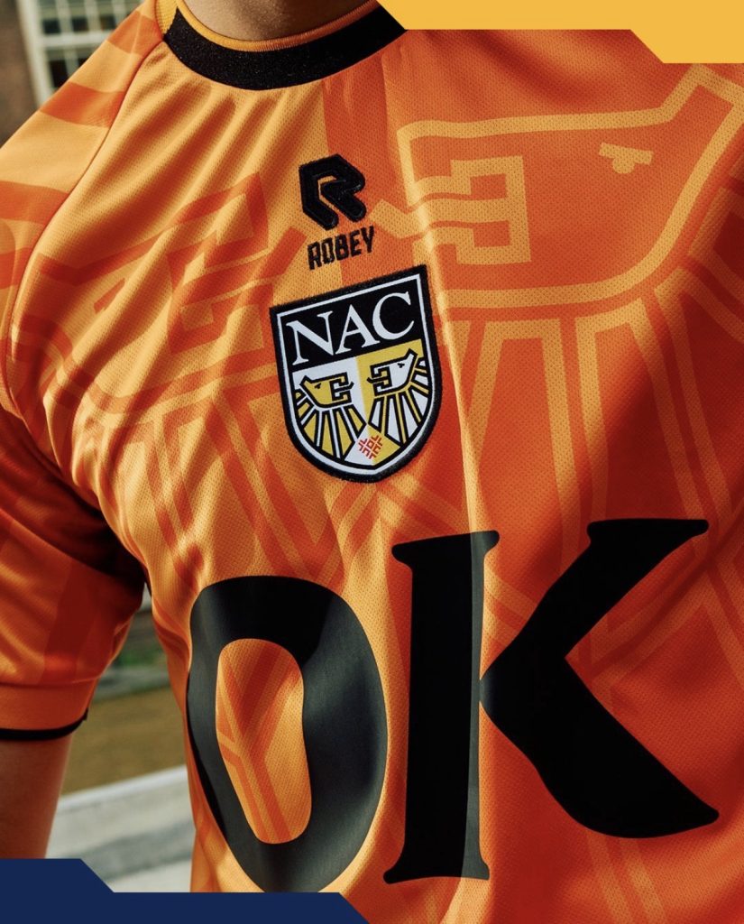
The split orange tones radiate outward from the badge, creating a visual continuation of the crest across the shirt. It’s a clever piece of design work and helps the central placement feel intentional rather than simply following a modern trend.
The question is whether the shirt would have carried the same impact without the historic badge.
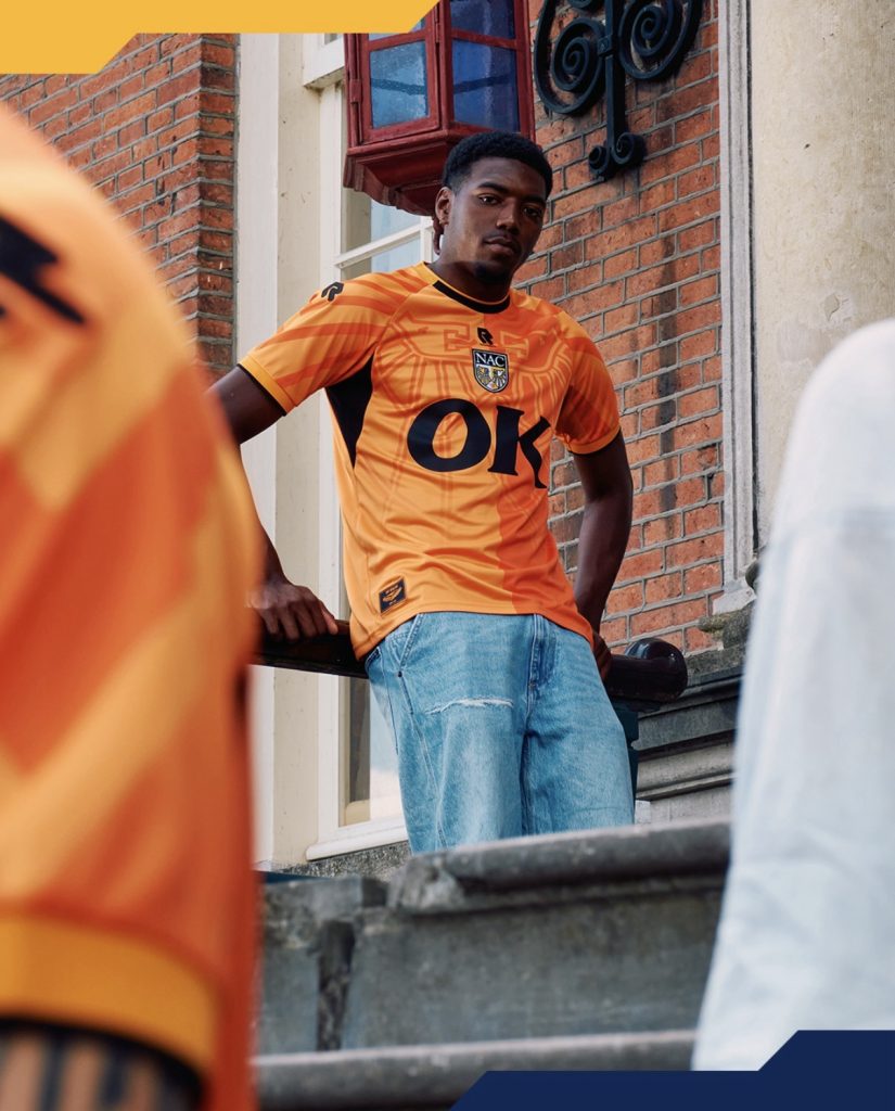
For some supporters, that crest will make the kit. For others, the vivid orange and large-scale graphic treatment may prove a little too bold compared to some of NAC’s more traditional looks.
That’s often the balancing act with heritage-inspired releases. Do you recreate the past exactly as it was, or reinterpret it for a modern audience?
NAC have clearly chosen the latter.
What isn’t in doubt is the commitment to the concept. Between the House of Orange references, the stadium anniversary and the revival of a crest tied to a significant moment in the club’s history, there’s plenty here for supporters to connect with.
Whether you’d wear it every week is one question.
Whether you’ll forget it any time soon is another.
Join the conversation:
https://www.instagram.com/the.kitsman?igsh=ZWtuMDJkb2c4Ynhz&utm_source=qr
https://x.com/the_kitsman?s=21&t=YKLtf2JIakFxujMRxTUh9Q