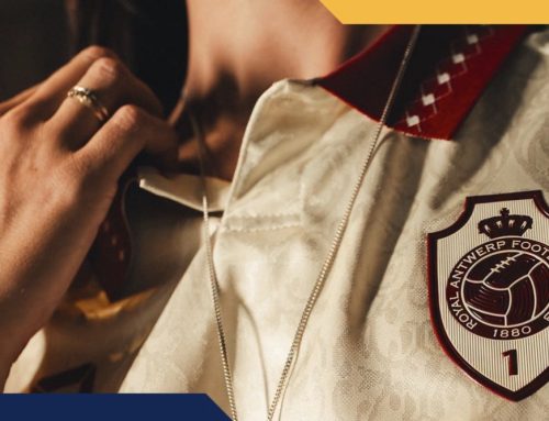
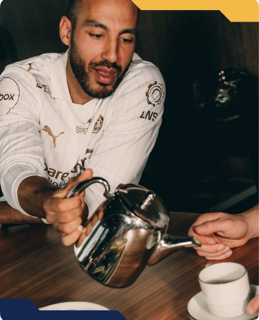
Cream of the Crop 🫖
Bodø/Glimt have built a reputation for doing things differently, and this away kit leans straight into that rise. The bright yellow home is already one of the most recognisable looks in Europe. This time, the switch goes in the opposite direction.
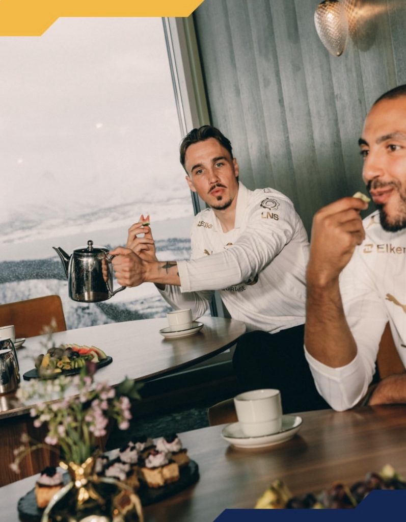
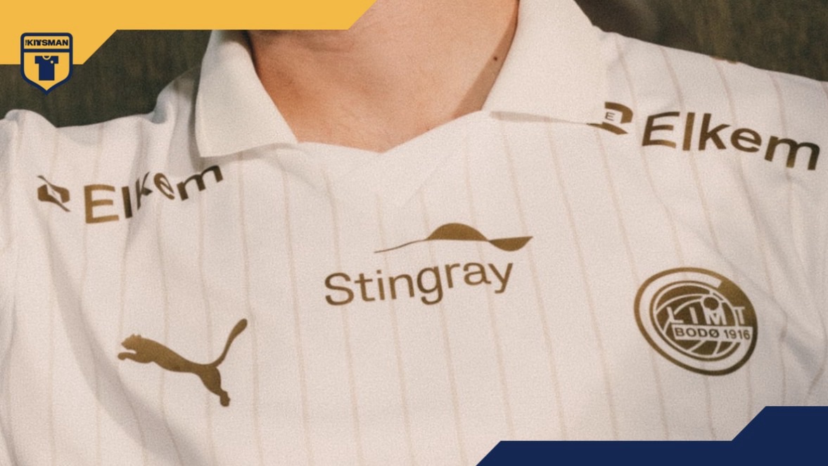
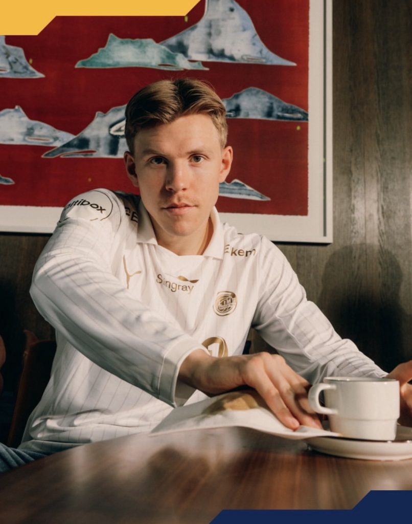
A soft cream base immediately changes the tone. It feels calmer, more refined, but no less deliberate. That restraint is what makes the rest land.
The pinstripes are easy to overlook at first glance. They are thin, subtle and spaced just enough to add structure without overpowering the shirt. That is where the kit quietly builds its identity rather than shouting for it.

Gold does the rest of the work. The badge and sponsor sit sharply against the cream, giving the whole thing a polished edge that fits a club currently moving with confidence on the European stage.
The contrast with the home kit is where this really works. One is loud and unmistakable. The other is controlled and composed. Together, they tell the story of a club that knows exactly where it is going.
The question is simple…
Does this understated approach hit harder than the yellow?
Are the sponsors just too much distraction to get over?

Join the conversation:
https://x.com/the_kitsman?s=21&t=YKLtf2JIakFxujMRxTUh9Q
https://www.instagram.com/the.kitsman?igsh=ZWtuMDJkb2c4Ynhz&utm_source=qr