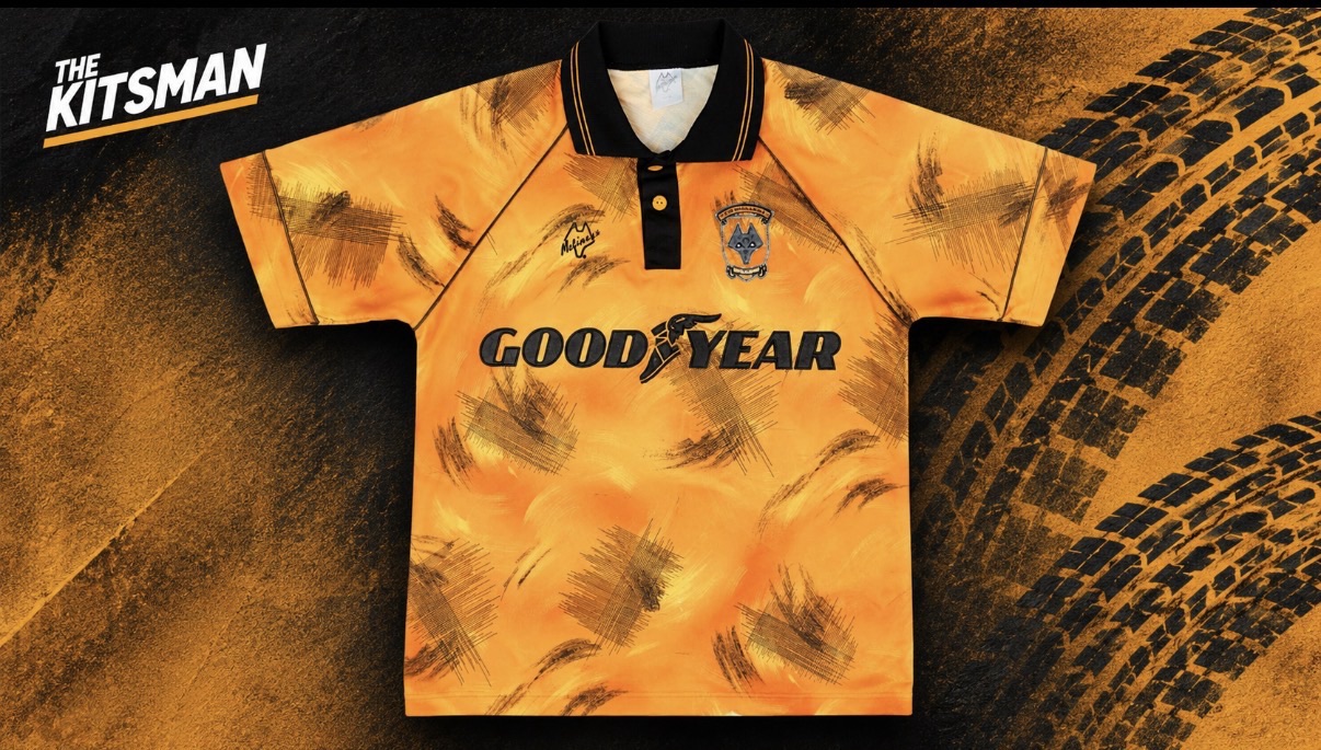
There are football shirts that supporters dislike when they’re released. There are shirts that divide opinion for years afterwards. And then there’s Wolves’ 1992/93 home kit, which somehow managed to look as though somebody had driven a car across it.
It wasn’t exactly what supporters were accustomed to seeing at Molineux.
Thirty-four years later, though, the infamous tyre-track shirt has become one of the club’s most recognisable retro designs. You can still spot it in the stands, and Wolves themselves acknowledge how popular it has become.
Not bad for a shirt that initially made some supporters furious.
What Were Wolves Thinking in 1992?
The early 1990s were an extraordinary period for football shirt design. Manufacturers were experimenting with oversized patterns, unusual colours and graphics that would have seemed ridiculous a decade earlier.
Wolves decided to join in, although they didn’t have a major manufacturer behind them.
After spells with Scoreline and Bukta, the club introduced its own Molineux-branded kit for the 1992/93 season. It was designed and produced in-house, which makes the finished article even more interesting.
The familiar old gold remained, but almost everything else was up for grabs.
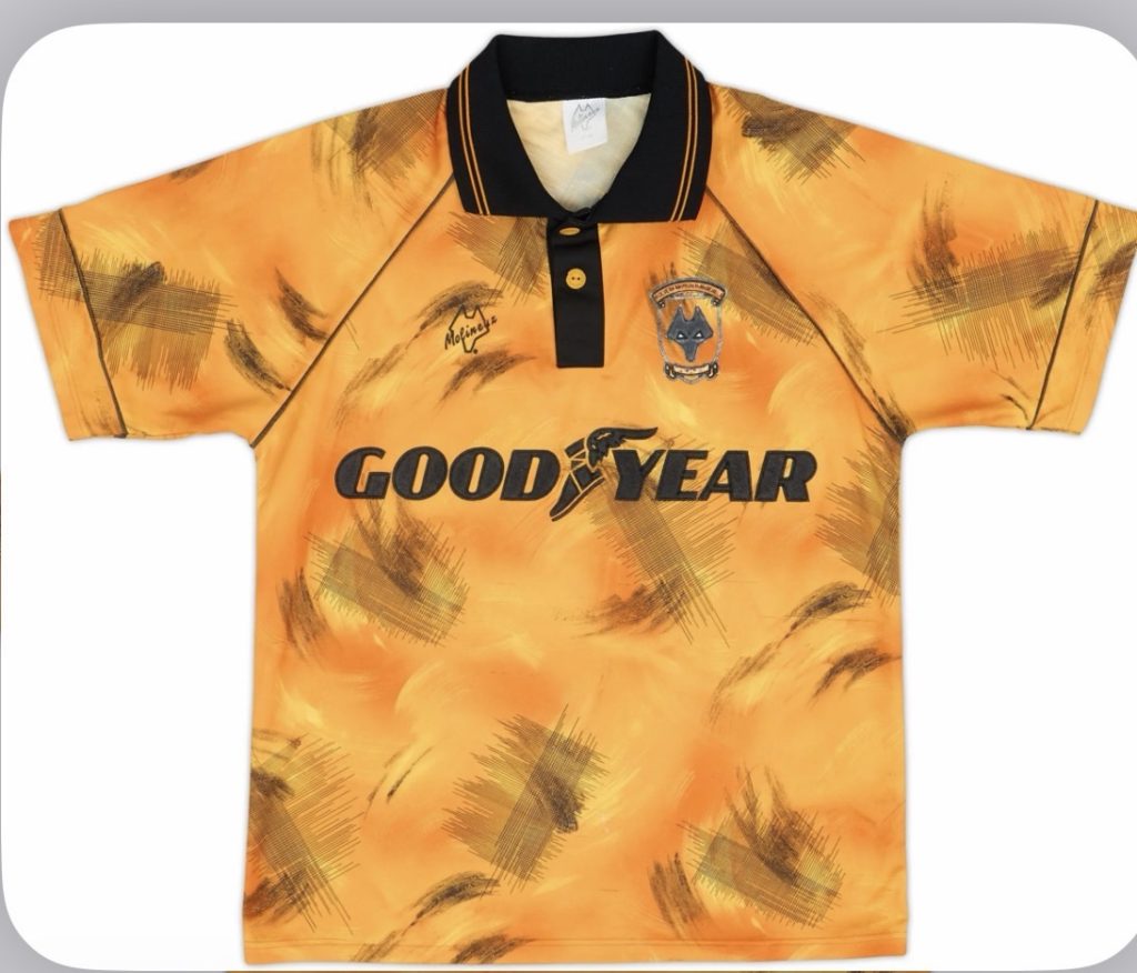
Black markings ran across the shirt, accompanied by patches of darker gold and an irregular pattern that looked remarkably like tyre tracks. The Goodyear sponsor sat prominently across the chest, making the resemblance particularly amusing.
Whether the design was deliberately inspired by the tyre manufacturer is less certain than the nickname suggests. What we can say is that having Goodyear written across a shirt covered in tyre-like markings was a remarkable coincidence if nobody intended it.
It certainly wasn’t subtle.
The club’s traditional wolf-head crest remained, but there was little else about the shirt that could be described as conventional.
For supporters accustomed to relatively straightforward gold shirts, it was quite a departure.
A Shirt That Divided Molineux
According to Wolves historian Pete Crump, the design caused considerable controversy when it appeared, angering some supporters.
That’s hardly surprising.
A football club’s home shirt is different from an away or third kit. Supporters generally expect it to look recognisably like their team, even when manufacturers experiment with the details.
Wolves hadn’t abandoned their colours, but they’d done just about everything possible to make those colours look unfamiliar.
The shirt also belonged to an interesting period in the club’s history.
Graham Turner was in charge, Steve Bull remained the main attraction, and Wolves were competing in the newly renamed First Division following the creation of the Premier League.
They began the 1992/93 league season unbeaten in their first twelve matches, their best opening run since 1949/50, but eventually finished eleventh.
It wasn’t a season remembered for promotion or silverware. Yet the shirt has arguably become more famous than much of the football played in it.
There’s something rather fitting about that.
Why Has Everyone Changed Their Mind?
The obvious answer is nostalgia, but that doesn’t explain everything.
Plenty of ordinary football shirts from the early 1990s have disappeared into obscurity. Wolves’ tyre-track design has survived precisely because it was so unusual.
It doesn’t look like a modern shirt. It barely looks like another Wolves shirt. You can identify it almost immediately, even without seeing the badge.
That’s a valuable quality in an era when so many new kits seem interchangeable.
Wolves journalist Tim Nash has also revisited the design favourably, highlighting its distinctive character and the deeper gold used at the time. The shirt has gone from being something supporters questioned to something they actively celebrate.
Perhaps our expectations have changed too.
In 1992, this was the new home shirt that supporters were expected to wear and watch their team play in. Today, it’s a piece of football history. Nobody has to accept it as the club’s current identity. They can simply enjoy how gloriously strange it looks.
That distinction matters.
A design that feels inappropriate for your club’s next season can become wonderfully appealing when viewed from thirty years away.
We’ve seen that affection for older designs influence modern releases too. Santos recently revived their 1997 Umbro aesthetic, drawing on the oversized styling and distinctive details that have become synonymous with the decade.
Wolves’ tyre-track shirt is a rather more extreme example of the same appeal.
That renewed affection isn’t just confined to photographs and social media. Original examples are still available to collectors, including this 1992/93 Wolves home shirt at Classic Football Shirts. It’s quite a turnaround for a design that once left supporters questioning what their club had produced.
MORE FROM THE KITSMAN
Santos 1997 Throwback Kit Revives an Iconic Pelé-Era Umbro Design
A look at how Santos brought a distinctive 1990s Umbro design back into the present.
Wolves Have Come Full Circle
Perhaps the most telling comparison comes from Wolves themselves.
For their 150th-anniversary shirt in 2026/27, the club went in almost the opposite direction, returning to the historic Wolverhampton coat of arms and embracing a more traditional interpretation of its identity.
We covered that anniversary release earlier this year, including the decision to revive a crest last used on the club’s shirts during the 1990s.
There’s an interesting connection between the two designs.
In 1993, immediately after the tyre-track experiment, Wolves returned to a more traditional home shirt featuring the town coat of arms. More than three decades later, the club has once again looked towards that period for inspiration.
The outrageous shirt and the traditional one now both have their admirers.
MORE FROM THE KITSMAN
Wolverhampton Wanderers Mark 150 Years With Historic Crest Return
Wolves celebrate their anniversary with a return to the city’s historic coat of arms and a heritage-inspired design.
Was It Actually a Good Football Shirt?
Here’s the awkward question.
Would we praise this design quite so enthusiastically if Wolves unveiled it tomorrow?
I’m not convinced.
The pattern is chaotic, the black markings are excessive and the Goodyear sponsorship makes the whole thing look like an elaborate joke about car tyres.
But I rather like it.
Not because every part of the design works, but because it has a character that many safer shirts lack.
It represents a period when clubs and manufacturers were prepared to produce something genuinely peculiar, even if the results occasionally horrified the people expected to buy it.
The tyre-track shirt might never have been a universally loved Wolves home kit. It has become something arguably more interesting: a football shirt that people still want to discuss.
Thirty-four years later, the design hasn’t changed.
We have.
Further reading: Wolves historian Pete Crump on the club’s home shirt history · Tim Nash revisits the 1992/93 shirt · Wolves’ most memorable kits
For more football shirt history, kit releases and opinion, follow The Kitsman on X and Instagram.