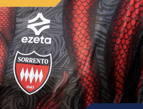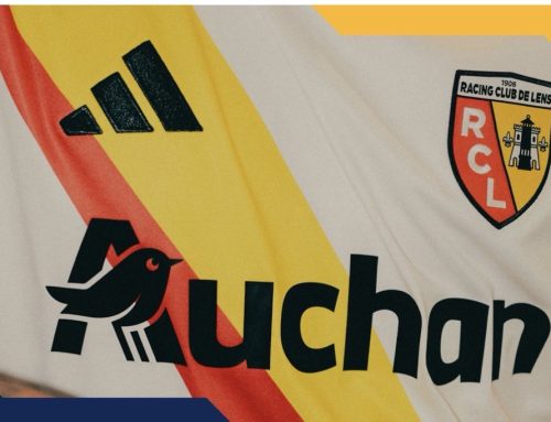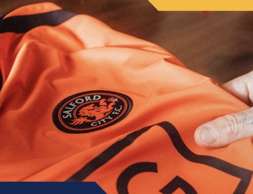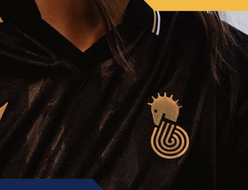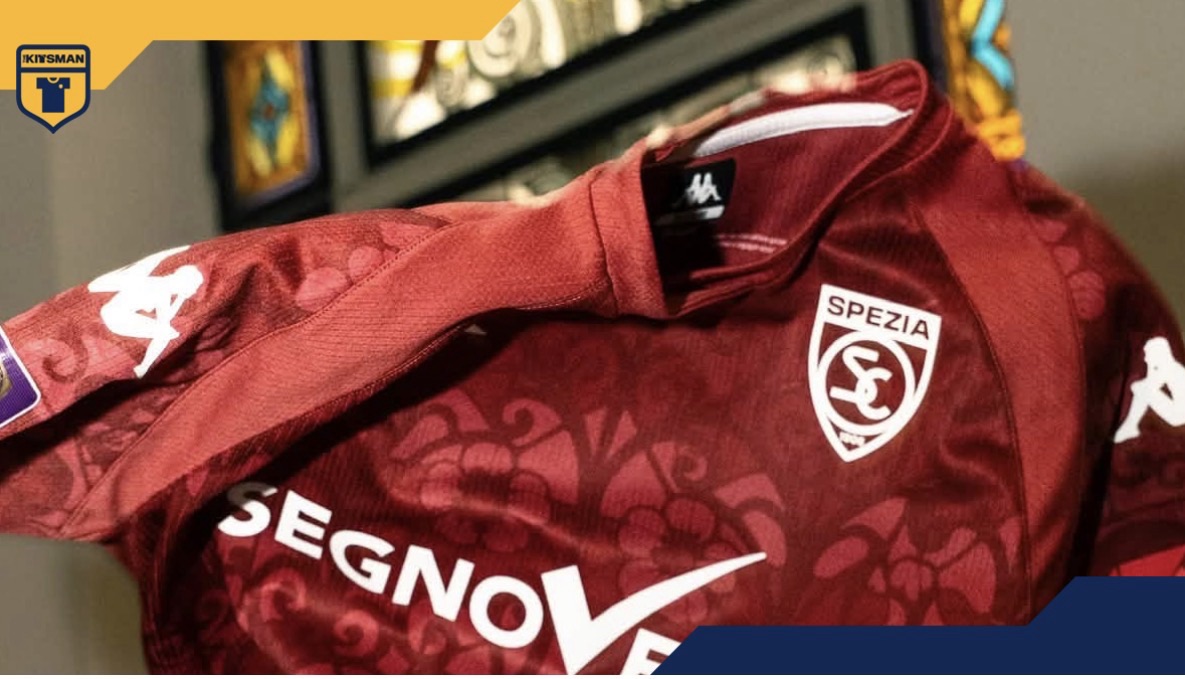
Look closely at football shirts this season and you’ll find all sorts hiding in the fabric.
Club crests. Architecture. Maps. Monograms. Local landmarks. Historical references.
Embedded and tonal patterns seem to be absolutely everywhere.
Spezia Calcio are the latest to embrace the idea, and they’ve certainly got plenty of source material to work with.
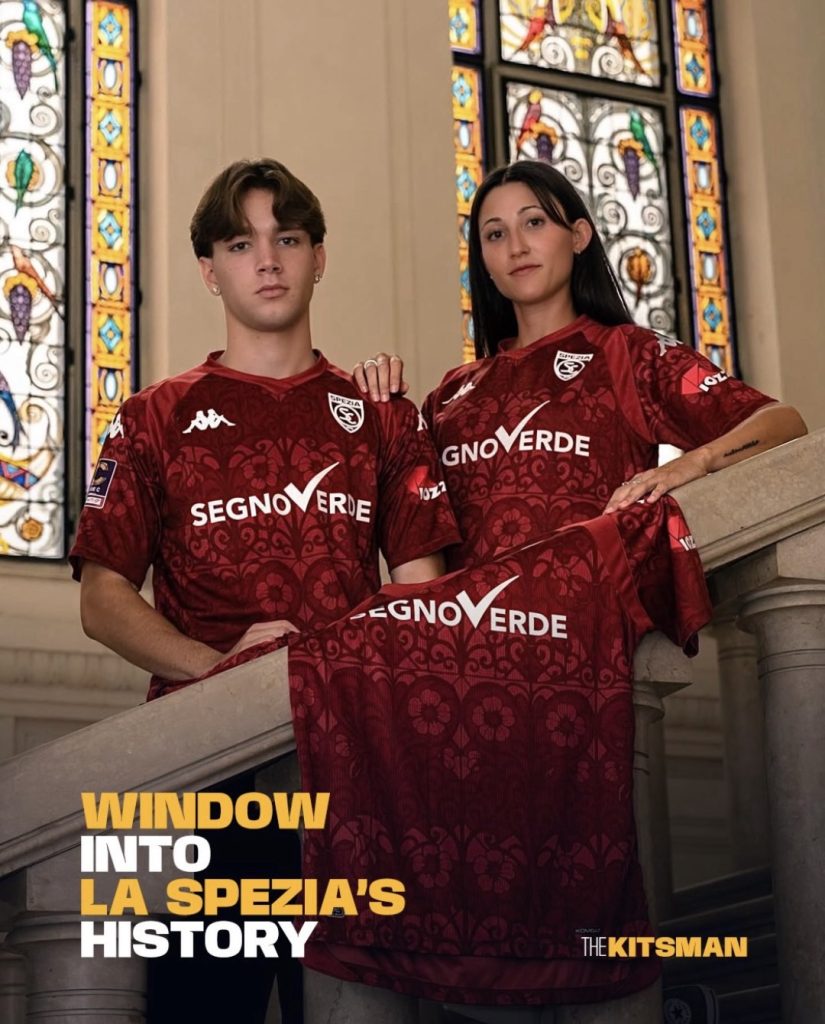
Their new third shirt celebrates the Liberty architecture of La Spezia, Italy’s own expression of the Art Nouveau movement.
Wander through the city and you’ll find elaborate façades filled with floral decoration, intricate wrought ironwork and beautiful stained glass windows.
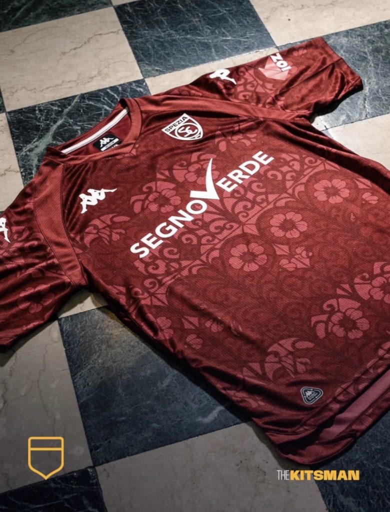
Kappa have taken those details and worked them across the shirt as an all-over monochrome pattern.
We’re big fans of that approach.
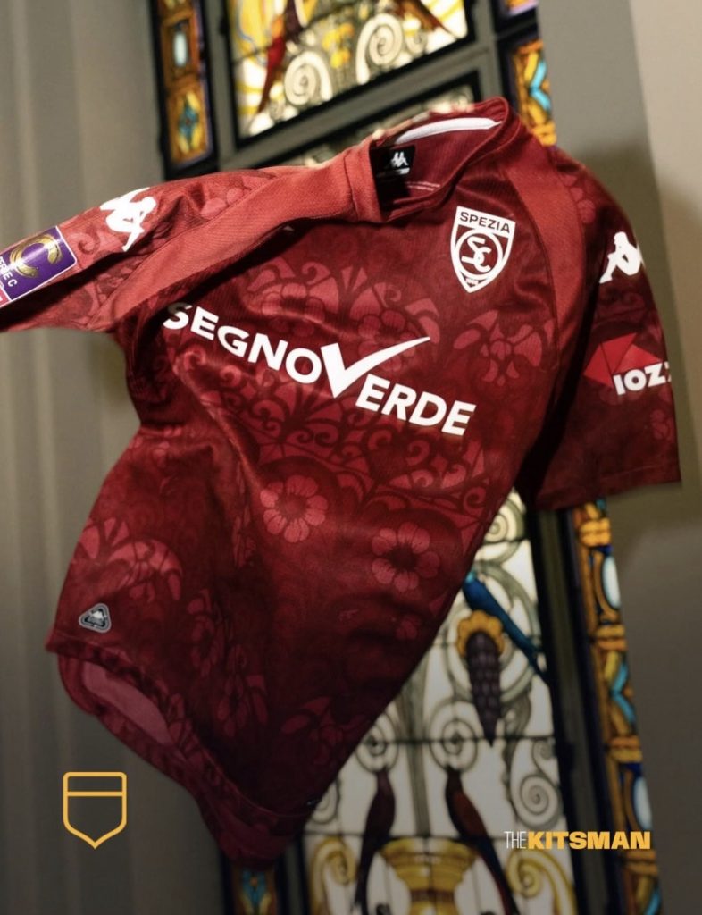
As spectacular as the original colours of those buildings and windows can be, resisting the temptation to recreate all of them allows the detail itself to do the talking.
Instead, a deep garnet provides the canvas, with the architectural elements intertwining throughout the fabric and bright white detailing offering a clean contrast.
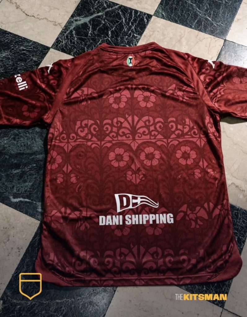
It’s essentially a visual tour of La Spezia in football shirt form.
Interestingly, football’s fascination with patterns buried within shirts goes back much further than the current trend.
Shadow patterns emerged prominently during the 1980s before fabric technology helped manufacturers take things considerably further. By the early 1990s, jacquard weaves and sublimation were allowing manufacturers to incorporate logos, crests and increasingly complicated graphics directly into the appearance of shirts.
Then football largely cleaned itself up.
Research into kit design found that the complicated micro-patterned shirts associated with the late 80s and early 90s declined significantly from the mid-1990s onwards, with considerably plainer designs becoming commonplace again during the 2000s.
Now we’ve seemingly come full circle.
Only this time, rather than purely geometric graphics and manufacturer logos, clubs increasingly use the technique to hide stories within their shirts.
Spezia have an entire architectural movement embedded in theirs.
Has the tonal pattern become the defining football shirt design trend of the 2020s?
And more importantly, are we still enjoying them or are they becoming too common?
Images; @speziacalcio @kappa_sport @kappa
#laspezia #spezia #kappa #architecture #liberty #stainedglass #footballkits #thekitsman
Join the conversation:
X:
https://x.com/the_kitsman?s=21&t=YKLtf2JIakFxujMRxTUh9Q
Instagram:
https://www.instagram.com/the.kitsman?igsh=ZWtuMDJkb2c4Ynhz&utm_source=qr