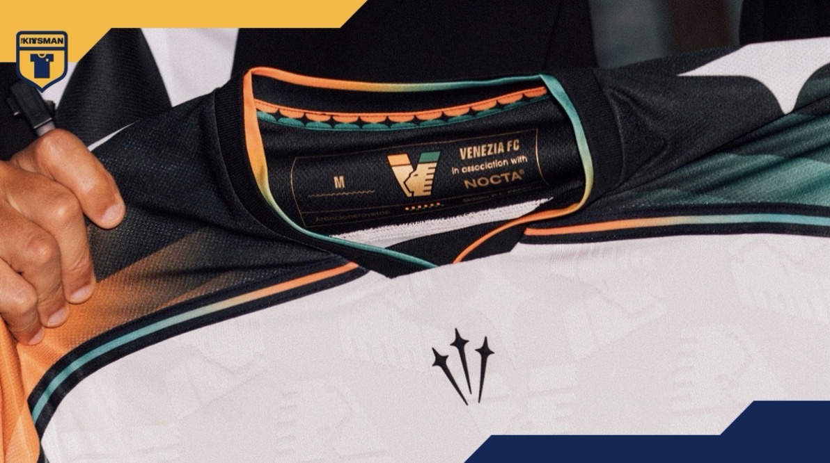
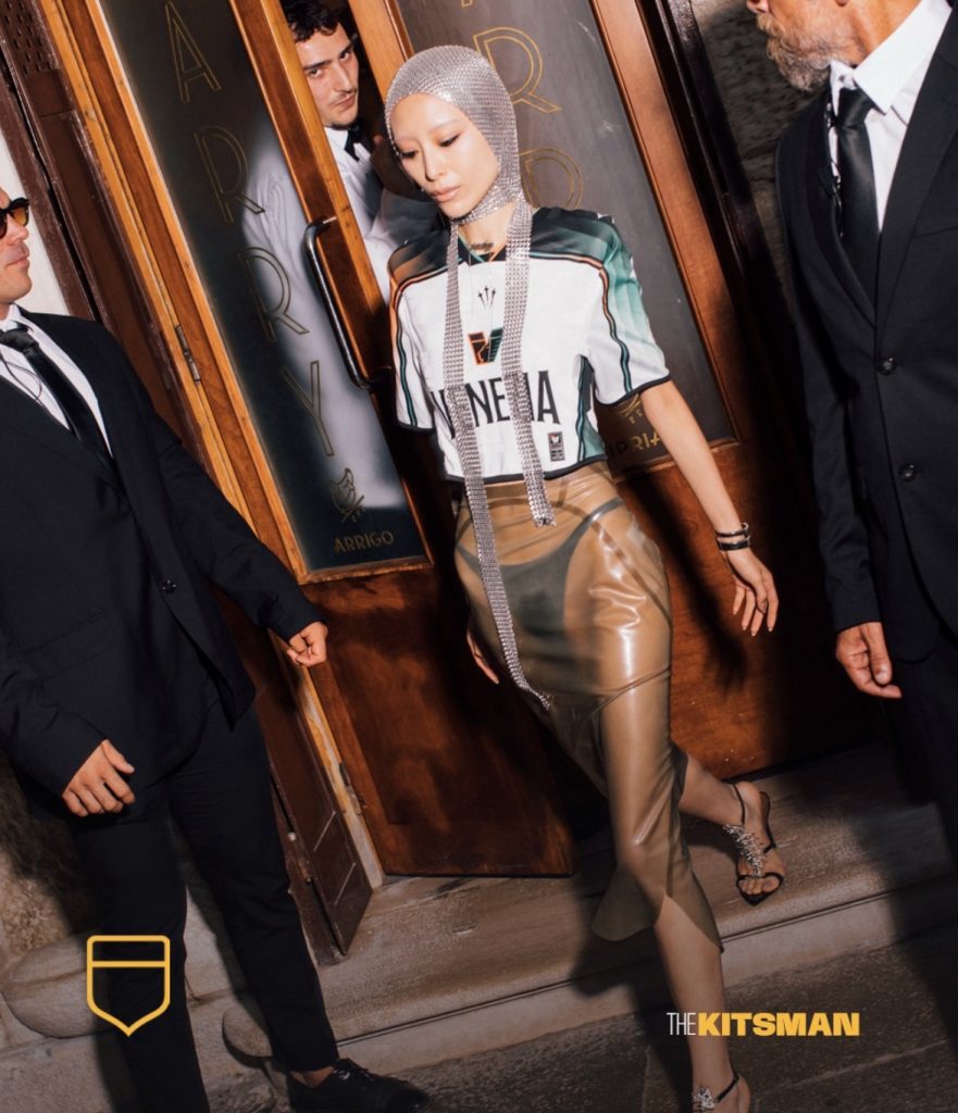
Few clubs have mastered the art of making a football shirt look desirable quite like Venezia.
The location. The styling. The photography. The fashion-first presentation.
But strip all of that away and are the shirts themselves actually as good as the hype?
Their latest NOCTA creation gives us another chance to decide.
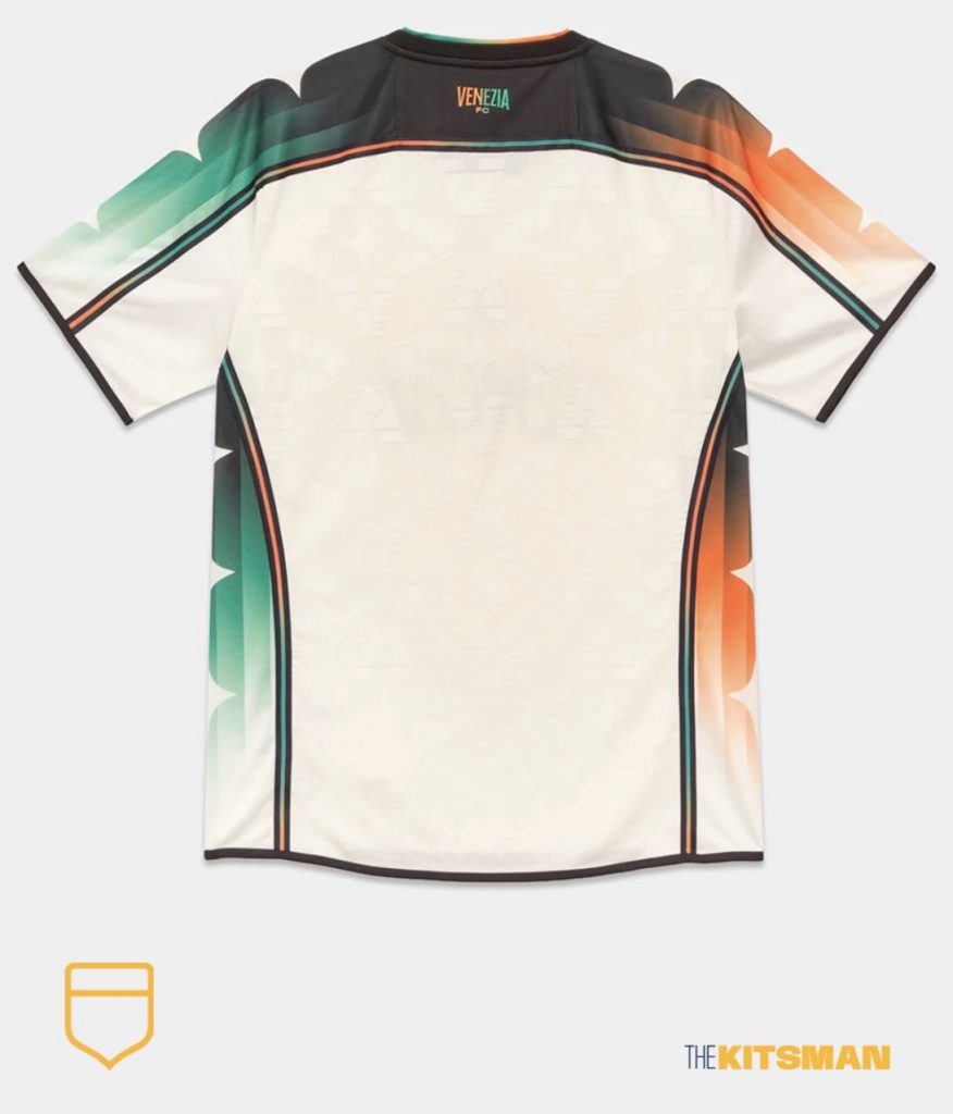
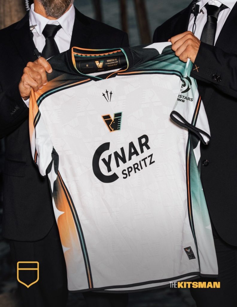
Where the home brought Venezia’s famous green and orange together across the chest, the away separates the colours without ever really allowing them to leave one another.
The sleeves are the immediate standout.
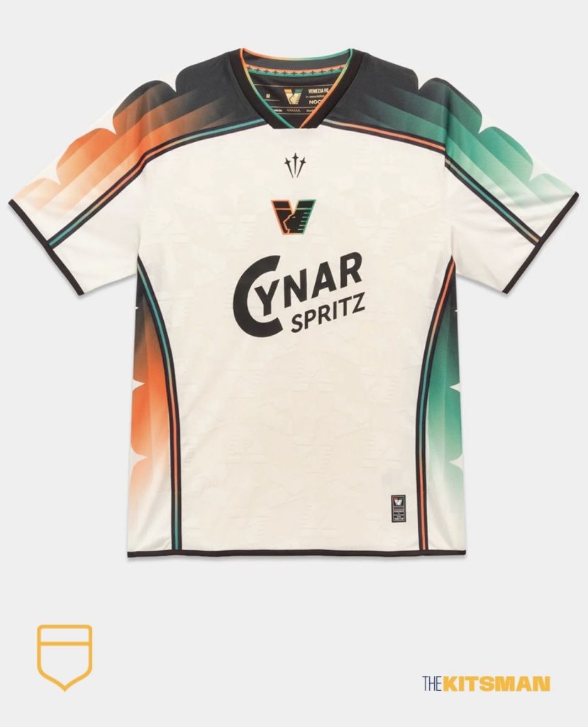
Fading bars shift through different levels of green and orange against the black, with NOCTA’s stars layered over the top and continuing down the sides. There’s plenty happening, but it retains that distinctive styling we’ve come to expect from the collaboration.
Then the blending spreads elsewhere.
The piping shifts between colours. So does the collar. Even Venezia’s badge gets involved, refusing to settle on one side of the green and orange divide.
It’s colourful, unusual and certainly doesn’t look like a generic teamwear offering.
Yet Venezia shirts almost arrive with an advantage these days.
We expect them to be cool.
They’ve spent years building an identity around football, fashion and Venice itself, with launches that can make a shirt feel like the latest designer drop rather than something intended for 90 minutes on a pitch.
Perhaps that’s a skill in itself.
But are Venezia genuinely the fashion gurus of football shirts, or are they simply better than everyone else at making us believe they are?
Take away the setting, photography and styling.
Are the kits still that good?
Images; @veneziafc @nocta
#venezia #venice #nocta #nike #footballkits #thekitsman
Join the conversation:
X:
https://x.com/the_kitsman?s=21&t=YKLtf2JIakFxujMRxTUh9Q
Instagram:
https://www.instagram.com/the.kitsman?igsh=ZWtuMDJkb2c4Ynhz&utm_source=qr