Anniversary kits often live or die by one decision.
How much do you change?
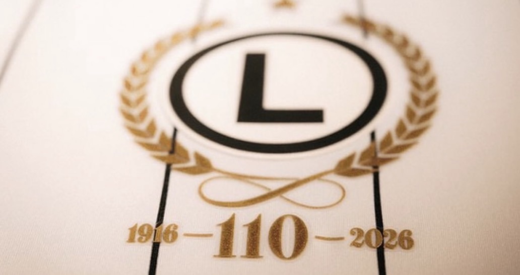
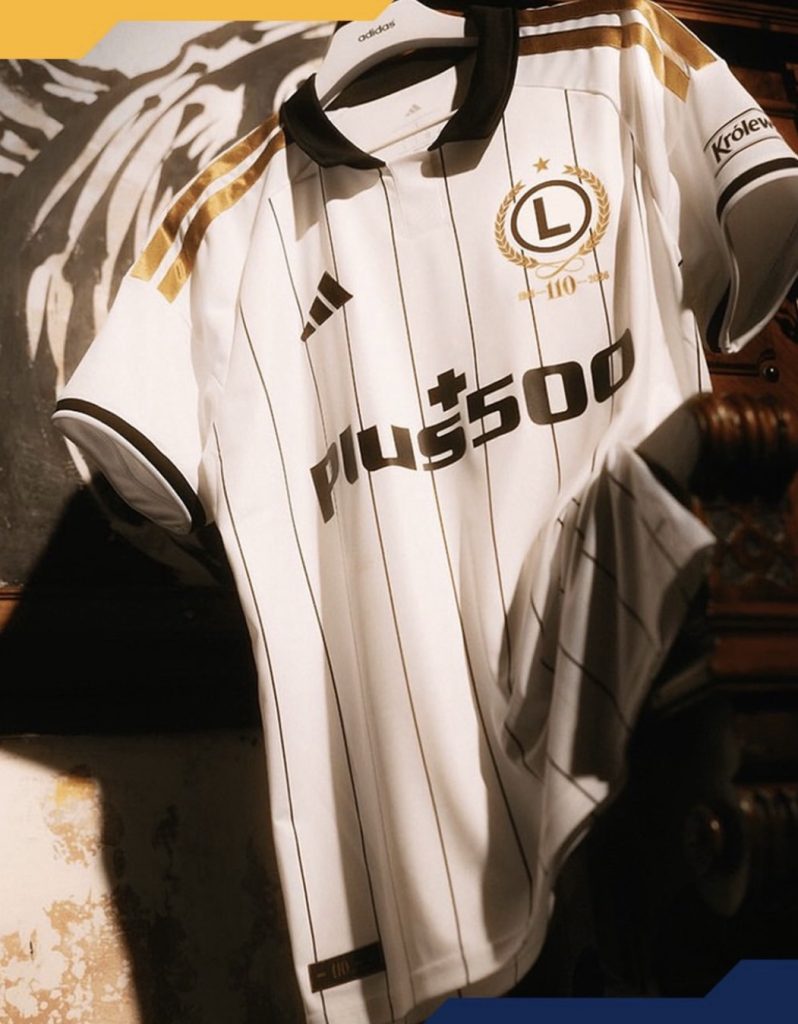
Legia Warsaw have largely resisted the temptation to reinvent the wheel for their 110th anniversary, instead focusing attention on the detail most supporters will notice first: the badge.

The iconic ‘L’ remains front and centre, but for the occasion it receives the celebratory treatment. Wrapped within a golden wreath and supported by gold accents elsewhere on the shirt, it becomes the focal point without completely overpowering the rest of the design.
It’s a reminder that sometimes the smallest adjustments can have the biggest impact.
The gold striping works in much the same way. Rather than dominating the shirt, it provides just enough contrast against the traditional base to signal that this is something a little different from a standard home release.
The interesting question is whether anniversary shirts should do more.
Some supporters love elaborate throwbacks and historic references packed into every corner of a design. Others prefer exactly this approach: taking an established identity and giving it a subtle celebratory touch rather than a complete overhaul.
Legia have clearly landed in the second camp.
The launch imagery reinforces that feeling too. There’s a confidence to the presentation that matches the shirt itself. Nothing feels forced and nothing is trying too hard to convince you of its significance.
After 110 years, perhaps it doesn’t need to.
The badge does most of the talking.
Join the conversation:
https://www.instagram.com/the.kitsman?igsh=ZWtuMDJkb2c4Ynhz&utm_source=qr
https://x.com/the_kitsman?s=21&t=YKLtf2JIakFxujMRxTUh9Q