Instantly classy. And we don’t throw that around lightly.
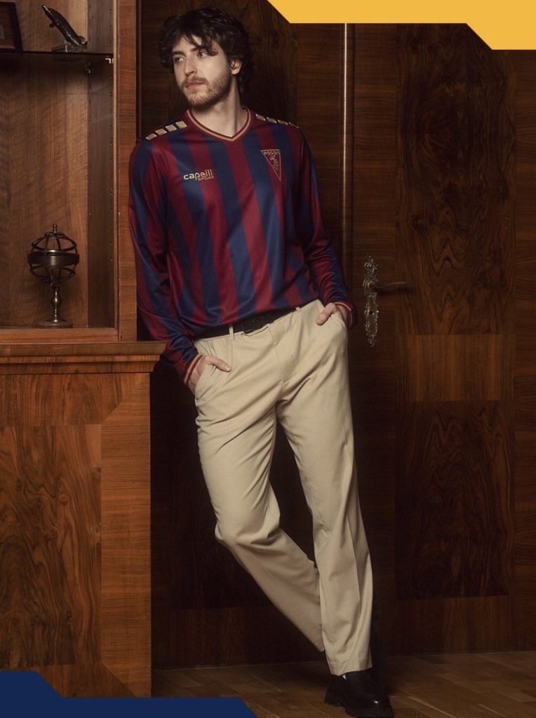
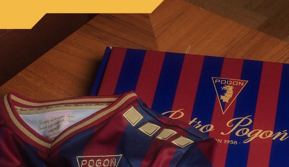
There’s something about deep red, rich navy and a touch of gold that just works, and Pogoń Szczecin have absolutely leaned into it here. No overthinking, no overdesigning… just a combination that feels premium from the first look.

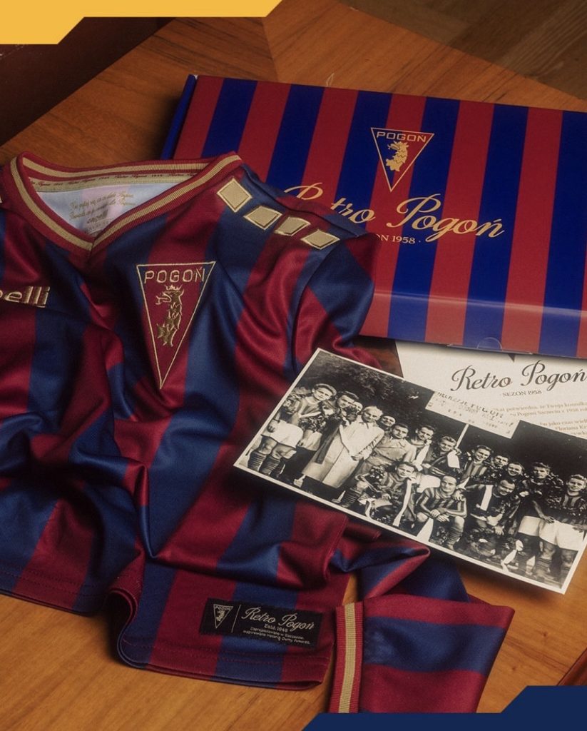
Inspired by their promotion to the Polish top flight back in 1958, this one carries real weight. And you can feel it. It doesn’t scream for attention, it earns it.
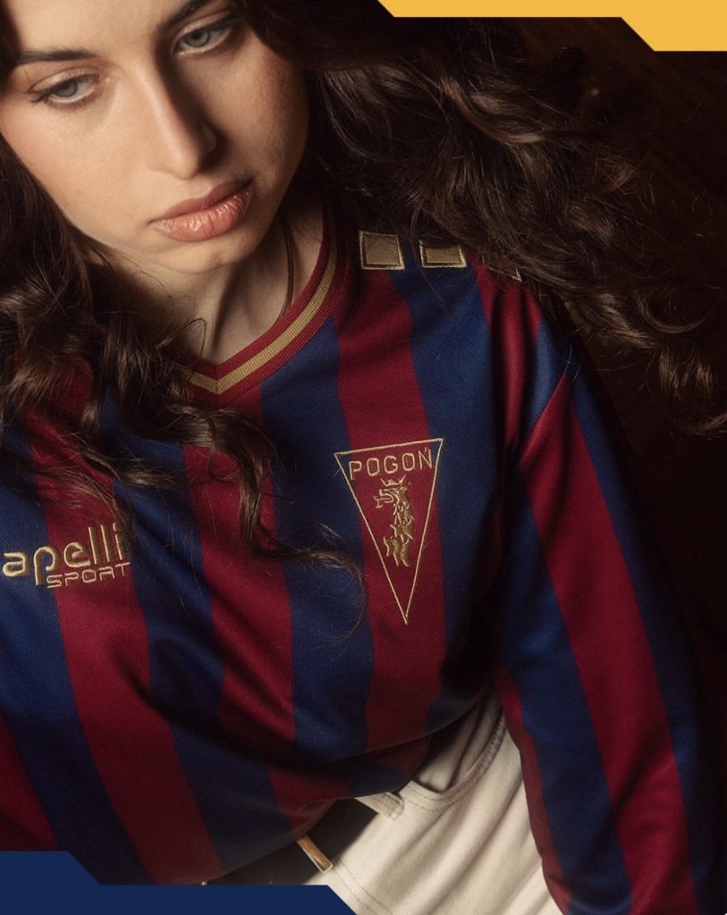
The stripes do most of the talking. Clean, solid, no unnecessary extras. It’s the kind of base that lets everything else breathe, and more importantly, lets the details land properly.
And that badge… that’s where it clicks. A simplified, gold monochrome version that fits the tone perfectly. It doesn’t overpower the shirt, it elevates it.
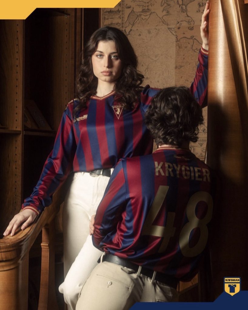
Capelli have kept their identity in there too. The shoulder detailing is subtle but recognisable, with finer details like key dates and a nod to Florian Krygier adding depth without forcing it.
But here’s the thing…
In a year where so many kits are trying to do too much, this does the opposite. And that might divide opinion.
Because if you’re looking for bold, loud, experimental, this isn’t that.
But if you’re into timeless, considered, and properly executed design… this is right up there.
We said it wouldn’t go down well, but we’re saying it anyway.
This might be one of the best kits of the year.
Join the conversation:
https://www.instagram.com/the.kitsman?igsh=ZWtuMDJkb2c4Ynhz&utm_source=qr