Find it cheapest here with 10% off using KITSMAN10
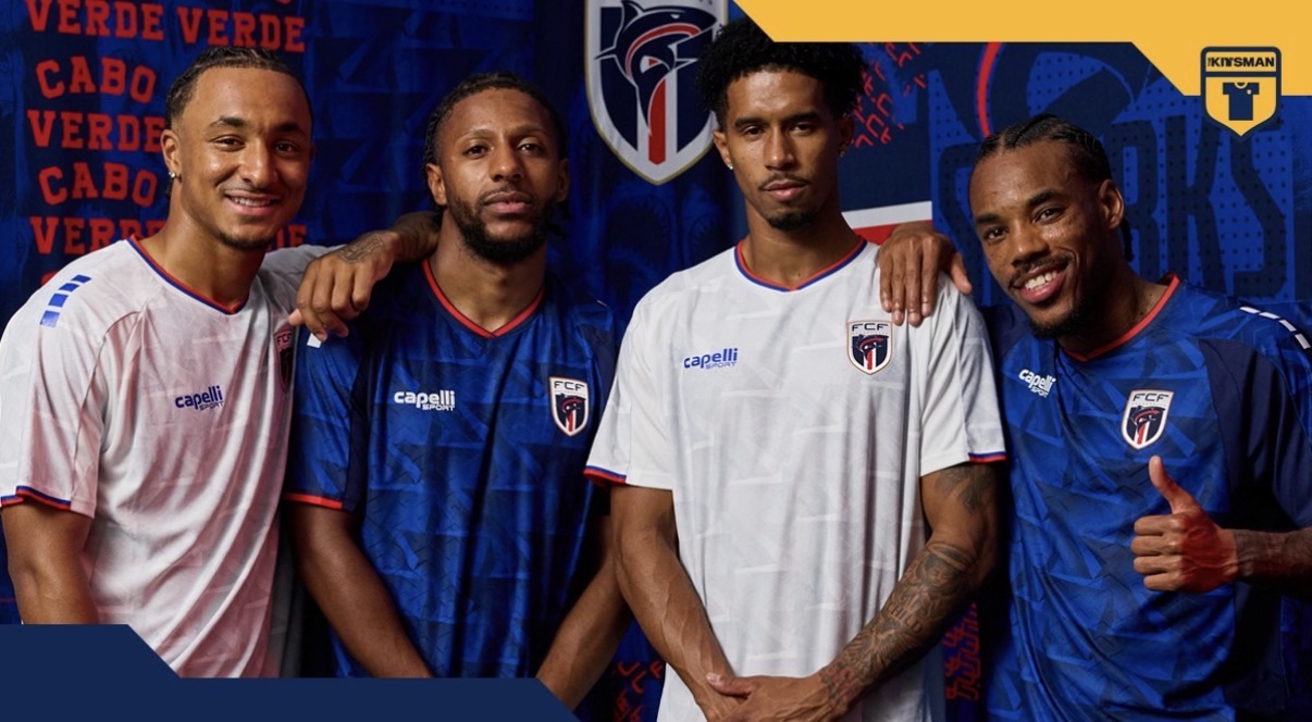
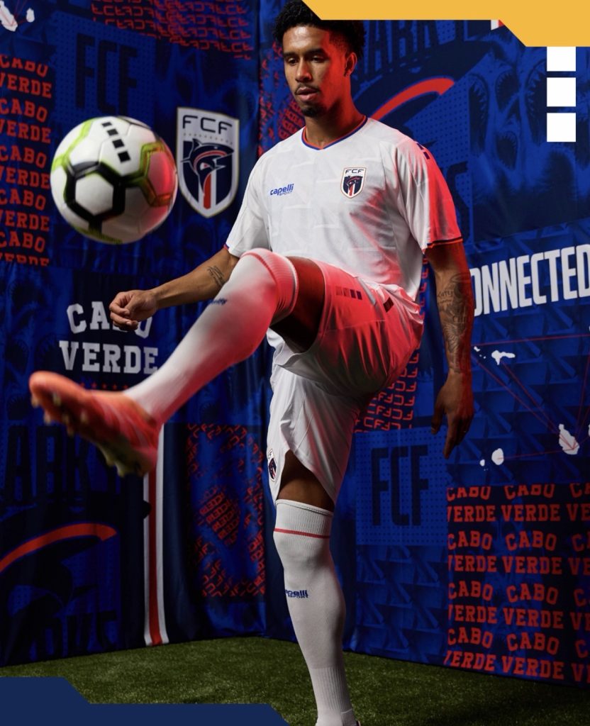
A nation preparing to step onto football’s biggest stage for the very first time is doing so with identity at its core. Cabo Verde’s 2026 home kit isn’t just about showing up, it’s about representing everything that connects the islands, the people, and the journey that’s brought them here.
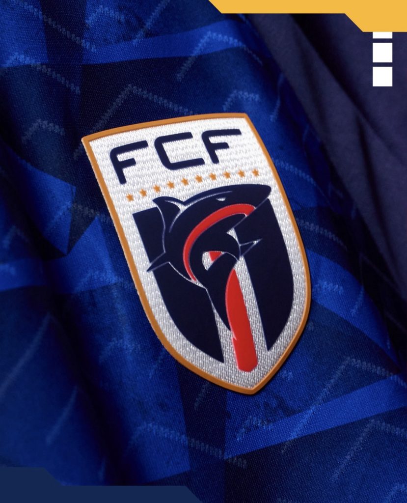
We always say it; kits hit differently when there’s a story behind them, and this one delivers. With Capelli at the helm, the design centres around a symbol that carries real meaning across the nation.
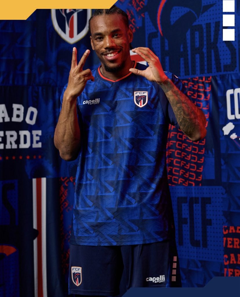
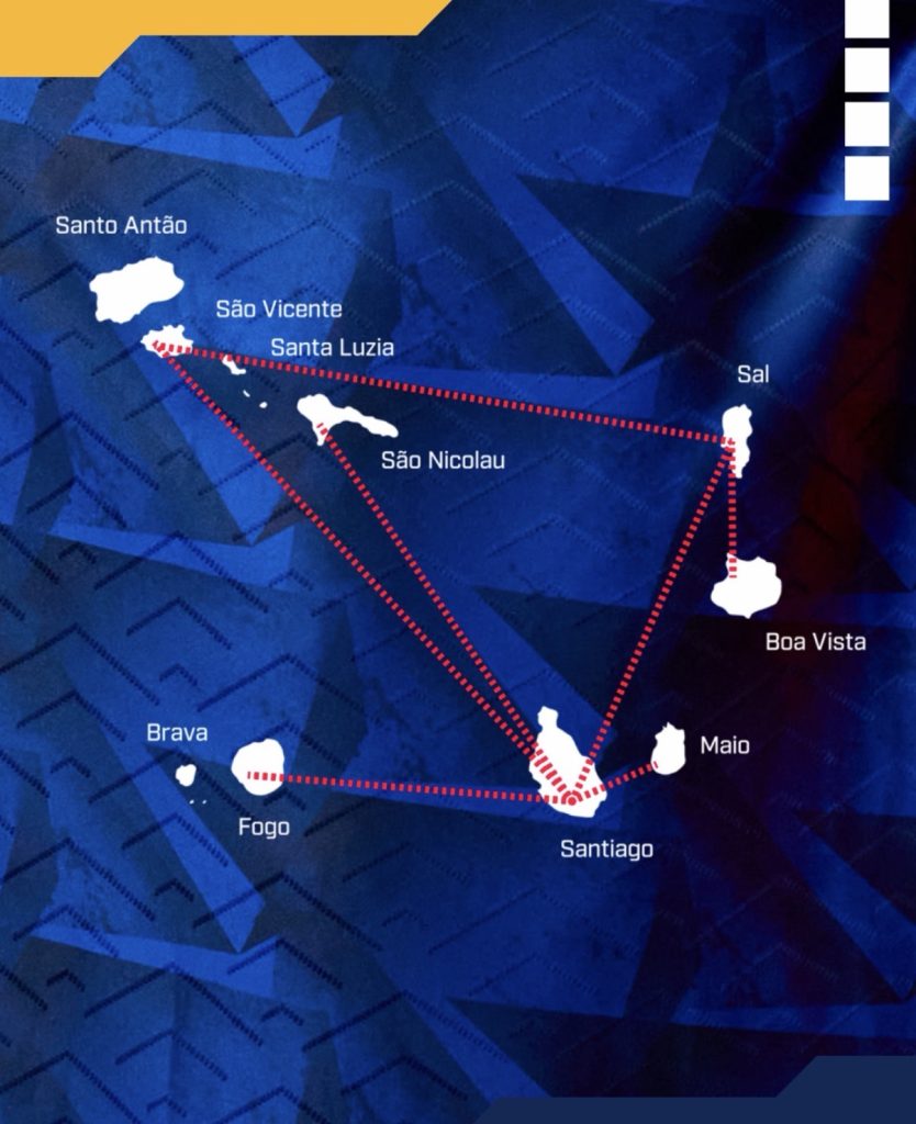
At first glance, it’s a striking geometric pattern. But the triangle at its heart is far more than just a shape. It represents the flight paths and sea routes that link the ten islands of Cabo Verde, connecting communities both locally and across the world. As those lines branch out and intersect, they form a layered pattern that gives the shirt its depth, overlapping edges, subtle shading, and a sense of movement that mirrors the journeys it represents.
Visually, it lands perfectly. The rich blue base feels strong and grounded, while the crisp white detailing adds clarity and contrast. There’s a slight retro undertone in the palette, but it still feels fresh and modern. Then comes the red trim, small but important, tying all the national colours together and elevating the overall finish.
It’s also a big moment for Capelli. Stepping onto the World Cup stage with a design like this, they bring their own touch to the global spotlight; clean execution, meaningful storytelling, and attention to detail.

More than anything, this kit feels personal. Cabo Verde aren’t just heading to the World Cup – they’re bringing their home with them. A symbol of unity, of movement, of identity. And it’s one we’ll all be watching.
Join the conversation:
https://x.com/the_kitsman?s=21&t=YKLtf2JIakFxujMRxTUh9Q
https://www.instagram.com/the.kitsman?igsh=ZWtuMDJkb2c4Ynhz&utm_source=qr