Gold football shirts can be a dangerous game.
Too shiny and they start resembling a trophy presentation outfit. Too restrained and you wonder why the designers bothered with gold in the first place.
Bologna and Macron appear to have found a rather lovely middle ground.
Their new 2026/27 third shirt celebrates the approaching centenary of the Stadio Renato Dall’Ara, combining a rich golden base with details inspired by one of Italian football’s most recognisable stadiums.
And there’s a tower at the heart of it all.
A Century in the Making
Opened in 1927 as the Stadio Littoriale, Bologna’s historic home has witnessed generations of Rossoblù football.
The stadium has hosted World Cup matches, seen domestic triumphs and provided the backdrop for countless moments in the club’s history.
Perhaps its most distinctive feature is the Torre di Maratona, or Marathon Tower, which rises above the stadium and has become one of its defining landmarks.
Interestingly, the tower wasn’t part of the original stadium when it opened. It was added later, yet has become so closely associated with Bologna’s home that it’s difficult to imagine one without the other.
For the stadium’s 100th anniversary, Macron have made sure it gets the recognition it deserves.
Gold Without the Glare
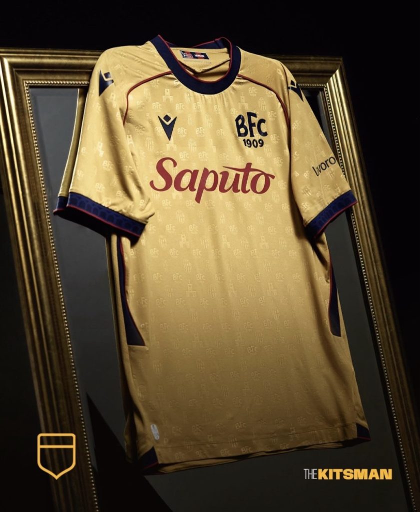
The shirt itself is a wonderfully balanced exercise in colour.
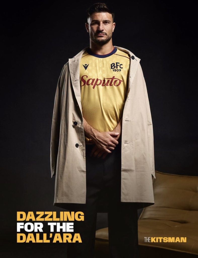
A warm gold covers the body, while Bologna’s traditional red and blue provide the contrast through the collar, cuffs and side panels.
The blue crew neck is finished with fine red detailing, a combination repeated across the sleeves.
Even the bright red Saputo sponsorship manages to sit comfortably within the overall design.
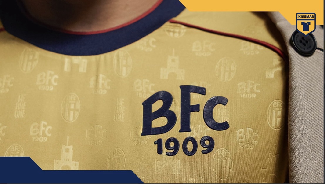
The chest features a simplified BFC 1909 emblem rather than Bologna’s usual full crest, giving the shirt a little extra vintage appeal.
It’s a smart choice. The gold is already making a statement, so the remaining elements don’t need to compete for attention.
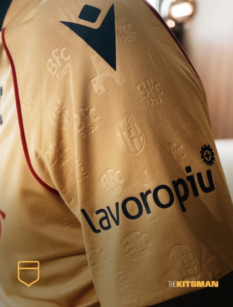
Look more closely and there’s considerably more happening.
Embossed into the gold fabric are repeating details from the club’s crest, the words WE ARE ONE and, of course, the silhouette of the Marathon Tower.
The stadium connection continues onto the sleeve cuffs, where a subtle pattern recreates the arches of the portico along Via De Coubertin.
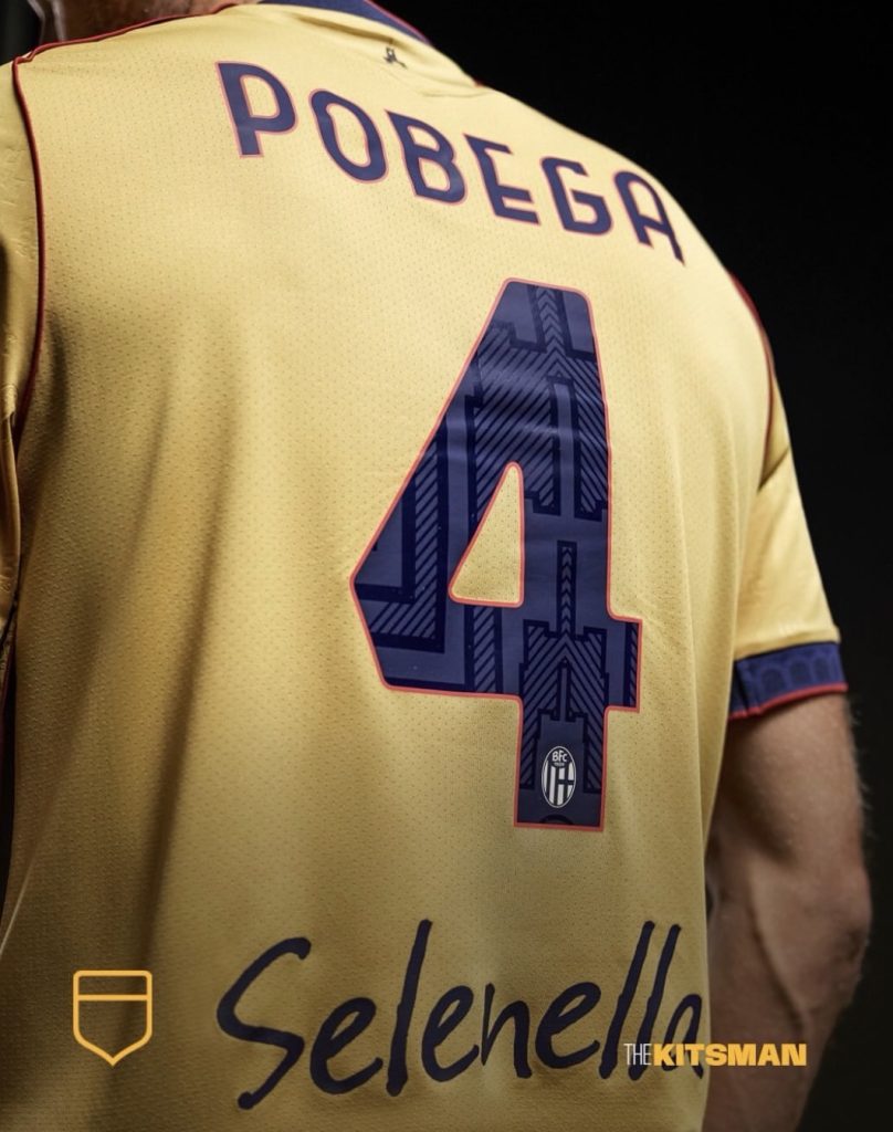
You’ll also find the tower represented beneath the back collar.
It’s the sort of detailing that could easily go unnoticed from the stands but makes a difference when you’re examining the shirt up close.
Should More Stadiums Get Their Own Shirts?
We’ve seen plenty of clubs look towards local architecture for inspiration.
SPAL’s 2026/27 home shirt, for example, incorporated architectural details from Ferrara directly into its traditional stripes:
Bologna have taken a similar idea and made it more personal to their supporters.
A stadium isn’t simply another building in a city.
It’s where generations of families have gathered, where unforgettable goals have been scored and where football memories have been passed from one supporter to the next.
The Dall’Ara has been part of Bologna’s identity for almost a century, so celebrating it through the club’s shirts feels entirely appropriate.
It also raises an interesting question.
Which football stadium deserves its own tribute shirt?
Anfield’s Kop? The unmistakable stands of La Bombonera? The San Siro’s enormous towers?
There are countless possibilities, and some grounds have architectural features every bit as recognisable as a club badge.
For Bologna, the answer is already clear.
One hundred years of their historic home, a golden celebration and a tower that has watched over it all.
This is gold done right.
Credit; @bolognafc1909 @macronfootball
#bologna #bolognafc #macron #renatodallara #torredimaratona #goldfootballshirts #seriea #footballkits #thekitsman
Join the conversation:
X:
https://x.com/the_kitsman?s=21&t=YKLtf2JIakFxujMRxTUh9Q
Instagram:
https://www.instagram.com/the.kitsman?igsh=ZWtuMDJkb2c4Ynhz&utm_source=qr