Wycombe Third Shirt 2020/21 REVIEW
thekitsman2021-01-29T10:50:07+00:00Image from footyheadlines.com Last on the list, but nowhere near least; this third shirt from Wycombe and O’Neills is so far up my street that it’s let itself into my

Image from footyheadlines.com Last on the list, but nowhere near least; this third shirt from Wycombe and O’Neills is so far up my street that it’s let itself into my
Image from footyheadlines.com This Wycombe away shirt from O’Neills is mango madness. Everywhere you look is mango. Even the pattern subtly poking through from the background could be pieces of
Image from footyheadlines.com Being in the Championship this season is the furthest up the football league that Wycombe have ever been, but there’s something reassuringly familiar about their shirt, made
Image from footyheadlines.com It’s jet black, with a camo pattern adding some texture. It’s got Watford yellow pipping round the neck and cuffs, matching the club crest, Kelme prints, and
Image from footyheadlines.com Here we go, great effort from Kelme and Watford. It’s not flashy, far from it actually, and there’s so much white I’d probably be scared to ever
Image from footyheadlines.com Here come Kelme, like the new partner that gets leathered and tells your gran to eff-off the first time they meet the in-laws. They’re fresh on the
Image from footyheadlines.com After the horror show of the Swans away shirt, the club and Joma have pulled it back a bit with the third shirt. There must have been
Image from footyheadlines.com Credit where it’s due, Joma and Swansea certainly aren’t playing-it safe with their connection this season. The same shirt layout and embroidered badges from the home shirt
Image from footyheadlines.com Here come the Spaniards, as Joma ride into Swansea, or should that be sail into Swansea, on the crest of the weird wave they’ve splashed all over
Image from footyheadlines.com Not one for epileptics, this, with more zig and zag than an episode of The Big Breakfast (one for the 90’s heads, there). Luckily, I can handle
Image from footyheadlines.com Stoke bring us the return of the Macron for the final time in this year’s Championship, and there’s a familiar feeling to the Italian manufacturer’s other team-ups
Image from footyheadlines.com Oh joy, another grey kit. Another grey camo kit. Much like the Forest effort, this is pretty much bobbins – grey camo covers the entire shirt, with
Image from footyheadlines.com It’s hard to know what to make of Sheffield Wednesday kits as there’s so many odd factors at play that you don’t usually get from other shirts.
Image from footyheadlines.com This is simple in design but still smart, a sure case of less being more. It’s got pinstripes which immediately puts you at risk of looking like
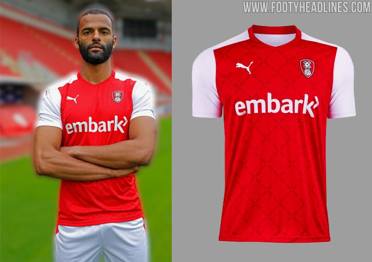
Image from footyheadlines.com This season’s Rotherham shirts are the second and final contribution to the Championship from Puma, and this home shirt is exactly what I’d see if I closed
Image from footyheadlines.com The catchily-titled Rotherham United Alternative Change Shirt has actually got more excitement in its name than in the shirt itself. It’s inoffensive enough, but it’s all just
Image from footyheadlines.com The away effort from Reading & Macron this year is something a bit different without getting giddy, and I like it. It’s a half and half number,
Image from footyheadlines.com Classic with a few modern frills here from the Reading/Macron home combination. The blue and white hoops synonymous with Reading are the cornerstone of the design –
Image from footyheadlines.com Launched to pay the bills homage to Rangers’ famous 1976/76 45 years ago, this white and red half and half shirt is similar to the one worn
Image from footyheadlines.com Strange things are afoot at QPR, as they seem to have rolled-out a Forest shirt, and this actual season’s Forest shirt at that. There’s not much difference